Poll results
Save to favorites
Add this poll to your saved list for easy reference.
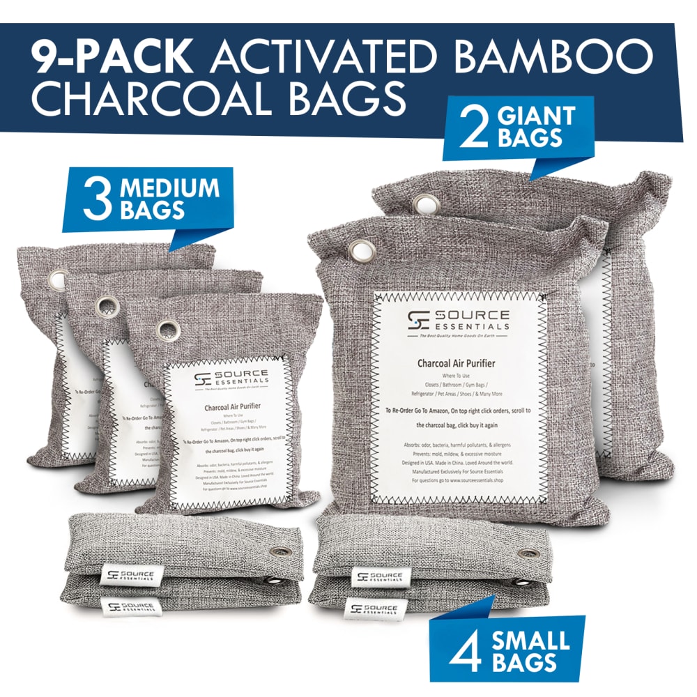
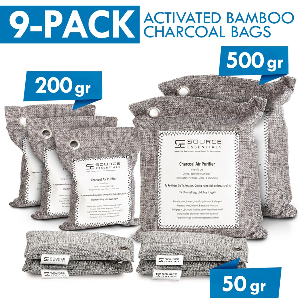
Based on the image, which product would you buy?
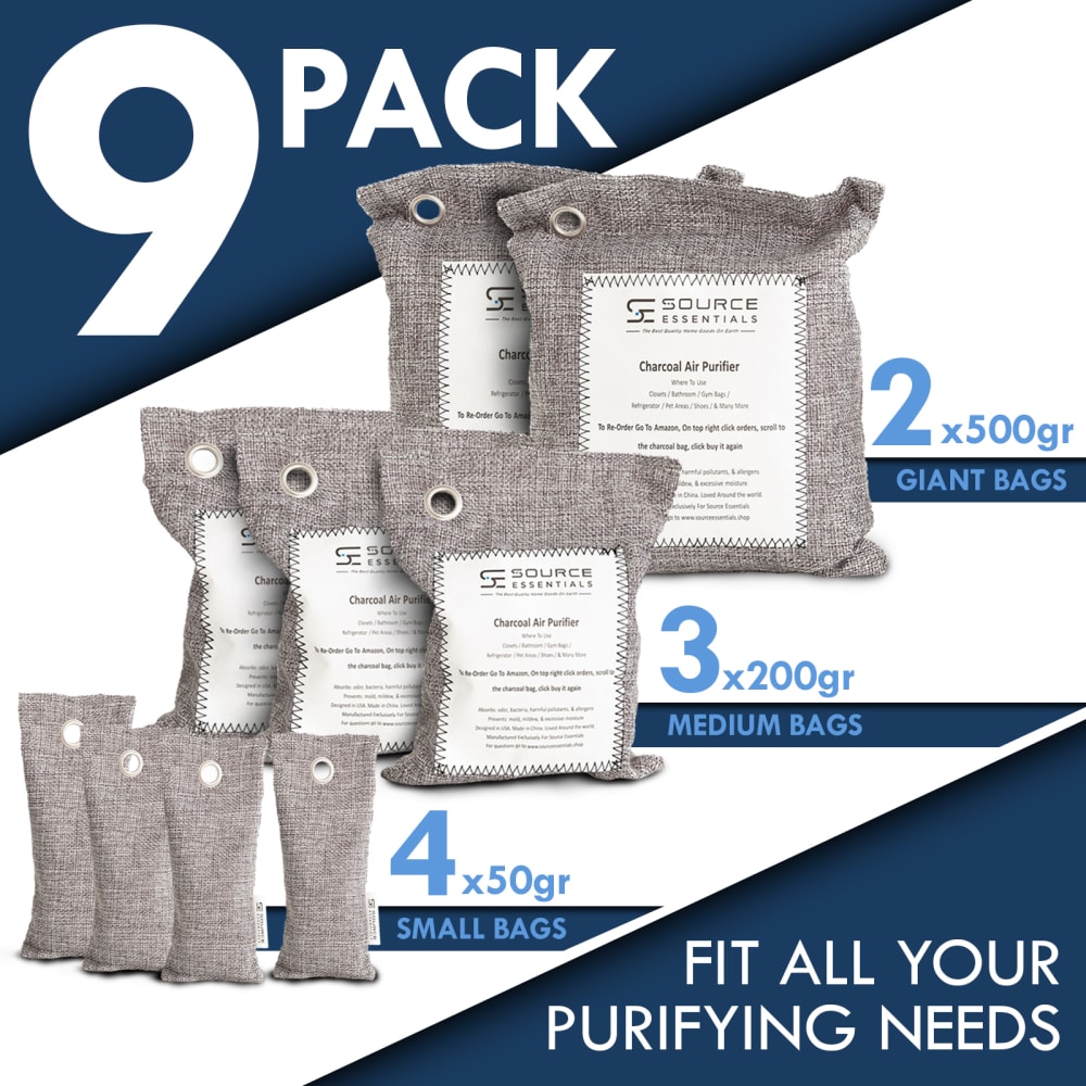
Option A won this Ranked poll with a final tally of 27 votes after 1 round of vote counting.
In a Ranked poll, respondents rank every option in order of preference. For example, when you test 6 options, each respondent orders their choices from first to sixth place.
PickFu requires a majority to win a Ranked poll. A majority winner differs from a plurality winner. A majority winner earns over 50% of the votes, whereas a plurality winner earns the most votes, regardless of winning percentage.
If an option does not earn a majority of votes, PickFu eliminates the option with the lowest number of votes. The votes from the eliminated option are reassigned based on each respondent’s next choice. This process continues in rounds until a majority winner emerges.
Scores reflect the percentage of total votes an option receives during the vote counting and indicate the relative preference of the respondents. If there is no majority winner, look to the scores to see how the options fared relative to one another.
| Option | Round 1 |
|---|---|
| A | 54% 27 votes |
| B | 32% 16 votes |
| C | 14% 7 votes |
27 Responses to Option A
The large font and bold blue of option A is stands out the most among the other two. Option B is next on the list because of the bold blue again and the values make more sense versus what is found in option C.
I chose A first because this image shows the size differences and shape of the product.
A is my favorite because it shows all the sizes the best for me. This is the best layout that showcases the product the best. I would click and buy this one because of the layout.
I preferred the layout of option A. The large 9 made it seem like I was getting a lot. Layouts c and b were a toss up. I liked the lighter colors of c over b.
I chose option A because I like that it tells you the sizes you'll get- grams and description. I also like the triangles in the corners.
A's simplicity of design was more eye catching. A conveyed the most critical information boldly but stated the nuanced data subtly making it very easy to absorb the information quickly. Option B was nice but crowded and the sizes did not stand out as much because they were sorted in 4 stacks. The same held true for option C but it lacked the count for individual sized bags putting it as my 3rd option.
for some reason I like the bold dark blue color on the top and bottom. Also the triangle shape make it more appealing to me. I know I am going to get 9 in a pack
The amount of the bags and the sizes are clearly visible.
I like the options that specify the actual size instead of just small / medium / large.
I think the option I chose looks the most organized and professionally designed, which suggests good quality control and possibly a better product.
Because the a, c have more details then b
I like the bold in your face ad
You loose your audience when you have too many distractions in the photo. It just gets too cluttered and people don't see the product you are trying to show them but they see just chaos and clutter.
I chose A first because I like the contrasting shades of blue and the very large "9" that calls attention to how much you get. I chose B second because of the contrasting blues and the information in the text. I chose C third because it is less bold.
I liked the breakdown of A explaining simply what is offered in the package and size. B just says small bags and doesn't advertise the actual size
I like that it says big/small bigs instead of number of gr. I also think the diagonal layout looks better, but the other layout makes it look like theres a lot of product
The dark blue offers a nice contrast that attracts my eyes
i think A lays it out the easiest where you can see that its a 9 pack and how many of each different size, and what those sizes are
The first one is more organized and clear seeing what you are getting
The large 9 pack and the way they are organized by size makes the product more appealing.
I like how nicely and neatly this one is laid out. the font is laid against a dark background, making it easy to read and catch your eye. the second one is good because I like how it states how much the item is. the last one is good because I also like how it mentions how many items you get.
I choose these options in this order based on the best overall description and image. The first image has the most information on bag size and contents and has the best overall image that makes me want to purchase the product.
I like A best because I like how all of the bags are upright so you can easily compare the sizes to each other. It's also pleasing to look at and I think the images flow nicely together. I like B next because I like the darker blue in contrast with the lighter blue all with white font. I think this gives the image a more modern look. I like C least because I don't like how all the text boxes are the same color. I don't think this image is as pleasing and I would be less likely to click it.
I think the product placement in the Ad and the dark blues in the first two look the best.
I don't need to see it in grams. Option A followed by B does the best job of explaining the product sizes.
I like A because all the objects are very nicely arranged and the way that the number of bags and the size of the bags is visually pleasing. C lacks information on the size of the bags while B lacks information on the grams of the bags.
Option A seems the most clear about what we're getting, and is the most clearly presented
16 Responses to Option B
I think B and C offer the most information, and B has a sleeker design to the color format.
The text in option B is the most easy to read and has a good bold display. The quantities of bags are marked clearly.
I like B best as the design is good, and it make it very clear what the product is.
i would buy b, the layout is more appealing
The first one gives a clear presentation and description of the product and the contrasting blue and white makes it easy to read. Having the product description with the product makes it much more appealing.
I liked B because it highlighted what the features/identity of the product the best while C and A are 2nd and thrid after woed.
3 is too plain. The blue in 2 is a big too big. 1 is just right -- just enough blue and just enough information
I like option B as it is clear you get 4 small, 3 medium, and 2 large bags. Think it is a good choice for the charcoal purifying bags. I like the image in option C as well as it is easy to read. Think option A has too much text in it.
I definitely prefer option B the most because I don't know what gr means as far as size. Option C I like the layout better of the wording without the triangle sides like option A has.
I LIKE THAT B BREAKS DOWN THE DIFFERENT BAG TYPES THAT YOU GET. I LIKE THAT IT HAS THAT IT HAS IN THE BLUE, WHAT KIND OF BAGS THEY ARE.
i dont understand it in grams
I prefer Choice B because I like the way the bags are laid out! I also like the dark blue background color on the top heading. Its is easier to read and more appealing to look at.
I just chose the ones that stuck out to me the most.
I chose the options that most clearly stated what the product is first
I like the first option the best because it tells you what it is at the top so you don't have to scroll and see what it is. I like the white lettering on blue background too.
This image best displays the different sizes and the amounts available in each size.
7 Responses to Option C
the options C and B are better because they promote "activated charcoal" in large text which is important when considering such products.
I prefer to see the product up close. It helps me better analyze it.
more precise details about weights
My first choice shows the sizes the most clearly
the product is larger in options c and b I think these are the best two due to that
I chose the image based on how much focus was but on the product image.
I like the blue it stands out more I think. I also like it say 9 so I know right away how many are in the pack.
Explore who answered your poll
Analyze your results with demographic reports.
Demographics
Sorry, AI highlights are currently only available for polls created after February 28th.
We're working hard to bring AI to more polls, please check back soon.

