Poll results
Save to favorites
Add this poll to your saved list for easy reference.
Based on the image, which product would you rather buy?
Option C won this Ranked poll with a final tally of 32 votes after 1 round of vote counting.
In a Ranked poll, respondents rank every option in order of preference. For example, when you test 6 options, each respondent orders their choices from first to sixth place.
PickFu requires a majority to win a Ranked poll. A majority winner differs from a plurality winner. A majority winner earns over 50% of the votes, whereas a plurality winner earns the most votes, regardless of winning percentage.
If an option does not earn a majority of votes, PickFu eliminates the option with the lowest number of votes. The votes from the eliminated option are reassigned based on each respondent’s next choice. This process continues in rounds until a majority winner emerges.
Scores reflect the percentage of total votes an option receives during the vote counting and indicate the relative preference of the respondents. If there is no majority winner, look to the scores to see how the options fared relative to one another.
| Option | Round 1 |
|---|---|
| C | 64% 32 votes |
| A | 22% 11 votes |
| B | 14% 7 votes |
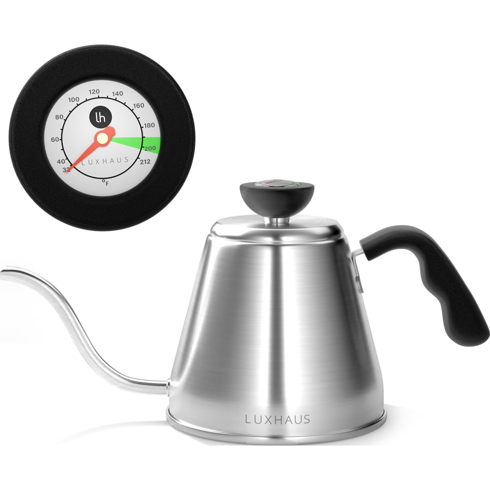
11 Responses to Option A
front view is best / side view is good / pour pose is not good
The angle of B is strange, and the green color in C looks off. A looks the best.
I chose A, because that image gives me the best overall look at the shape of the kettle and the lid dial. I chose C over B next, because I like the closer look at the function of the lid.
I prefer the straight and more typical angle of A over the turned presentation of C. The tilted angle of B seems awkward.
The gauge is colorful most in this order.
I like that the tea kettle is shown right side up and I like the gauge better in option A, I like the more lime green color where the hot indicator is.
A- i prefer how this one is angeled away from the camera so we get a great profile of both images. B-I wish the image was turned a little bit more to the side, like in image A because i prefer the size of the images but do not like the rotation as much. C-This is my least favorite because the positioning seems odd to me.
A & C the are normal images with a good overview of the product.
I think the angle used in A was best because it seemed natural and resembled sitting on a table. I didn't like either of the other angles, as they looked awkward.
The look of the image with the display for seeing the information about the heat contents like A and C is appealing
I like the basic look of option A, it shows the best quality of the product
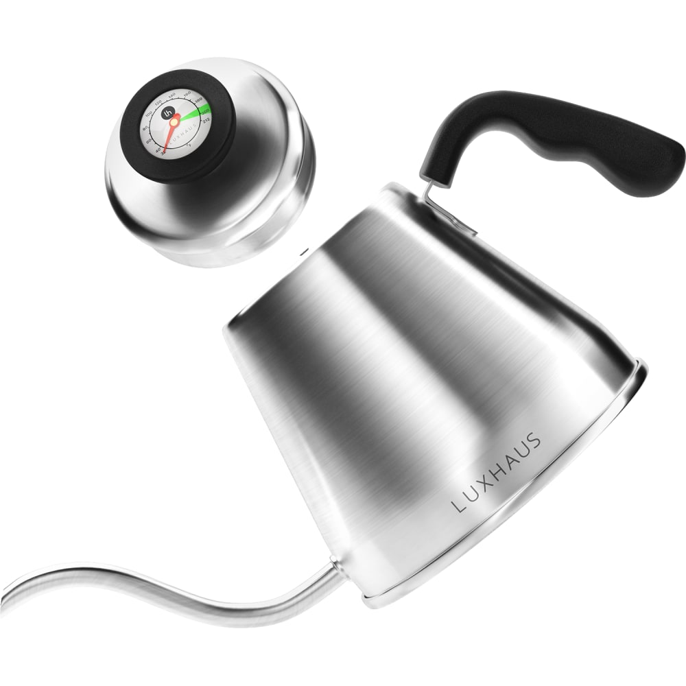
7 Responses to Option B
The most important and unique feature here is the integrated temp gauge and the WAY it's connected is very clear in B, ALMOST visible in C and unexplained in A, the temp cap IS shown in C and A but it's not clear how it all fits together, which renders it meaningless.
I think option B would be more convincing for me, it is much more clear that the thermometer is on the knob. I wouldn't have understood that from the other two pictures.
B felt more dynamic to me. I liked that C showed the product in a larger size.
i would buy the product in option B based on the image because it looks the most durable
I simply selected in order of the images that I felt showed the product off in its most appealing and natural light.
option B shows the lid and the gauge more clearly than the others.
My top choice was Option B because I really liked the way it was designed. I liked how it was tilted as if pouring and I also liked the way the top was detached so you could still see what its function was, but it still felt like a cohesive unit. Option C was my next choice because I liked the size of the pot, the angle it was positioned in, and the thermometer was the right size. Option A was the most bland and there was almost more emphasis on the top rather than the pot itself.
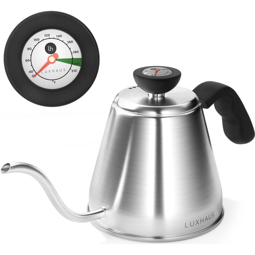
32 Responses to Option C
I like being able to clearly see the top of the kettle, and I also prefer the larger image of the kettle in C.
I most prefer option C. I feel that this listing looks most professional out of the bunch and is most enticing to my eyes compared to the other options.
I initially liked Option A as my first choice because this isn't a product that really needs to be seen from different angles but the more I look at Option C the more I really like it. It starts to feel welcoming and comfortable in a way that Option A doesn't.
I was very confused about the thermometer until I saw the way it was presented in C
I prefer Option C because it provides a better view of the top of the pot with the temperature scale on the dial more visible.
I like seeing the larger measuring dial on the lid. Like the axial view because it shows more details.
It gives me the most accurate view of how the teapot looks. I know what to expect from it.
I like option C the best because it clearly shows me what the product and the thermometer looks like. I like option A the next best because it also does a good job showing me what the total package looks like. Option B does not do a good job showing me the full product and I do not like that.
B kind of reminds me of something broken; it is arranged awkwardly. C appears bigger and more useful than A.
I like Option C the best because it shows the kettle in the closest view as well as shows the temperature gauge at the top. Option B's image is too convoluted.
I really like the darker green on the gauge from C. The lighter green from the gauge on A is nice as well. The exploded view of B does not look as nice as the other two.
I like C and A better as I can see the temp gauge much better and get an idea how it will look
I pick C in this one because I like that the angle shows where the thermometer is in this kettle. I usually like the look of straight on like A but you can’t see the top in this case. Just having that little bit of an angle is the perfect view.
I prefer the images that best show that there is a temperature dial, that it is in the lid, and how everything fits together.
The images of the product are displayed ideally and most details are clear. I like showing the product at different angles for maximum visibility.
C paints the most complete picture of the product which increases my comfort and confidence that I would be making an informed purchase decision. I really like how clearly it shows that the gauge is a feature included on the lid handle/knob.
I prefer the levelness of Option C. It's photographed in a appealing, straightforward,manner and its effective. Option A with the slight angle and Option B with the full tilt are not as likeable and you don't get a good look.
What a delightful way to make one's coffee in the morningThe esspressor maker is well designed and attractive
I prefer chocie C since it gives a side view of the actual product but also a closeup to the temperature scale on the lid. It's nice to see all the sides and angles of the product as it is more appealing to the consumer because they know exactly what they are buying.
I like seeing the temperature gauge on its own and also on the kettle, which is why I chose C. The angle is a little more dynamic, which is why A is second. C just looks a little silly to me.
The product is more attractive to the potential buyer in the image C. The product is bold and placed properly.
Option C gives me the clearest image of what the whole tea kettle looks like, as well as a look at what the temperature gauge looks like as well. Option B is the least useful to me since it doesn't show me a close up of the temperature gauge.
I chose option C first because the handle looks thicker/sturdier. I chose option A because I like the look of the product with the lid on. Option B was my least favorite.
Choice C has a good view of the temperature gage, opening of pouring spout and the grip on the handle of the pot. Choice A Has a good image of the temperature gage and how handle is attached but the pouring spout seems very tiny. Choice B shows good angle view for handle and lid but focus is on the name of the product seen clearly on the pot which seems to have a design and is not a smooth surface.
C is the image I like best because it shows a better angle and a closer level of zoom so I can see better detail
I ranked the designs of the kettle pot that I liked the most. I really like option C's image the most followed by the angle of the kettle of option A and then finally option B.
The top down angle in C is my favorite. It gives me the best sense of the dimensions and provides the most information
Based on the image, C is my top pick because of the details shown. The handle, in particular, from this angle looks very manageable and easy to hold!
I would much prefer to buy option 'C' as the image is much easier to see the details of the pot and gauge.
With this image at this angle I get the best view of the entire teapot with all the details one needs in order to judge if you like it or not.
I like showing the close up of the top and the angle of the product
In option C , the kettle size was depicted in full view. The heating meter was looking in good quality and in good condition. I like to buy that product in Option C.
Explore who answered your poll
Analyze your results with demographic reports.
Demographics
Sorry, AI highlights are currently only available for polls created after February 28th.
We're working hard to bring AI to more polls, please check back soon.

