Poll results
Save to favorites
Add this poll to your saved list for easy reference.
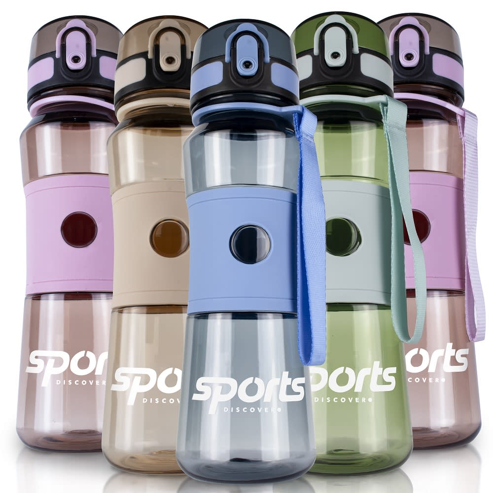
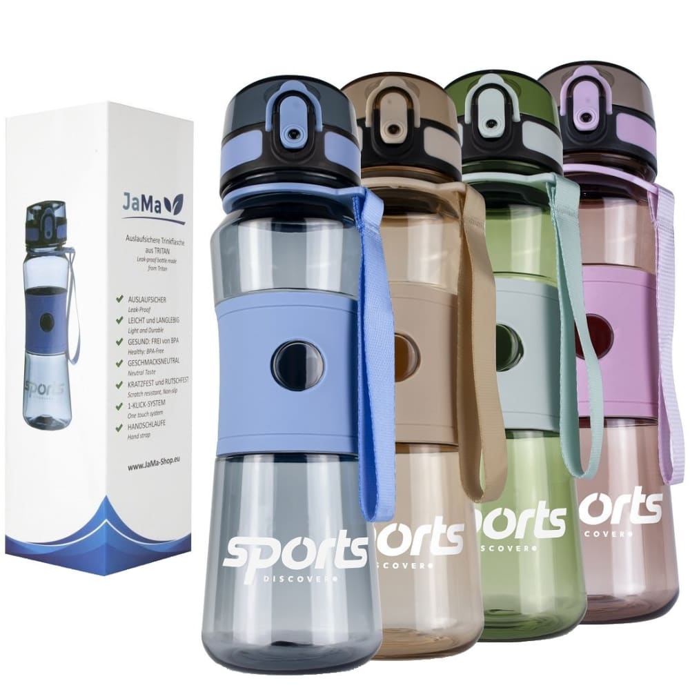
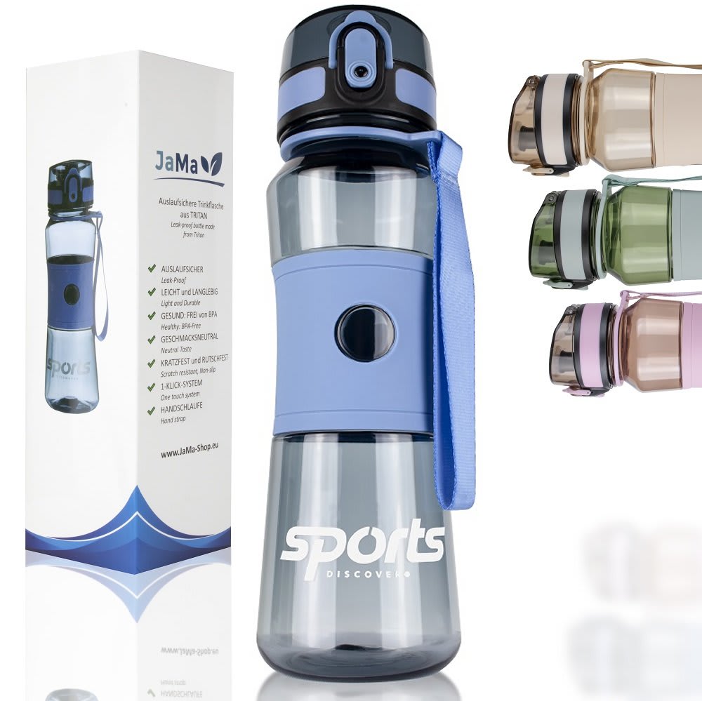
Based on the image, which product would you rather buy?
Option B won this Ranked poll with a final tally of 29 votes after 2 rounds of votes counting.
In a Ranked poll, respondents rank every option in order of preference. For example, when you test 6 options, each respondent orders their choices from first to sixth place.
PickFu requires a majority to win a Ranked poll. A majority winner differs from a plurality winner. A majority winner earns over 50% of the votes, whereas a plurality winner earns the most votes, regardless of winning percentage.
If an option does not earn a majority of votes, PickFu eliminates the option with the lowest number of votes. The votes from the eliminated option are reassigned based on each respondent’s next choice. This process continues in rounds until a majority winner emerges.
Scores reflect the percentage of total votes an option receives during the vote counting and indicate the relative preference of the respondents. If there is no majority winner, look to the scores to see how the options fared relative to one another.
| Option | Round 1 | Round 2 |
|---|---|---|
| B | 36% 18 votes | 58% 29 votes +11 |
| A | 36% 18 votes | 42% 21 votes +3 |
| C | 28% 14 votes | Eliminated 14 votes reassigned |
18 Responses to Option A
I like seeing the bottles lined up like an army in option A, so that is the one I would choose.
It's a little weird that it has the same color twice but I like the symmetry.
Choice A has the most variety of colors.
I like A the most because I think that A is good. I like the symmetry of this one and I also like being able to see all of the colors that are offered
Option A is great. it's a powerful display. It does a great job of showing off your product. And yes, I'd buy, based on option A.
i like seeing all the colors shown strongly up front like this layout in A
I would rather buy A because the product sticks out the most and the design is the most colorful as well as eye-catching. B is a bit unbalanced but at least shows the different colors however I hate the inclusion of the box. B is the least useful image and doesn't show me the color selection.
It should not be in a box (too wasteful) so I would have picked the one that made me think there is not box (item A). For the other two there really is no difference.
The more clearly I could see the colors and the other features of the actual product, the better for me.
I like option A because it has variety and feels the most high quality. Option B and C look alright but don't compel me as much!
Based on the image, I would rather buy option A because I think that it is the most eye-catching and visually appealing product image out of the three options.
Option "A": This is the better visual for the product with the rainbow of color assortments making it both appealing and interesting comparatively; if the packaging were in English, it might sway my pick if details of the product were visible but since it is not, this is the better selection.
i liked the way the variety of colors were displayed
I chose "A" because symmetry pleases the eye, and it shows off all the colors. "B" was next because asymmetry has it's place too. "C" I'm not a fan of.
I chose option a because it is most appealing. It clearly shows the products. I chose b next because it was more appealing than c. I chose c last because it looked cluttered and messy. I don't need to see the box the product comes in.
I love seeing the different colored bottles available and I think they're lined up nicely in A.
Option A. I like it because it shows the lineup of different colors the product comes in. Which makes it more eye catching, as well as it is shown at an appropriate distance to give a full view of the product.
Seeing all of the color options is the best choice
18 Responses to Option B
I picked option B because it shows the variety of colors the product comes in, along with its packaging box.
I chose option B because i can see the way it will come packaged as well as the other colors that it comes in.
B and C were first because they show the box with additional info. C was second because the placement of the additional bottles is strange. A was last - image is good but missing the box.
I ranked the images of the water bottles that I liked the most. I found the image of the four different colors next to each other and the box in option B to be the most appealing. I then liked the image of option C more than option A.
Options B and C give the viewer more information about the product with the inclusion of the packaging.
I think the box helps make it look higher quality and more expertly engineered. B shows the different colors of bottles more effectively than C though.
I like to see the image of the box included. Having the other bottles floating on the side is offputting
A doesn't show me the box at all, but B has the bottle organized in a normal way and shows the box
I like the combination of being able to see full length products (don't like how they're cut off in option C) and being shown the product packaging, which has a bunch of important info on it.
I like seeing the bottles from the side view as well as the box it came in
I picked B as first choice because it clearly shows each bottle fully as well as the packaging. I picked C as the second choice because it shows all colors and the packaging, but does not show the entire bottle in each color. I picked A as the last choice because it does not show the packaging, which is important to get more detail about the product.
I choose B, Because the product color and display is more presentable and is more attractive.
A is really the most attractive, but I had to mark it second because I really want to see that box with the product attributes on it. C is not appealing visually with the tops popping on the side.
Option B is my first choice because I like seeing the packaging and the product and I think that image best displays the array of colors available. Option A is my second choice because it displays the available colors well. Option C is my third choice because although I like seeing the packaging and the center bottle, the bottles to the side are very distracting and make me unlikely to click on that image.
I like that you can see all the options and the box.
Option B is the most well rounded image showing all of the product varieties as well as the packaging in a neat, professional setup that is not trying to be fancy with unnecessary graphics added in.
The product arrangement in Option B is much more appealing and catchy to me.
B SHOWS OFF THE PRODUCT WELL BUT ALSO SHOWS YOU THE PACKAGING WHICH GIVES ME MORE INFORMATION
14 Responses to Option C
I like C because I like seeing the packaging, then B because I like seeing the packaging more than just the bottles it makes the item look more legit.
I prefer that the product is featured standalone in the middle as in C. It puts more focus on it.
i would rather buy the product in option C because it looks easy to carry to me
C looks a lot better because I can focus closer on the detail and quality of the product
B felt the most crowded and this was hard to see clearly. C felt the most upscale with its central placement.
I prefer to see the packaging in the picture with the bottle.
I would buy option C because I like that I can get a good look at the bottle and I like that I can see the packaging next to it as well. I like that the main focus is on the bottle and it's nice to see the different colors the bottle is available in.
I'm assuming these are water bottles. It's difficult to tell just from the photos so I selected C since it shows the box along with a secondary image of the bottles. This gives me the best views of what the product is and what it could be used for. B is my second choice since it also showed the box with the info on the side. A is my least favorite cause I know nothing about it besides the brand name.
C focuses my attention the most. B seems a little too off center.
Image C gives the best uncluttered view of the product and provides the most information about the product. Image B is good, too, but is more cluttered.
I really like C and B because it shows the box and the colors that is available. The boxes help with showing if it would be a good gift or not.
I like this one the best as it shows me the best image of the actual product since it has been zoomed in.
I like that the picture is not too cluttered. You could see the bottle in exactly how it looks that being distracted
C-HAS A GOOD DESIGN AND OUTLOOK A- SEEMS TO BE APPEALING DESIGN PATTERN AND OUTLOOKB-HAS A GOOD DESIGN AND OUTLOOK PATTERN
Explore who answered your poll
Analyze your results with demographic reports.
Demographics
Sorry, AI highlights are currently only available for polls created after February 28th.
We're working hard to bring AI to more polls, please check back soon.

