Poll results
Save to favorites
Add this poll to your saved list for easy reference.
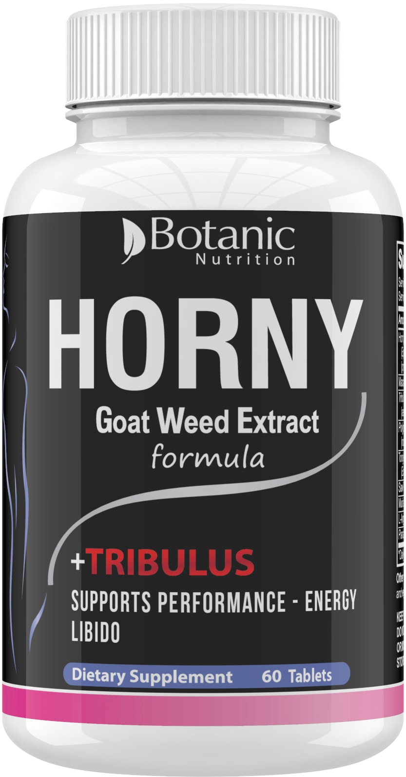
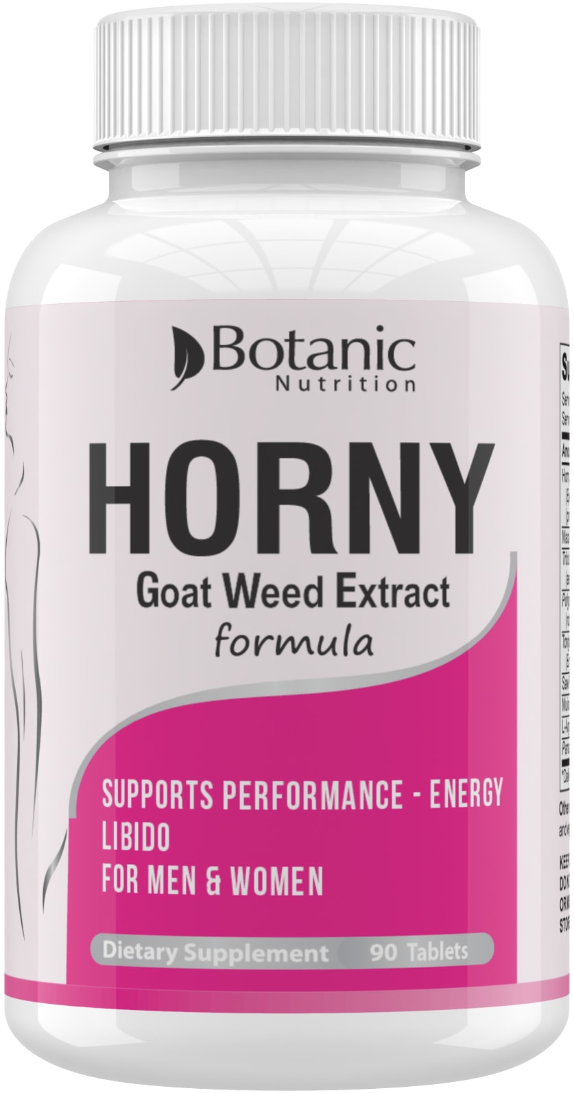
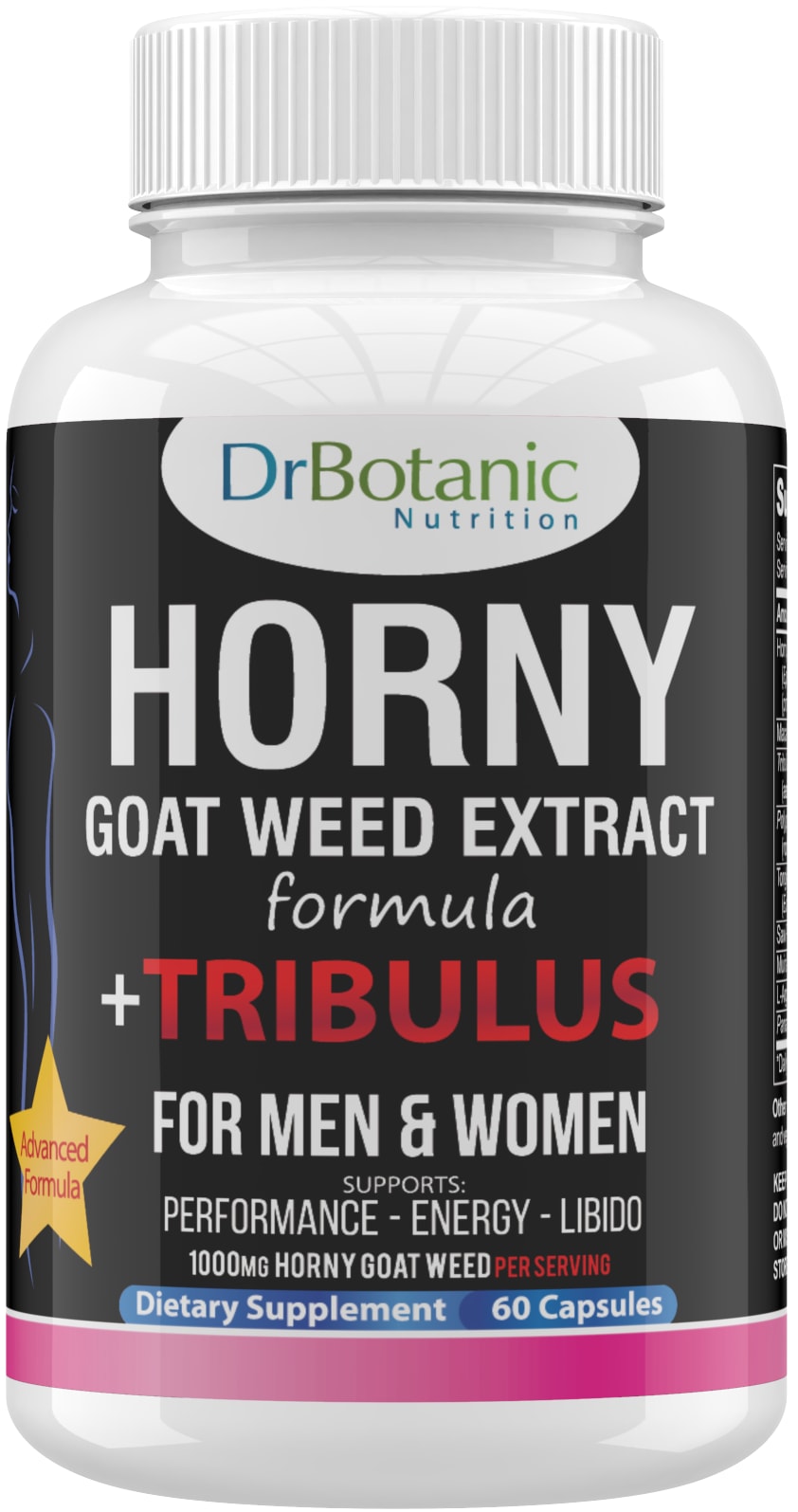
Based on the label, which bottle would you rather buy?


Option B won this Ranked poll with a final tally of 26 votes after 2 rounds of votes counting.
In a Ranked poll, respondents rank every option in order of preference. For example, when you test 6 options, each respondent orders their choices from first to sixth place.
PickFu requires a majority to win a Ranked poll. A majority winner differs from a plurality winner. A majority winner earns over 50% of the votes, whereas a plurality winner earns the most votes, regardless of winning percentage.
If an option does not earn a majority of votes, PickFu eliminates the option with the lowest number of votes. The votes from the eliminated option are reassigned based on each respondent’s next choice. This process continues in rounds until a majority winner emerges.
Scores reflect the percentage of total votes an option receives during the vote counting and indicate the relative preference of the respondents. If there is no majority winner, look to the scores to see how the options fared relative to one another.
| Option | Round 1 | Round 2 |
|---|---|---|
| B | 44% 22 votes | 52% 26 votes +4 |
| C | 36% 18 votes | 48% 24 votes +6 |
| A | 20% 10 votes | Eliminated 10 votes reassigned |
10 Responses to Option A
I would avoid too much pink if this is for men and women.
I like that choice A doesn't gender discriminate and has all the good benefits.
Tribulus shouldn’t be too prominent as it distracts from the name of the actual product, and too much pink implies it’s for women only
I prefer the darker colors to the pink bottle.
I picked A because it was less cluttered with text and less pink, so more gender neutral. I then chose C over B because less pink looked more gender neutral.
I prefer the gender neutral color since it is targeted to both men and women, but I also like a label that looks attractive and professional.
Option A's label looks best because the information is displayed best.
the one that is more gender neautral since it's for male or female
I think if it's for men and women, I like choice A better. I don't like the the name Dr.Botanic (it seems gimmicky), so prefer both A and B best, but A is more unisex.
Option A looks the most modern of the three. I would think Option A was made the most recently. Option C is crowded with a lot of extra things on it and the star makes it look cheaper.
22 Responses to Option B
My top choice was option B, I thought the hot pink and the white background in the packaging design popped a lot more than the black bg used in option A and C. Option A, I choose second over option C, because I thought the overall design looked clean and more sleek.
the pink color of the bottle grabs your attention?
B - I loved the bright pink color, it makes the product stand out C - the fonts were bigger than the last option A, so that made the bottle stand out a little more.
I chose B first. I like the label, it lets me know right away it would work for me as a woman. I chose C next. The label lets you know right away it works for both men and women. I chose A last as the label doesn't distinguish whether it would work for men or women.
Based on the label, I would rather buy B.
I think all designs are tacky but I do like B because it looks the cleanest, followed with A and C last because it just has way too much words making it clutter.
I chose B first because I like the color pink, and the bright bold color is something that women may gravitate towards (which is good because it is a product specifically for women). I chose option A second because the color black looks nice and sleek, but I think that if it was black and white (without the pink/blue colors) it would look nicer and less all over the place when thinking from an aesthetic standpoint. I chose C last for a similar reason to choice A- there were a lot of new colors added to the bottle and it made it look all over the place. I do not have an issue with it being a gender-neutral product (I like that fact) but the labeling could have been done better in utilizing more colors.
I love the idea of using a pink label for men and women. I wish more things were made to be gender neural, like colors.
B - If this was geared towards women then B since A and C are clearly for men. / A - A's label is a lot more clean and less cluttered than C. / C - C is way too wordy and makes me think of product that comes from either the Dollar Store or China.
I prefer the pink bottle because it’s unisex, and the color pink seems more inclusive for both genders
I am not particularly interested in buying a bottle with H O R N Y written in all caps across the side... although since all thesebottles have that on it, I am forced to eliminate that from my decisionmaking. First of all, a pink bottle would make me feel slightly more comfortable buying this; i.e. option B. And option A and C are really close, except option C looks a little more sensational which makes me dislike it even more. However, option C did have the white circular cutout at the top which, designwise alone, I think is a good choice to make it seem less like you're buying something you shouldn't be!
MY CHOICES ARE BEST TO WORST FROM THE LABEL.
I can read the label much better with the white background. Also, what sticks out to me is this is sports energy for both men and women.
The pink color gets my attention and seems appropriate. The packaging design is very good as well
I like choice A better than the other choices because of the label it uses. I like the pink and white color of the label.
The label designs are all nice and beautiful. After scrutinizing all the designs and their colors, I feel most favorable towards the Option B product label design. It looks better and it attracts me to it. I love its design and appearance. The color theme is adorable. I love the pink color used in the design. It's sleek and elegant. Its beautiful to behold and looks so appealing to me.
I like the white label design best and my third choice doesn't way it is for both men and women.
I like Option B because the white bottle seems modern and more trustworthy.
Would like to pick option B is an amazing product which is compelling and likely to buy the product, recommend for men and women specially
My #1 pick is because it's a bit more subtle, but not by much. Maybe they shouldn't make "HORNY" in all caps, in such a large font? It is hard to take seriously.
i like the pink label best
I voted b because I liked the pink
18 Responses to Option C
C seems the most detailed and professional.
I like C most because it looks more expensive with the bigger text and the star. A is similar. B is bad because it looks like it's only for women being all pink. I would buy C.
as my choice it is for both gender.my second choice is have extra capsules and then remaining one
Makes it clear that both women and men can take it, so I perceive value in this order.
i was really good product no side effects and it was give more energy
I do not like how the word horny is highlighted in all of them. So I first chose the option that said Goat Weed Extract in the biggest letters. Option A had a smaller font for those words than C. Adding pink to the bottle as in option B is just confusing. It says it is for men and women but men will probably pass right by something pink on the shelf.
I like the star on bottle saying it’s advanced formula . I like how it has big print men and women.the black background with pink border nice especially with tribulus in red very eye catching. I like b because it’s pink and I am a woman . The horny in black is eye catching. A is ok but black little overpowering.however the horny in white makes it work.
option C really looks professional and the information is well placed, fonts are easy to make out the information, i also liked the target gold star as well for pertinent info.
I would mostly purchase Option C. I think the overall design is the most promising and attention grabbing. I especially think the star icon was a nice detail.
I picked C because the black makes in gender neutral and it had bigger lettering for easier to read.
it was give more energy and more power it was really awesome product
I really like that c is the advanced formula.
'C' is my first choice because the label contains the most information, or at least most visible information, of the three choices. It specifies that an Advanced Formula is used, that the product is for both men and women, and has the added benefit of Tribulus as well as including the MG of Horny Goat Weed per serving. While some or all of this information might be included on the other two bottles, I like that it's all on the front of the label (and easy for me to see) on 'C'.'B' is my second choice as it specifies it's for both men and women. Some of the info from 'C' (and 'A') is missing on 'B' but 'B' includes a benefit the other two choices do not have, in that there are 90 tablets in the bottle instead of just 60.'A' is my third choice, largely because the front of the label does not specify "For Men & Women" as the other two choices do. I would probably avoid 'A', actually, and not even consider it due to not knowing if it was a product intended for women or just men.
I'm not sure what tribulous is but if I can get it in the same supplement then I would want to do that. I also want to know if it's for men and women or not.
I like how choice C gives a lot of information on the label and it's all easy to read. Choice A doesn't give as much information as choice C but there is enough to be helpful. Choice B looks a little cheaper to me so I might not trust that one enough to buy it. And the gray area with the white writing is hard to read.
Choice C: This label is striking with the black background and white lettering. On this label it says "For men & women". This is important as it lets me know, as a woman, it is also safe for me to use (not just for men). I like it is an "extract" as it tells me it is "potent" and I should feel its effects. I like that the label shows what I can expect from this formula "performance-energy-libido". All three are desirable. I like "Tribulus" is in red letters and pops out. I know this is where I am getting positive benefits. I like the pink stripe at the bottom of the label as it confirms it is for women also. I like the yellow star with red writing "Advanced Formula" as I want the most benefits possible when I buy supplements. I like the brand "DrBotanic Nutrition" in a circle at the top of the label which makes me feel it is doctor recommended. I like the fact this comes in capsule form and that it is highlighted in blue. Sharp label. Choice B: I chose this as my second choice as it says "For men & women" on the label. I also chose it as second because it states "performance-energy-libido" which are the benefits I want. It is second because it does not have all the features of my first choice and also the colors of white and pink makes it seem for women only which is not the case. Choice A: Similiar to my first choice but chose it as my last choice since the label is missing all the relevant information I wanted to see. Label is too simple and does not contain the excitement of my first choice. Glancing at this label I would assume it is for men only by the black color.
I chose Option C first because I like the design the best. It explains clearly that it is for both men and women, and has the important information in large text. I chose Option A 2nd because I think the swoosh graphic takes a lot of unnecessary space. This space could be used for more information and it doesn't even add anything aesthetically. I chose Option B last because the color scheme seems to indicate it's for women only. The white and pink color scheme will drive customers away.
The star and bold letters shows that it is powerful and going to work.
Explore who answered your poll
Analyze your results with demographic reports.
Demographics
Sorry, AI highlights are currently only available for polls created after February 28th.
We're working hard to bring AI to more polls, please check back soon.

