Poll results
Save to favorites
Add this poll to your saved list for easy reference.
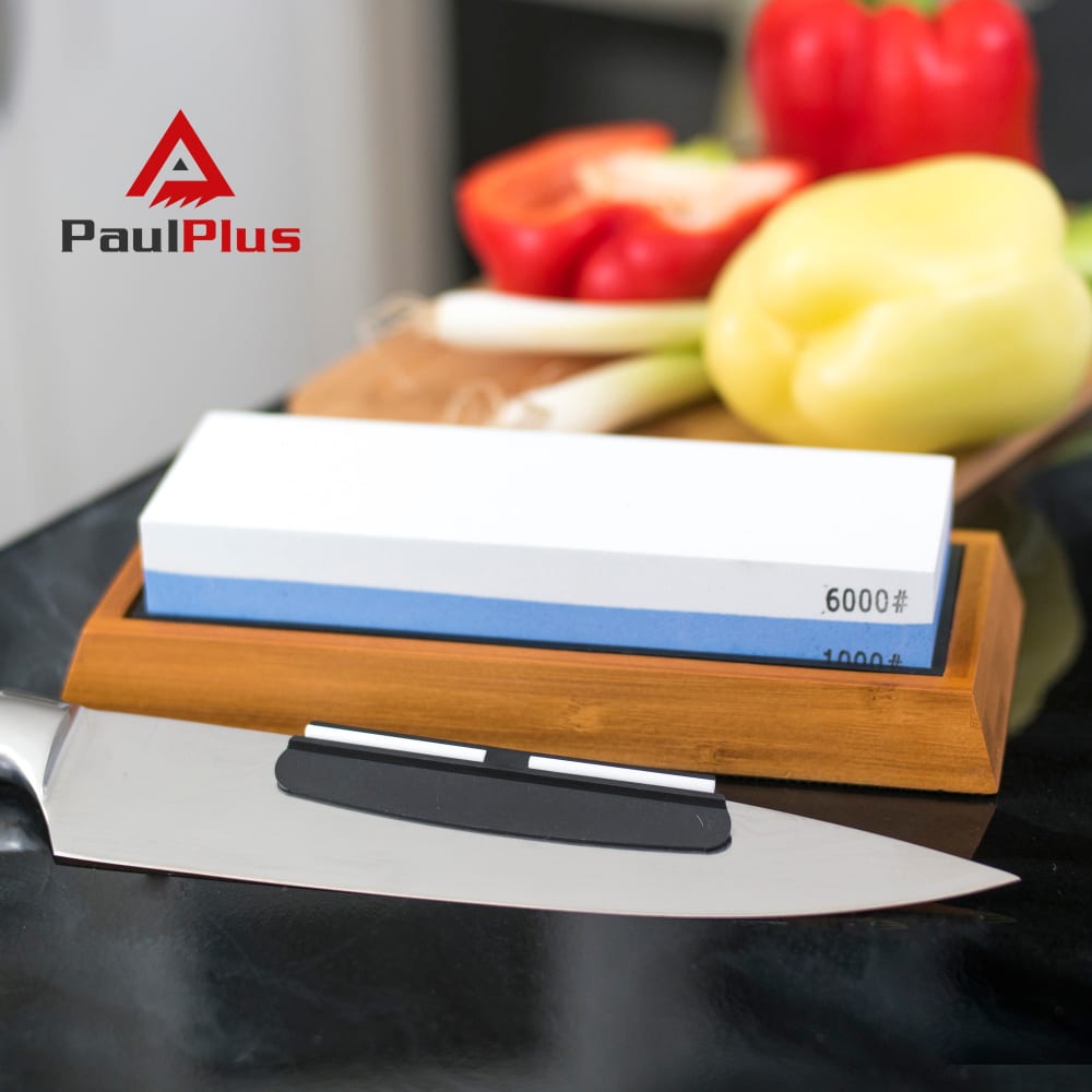
Do you like Image A, Imgae B or Image C for my first photo to promote knife sharpening stone in Amazon ?
Option A won this Ranked poll with a final tally of 28 votes after 1 round of vote counting.
In a Ranked poll, respondents rank every option in order of preference. For example, when you test 6 options, each respondent orders their choices from first to sixth place.
PickFu requires a majority to win a Ranked poll. A majority winner differs from a plurality winner. A majority winner earns over 50% of the votes, whereas a plurality winner earns the most votes, regardless of winning percentage.
If an option does not earn a majority of votes, PickFu eliminates the option with the lowest number of votes. The votes from the eliminated option are reassigned based on each respondent’s next choice. This process continues in rounds until a majority winner emerges.
Scores reflect the percentage of total votes an option receives during the vote counting and indicate the relative preference of the respondents. If there is no majority winner, look to the scores to see how the options fared relative to one another.
| Option | Round 1 |
|---|---|
| A | 56% 28 votes |
| B | 32% 16 votes |
| C | 12% 6 votes |
28 Responses to Option A
Seeing the sharpener with the knife in the largest detail is more preferable and gives a better idea of the quality.
Option A is the best because it has an actual picture of a knife.
I like seeing the knife itself in the foreground in that first photo, and the focus of the lens is on the knife as well
I like seeing the knife in the shot as it kind of 'reminds' me as to exactly what the product does, visually. Also a fan of the shot being in the kitchen as its where I'd be locating the sharpener, anyway :)
first choice gives the nicest view of the product, I don't think we need to see the box it comes in
I like choice A because it is the most descriptive and shows me exactly what the product is for. I like the background of choice A and it doesn't look as plain and boring as choice C with a blank background. Choice B isn't as direct and forthcoming at what the product does.
first choice was because it has a knife in the picture makes ad pic a little easier to know what the product was
nice to see what it would look like in a real setting
the first two look much more natural and... better
Showing a knife with the block is key to me in showing the purpose. C and B pretty much show the same thing to me.
I like seeing the knife or otherwise, I wouldn't know what it was without reading.
The first one I chose is because it shows a close up. I'm not really sure about the fruit. When you think of a sharp knife you think of cutting something hard to cut like a steak.
A is the only one that I like because it's the only picture that has a knife.
It's not clear to me what the product is in image B right away so I wouldn't' use it to promote the product.
I liked A the best because it shows a really good shot of the sharpener.I liked B because it is like something you can imagine in your own kitchen and by placing it by the fruit, you can get a good idea of how the product's size. It makes you want to use it.C is the least favorite because it is showing the packaging. I do find that helpful though because it makes you think about what you are getting.
After carefully studying all three images, I feel that Option A is the best photo to promote knife sharpening stone on Amazon because this image had the most eye-catching appeal . I think that Option B would be the second best image followed by Option C based also on the relative eye-catching appeal of the images.
I like that it shows the knife with the sharpening knife
A is first because it prominently features the product and the tool for its use- a knife. C is next because it shows all the contents in the box. Finally is B which is a bit plain just showing the product and some produce.
A would be the best since it shows right off it is used for knives. Right away I would know that it sharpens my knife for better use. Choice B is okay, you see it is used in the kitchen but you don't know exactly for what. Choice C I would not use since it is not clear where it is used or what it is used for. Definitely A would be the best in my opinion.
I like that A actually shows a knife in the pictures, and I like that A and B are in a kitchen setting.
Took me awhile to figure out what it was, had to get clothes from the pictures. The one I picked had the most clues
I like the design of Option A the most because it looks most clean. Plus, I can get right away what the product is actually used for (knife sharpening).
I normally don't really like the main photo being one in a setting like a kitchen, but I think in this case options A and B really work. They give a good idea of what the product is, especially option A. They aren't too cluttered. I like the fact that Option A includes the chef's knife, because it gives a good idea of the size of the stone as well.
This is the only image that shows a knife. In the other photos, it's not clear what the product is for.
Option A showcases what the item is and what it does.
The first two provide needed context
I like A because it shows the knife so it's easier to understand the purpose. I like B because the items up front are in focus and the logo is very visible. I don't care for C because I have no idea what the product is.
A is the best as it shows the knife in it and almost shows it in use so you know exactly what the product is just by looking at it. I think B has the best overall picture of the item. C is too cluttered for my liking.
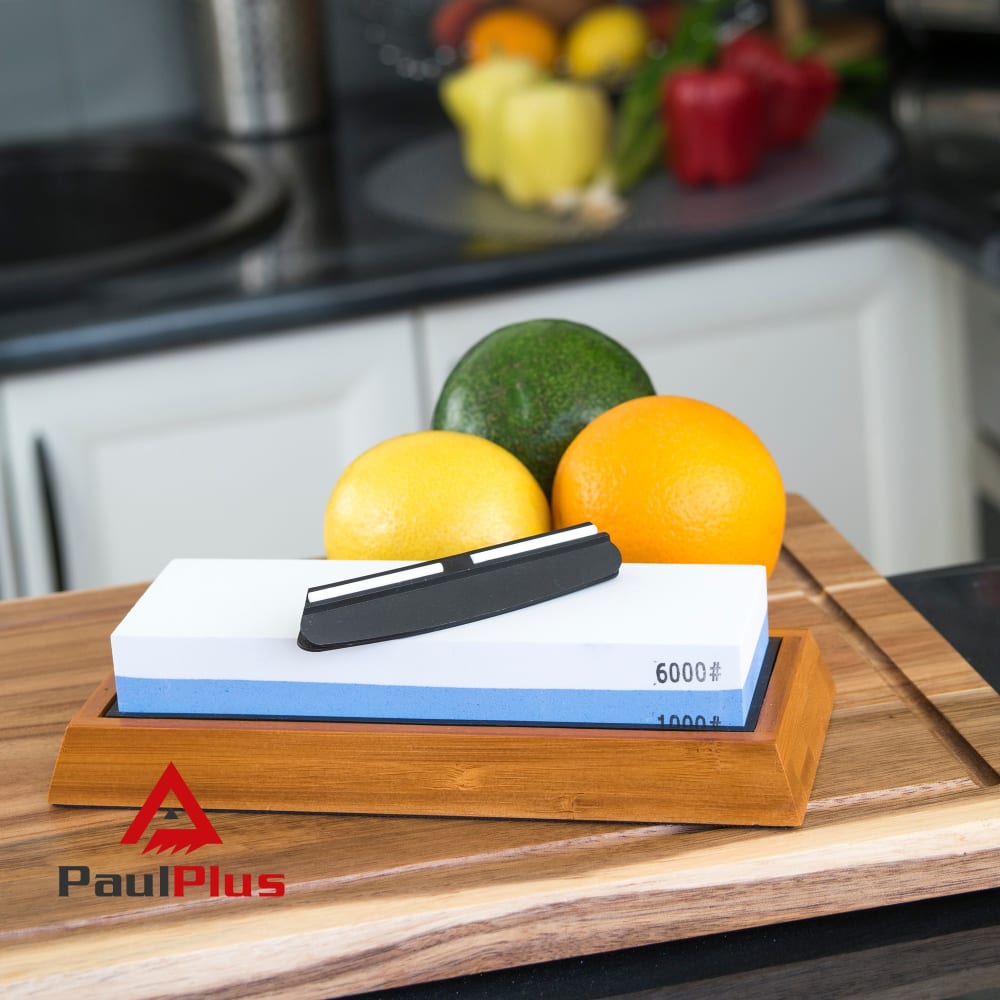
16 Responses to Option B
B and A are showing the item as it would be used in reality - C is not good as its just the box and the item.
Option B seems to be the best and most kitchen friendly photo here. I would go with that as the primary image. Then, as option C as a secondary image to see the customer clearly what you get with the product.
I liked the angle and clarity of B the best. I thought it was more artistic than C which was pretty boring. I liked A next but I thought the angle was not as good as B
Like the ones with the food in the picture the best. Lighting is the best in the first one I picked.
Option B displays it very nicely, you can see what you're getting. Option A shows it a little closer but it doesn't look as nice as A. Option C is just too generic and boring.
I like Option B as my first choice because it gives a clear idea of what is included and gives a good idea of what the knife can cut through. I like getting as much information as possible before deciding to make a purchase.
I am liking choice B the best. The layout on the others does not interest me too much.
I like option B best because it really makes me feel like I am in the kitchen because I can see more of the background. However, I do like the logo placement more on Option A that is why it is my second choice. I think the logo should above the board and to the left in Option B. I did not like option C because even though it shows everything that is included in detail it was too plain and boring. This product really needs the background scene, in my opinion, in order to make you feel connected to it and therefore strongly consider purchasing it based on the image alone. I also think that the bell peppers look best behind the cutting board too as opposed to fruit.
Option b feels like it would be the most capable based on the food behind it. Option A is good because it includes a knife in view (definitely want to make sure it is clear the knife isn't included if it is not for this image though). Option C feels more standard and the white background doesn't do much to help sell the product. Options B & A have more colors so they appealed me to me
Option B and A give me a better sense of scale for the product than C does. I like the composition of B over A, but just slightly. I like B and A a similar amount, but prefer B just slightly over A. I like that B and A show the product in its typical environment. While C shows more about what comes with the product, the packaging and informational guide are not a draw for me for this product.
B looks the most dynamic with the ingredients and C looks the most boring and generic.
option 3 does not show any food so not sure what the product is.
B looks like how it would look in a real kitchen, A is next best, C is pretty dull.
The third one is boring, the first is bright and colorful, the second is not as colorful, but still attractive
I liked option B and A because of the nicer background instead of option C as I do not like the solid white color. And I liked option B as the best because of the colorfulness of the fruits; it makes the picture more inviting.
A does a better job of showing me the size of everything and showing me everything I get.
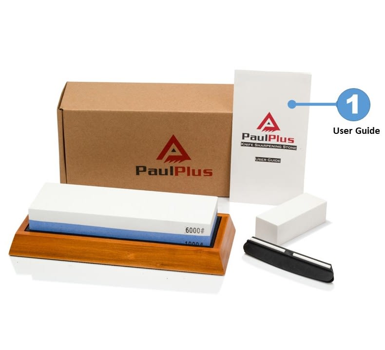
6 Responses to Option C
i like that the first one shows all the item that you get, including the box that the item comes in. i like to see the box because it makes me know what to look for, whether it's bootleg or not. the second one i like because i like that it shows the item in use. the last one is okay, but it just doesn't even show the item in use.
I'm going for C but honestly unless I read I had no clue what was for sale here, I'd change them all.
I think the white background image shows off the product best. Option B is second best. Option C is unclear what the product is.
I have always like being able to see the packaging as well as the product and all it contains.
I like C because it shows the packaging & all the parts that come with.
I like, a lot, that choice C shows a user guide for the stone. It would make me feel better about buying a product I don't know how to use yet and I am a little intimidated by.
Explore who answered your poll
Analyze your results with demographic reports.
Demographics
Sorry, AI highlights are currently only available for polls created after February 28th.
We're working hard to bring AI to more polls, please check back soon.

