Poll results
Save to favorites
Add this poll to your saved list for easy reference.
For a gender reveal product sold on Amazon, which main image do you like best? can you provide criticism of how I can improve your favorite image further as well?
There was no majority winner of this Ranked poll after 2 rounds of vote counting. However, Option C and Option A had the most votes (25).
In a Ranked poll, respondents rank every option in order of preference. For example, when you test 6 options, each respondent orders their choices from first to sixth place.
PickFu requires a majority to win a Ranked poll. A majority winner differs from a plurality winner. A majority winner earns over 50% of the votes, whereas a plurality winner earns the most votes, regardless of winning percentage.
If an option does not earn a majority of votes, PickFu eliminates the option with the lowest number of votes. The votes from the eliminated option are reassigned based on each respondent’s next choice. This process continues in rounds until a majority winner emerges.
Scores reflect the percentage of total votes an option receives during the vote counting and indicate the relative preference of the respondents. If there is no majority winner, look to the scores to see how the options fared relative to one another.
| Option | Round 1 | Round 2 |
|---|---|---|
| A | 44% 22 votes | 50% 25 votes +3 |
| C | 46% 23 votes | 50% 25 votes +2 |
| B | 10% 5 votes | Eliminated 5 votes reassigned |
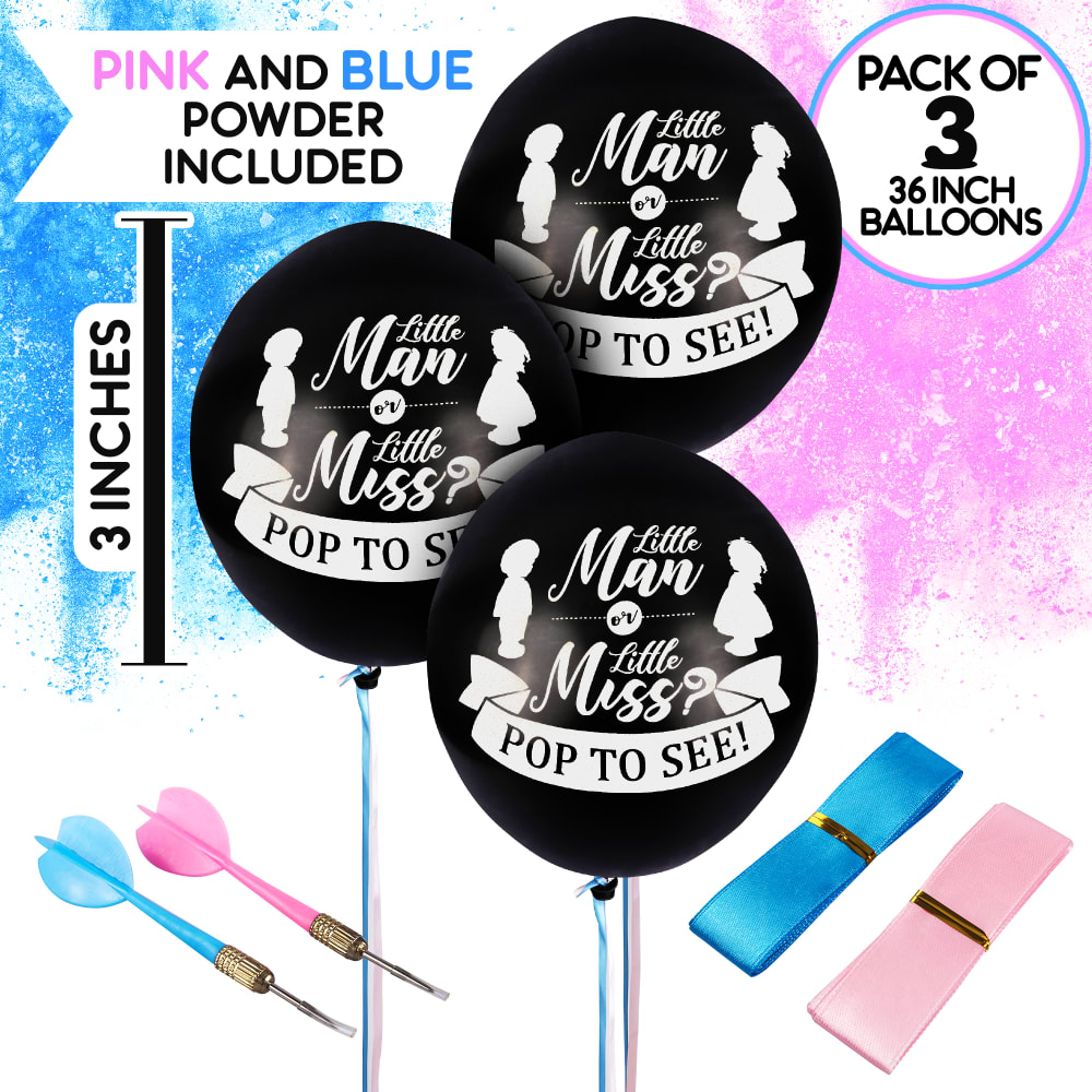
22 Responses to Option A
full details of listed items, good to see what's included and provided with the package
Choice A shows and describes what you will be receiving. I like having the balloon size easy to find.
"A" is best because the image is the most descriptive (shows the balloons, powder, darts, and size info). That's the one to go with
I like my choice the best and think you did a good job at describing this choice. Maybe the pink could be a different hue of pink. It has a purple tendency in it
I like that this image shows exactly what is included with your purchase.
I really like A. I like that it shows you how many balloon and what it says. I would take the graphics from the top of C and put it in this picuture.
option A had details printed so i knew what was included. Also i like the dart aspect, more fun for popping.
This is more descriptive.
To be honest with you. The three images are horrible because that black color makes it look like having a baby is like going to a funeral. Please get rid of this black color and use green, brown, violet colors instead of black. The distributions of your items in Option A is good but the black color is bad. If my wife and I found your services or ad posting we would never be interested in purchasing your products.
better visual and description of what the product looks like.
Option A was my favorite, I like that I can see all that is included and some of the specs of it. I like that a lot. It makes it seem a little cluttered if anything, but I would still pick that first to have all the info with the design. Option C was second, because it probably stood out the most, or caught my eye the most,
The first one is the best as it shows a lot more information and detail of what the product is. The second on just shows what the product is, but without the extra information which is good. The last one looks good ,but it doesn't explain much.
More info on the product and what it comes with. i like the simplicity of Baby is a...
I like A because it provides information that i need. B is a clean look and I can see what is included. C just looks messy and made me not want to choose it at all.
I chose A first because I think these balloons are adorable and the powder and accessories come with it, and so that is why I chose B next, it's the most similiar. I like C last because it's so basic and simple. Some people may like that, but I like the others better.
I like A the best because it seems to show everything in the package and gives the measurement of the balloons. I don't think C shows enough of the product.
I chose my selections in the order that I liked them. I liked A the best because it is the most descriptive of the product.
They would all make a great prop for a party
Choice A has size of balloons, both pink and blue powder included and quantity. The balloons are easy to see and the font is clear. Choice B has no size, quantity or that powder for gender is included. The balloons are easy to see and the font is clear. Choice C - one balloon? do I order it per gender or does it come with the pink and blue bits and glitter? This is confusing as there is absolutely no information on this image.
I like the titles that include more explanation as to what exactly will be inside. I do not really like any of the phrases for any of these choices.
A is by far the best image because it is the most descriptive. It has all the information I would need to see to make a purchase decision.
I like A the best - I like the balloon design and the fact that it says it's a 3 pack right on the advertisement.
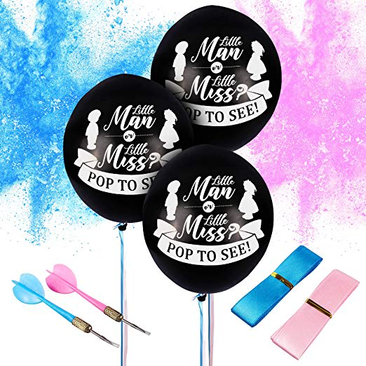
5 Responses to Option B
B has good variety. A is too cluttered and confusing to follow.
Best wording..
I like the design of the balloon and what is inside it.
I think it needs to have the confetti in the image.
I prefer the options that show all of the product'c contents in a single image. And specifically, I like the more faint background that is not as distracting.
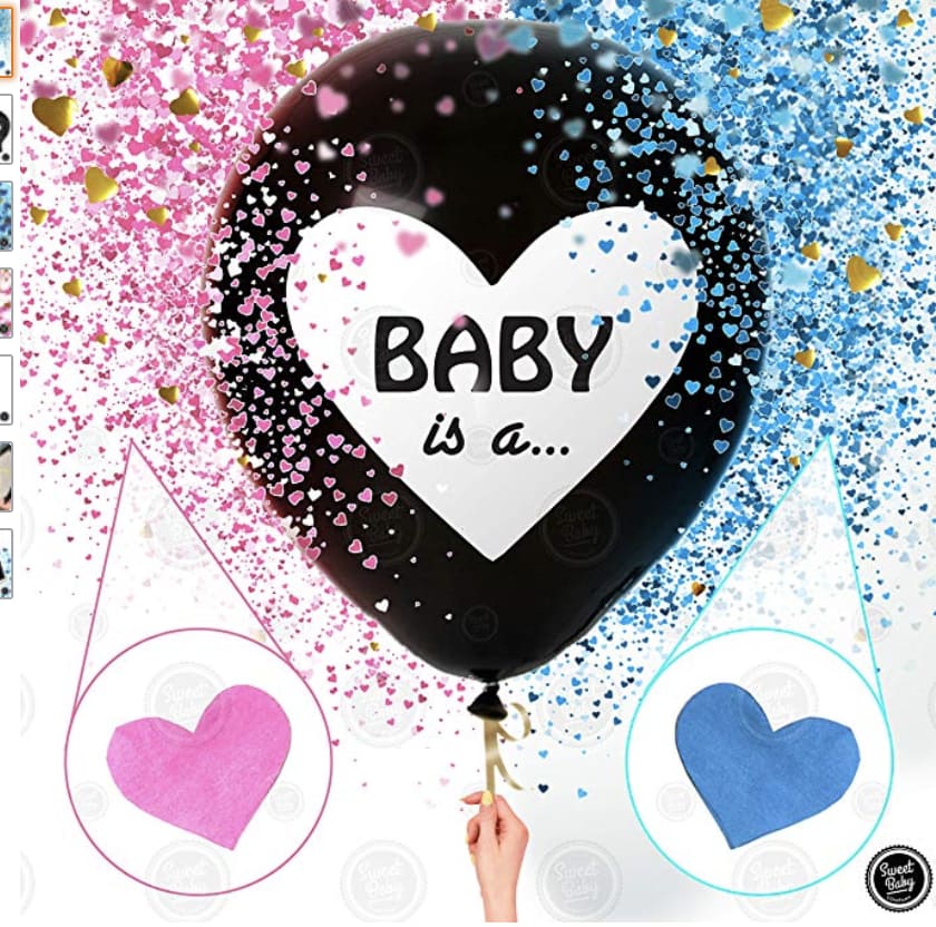
23 Responses to Option C
I think C is the most easy to understand B and A are much to busy and distracting to me.
I like c first the baby is right there in ceneter and I know what it is for, the others are good too, like them all in fact
I prefer the design of option C greatly. It sweet and simple. The cursive text on the other 2 styles is kind of hard to see and the design is too busy. Option A and B appear to be the same but more information is always better! I feel like Option C would be better if the same information was provided. Size, colors, quantity etc. And hopefully option C also comes with the darts!
I think C is simplest, which is why I like it better. I also do not like the wording of "little man or little miss" - that sounds so cheesy and the balloons are hard to read. But A at least tells you more details about the supplies, which is why I like A more than B.
Don't like the "man or miss" tagline, you''re having a baby not a full-grown human
I like the most simple photo, C, because it is easiest to read. The balloons featured in the other photos are harder to read because they have to be smaller to fit in so much other stuff. I think C clearly shows what to expect from the balloon. To improve, I would suggest adding some simple, clear text to describe the the contents included, but not as cluttered as is done in A.
I like the simpler design of C, rather than the pictures and statements of little man or little miss. However, I do like the more information that comes in A, specifically the size of the balloons. If that were added to C that would be good.
prefer the grahics of the confetti of C and like the pull chord over a dart
i picked C because it is the easiest to read the balloon. Not everyone will be close enough to see the text on the balloons. You could add some color to the balloon. Black and white isn't very festive.
I like option C the most. The glitter in the upper corners really makes the product more appealing for me. I also like B and that it states that the powder is included and shows what is included so I do not have to guess. The only thing I would change to improve the pictures is provide different color balloons such as gold or white
1 is more flashy. 2 shows more wording and descriptions. 3 is terrible
i chose image c as my top choice because i feel this one was the best of the 3. i say this because it is simple and not much going on and i think people like simple. i think if you were to change the confetti part that is covering the balloons i feel would make it look so much better because right now it sort of makes it look blurry.i picked b second because i do like this one as well. it has more going on and is not technically simple looking. the lettering is very hard to read i picked a for last place because it just has way too much going on and its so hard to read. i feel if you were to make the lettering bigger or maybe change the font style and size it would be awesome
I prefer the wording on C the best, followed by the others.
C, as the balloon image is more appealing, and graphically shows the contents.A is better than B as it is more descriptive of the product; but I do not like the "Little man/miss" concept here and would not choose this option.B has less information than A.A and B have one positive over C, in that it shows the full contents of the package. The description of A, coupled with the balloon image in C, would be best.
I chose A first because this image is simple and clear. I would change it by making the balloon a different color than black.
I picked C because it is not as busy on the balloon. Not sure what I would change to make it better. I like A Better than B because it lets me know what size the balloons are and that the powder is included.
I picked C as my favorite because I love the design and the glitter. The other two were very much alike. I chose A first before B because it said the color powder was included.
I like choice C, as it's the most simple. A is second, only because the image tells what you get with the order.
C is my first choice because I like the design on the balloon much better than the other designs. A is next because despite the ugly design, at least the image provides lots of helpful information.
Black is not a good color for a baby reveal, maybe something gender neutral. man or misses i dant care for its a baby, it should be boy or girl
Think the writing on C balloon is not too much. Could include the writing on A that shows the height and what is included on the C .
I prefer the balloon that says "baby is a ..." better than the other one. I don't really like "little man or little miss" I would rather it just say "boy or girl" The darts frighten me a little as well...and what are the blue and pink things with the gold band around the middle? I don't really like options A & B and would likely not purchase them. Option C, on the other hand, is really cute and I love that the confetti is shaped like hearts.
I really like the simple, easy to read design most. After that, I appreciate that Option A shows a measurement to get a better idea of sizing.
Explore who answered your poll
Analyze your results with demographic reports.
Demographics
Sorry, AI highlights are currently only available for polls created after February 28th.
We're working hard to bring AI to more polls, please check back soon.

