Poll results
Save to favorites
Add this poll to your saved list for easy reference.
How does this image make you feel about the product?
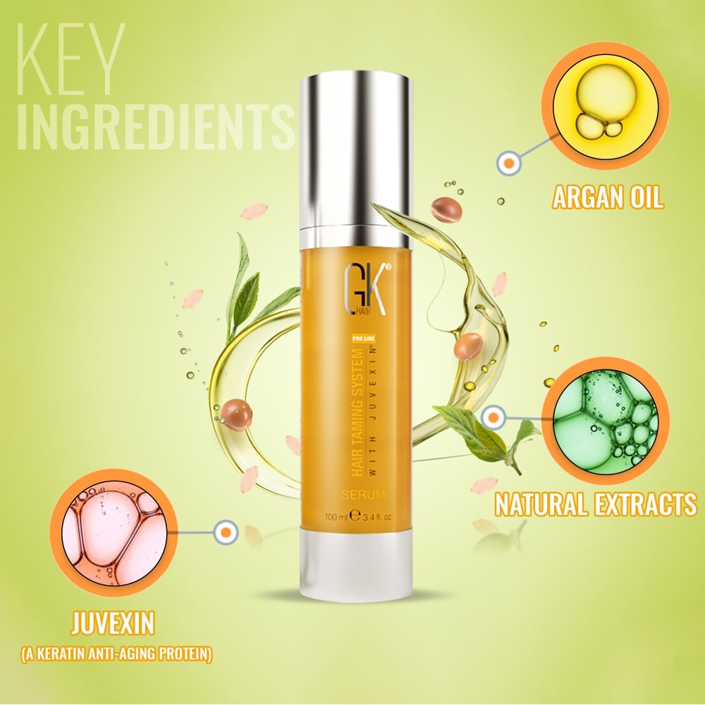
46 Responses to Option A
This option was more informative since it told me that the ingredients were natural.
I like to see what is in the spray. It makes me want to buy it more vs a simple bottle.
It makes me think the product is professionally designed overall
It makes me feel good. I especially love the little bubbles that give the details of the product. I enjoy the color scheme as well.
i love option a. i love how it has the orange background. i also like the information is inlcuded that tells you the benefits of the product.
This is a better image, it makes me feel a little more confident about the product since I can see more information about what's in it.
This one makes me feel like the creators care about their product and what's in it
This image makes me feel like i am floating
A makes me much more excited for and interested in the product than its less-informative counterpart. I suppose overall most of what A shows doesn't really change much compared to what you'd get off reading the packaging itself, but I do like seeing the benefits of it made abundantly clear and displayed in an interesting manner.
Looks more natural and shows more detail of whats in the product
This image A makes me feel positive, lively, joyful and uplifting feelings because colors are popping and bright.
A felt a little more professional and comprehensive which would help the customer more.
The more descriptive photo is more informative and useful for me
It's good to see some of the ingredients right off of the bat. Plus the background design is quite nice.
This product just look like it has a lot going on and should read it and check in to it.
A GIVES YOU MORE INFORMATION ABO THE PRODUCT.
I like Option A because it tells me what ingredients are in the product. However I don't think the images in the circles make sense to me, I would rather just have the listing of the ingredients. I like the green background color, green reminds me of natural ingredients. I don't like Option B because I see the product but I am not given any information about the product.
I love the design and all the colors. The information provided by the image is nice.
I choose A because it has more information about what is in the product but honestly still confused about what the product is / does. B has not much information at all.
i prefer this one because it mentions the ingredients, although i would change the colors because it's not very readable
I like the insets to explain features of the product.
the image in option A makes me feel like the product is pleasant and comforting to me, and relaxed
Image A, with the green background, makes me feel the product is natural and healthy. Image B? It's just bland.
Having production description always help know what you’re buying
I prefer A because it has that super colorful background as well as the image blurbs that break down various elements of the product.
The design makes it look clean and interesting
Seeing the key ingredients is appealing. Also the colors and display of the ingredients is preferred.
image a makes me feel the product is innovative and works well
I prefer option A because of the beautiful attributes in the display which makes a big difference.
This image is way more descriptive of what the product actually does.
Like knowing what some of the ingredients are for the products I buy
It looks brighter and more flourishing. I love the green background
A does a way better job explaining the product and its benefits
I like this one because it gives me more specific information about the product! I like that it shows me with the circles and the information what's in them and what that can do.
This image makes me feel proud that the product is on display and is of a particularly high quality.
This image with the key ingredients makes me feel like this product is authentic.
The image in Option A makes me feel like its a product I want to try. The image is attractive and the colors are done very well with minimal contract, the image also points out key ingredients in the product that may be what I am looking for. If the price is competitive and the product has good reviews it is something I would likely purchase.
Option A makes me like it much more than Option B does, because Option A is colorful, eye-catching, and highlights the key ingredients.
I think they are both just fine and relevant images for a product's listing, but I definitely like having the information bubbles around the product so that it's a quick and easy way to get an idea of the purpose of the product.
I like option A more because I like that the various benefits of the products are given out.
I like choice A the most because the design of the background looks really nice.
The product layout has potential to get traction within households. The product look is likeable within the dynamic listing.
I like A more because it shows the key ingredients in the product and has an aesthetically pleasing background design.
I think it stands out more.
I don't know which option the question is referring to ("How does this image make you feel about the product?"), but I picked option A. Option A makes me feel like the product is natural and good for me.
I like A a bit better than B because of the little informational pictures and captions in A. However, B has a very clean and simple look, and I also like that.
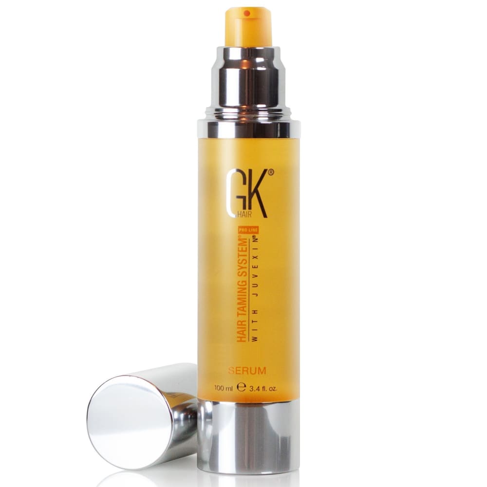
4 Responses to Option B
I don't like the green background that is used in this image here
I feel a little overwhelmed with the other choice. This one is nice and simple, makes me think of honey.
Unpacked product seem more genuine and attractive. I choose the second one.
Choice B looks like something I might get or try. The other option A looks so scientific its a turn off.
Explore who answered your poll
Analyze your results with demographic reports.
Demographics
Sorry, AI highlights are currently only available for polls created after February 28th.
We're working hard to bring AI to more polls, please check back soon.

