Poll results
Save to favorites
Add this poll to your saved list for easy reference.
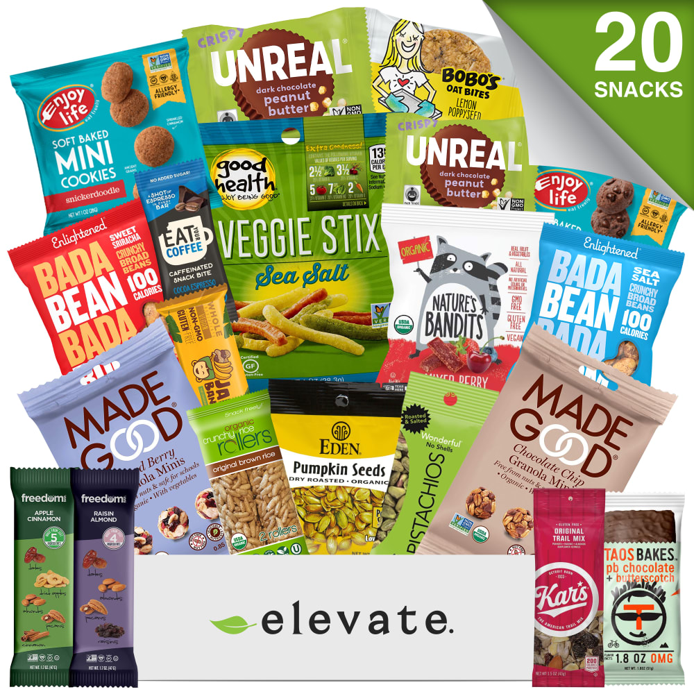
If Browsing For Healthy Snacks On Amazon, Which Photo Catches Your Eye More?
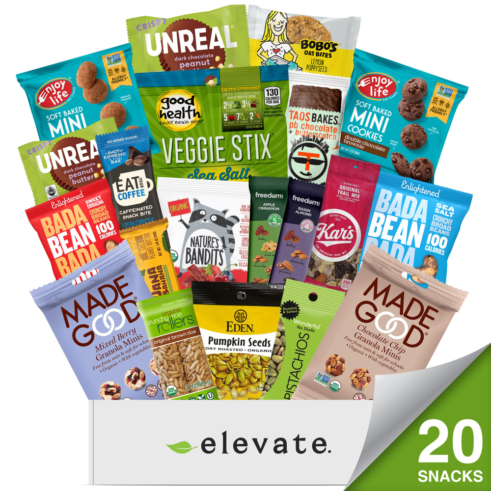
17 Responses to Option A
I like choice A. It is a bit more clear and easier to see. Choice B is too cluttered and has too much going on.
B is too much in my opinion. There is a lot to focus and pay attention to which is distracting. A is better as it is a little more simple than the other option
The options are pretty close but for some reason the 20 snacks on the bottom right just looks right and makes me feel good about that specific advertisement. Therefore my choice is option A. I believe both ads do well in displaying all of the available snacks and I even like option B for displaying 2 snacks on each side of the elevate but I just feel right with the 20 snacks on the bottom right.
I prefer choice A. I am not fond of choice B with the specific snacks on the bottom, it leads you to believe that is what it is full of. However A, lets you clearly know what the brand is and how many products are in it.
I like option A better because I felt like there was too much going on in the second picture.
I caught the 20 snacks in A first where its placed
More appealing with the amount of snacks shown
A: The graphics are clear and not as crowded with images as B.
I like the numbers of contents at the bottom.
I like the fact it tells you how many snacks at the bottom. My eye went to the bottom 1st
I think choice A is more neatly organized than the other choices. I think the products jump out at me more the way they are presented.
I think the snacks featured on the bottom of Option B are not very noticeable and kind of get lost in the business of the photo. “20 snacks” definitely caught my attention, though. It really stood out in the photo.
I feel like the extra snacks in the bottom of the other label are a little too much, just distracting. This one is less crowded and more eye catching.
My eyes don't have to scan the whole thing to know the brand and how many pieces there are in this package.
I think I tend to view things from the top down, so just seeing the snacks first without any words catches my eye better
the 20 snacks is closer to the middle, and is the first thing I see, so this one wins for me.
I chose option A since my eye was immediately drawn to how many snacks were included. With option B your eye is drawn to the snacks at the bottom next to the logo. Also, the Veggie Sticks being so prominent in option B seems to throw off the balance of the image.
33 Responses to Option B
Photo B catches my attention the most compare to photo A.
The number 20 at the top is more eye catching, rather than scrolling down to see it.
I chose option B as my favorite because it had the "20 Snacks" in the upper corner. It caught my eye right away so I knew how many there were. It was harder for me to notices when it was down at the bottom along with the name.
I like B because I think the snacks in the lower right and left corners make it look like you get more, even though they both say 20. That gets my attention first so I would click on it over A.
B has more going on in the advertisement. Plus it has everything bigger which makes it easier to read what the different products are.
B is better because those 4 smaller bars get kind of lost in A and it makes it look like there is more product in B
i like option "b" because of the placement of the snacks by the logo "elevate" makes me more interested to see what else is inside the variety pack
Option B looks more impressive because the snacks are spaced farther apart and take up more of the screen.
This is the one that would catch my eye easier. I like the green "20 snacks" at the top right corner rather than the bottom right. It immediately caught my eye and would do so again on a website.
I can see how many snacks there are. I'd rather see more than just know how many are included.
Option B makes it look as if I am getting more than what is specified.
I like B slightly better. I guess because of the extra things outside the box.
I was impressed by the layout of Option B. It looks more expensive for the price.
This one stood out more because the veggie sticks and bean labeling stands out.
I like design B better because it shows more of the snacks featured close up in the image.
This image makes it look like more items are included so it catches my eye more.
The image feels more complete based on the location of the tab
This image lets me appreciate better the 20 snack value on top right and this product presentation lets me see the average size of each snack.
This option is a little more filled in than the other option. The placement of the snack images is great and makes the image more likable.
looks like it has more snacks + granola bars
B shows more of the snacks on the bottom line that may be missed jumbled in the bags in A
I like how the food is arranged in choice B.
It appears to make better use of the white space. Highlights "20" where the eye goes - the top.
The snacks in the front make it stand out more, like there are more snacks on Ad b than on Ad A. Some of the labels on the bags appear to be easier to read in this ad as well, letting you see if something stands out to you.
Having the snacks at the bottom is more appealing.
The number of snacks looks more natural in the top right. Looks like a nice array of products!
B catches my eye more because even though both say 20 snacks, B looks like there is more.
Be looks more balanced and thus looks better to me.
I would pick choice B because it stands out more! The pictures seems bigger and you notice the food bags inside more. Also the 20 items stands out more at the top! Overall B is the best!
I chose this one because I felt like it displayed all of the products included in a way that made more sense.
seeing 20 snacks at the top draws my attention in just a little more than A with the snack number at the bottom
I chose B because I prefer the way the actual snack bags are shown more fully. Instead of just seeing a label, you actually get to see what is in the actual package. I especially like the four snacks fully displayed at the bottom of the picture.
My eyes went right to B. I think the 20 up top helped. It also helps it was a little bigger in size.
Explore who answered your poll
Analyze your results with demographic reports.
Demographics
Sorry, AI highlights are currently only available for polls created after February 28th.
We're working hard to bring AI to more polls, please check back soon.

