Poll results
Save to favorites
Add this poll to your saved list for easy reference.
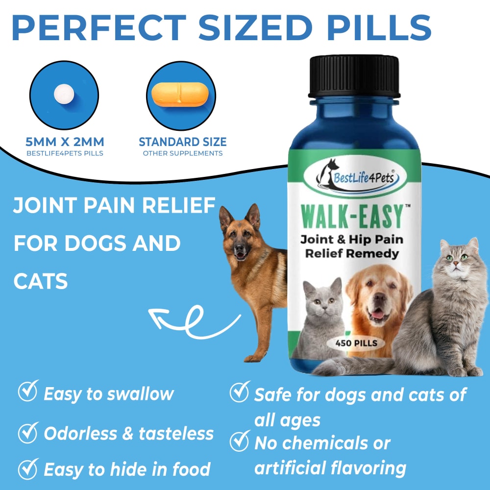
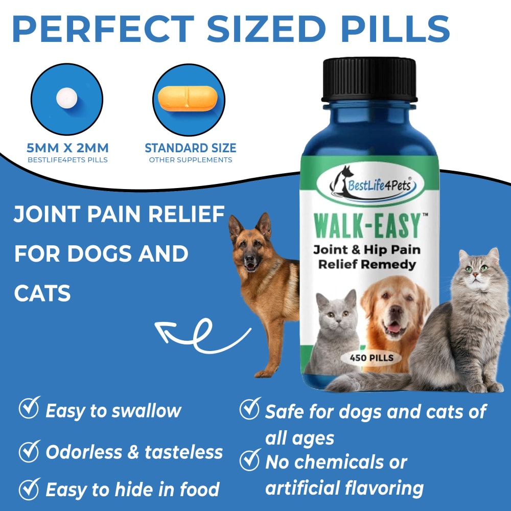
If you are shopping for your pet, which image would you click on and why? Which image makes you feel that you can trust the company and that the remedy will solve your pets problem?
15 Responses to Option A
The lighter blue color background has a more friendly feeling to it and a sense of being approachable.
Option A, lighter color background looked easier to read.
Option A is easier to read, the lighter background helps me visualize the supplement and text better. It looks lighter and healthier.
For some reason, A makes it easier to process the information and seem brighter and makes me feel overall better about using the product for my pets.
option A i like the lighter blue its easier on the eyes/more pleasing and enjoyable to view.
I would click on this image because the shade of blue used is a little more comforting. Makes it seem like the company is very caring and trustworthy .
For some reason the lighter tone gives a more trustworthy look. I really have no idea why but it does.
I think the lighter blue is more approachable and just has a more playful attitude which suits petcare items a little better.
With all things being identical I think the lighter blue feels more welcoming and professional
I like A's lighter blue color on the label. Because the lighter background, the images of the pets stand out and that brings attention to them and what is written on the label. B's darker background makes it difficult for the pets to pop out and read the label.
this color is a bit easier to see and the pills, both of them, actually look a bit smaller.
The brighter color makes it easier to read, I wouldn't trust either one as they dont say vet reccomended so IDK if they are safe.
I like the lighter blue color of A better. The feelings I had when looking at it were "inviting" and "calm". I think the feeling of calm goes well with the product since it is trying to relieve joint pain in cats and dogs.
They look so similar but I like the blue on this one netter
A is brighter and draws more attention, which would make me want this option. They both seem reliable and trustworthy though, as they only have one minor difference between them. I just prefer the light blue.
35 Responses to Option B
The color difference makes it much easier to read in than in A
The darker background just makes the white text easier to read.
I would pick this option because the darker blue color makes it easier to see the font.
B is the better of the two because of the color scheme. This option is easier to process visually.
The darker blue really attracted me more to the image. Maybe because it brings out the images of the animals more to me to the contrast of the darker blue.
The higher contrast makes it easier to read the text.
I like the darker blue as it is easier on the eyes and draws more attention
The slight darker blue I feel looks better as it is able to stand out more.
I am drawn first to the darker blue background.
Option B is better as the darker blue makes it stand out a bit more.
I think the darker color makes it easier to read and follow along.
I would be more likely to click on option B because I think that it is a more visually appealing product image. I think that the darker background makes the text easier to read.
The only difference I can notice is the shade of the blue background. I prefer B better because it meshes with the white text and looks more professional than A.
I liked choice B and the darker color scheme looks more eye catching and appealing to look at. Choice A looks too light and not as trustworthy.
I think the darker blue goes better with the color of the bottle and ties everything together more than the lighter blue option.
Choice B is the one that I would click on because the darker blue color it uses looked better to me and I liked how it matched better with the blue background behind the pills and on the bottle.
I like B over A because the darker background makes it easier to read and makes it look more trustworthy.
The darker blue pops out more and I like the image better.
I think option B is much easier to read and I like that it’s a little higher contrast. It definitely seems more trustworthy because it’s much easier to read and looks more professionally designed.
I chose option B because the image quality seems to be much more professional compared to option A.
I like the darker blue background on the lower part of the poster.
Unless I am missing something, these labels seem to be almost identical. I picked B because I liked the darker background. It seemed more serious
I chose B, because I find the darker blue background makes the text easier to read and is easier on my eyes.
The darker blue of B gives me more trust and allows me to have peace of mind.
B stands out more because of the dark blue label
I likeThe darker shade ofBlue. It is still light but it looks better than being too light. The dogs looks really cute
B because the darker color blue pops better and it's easier to read the reverse white text. The easier it is to read the more I can trust the brand.
Option B. By having the label darker, it causes the information on the image to stand out more. Which makes it more likely to catch attention and click on for possible purchase.
This one is easier to read because of the darker blue.
I think this catches the eye more and seems more confident.
I like the darker background of this one. It makes it look more effective and trustfull.
I think B is the better copy for this pet supplement. I like the darker blue used, as to me a dark blue is indicative of being healthy and vibrant, which I would want for such a product.
The darker background makes it easier to read the text as there is a contrast between the white font and the background. Hence, this in a way makes me want to trust the brand more as it symbolizes transparency or ease with understanding the information.
The lettering stands out better against the background and easier to read.
The darker shade of blue used in Option B makes it look more credible. It also makes everything easier to read.
Explore who answered your poll
Analyze your results with demographic reports.
Demographics
Sorry, AI highlights are currently only available for polls created after February 28th.
We're working hard to bring AI to more polls, please check back soon.

