Poll results
Save to favorites
Add this poll to your saved list for easy reference.
If you see an ad with one of these images, which one would you rather click to learn more about it?
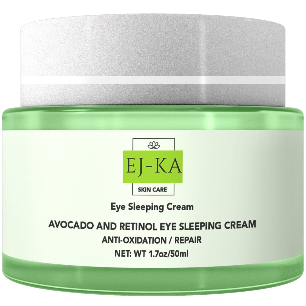
26 Responses to Option A
I chose A because I like that it focuses just on the tub itself.
I can see what the product is and the description written on the cream better in this photo which would make me more interested in learning more
My first choice feels closer and it is easier to see and evaluate.
A I feel is more informative and helpful to me being able to read the label.
I would click on choice A because the image shows me more of the actual product and allows me to clearly read the side of the item.
I love this one more because it shows the actual product up closer making it easier for me to read it.
The product itself (product description and colors involved in the image) makes me feel attracted to this new concept. The ingredients of this product look convenient for me that's why I would love to learn more about it.
I would rather click on option A because it shows a large photo of the product and I can see what it looks like really well.
I think having the item in the foreground increases a willingness to view it and desire to learn more
I like a better since I can see what is in the bottle and know what it is, so retinol for your eyes, so for picture b it is good too, I would like to see both in fact
The larger image of the product, as we as the information on the jar is eye-catching and attention-grabbing.
I like the closeup of the package in A because it lets me clearly see the text and what is going on, plus it reduces the amount of unused empty white space like in picture B
I like the close-up shot of the product label in A. I like how this allows me to easily read the label and get a good idea of what I am looking at with just a glance. I can click on it to get supplemental product info in the listing itself.
B is nice with the avocado but for something like eye cream, I like something more scientific looking and the label on the right gives me more confidence the ingredients are more likely to be effective.
Having the description clearly on the label gives me a great idea of what the product does.
I don't need any special effects or looks. Just show me the bottle up close. This version describes the product well in my opinion and puts the product in a good light.
I can read the product easily and know what it is. The other is a nice picture, but I don't know what the product is.
Option A actually shows me the actual product container versus option B displaying its packaging
I would be more likely to click on an ad with choice A as the photo. I like that choice A is more in your face and the labeling on the jar is easy to read. The jar looks sleek and like something I would want to use. The jar in choice B is too small to make out any of the label and the box that is included in choice B is not eye catching. The box actually looks more like it belongs to some kind of food/beverage product.
I will click on option A to learn more about the product because I like the products package. I like how shiny and organic it looks. I like seeing the label that has a lot of information on it but also compliments the product package and jar. I like how shiny and bright the product is it actually looks like organic material or close to the inside of a fresh avocado seeing this image makes me more likely to click on it to learn more about the product.
My choice is based on my preference over the details provided in the graphic design of the packaging.
I chose option A because the focus is on the product and the ingredients are easy to see. I like that the bottle is easy to read and clear about what I will put on my face.
I get to read more information on the product.
I prefer "A" because the image gives a clear indication of the what the product is/is for with a visible label. I am not going to click through a product that like "B" if "A" is available because "B" focuses to much on "style" rather than the product itself; I am not interested in investigating every product because manufacturer couldn't be bothered to give a useful image.
I like A over B because it is easier to read what the product is.
I prefer just seeing the can. The version with all the packaging is just too busy.
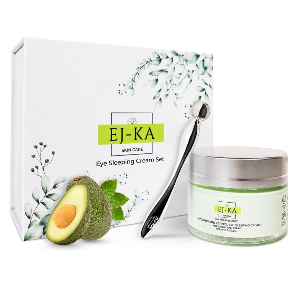
74 Responses to Option B
I liked that option B showed the entire set and the eye roller.
I'd probably check out the ad if I saw this particular image
Having some real avocados in the picture helps it look like a really natural, organic, healthy sort of cream.
This option featured a lighter and more refreshing color scheme so it seemed more healthful.
B seems more interesting and more informative, definitely more appealing to the eye.
I like that it shows the box and bottle
I think it is nice to see the full package of what you're getting (including the package), so I would definitely go with Option B here.
I chose B because the box and metal spatula are shown with the product itself. I can see everything it comes with and the box looks really nice also. It visually feels like it would be a high quality product.
I would be more likely to click on option B to learn more because I think that it is a more eye-catching and visually appealing product image.
I would love seeing that the cream is apart of set and I like seeing what I will get with that set along with the cream.
I like B because I like how it shows the product an the package. That gets my attention first.
I chose B because the image is more complex than A and immediately drew my attention.
I like seeing the box and what exactly is inside of it.
I would prefer the product to be a bit closer to the camera, but I like choice B since it shows me everything I am getting and the presentation is very appealing as well.
I like option B better because it gives a whole picture about what the product is about and how nice the set is, and the natural avocado in it. In this case I do not particularly need to see the jar larger for detail, so the size of the jar relative to the photo in B is a fine size. A, The jar of eye cream alone, it could be any kind of product, not intriguing to click on, and the enlarged jar doesn't really give me more information than the other.
Option B's product image has an avocado in it.
After carefully studying and comparing both images of Eye Sleeping Cream displayed above, I selected Option B over Option A as my first preference and the one that I would more likely click on to learn more about before purchasing. I felt that this image had more eye catching appeal to me based on the design and arrangement of the product which included the packaging image and other extras. However, I felt that both images were quite acceptable.
I choose the image pictured for choice B because I simply like the image more than what is pictured for choice A. I like the box that is advertised, the avocado (although it is fake), and the instrument that can be used to apply the cream along with the actual product. The close up image in choice A just does not capture my attention and I am uninterested in learning more about the product. Overall, choice B is just more aesthetically pleasing in my personal opinion. If I came across the ad with choice B as the image, I would click on it to learn more without a doubt.
I choose B because I can see all components that go with the product as well as packaging material
Prefer Option B. In addition to seeing the product, seeing the tool/implement and the nice packaging is appealing. Would want to know how the tool is used and its benefits.
B shows not just the product but more of the raw materials, which makes it look more natural and appealing
I like seeing the avocado and the other items around the eye cream.
I prefer option B because it feels more simple and intuitive. Option A does not resonate as much with me.
Option B is better as it shows the box and associates it with a fruit as well.
I would choose B because it says it comes in a set. I'm not sure what that tool is that comes with it but I would click on this one to find out more about the tool for sure
Option B because I like seeing it with the packaging that it comes with and in and this one has a piece of the avocado on the side and it has a nice visual appeal
The design of the box is very appealing and refreshing, so I would definitely click on option B. I also like that the actual product is displayed next to the box, as well as the avocado so I can see everything I need to know in one glance!
It appears more spa like and looks like a higher quality product.
I like the variety shown in option B. It makes me much more interested in the product and what all these items are. I find that much more enticing than just a regular photo of the jar like in option A.
The picture tells me exactly what's in the box without me reading it. This would immediately get my attention if I'm searching for an item that's on the shelf with this particular ingredient.
definitely B has fancier packaging and better color and design
I like seeing the whole package.
If I saw an ad for either on of these products I'd click on Choice B. This choice looks more intriguing and it makes me wonder what the product is and is all included because of the entire layout.
Choice A has more to look at and is visually appealing. The pictures of the plants makes me want to look closer.
I love this one because I can see the box and extra information such as the ingredients that are inside.
I think it's nice to know the box that it comes in because this would be something I would give as a gift
includes the packaging and has better colors
I find this option (B) more interesting and attractive . It makes me curious to learn more about the product.The design and the way the products are positioned in the image makes it a preferred option.
B seems more complete and more thought-out
i go with option B because To use as a moisturizing sleeping mask: -After cleansing, apply a pea-size amount to under eye area and gently pat with ring finger into skin for optimal absorption. -Apply nightly. -Do not layer with an eye cream.you can slather on a thin layer of the Avocado Melt Sleeping Mask before bed and let it sink into your skin while you sleep. The addition of kaolin clay helps it dry down, so it doesn't get over your pillow.
Overall option B is a better exposed image, so that one wins it for me. I'm also curious about that tool pictured there. The box is nice. I think the avocado is out of place. I get that it's part of the cream, but it looks photoshopped in and the wrong size. Either that or that jar is gigantic. Anyways, even with the giant jar, I like the looks of option B the best.
A looks like a generic photoshop image and like every other product out there. B has details and looks more real.
I like seeing the packaging and everything included with my purchase.
I would pick B because it shows another item along with the cream that I'd be curious about because I can't figure out what it is from the image.
Option A looks like you’re standard jar of face cream, whereas Option B looks off the beaten path, intriguing.
I find option B much more visually appealing with the pretty box in the background and the perfect looking avocado.
I chose B because the box and feel of the overall items really made me feel more of a connection to the product more than just the item itself.
I would choose B because it looks more expensive.
I like option B because it shows the pretty artwork on the box.
I like how B shows more of the set within the box and more about the products from the image.
I think the listing for be is done tastefully artistic, and it would entice me to possibly purchase the item since it is so visually appealing
I prefer option B the most since it shows the product and the packaging, I really prefer when a product image shows everything that is included in the product. The design and placement of everything is visually appealing as well and pops out more than option A.
There are more things in it that catch my attention over just the jar.
I chose B because the image has much more character to it than the other. It is much more attractive.
It shows more than just the container which I think gives people a better idea of what they are getting.
The picture with the box and the avocado is more interesting than the jar by itself.
I would rather click on Option B because the box is visible and I can see a picture of an avocado. This tells me what the cream will include.
This looks like a nice set and I would be more interested seeing that it might be avocado based.
The visual is appealing and the product looks more expensive.
I like the ad with the avocado in it better I would click on it.
There is something about showing the fruit that scent comes from that is appealing to me, so I chose (B).
I choose B, Because the image example is more clear and the example really interest me and more attractive.
I think it looks prettier and more luxurious. The avocado image makes it look natural and fresh.
I like that it comes in this nice box. And the graphic design is great.
I would click through on option B because I like that I can see the tool that comes with the jar and the packaing.
Because it shows a set or kit. It shows the box that it is within and shows the applicator as well. It is more comprehensive or complete of a display than option A.
The aesthetic, colors and whitespace of option B is more appealing than the neon green in option A. Option A looks like it's mildewy and expired, whereas option B looks clean and more expensive... you can also tell that avocado is an ingredient which makes me feel like this product will improve fat/collagen around the eyes.
Option B looks like more thought went in to the packaging and photos so it would draw my attention.
I much prefer how the product is presented, with the packaging and the additional items.
I chose panel B. I think this packaging is extremely professional and looks very expensive.
I like the avocado in the ad. Makes it look clean!
The box design is really pretty and stands out plus I love Avocado anything
I would choose choice B first because it has a nice display and the details of the product are well displayed to me as compared to choice A which is not well displayed for me.
Option B as it is much more visually appealing than the other option. The inclusion of the avocado and the box with the plant graphic make this an appealing ad. It is soothing just like the product. The image is aligned perfectly with the product and what is accomplishes. Option B you also see the applicator so option B gives a complete image of what you are purchasing. Option B is a superior image that makes the user feel great about the product.
Explore who answered your poll
Analyze your results with demographic reports.
Demographics
Sorry, AI highlights are currently only available for polls created after February 28th.
We're working hard to bring AI to more polls, please check back soon.

