Poll results
Save to favorites
Add this poll to your saved list for easy reference.
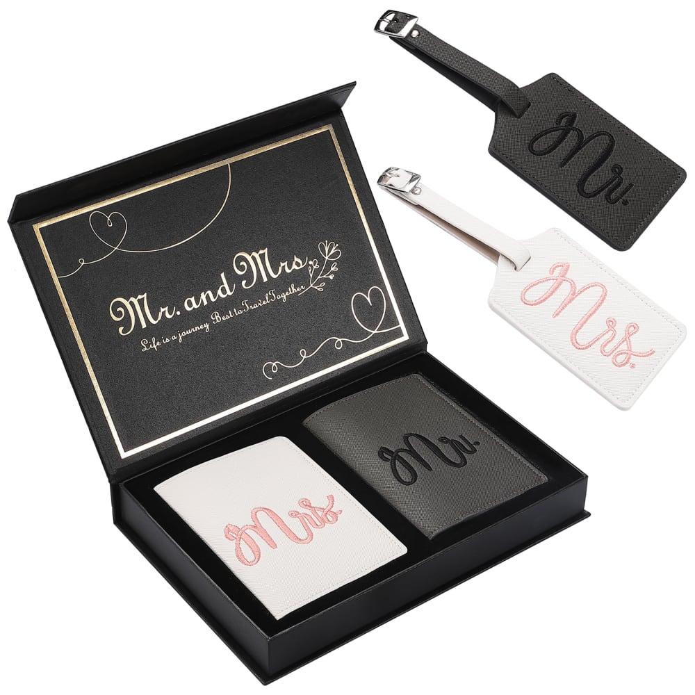
If you were browsing on Amazon for a honeymoon gift for yourself or a friend, which of the following product images would be more enticing to you for purchase?
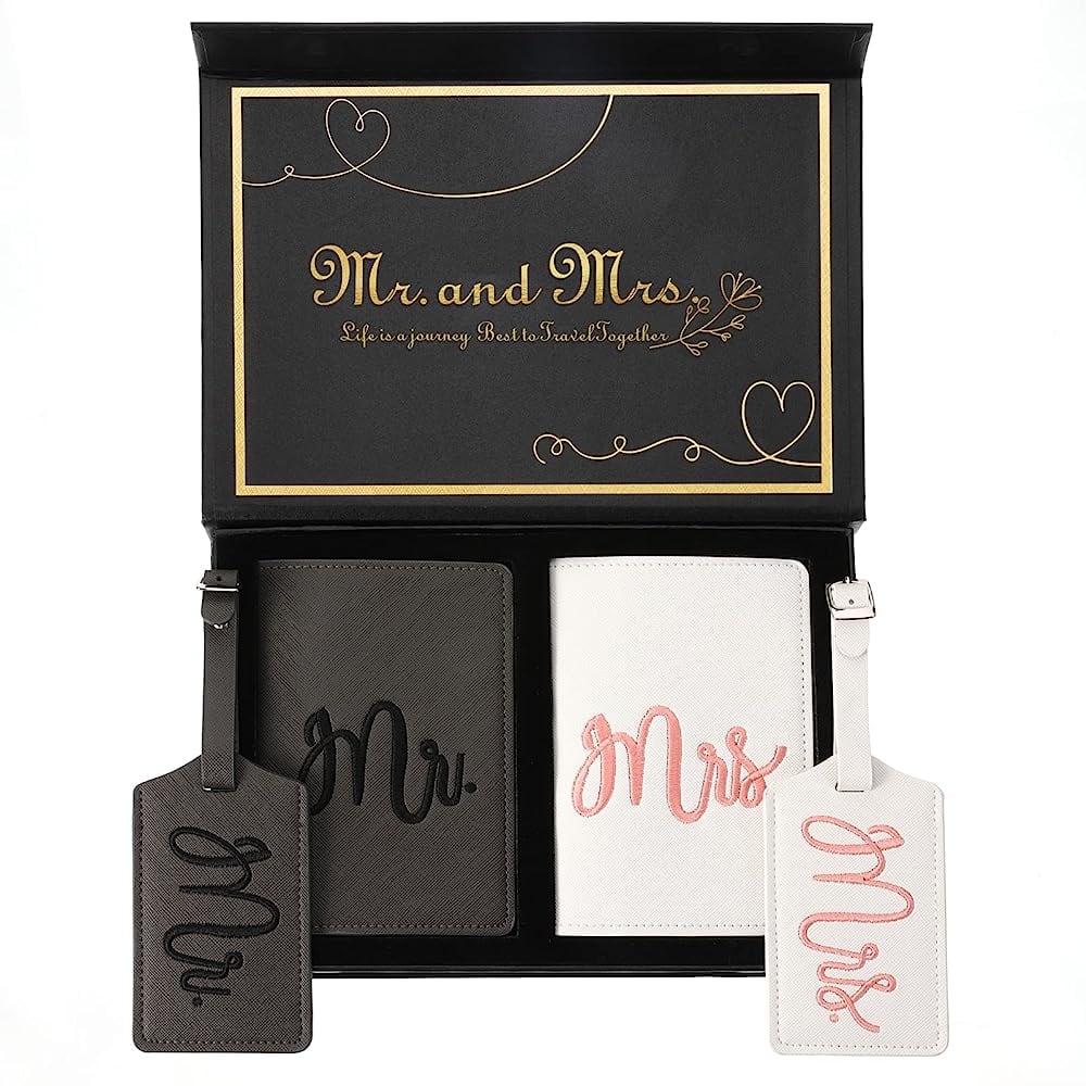
27 Responses to Option A
They’re both lovely but I think I’d go with the brown container.
I would be more interested in buying for option A because I like the layout and angle of the product image more compared with the alternative.
It's easier to read the text when it is positioned square to the camera.
I like the gold metallic writing on this box as well as the way the box is presented. It is easier to see the product.
option a font is more golden in color so its my choice
I think A more clearly shows that the luggage tags and passport holders are part of a set rather than B, which has them to the side which insinuates that they are available to be purchased separately.
option A looks like a elegant set and something that would make me want to click on the link to see what it was all about . i like how the monograms stand out ith the side by side compared to how the other one looks like the forgot about the bag tags and photoshopped it into the pictures
A is more organized and zoomed in to view the details of the product.
I like that this option is displayed better. It looks really nice and I like that they are not overly large.
I prefer the gold label in Choice A. The products look very similar, but A has a nicer box and the photograph for A has better composition.
I liked the way the items were arranged in A. I didn’t like their placement in B.
I prefer the gold trim over the silver trim.
I chose A because the aerial view is personally more appealing to me. It shows me what the package looks like to the recipient upon opening it.
I thought the color of the font in A was slightly more appealing
I like the symmetry of A better.
I would choose A because I like that it shows both products out of the box and right next to what actual product they are. I also prefer the gold lettering because it feels more elite and important. It makes it more special.
A.. I like the gold and the black it looks professional and classy and it would be perfect for that gift. Also I like the weights set up for the image where I can see the product very nicely and get a good look at that beautiful lid packaging design
The arrangement of the product in A is more appealing to me than the image for B. When I scroll through Amazon, all the listings look the same to me, and they usually tend to look like B, which looks photoshopped or doctored. I prefer the image for A, as it also helps me to understand what the product is more, in addition to being more visually pleasing to me.
The way the product is presented in option A makes it more appealing to me. It shows the product that comes with the purchase in a neat and organized manner.
I feel like I can see the product better in the picture for Option A. The more straight-on angle makes it easier to tell what shape and size everything is in the product.
Option A is much better as you can see the product clearly and it is more enticing that way. I want to know what I am buying.
Just looks like a neater clean image
A seems to be clear on the picture of what is all included in the purchase. This picture would catch my eye first, and it did while I was looking at this page.
I like A better because the larger more up close photo lets me see the product better.
A is solid and grounded looking and centered. B is off center and the items look weirdly like they're floating.
option a is more visually appealing.
Option A is a little easier to read, but overall I don't see any much real difference between the two
23 Responses to Option B
I think you can see the products more clearly when they are not layered on top of eachother.
I just like the simple layout of B.
I appreciate that B shows the product from an angle, thus better displaying the depth and in general, the sides of both the product and the box.
I would rather buy B because I think that the product overall is far more impressively shown off than A is. I think A just doesn’t show you the good parts of the product as well as B does.
I find B more eyecatching, the angle of the box is interesting and I can clearly see the luggage tags. In A the tags don't stand out as well against the box, and if I was scrolling through a search quickly I don't think they would pop out at me as being luggage tags.
I think the separation of the products in B gives a better initial view of what is included.
It is easier for me tell that there are luggage tags included in the gift set.
B because you can see the elements better because they are more separated. In other option you can see everything not that well because it is all together.
You can see the lettering on the box better
I like the angle at which the box sits.
After carefully reviewing the provided products and comparing the two images, I would personally find option B more enticing for purchasing on Amazon and gifting for a honeymoon. Option B stands out to me because the image is clean and well-organized. The products are displayed separately, making them easier to identify and examine. In addition, the box in option B is gentle to the eye by displaying a trimmed gradient of white and gold, which adds an elegant touch to the overall presentation. On the other hand, while option A has a visually appealing display and an elegant gold trim, it does not seem to clarify the product displayed. Also, having a lack of cohesion created a bit of hesitation for me to choose. However, considering all the factors, I believe that option B provides a more visually appealing and coherent presentation, making it a more enticing and desirable purchase for Amazon.
Both of these look quite nice, I think either presentation would be fine and would adequately serve to get my attention on the object as a prospective purchase. I did note, though, that my eyes went to option B first, which I take to be a sign of which one I would be more likely to look at and learn more about in an actual purchase context. That's about the only thing I can really say to differentiate them, as they are both fine-looking on their own. I hope that's helpful.
I think that the colors make more sense.
The presentation of option B is more appealing. I can better view the tags (they do not overlap with the box like they do in option a)
I think option B does a better job of showing the size and scale of the two tags. In option A they kind of blend in with the box.
The image gives you a better view of what is included.
The picture for b just looks more appealing and even though it’s the same amount of items and same items, I feel like im getting more by the way the image looks.
I think that the coloration and angle of Image B makes it more visually pleasing to me. I would be more apt to buy that product because it appeals to me visually.
I chose B because it is easier to see what the item is supposed to be with it to the side of the box than it is in front of the box like option A
The picture on option B is nicer, but most of my girl friends don't like pink. I would hope that they would come in other color options. They really don't like how women are shoehorned into having to have pink things all the time.
I think B because it's easier for it to catch your eye that they are selling paddles. It's not as obvious in the first one because everything is laid out more neatly.
It looks like a bigger display where I can see it all instead trying to turn it and figure it out on what it is or does.
I think the tags being shown somewhat sideways makes it easier to tell what they will look like when displayed and also gives a sense of their size proportions.
Explore who answered your poll
Analyze your results with demographic reports.

