Poll results
Save to favorites
Add this poll to your saved list for easy reference.
If you were purchasing this product which image would you find more apealing and why?
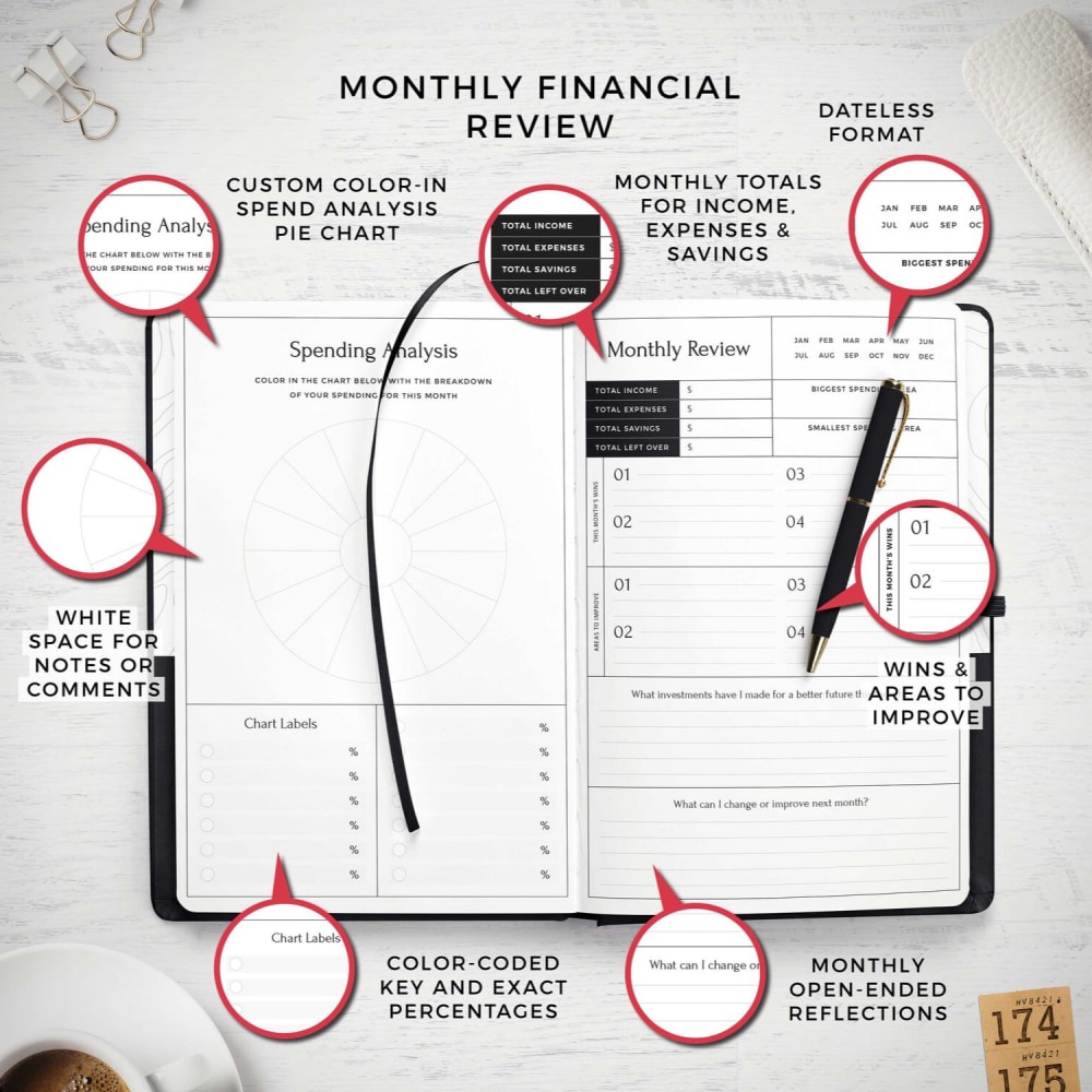
5 Responses to Option A
B is much too busy. It takes the eye all over the place.
I like this one better. Easier to see.
I chose A because it is less busy, but it is still too busy for my liking. It makes the product look cheap.
It looks more clean.
Not sure we need to use colors.
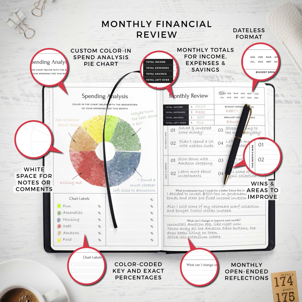
45 Responses to Option B
this one is the best
This shows the potential of the product more
There is a lot more color in Option B. Option A seems kind of boring.
I like that you can see the colors
More colorful and engaging.
Choice B because it looks so much better with the color and filled out. Choice A looks sad with no information or color.
More colorful. Looks like it has more features.
The color is more eye catching
"B" seems to be more informative.
I prefer the design of option B. I like that pages are filled in to give an idea of the use of space.
The colors make the image more appealing.
The image contains color which makes it more attractive.
In the Monthly Financial Review, the image in color is brighter and makes more sense with some notes filled out. I like the color and it shows good points to note for using this. I would go with this image as the product image.
Having the pie chart helps get more info. Plus something has to go in the blank space or it looks unbalanced.
Actually showing the colored-in pie chart seems to be crucial here.
These are very professional and boring. My choice is option B because it has that rainbow circle and it adds color and some fun to this serious organizer! I would use all sorts of different colored pens and markers.
The colorful graphic is much more appealing. It's more eye-catching and pleasing to look at.
The color makes it easier to see the charts, so it's more obvious what you get from the product
i like how it's colorful and shows how it can be used. cool product!
I like the more colorful picture.
I prefer the different approaches used in B and the colors
The circular graph image makes this product presentation way much better than option A and the whole product image makes me think that I could be tracking better my monthly income expenses and savings and gain more control.
I like B because I think seeing the examples of how it's used and filled out make it easier to see how to do it and that would encourage me to want to get one and use it.
I chose B because I usually like to see how people use planners.
I like B. the colors are very good. The wheel graph is what sold me.
The more color, the better..
I chose B because it shows the book filled in with examples.
It actually shows colors.
The pie chart added color and pop.
With the chart filled in in different colors, choice B is more interactive and attention grabbing.
Looks better with color in it
option B shows off what a fully utilized planner page which is very useful for people that are on the fence about this purchase. Option A just shows blank space that is uninspiring for someone who might be looking to purchase this type of item.
i like seeing the journal being utilized, the color wheel adds a pop and makes the image look unique. the plain one does look great and clean but the idea of a working journal would be different than most ads you see since most are blank
I prefer the image that includes a pop of color - the black-and-white scheme feels a bit stark, but this one has more warmth and depth to it.
I like B seeing the product filled out with information give me inspiration as to be able to use the journal for a project or my own information. It shows you what possible with it.
Seeing the colorful graph in the middle of the product really adds a lot of life to it. It's nice to see it in use.
The colorful pie chart is striking and really catches my eyes, so it's the preferred display of the data.
I picked B because the color pie chart grabbed my attention to the page before anything else. It made me want to read more about what I am seeing. The other choice is just plain and boring and doesn't motivate me to read more.
I like the use of colors in the picture as it grabs my attention more quickly. There's also more detail within the picture in terms of writing, which makes it look much more organized.
I like the colored in graph. It really sticks out and it makes the product look more appealing.I also like all of the information on the page because I can see how it would look with writing in it.
I definitely prefer option B. It's really nice to see the product in action, with the areas filled in. I like seeing how it is used. The color of the pie chart is nice. It really caught my attention. Option B really makes me want to buy this product because I want my results to look as nice and colorful as the results in the picture.
It simply has that colored graph on the left side, and the other one doesn't.
I chose B because it's more colorful and the planner pages have been filled out so it gives the consumer an example of how it looks.
Seeing it laid out and filled in makes me see how I would use it. It gives me more of the concept to how it would flow and the colors stand out. The chart list make me think this is something I would use and find useful by seeing how choice b has utlizied it for their needs I can conceptionalize myself using it as well.
This one is more appealing to me because the pages are filled out and show a good example of how to use it because without the writing I would wonder what anyone would put in some of the areas on the pages.
Explore who answered your poll
Analyze your results with demographic reports.
Demographics
Sorry, AI highlights are currently only available for polls created after February 28th.
We're working hard to bring AI to more polls, please check back soon.

