Poll results
Save to favorites
Add this poll to your saved list for easy reference.
If you were shopping on Amazon for Bible tabs, which design do you find the most beautiful and aesthetically pleasing?

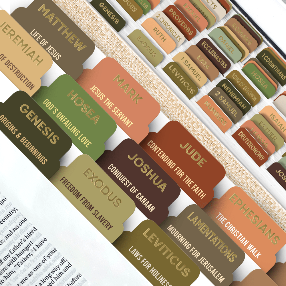
Option D won this Ranked poll with a final tally of 16 votes after 2 rounds of votes counting.
In a Ranked poll, respondents rank every option in order of preference. For example, when you test 6 options, each respondent orders their choices from first to sixth place.
PickFu requires a majority to win a Ranked poll. A majority winner differs from a plurality winner. A majority winner earns over 50% of the votes, whereas a plurality winner earns the most votes, regardless of winning percentage.
If an option does not earn a majority of votes, PickFu eliminates the option with the lowest number of votes. The votes from the eliminated option are reassigned based on each respondent’s next choice. This process continues in rounds until a majority winner emerges.
Scores reflect the percentage of total votes an option receives during the vote counting and indicate the relative preference of the respondents. If there is no majority winner, look to the scores to see how the options fared relative to one another.
| Option | Round 1 | Round 2 |
|---|---|---|
| D | 43.33% 13 votes | 53.33% 16 votes +3 |
| B | 20% 6 votes | 23.33% 7 votes +1 |
| C | 23.33% 7 votes | 23.33% 7 votes |
| A | 13.33% 4 votes | Eliminated 4 votes reassigned |
Age range
Education level
Gender identity
Household income range
Options
Racial or ethnic identity
Religious affiliation
4 Responses to Option A
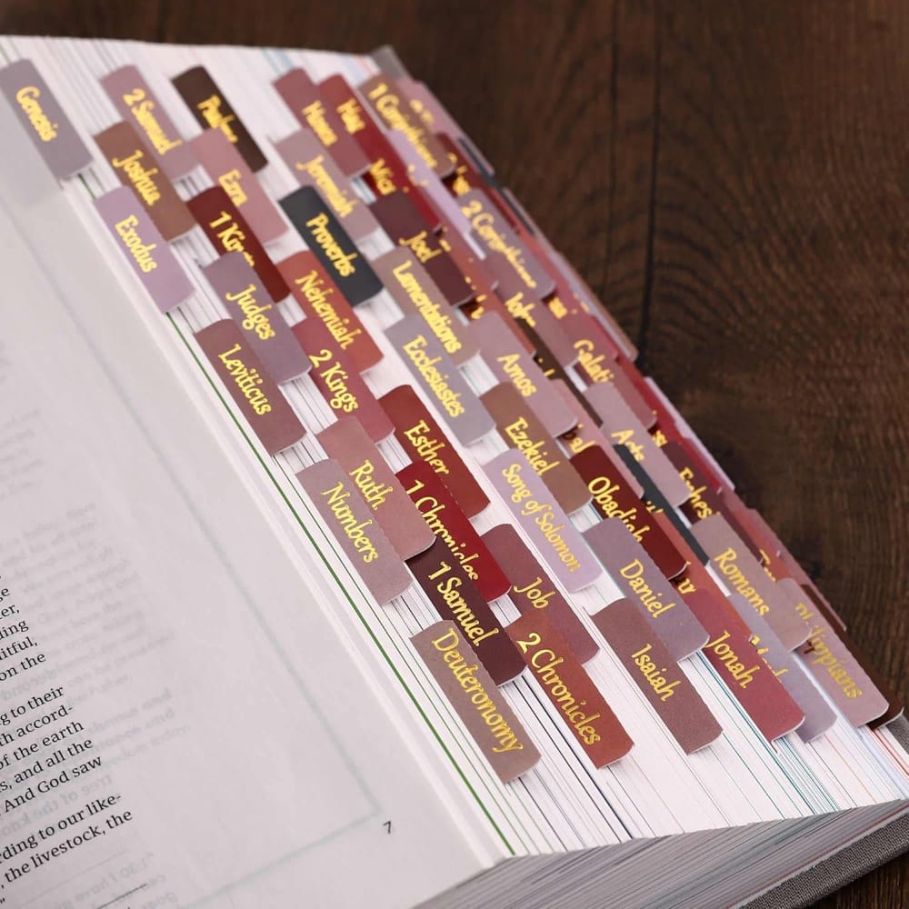
I like "A" the most because they are not overly formal but are not informal. it strikes the perfect balance.
The words in gold font is very bold which makes it easy to read so I'll buy A. The font styles in D is more interesting so raked it second and in B the words are less visible so ranked it last.
The words in A and D are bold which is clearly visible and the font style, color in A is shiny so I chose I'll buy it.
A was definitely my favorite, it keeps things simple and doesn't come across as too obtrusive.
6 Responses to Option B
I prefer option B. I like the colors and light gold font. It looks great.
I like pinks so Option B is my favorite combination. I would not like one that is all brown like Option C.
I put the images of the Bibe tabs from Amazon in B, A, C, and D order. I really like B. I love the color and font. They're both very nice for a Bible and church.
I like this Bible tab's color and format. This Bible tab has both light and dark coloring. Most of the Bible tab colors are pink and brown. The different text styles and colors make the tabs seem more professional, engaging, and attractive. This tab color matches my preference and reading style. While shopping on Amazon, I would buy this Bible tab because of its more visually appealing and aesthetically pleasing color variation.
B, A first because the color designs are the most colorful and neutral which makes it the most appealingD second because I like the simple and sleek color designC last because the color design is a bit dark and vague which makes it the least appealing
B The colors are alright. D I like the font and the look. C The font is alright, and the look is ok. I don't like the gold. A I don't like the gold.
7 Responses to Option C
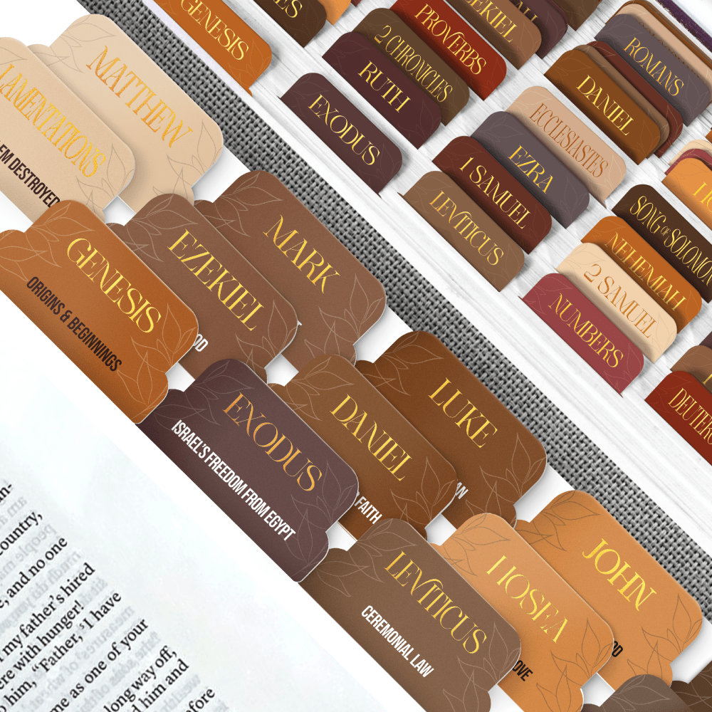
I like the colors and I like the subtle design on them. It's understated but adds a lot.
Choice C is the clearest and easiest to read tabs. I like the color choices in Option C and B.
I like the bigger tabs, that give slightly more info than the smaller ones. Also, the color scheme from this one is better than option two in my opinion.
I like the lettering in C the most, however the card color is more varied in D.
The gold lettering is easier to see on the darker on in option C. I think there are too many colors going on at once in option D, but compared to the remaining 2, I like it better because the brighter tabs are just too distracting.
Option C has the best design, it's beautiful and aesthetically pleasing. They would be very helpful and good to have.
C is my favorite because font is larger and I love gold letters.
13 Responses to Option D
These are easily the ones that are most legible and easiest to read from afar due to their nice fonts
I chose panel D. I love the mixture of colors and I could use these for my Bible. They would make study easier for reference.
I would say the option D I am liking the way it is organized here I feel is more convenient for the user as well to use for the bible tabs also the colors to it I think is more variety involved not so repetitive looking making it a much improved pick than the other options
Option D is clear. The tabs are too colorful, but the font works. The letters are bold and easy to see. If called upon one can quickly move between sections and locate the names quickly because of the tabs. Option C may take a second, but it works. I don't care for the colors of the tabs, but the size of the letters helps. Options A and B have colors that aren't my first , second or third choice. The writing is beautiful. However, the size of the letters and the colors belong Inside a greeting card or a guestbook or an album. They are not easy to locate during a sermon or at the Bible class.
I like D and A because they make the names pop out more to me.
I love the font used in D, and the color coding is fantastic. I really like that design. C is almost as good, and I do like the subtitles it includes, similar to D. B and A are not as appealing to me, especially the way A is organized. It seems too chaotic to me.
i chose option d because i prefer the different colored tabs with the gold leaf lettering
I really like the look of my first choice the best. I think this color assortment is the most appealing and attractive and I really like the way that this choice is displayed.
The brown and green colors from Options D and C look more attractive than reddish colors
I prefer shades and range of colors in Option D.
Options D and C are not only attractive in design but they have important info to explain each book of the Bible.
I prefer D because there seems to be a larger color pallet for the tabs. I think that would make them easier to use. The font is easy to read and stands out.
I think D looks the best. The text on the tabs is the easiest to read. I would buy them.
Explore who answered your poll
Analyze your results with demographic reports.

