Poll results
Save to favorites
Add this poll to your saved list for easy reference.
If you were shopping on Amazon, which product page is the most appealing?
38 Responses to Option A
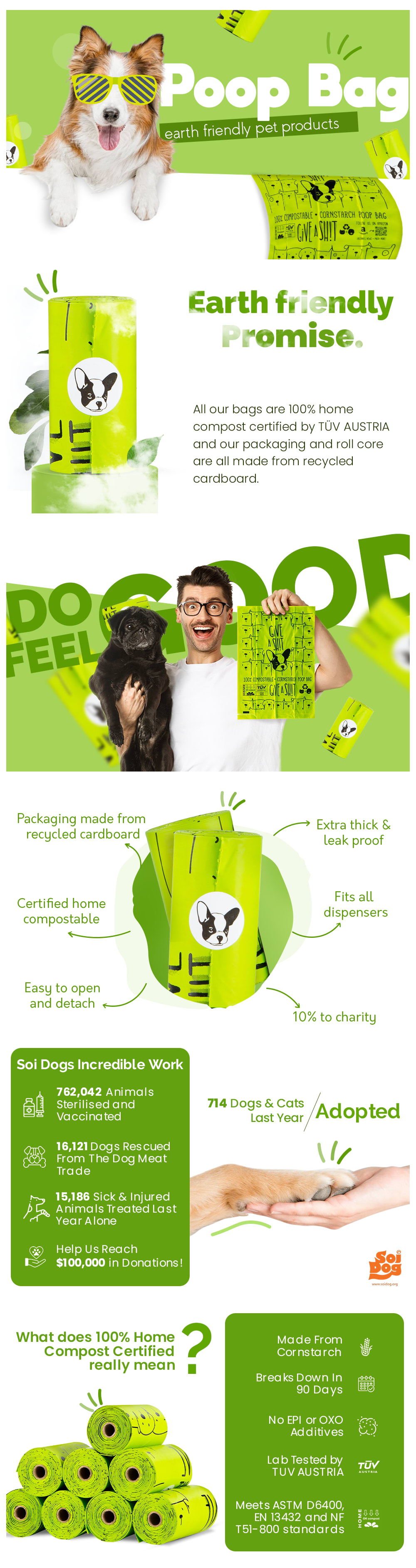
I like choice A because of the green theme and the environmental impact of the bags.
I love the bright green colors on the page, and I Love the dog wearing the sun glasses.
I Chose this option because I find the design more attractive and eye catching compared to the other option.
The color scheme on this option felt much more bright and vibrant.
My choice is based on my preference over the page's design that is more interesting and attractive.
A looks better
I prefer the option A dog bag product image set because the images are much more humorous and captivating and the colors and simple brief text descriptions are much easier to read than the long and detailed and unfunny information provided in the option B product image set.
I love how fun this option is. especially because of the dog with glasses
There's a helluva lot of copy in Option B! Give me the funny, lively Option A, which still gives me everything I need to know but presents it in a captivating, very humorous fashion.
This one is more friendly and makes the product look easier to use as well. It has the best presentation.
Option A is easier to read and I like the coloring and/graphics better.
I like option A the best because the design of the graphics and color layout is super catchy and does a good job of selling the poop bags. I think in this case the information should be kept to a minimum and the focus should be on graphically seeing the bags, which the product page does a good job of it. The important information is there and in this case there's no need to get carried away with information because after all it's just a little plastic bag for dog poop and as long as the eco-friendly information is there that means this product page overall does a great job of selling the bags.
Option A is a no brainer. It has everything that a marketing team would love to have. It has good colors, good theme, good graphical representation. Too much information isn't crammed onto one slide / page. I just want to keep on looking at it an admiring it. This type of work should be copyrighted. Its so amazing.
There are far too many words in B over A
Option A is fun, and let's me know the product is earth friendly which let's me know the product is good for the earth.
The information is much easier to read on A>
I like option A because it feels more vibrant and charming to me. Option B feels too bland and unimpressive to me.
Option A contains more graphics than option B and also doesn't have the information about the product jam packed into a couple of paragraphs using small font. Option A is both easier to read and visually more attractive making it the better option
The product page that is most appealing is the one on option A because it is simple and detailed.
I chose A because at the top it says poop bag, which makes it very clear as to what this product is. The other option says "100% back to nature promise" which without context, makes little sense. Overall A has a lot of big graphics and text that stands out, while the other option is filled with small fine print text which isn't appealing to read.
This one i easier on the eyes. The information is bolder and it’s fun to look at.
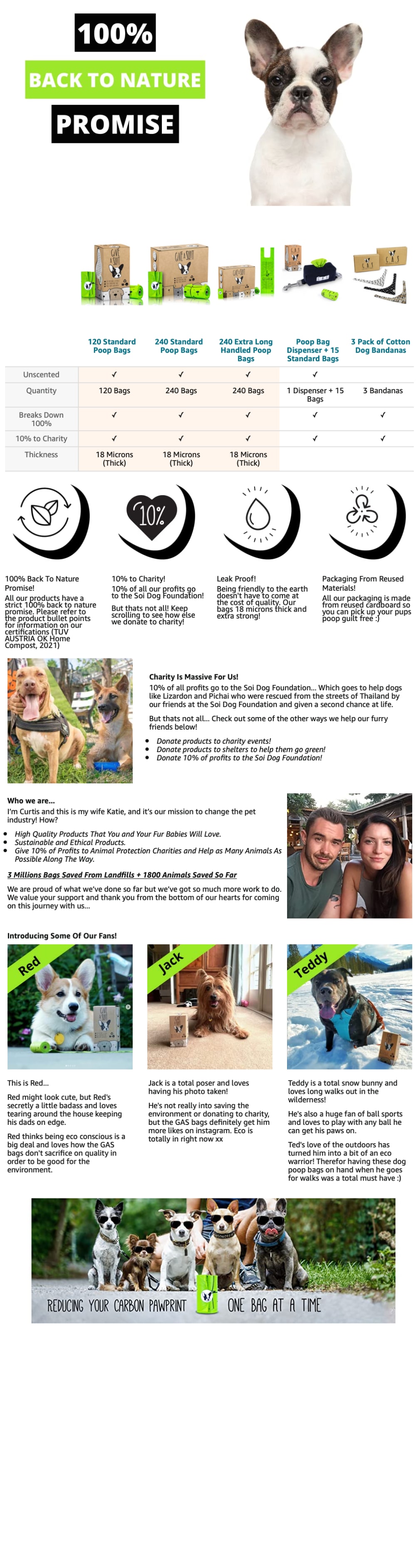
I like the more infographic style of the second one. It seems more professional. Plus, the dog is more attractive.
I choose A because it is more colorful which adds to its attractiveness, and also because the functions and instructions of the product are well itemized and explained.
I like the bright green colors and the pictures of people and pets having fun!
I think the style of option A looks more professional and trustworthy.
Option A. It is a great looking design all the way to the end. It is colorful, informative and humorous. A great triple combination. I love the infused color all the way through the ad. The images are modern, happy and dynamic. The high five paw to hand image is awesome. I enjoyed reading what else this brand has done other than produce poop bags that are eco friendly. They have done a lot for animals and their welfare. Option B is really informative... but to the extreme. It reads like a novel.Option A is great to look at, easy to read and very informative about their product and the benefit of the brand. It is an awesome, well thought out ad for poop bags.
It is much more clearer to read.
A I feel is more informative and has a more appealing design.
I chose A first because as most of us are, a part of me is a 13 y/o boy who is more amused by the word "poop" than a "back to nature promise." I think both of these are great and informative and should be used as part of the website or flyer or whatever informational resources you provide. I like the product and the presentation. On B, there is a typo under the profile for " Teddy." Therefore is misspelled.
Definitely A, B is so busy I have no idea where to look and it's overwhelming. I like how cohesive A is with the color scheme while still being informative and font being big and bold with the pertinent information. The photos are engaging and bring excitement as well as the little emote type pops on the photos.
Option B is more appealing and that green really makes it stand out nicely I also like how the wording is easier to see than in the other one. Either one is it hard to see but when they're compared next to each other option A is definitely easier
I like the second option A because we got ours at PetSmart - can't remember the price but I'd guess it was less than $15. I just got a golden retriever who seems to poop about twice a day! I seem to always run out of compostable bags.
The less pictures there are the easier I can see it he photos to see the product
The information is presented in a way that is easily digestible to the reader.
Much more lively, fun and not depressing.
I really like the dog with the glasses and the green color. I also like that it has less information. The other one is too overwhelming. Where this one I get a lot of info but in bit sized pieces.
A gets my vote because the green colors make it pop more and it also is just easier on the eyes to absorb all the information. B just seems like way too much text which is going to turn people off.
A is better designed which makes me think that the product reflects that same quality.
12 Responses to Option B
B has a better description of the product. It clearly explains the product options and its benefits. The pictures look interesting and entertaining.
B seems like a more appealing image in terms of presentation
The chart is informative and it has back to nature very visible which is a good draw in
Option B is a lot more appealing to me, I really don't like the over the top expression on the face of the man in the image in option A.
Well, this is a tough one because Option A is more eye-catching, but Option B has a LOT more information. I chose Option B in the end because of the plethora of information it has. It tells me about all of their products and exactly what I get with them, tells me all of the reasons why I should choose the product (compostable, leak proof, etc), introduces the actual business owners, talks about giving back and how they're very close with the Soi Dog Foundation, and explains the foundation. And best of all, it has pictures of rescued dogs, all with a personal profile! I love it! I would not even think twice about buying their product after reading and seeing all of this! Option A just talks about the basics, which is good if you don't want to know detailed information about what you're potentially buying, but I want to know!
I find the illustrations in option B more understandable and informative.
The image in option b is more appealing because it has an easily viewable product comparison
Top choice looks more of a serious product and less gimicky the alternative with a dog in sunglasses looks immature
The graphs comparing products makes it look more informative and convinces me better on why I should choose this product.
I don't like A because the big Poop Bag headline kinda ruins the ad for me and makes it feel weird instantly, so I'd prefer B.
i really thought the guy in the other choice was really annoying
I find option A a little too goofy for my taste. Option B is fun while giving a complete rundown of the product.
Explore who answered your poll
Analyze your results with demographic reports.
Demographics
Sorry, AI highlights are currently only available for polls created after February 28th.
We're working hard to bring AI to more polls, please check back soon.

