Poll results
Save to favorites
Add this poll to your saved list for easy reference.
If you were shopping on Amazon, which product will catch your attention and make you click to learn more about it, and what caught your attention to click it?
Option C won this Ranked poll with a final tally of 27 votes after 1 round of vote counting.
In a Ranked poll, respondents rank every option in order of preference. For example, when you test 6 options, each respondent orders their choices from first to sixth place.
PickFu requires a majority to win a Ranked poll. A majority winner differs from a plurality winner. A majority winner earns over 50% of the votes, whereas a plurality winner earns the most votes, regardless of winning percentage.
If an option does not earn a majority of votes, PickFu eliminates the option with the lowest number of votes. The votes from the eliminated option are reassigned based on each respondent’s next choice. This process continues in rounds until a majority winner emerges.
Scores reflect the percentage of total votes an option receives during the vote counting and indicate the relative preference of the respondents. If there is no majority winner, look to the scores to see how the options fared relative to one another.
| Option | Round 1 |
|---|---|
| C | 54% 27 votes |
| A | 34% 17 votes |
| B | 12% 6 votes |
17 Responses to Option A
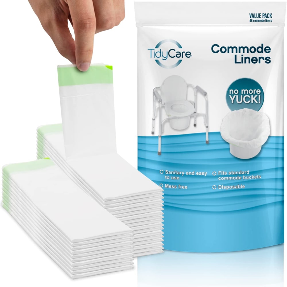
If I was buying a commode liner A would be best. Then others look like garbage bags
Commode liners says it all, no more yuck makes me smile and chuckle. I also prefer the light blue color in A and B.
It's funny.Initially C caught my attention with it's darker background color on the box. But than after looking at it for a second I decided that the accompanying real-life image on A would have been the best choice, followed closely by B.
I like these the best they stand out and they look great, I like how I can see the design in these better, I would buy these
Having the image of the portable toilet grabbed my attention. I did not know what these were until I saw the image.
Option A shows what the actual product looks like. B shows where it might be used. C is hard to understand.
I like the words "no more yuck". This explains the benefit of the product.
The illustration in my choice is the most informative
I prefer Option A because the images best explain to me what the product is for, but it could be more colorful.
All are pretty clear.
Having the portable commode in the picture let me know what it is used for.
Whenever a part of a human is involved I would choose that, my second pick was for a higher content count.
i chose this option because the picture shows what it is used with, the others dont really show the potty chair
I like the idea if the pad in A if it is flushable. I'm not crazy about the bags in B and C.
A that shows the commode....i thought the others were just trash can liners at first to be honest!
I like A because it shows how the pads look. B is okay too because it has good information on the package. A is okay.
Option A is a very clean looking ad. The hand caught my attention and my eyes followed the finger down to the product. The product is placed next to the commode with the phrase "no more yuck". It is a well staged image that leads your eyes all the way through the image. Option B is a solid second place as the text on the box is very prominent and easy to read, however, the product blends into the background and package. The bucket with the liner is completely lost as they are way too light for the image. It is essentially an image of a box.Option C is horrendous as an image. The vertical white lines on the box in back of the bucket and liner makes it look it stinks. The lines look like scent lines used in graphics which gives a hugely negative connotation to the product. The box is easy to read, but the ad is staged exceptionally poorly and sends very negative subliminal message. It is essentially showing liquid going in and smell coming out.
6 Responses to Option B
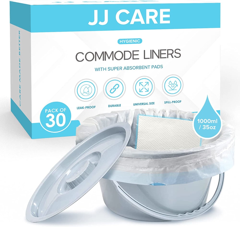
Option b has the easiest bag dispenser to use.
I've never had to use one but if I did I would probably click on Option B when doing a search
B caught my attention because of the comprehensive packaging, which tells me all I need to know about the product.
i chose option b because putting what the product does in large bold lettering grabs your visual attention immediately
I would choose B first - in the photo, it does the best job of conveying how the commode works with the liner (without being too graphic). Option C is second - Because of the packaging, the item stands out quite a bit, but I think it looks like paper thrown into a lined wastepaper basket. Option A - doesn't really convey the purpose and the hand reaching down and picking up the liner makes the liner look really tiny and the hand look giant - kind of creepy.
B would get my attention and make me want to click it. The information presented is clear and straightforward. C is next. A is last.
27 Responses to Option C
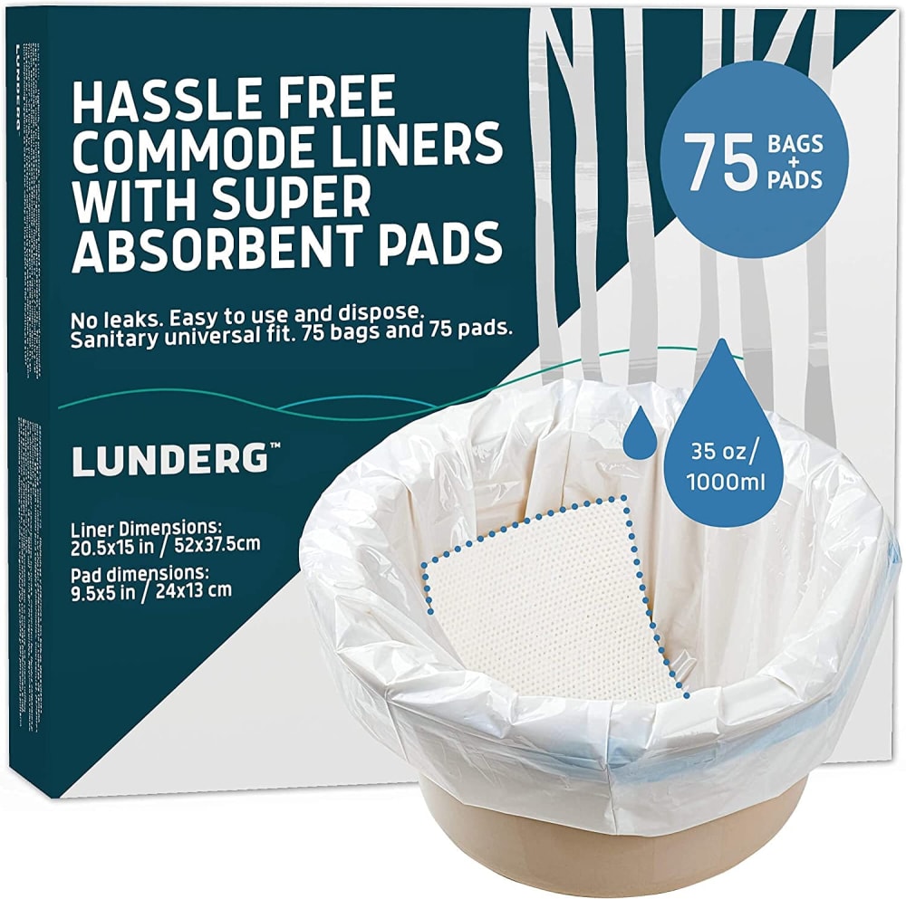
Option "C": Visually description with packaging and font made this the more easily picked choice for a product of this type; the text is immediately viewable and clear by comparison.
I like Option C. The layout looks fresh and clean with sharp graphics and a simplicity that's pleasing. It's much more visually informative than the other two options. Options B& A look dull in comparison.
Actually seeing it in the bowl caught my eye on option C so I would click on it to find out more. I also liked it with the whole chair in A but didn't understand the stacks of white at first...it looked like a small sheet not a liner so I would skip over that one. B is just too generic.
I find the wording in the top left really compelling as it summarizes the benefit in a clear and concise way. Hassle free is very desirable.
C is very self descriptive, showing the prodect with more items in full to show the size, Hassle free is a good interest point. A I like the simple packaging, it looks reclosable, C is more generic
This one C because it says hassel free and it tells you how many bags there are on the box. Seeing how many bags there are in big writting on the box and the words that its hassel free made me click on this one, over the others.
c since it shows you how it goes over the container, the pad and what it is for, easy to understand all the components.
C-wording starts with Hassle Free-that drags me in. B has qualities like durable shown clearly. Do not like A at all because of picture of fingers holding product-unattractive
This is a product that is new to me. I chose C as #1 b/c the image explained what the product does. A (#2) also does that, but I sensed that C did a better job. B is a distant #3 b/c it doesn’t as explicitly communicate the benefits and function of the product like the other two images do. I would click on C first b/c I think the color scheme of the packaging better catches my eye. The darker color communicates a higher quality. B and A look too generic. Those 2 look like cheaper imitations of C. I feel C is a high quality product for that reason.
the first thing i saw when i looked at "C" was "HASSLE FREE." as a person who is awful at anything relating to putting things together, fixing things, etc, "hassle free" sealed the deal for me. as far as the others, i rate them almost the same but "A" is a little more appealing to the eye.
Good description of the product.
This tells me more about the product and how reliable it is.
The color of the packaging on this one draws your attention to it and it appears to be the better liner.
I think C gives the best illustration depicting how the product is to be used/applied.
I can see the product and read the information well.
I like the addition of the words hassle free - that makes me think they are the easiest to use.
Option c provides me with more useful info on the product. I appreciate the dimensions and the actual photo with the product in use.
The dark blue color of the box in C caught my eye. The text was very readable against it. The other two packages are very light and the text is hard to read. The graphic of the item needing the liner in Choice B is not very understandable as to what it is. In Choice A, the person looks like they are picking up some kind of wipe.
I prefer option C. I like that the liner looks sturdy and like it has good millage. I like how the pad is shown. The color of the box is pleasant.
Option C's image best shows the use of this product.
C grabs my attention because I can read the package but I would like more info
C has larger typeset and offers more printed information. A does show the liners. B is rather bland.
Having had to deal with a commode all last summer while living through replacing all of our pipes, I can tell you that I would see C first on the shelf because of its clear and large description (liner and absorbent pad). That would be what I would want and it clearly shows that. Sold. A is last as the pads shown look more like a thin sheet of paper that would do little to nothing to absorb.
C caught my attention by giving equal billing to absorbant pad and liner each.
Image C with the darker background and white fonts was very eye-catching and appealing to look at. The other options were underwhelming.
The packaging draws my attention, large bold lettering and crisp pictures that are less hazy.
Option C is the best because of so good colors combination, big number and fonts - rank 1.Option A is somewhat worse than option C but deserves rank 2.Option B is not good IMHO - rank 3.
Explore who answered your poll
Analyze your results with demographic reports.

