Poll results
Save to favorites
Add this poll to your saved list for easy reference.
If you were shopping on Amazon, which product will catch your attention and make you click to learn more about it, and what caught your attention to click it?
Option B won this Ranked poll with a final tally of 27 votes after 2 rounds of votes counting.
In a Ranked poll, respondents rank every option in order of preference. For example, when you test 6 options, each respondent orders their choices from first to sixth place.
PickFu requires a majority to win a Ranked poll. A majority winner differs from a plurality winner. A majority winner earns over 50% of the votes, whereas a plurality winner earns the most votes, regardless of winning percentage.
If an option does not earn a majority of votes, PickFu eliminates the option with the lowest number of votes. The votes from the eliminated option are reassigned based on each respondent’s next choice. This process continues in rounds until a majority winner emerges.
Scores reflect the percentage of total votes an option receives during the vote counting and indicate the relative preference of the respondents. If there is no majority winner, look to the scores to see how the options fared relative to one another.
| Option | Round 1 | Round 2 |
|---|---|---|
| B | 38% 19 votes | 54% 27 votes +8 |
| A | 44% 22 votes | 46% 23 votes +1 |
| C | 18% 9 votes | Eliminated 9 votes reassigned |
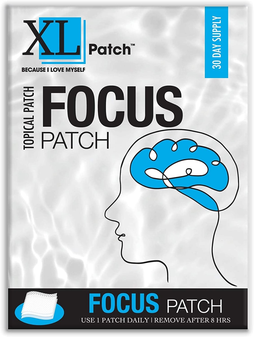
22 Responses to Option A
Option A having the brain graphic drives home what the product does.
The human figure and brain packaging design looks amazing
I like the colors of B but I think the imagery of A is more eye catching to me
The image of the brain is very fitting for the type of product it is.
A first because the image of the brain on the packaging intrigued me the mostC second because I love how simple the packaging isB last because there’s too much going on in the packaging
I chose Option A first. The design with the brain caught my eye and made me wonder what this product could do for me. I chose B next because the design is bright and intriguing and this caught my eye. I chose C last because the package is more plain and thus does not stand out.
I ranked these based on how easy it was to understand what these are used for.
the imagery of someone's head caught my eye the most along with the big bold black lettering of focus
I put option A first because the enlightened brain image on that product image was most eye catching by far. I put option C before B because that packaging looked less "medical" to me.
I like this option most because the imagery catches my attention and the product itself is something that interest me because I struggle with focus at times.
Option A has the most relevant imagery to me, with the picture of the brain, so that's the most appealing. Option C looks pretty generic and wouldn't stand out to me.
A tells me a lot about the product just from the packaging alone.
Option A is visually more appealing than the other options given
The simple drawing on A is smart and appealing
A has just the right amount of creativity attached to it and is very appealing in the packaging.
The brain drawing drew my attention. I'd want to learn where the patch is applied as it relates to the brain. The other options look like computer software boxes
The brain logo catches my attention more.
Option A is the best option because of the image of the brain that is present. This image is high quality and depicts what the product is about. The other options do not have this image.
I picked A and B as my top choices as I like how they tell me that it's for the mind.
Option A of an up close picture of the brain shows where it works on the brain.
I liked how from a glance you can tell the product is for focus or the brain which is why option A was my top choice. Option C, I liked that it had 50 patches and I also liked the overall design a bit better than option B.
I think option A is the easiest to read and seems the most unique due to the image on the package which makes me the most likely to buy
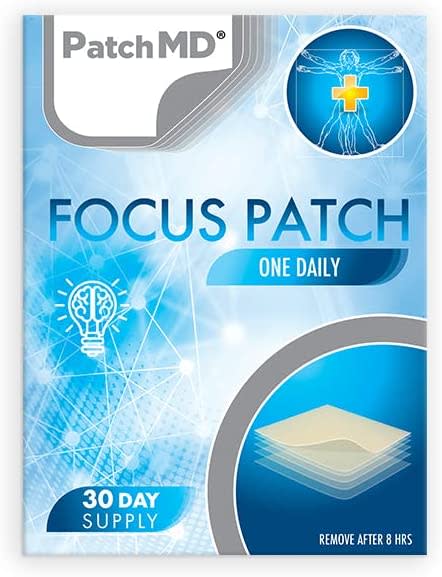
19 Responses to Option B
I find the designs look the most attractive and appealing in the order chosen. C, and A both look lower quality.
B and A have a more catchy appearance and one which is really attractive to me and easy to understand about the product as compared to choice C.
The bright color ful background with the darker and lighter Blues definitely caught my attention on option b
I get a little confidence with this when I am able to see the MD on there.
I choose B, the thing that caught my attention is the design that makes it more interesting for a product and the name of it.
I think B has the most attention grabbing look to it due to the brighter colors and more intricate design. I also liked C for the trustworthiness of it too.
makes it look more professional and still catches the eye
I think that option B looks like the most trustworthy and appealing option. The color scheme looks nice and the design has a modern look.
Option B' is most likely to catch my attention due to how appealing the packaging design is.
the design of B seems the most complete to me and it looks like the most well made to me
B has more color in it so it catches my eye more.
Option B is the best choice for me. I liked this design the most. Very stylish option, bright and appealing.
choice b was the most attention grabbing to me. i think the colors of the label and the way they are used, remind me of the brain functions.
B reminds me of the standard things you see on tv with how the brain works so it grabs my attention and would look at that one first. then C is visually stunning its so simple yet bright and smart planning on word placement. hate A it looks like something i would see at a as seen on tv section
The focus patch with the sort of genius motifs in option B gives a good impression for 30 day supply
I would be most likely to click on and ultimately purchase option B because I think that it has the most interesting, eye-catching, and visually appealing packaging design out of the three options above.
I love how B is so fancy and how it looks quite elegant to me when I see it. It also feels the most high tech to me which is a must. From there, I like A over C as A looks fancy while C is a bit plain to me
All of the blue on this looks great. I like how much there is of it. It is a really great shade of blue
I choose B because the illustration of B boasts an exceptionally appealing and attractive design
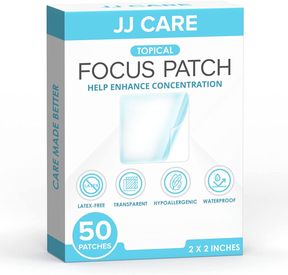
9 Responses to Option C
Option C clearly indicates the use of the product which is to help enhance concentration. Looking at options A and B one does not exactly know what they are for. Option A also clearly highlights the number of patches and their quality.
the bright white box stood out more to me.
Options C,B and A are good designs and I like the color schemes.
I think choice C looks like the most professional of the packaging, and the professionalism is what caught my eye and made me choose that.
I love option C the most because it best explains the product on the packaging making it easier for me to decide if I want it.
I liked the options with more refreshing blue hues as these felt more vibrant.
I am not a big of the blue because it makes everything look so clinical and I find it somewhat offensive of a color to begin with. The less blue the better, or no blue at all!
C has more patches and I like the packaging.B It has better visuals.
C and B seem to be something that actually works, and they seem like pharmaceutical grade
Explore who answered your poll
Analyze your results with demographic reports.

