Poll results
Save to favorites
Add this poll to your saved list for easy reference.
If you were shopping on Amazon, which product will catch your attention and make you click to learn more about it, and what caught your attention to click it?
Option C won this Ranked poll with a final tally of 32 votes after 1 round of vote counting.
In a Ranked poll, respondents rank every option in order of preference. For example, when you test 6 options, each respondent orders their choices from first to sixth place.
PickFu requires a majority to win a Ranked poll. A majority winner differs from a plurality winner. A majority winner earns over 50% of the votes, whereas a plurality winner earns the most votes, regardless of winning percentage.
If an option does not earn a majority of votes, PickFu eliminates the option with the lowest number of votes. The votes from the eliminated option are reassigned based on each respondent’s next choice. This process continues in rounds until a majority winner emerges.
Scores reflect the percentage of total votes an option receives during the vote counting and indicate the relative preference of the respondents. If there is no majority winner, look to the scores to see how the options fared relative to one another.
| Option | Round 1 |
|---|---|
| C | 64% 32 votes |
| B | 24% 12 votes |
| A | 12% 6 votes |
6 Responses to Option A
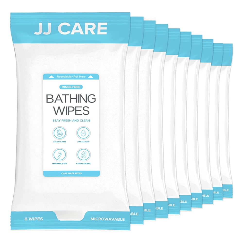
Option "A": The colors used, package design, and clear graphics were the most compelling when looking quickly and after reviewing all, would still be my first choice to buy.
Option a gives the most information at a glance on the front of the wrpper.
nothing real good or real bad stuck out at me so in this case i just went with what looked like the most; in terms of quantity.
Nice packing and product description.
I like the package. I can read the text. Looks like a lot for my money.
A and C the print is larger, as the most common constituency to use these are older people and those that are disabled, large clear print is a must. a over c is really just a package coloring preference
12 Responses to Option B
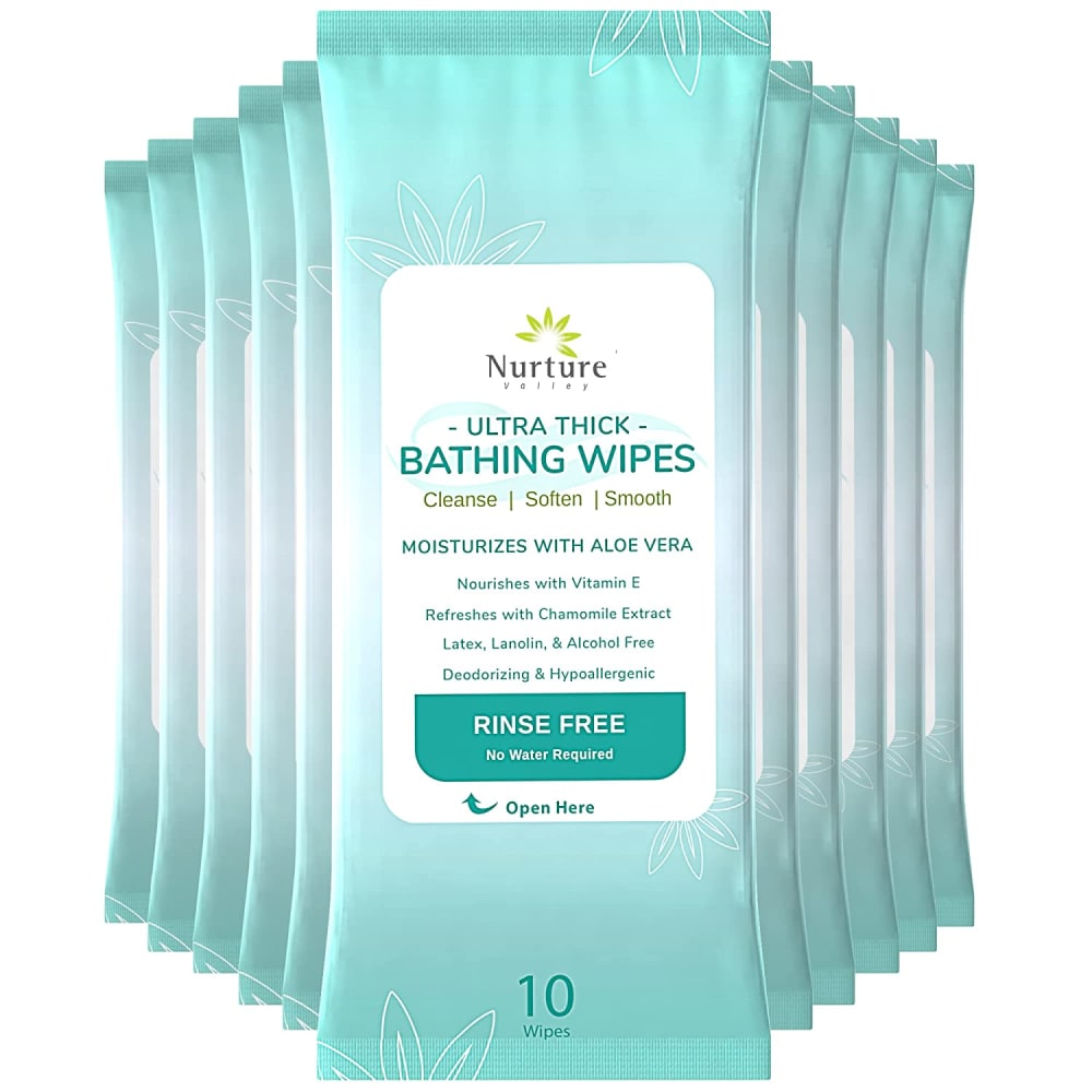
I would read the words right away and the aloe vera,vitamin E caught my eye.The others had circles and limited info.
Packaging and description on B. C - I think the lettering didn’t appeal to me. Looks Dollar Store
If these wipes are in place of a bath, should be bathing wipes. I like the wipes with aloe Vera the most, more soothing.
I like this one because it list some of the key ingredents in the product it all so tells you something about the product . I clicked on this one because it has more information than the others to let you know more about this product.
I like the design of how the images are displayed and it really attracts my attention.
I like these the best they stand out and they look great, I like how I can see the design in these better, I would buy these plus it shows me a lot of information
Latex lanolin and alcohol free statement on thus option caught my eye since my skin is sensitive to these chemicals.
I like that these are "ultra thick" - that seems the most helpful and comfortable.
I prefer option B since it moisturizes. I like the packaging better too.
I like that Option B shows the ingredients right up front so I could see if I'm sensitive to any of it.
B looks more like a washcloth which is nice. A is okay. I do not like the name of C.
Option B caught my attention immediately due to the stacking of the product in the image. The symmetry of the stack and the color of the packaging makes for an eye catching effect in the image. The sides actually lead your eyes to the text on the top package where it states these are bathing wipes.Option C is a solid second place as the smaller stack shape and the red highlights also caught my eye as a second choice. Body wipes is very prominent.Option A is the least effective as the stack actually leads your eyes away from the product. IT is also very white and fades into the background which is also white. It is like trying to spot a snowman in a blizzard against a pile of snow. Option B is the superior choice, the superior image and the superior ad design. IT caught my attention quickly due to the symmetry in the design.
32 Responses to Option C
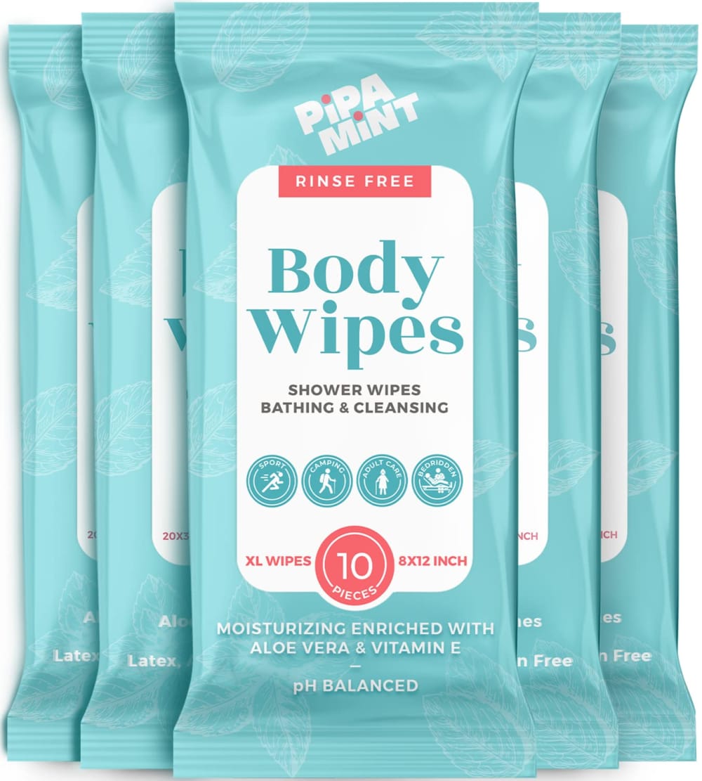
C has the most attractive packaging. It would appeal to a wide range of people. B and especially A, look like they would be found in a hospital.
I like Option C. It's bolder and more eye catching with a nice color palette and sharp font. Options B & A are perfectly fine but not as eye catching and seem to be rather ordinary.
The little splash of color grab me, and I like the icons; they are engaging and easily readable. I also like the name "Pipa Mint". It makes me think this will smell good.
C I like the multiple colors, the red stands out for me and the product count is easy to see. B is nice but not as stand out, A looks generic, cheaper.
I lik ethat C is rinse free, I also like that you get 10 of them. You also get 10 in B and it's also rinse free, but it's harder to figure this out with the packaging on B. A lacks all clarity, you can hone in on the fine print, but you really have trouble telling that you get many less wipes per pack when you DO get A.
C-pink color highlights attractive attention, B-like the blue background, A seems very white and plain, does not seem inviting
The color on this one draws you immediately draws your attention to it and the lettering is larger..
The color scheme and design caught my attention. Plus it is easier to read.
Bold labelling clearly identifies it.
C is first because of the clear labeling on the package. I also per 'body wipes' to 'bathing wipes' - the description of B and A.
Not as many so does not look too "busy"
The name "body wipes" explains the purposes of the product. I can understand the use of the product.
C is an attractive package that represents the products week with description and count.B is smaller text with a lot of information but looks attractiveA look generic version and the white washes out the text
I prefer the term Body Wipes
C grabbed my attention because of the varying font and colors that highlight the info I need to make the right decision for me.
I prefer Option C because the colors and the design are the most eye-catching and the most attractive and appealing.
The red caught my eye and I like the name better.
I like the large, clear words.
Red is my fav color so I went with C and A is too plain so I choose B for second place
i chose option c as the one i would click on first because putting the product body wipes in bold lettering grabs your visual attention immediately
C has the largest eye catching typeset and says mint. A second just based on the fact blue is a favorite color. B's typeset is too small.
C catches my attention to want to buy the product
C was my first choice because it jumped out at me right away. B was second because it looked more interesting than A.
Images C and A were the best because they had the best color and font combinations to attract my attention and curiosity.
Option C definitely stood out the most and caught my attention. I think because of the bolder color and also the use of another bold color on the packaging (green/salmon). I was also curious to see what each of the icons represented. Option B was next - the packaging is pretty and the label looks like it would be a quality product, so I wanted to read about it. Option A - looks generic and basic (not a bad thing necessarily, but didn't catch my eye).
C, has bigger and bolder lettering which still is a big deal on a crowded shelf. It's as if the other two are hiding.
Option C is preferred. The brightly colored packaging along with label with large, boldly printed product name with orange colored product notes is attention getting.
i chose this option becaiuse the type and layout and colors look best on this one. i would not use bathing wipes because i dont like them
C. The other two sound like something you take in the tub with you. I use body wipes...they are really handy here in florida because you get so sweaty so fast outside, its nice to have something like this to do a quick wipe down when you come inside.
I just like the color scheme of C better. The others are more boring. Ranked how appealing I find the packaging.
Option C catches attention faster than 2 others thanks to a bigger and nicer fonts and bigger number - rank 1.Option B catches attention as well but has smaller fonts - rank 2.Option A didn't catch any attention because of not good colors combination and small fonts - rank 3.
I think body wipes can be used for more things. I like the Aloe Vera in B
Explore who answered your poll
Analyze your results with demographic reports.

