Poll results
Save to favorites
Add this poll to your saved list for easy reference.
If you were shopping on Amazon, which product would you rather buy?
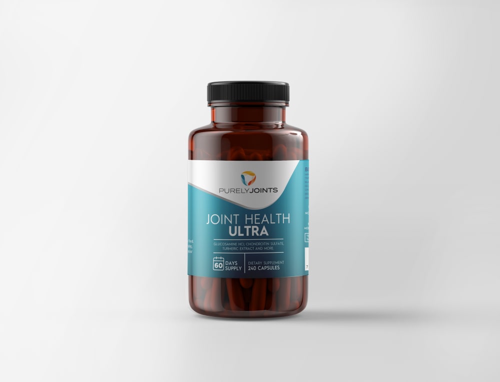
30 Responses to Option A
I think the blue is more eye catching!
Easier to read with the dark background
The color layout of the label on option A looks like better usage of space. The label feels more complete with less white space.
I chose option A because I like that this label has more blue.
A's label design I feel is able to stand out a lot more to me and draw my interest more.
I just really like the packaging on this one. the colors and design draw you right in.
The more blue one is easier to read and looks more professional, so I'd go for that one
The more blue on the front, the more personality it has. The bottle is more attractive this way
I love how bold, sleek and bright this label is
I think that the colors on this bottle and the way they blend make the font pop a lot more and looks a lot better.
The blue being the major color looks better to me. Much cooler looking.
Since the label on this bottle incorporates a larger portion of its area to a bright color, it attracts my attention more readily, so it would be a choice I would I would be more attracted to.
The blue color makes the product look appealing, and the product itself looks very scientifically done.
A because I like the blue label it makes the product attributes stand out more.
More blue, with the white letters on the blue, stands out more.
That's a beautiful blue on the label. Option A is just more aesthetically interesting.
I like a. Easier to read label.
I would choose A because I feel that the label looks more upscale and premium.
I like this it looks good, the other comes off as a cheaper or generic brand to me. A looks like it would be good quality.
I think the white letters make it more clear to read. They are also bigger and make it easier to know what the product is.
I chose A because the color pattern is more appealing. I like how bold the teal is. I wouldn't mind if someone saw it in my medicine cabinet. It looks clean and sophisticated.
Option A has a better designed label.
It have turmeric and glucosamine and much more healthier ingredients.
I like the color pattern of option A better. It seems to be more attention grabbing and unique which makes me more likely to buy
I like A because I think the label looks better with more blue. It stands out.
I prefer A because I like the separation of the brand and the specific product.
One of the reasons I chose A over B is because I prefer the coloring used in the product label. The white lettering on the blue labels stands out more in my opinion and the number of capsules provided in the bottle is easily seen.
I sort of like the dark teal label in A better, it shows a nice contrast, and is more wholistic looking to me. I enjoy it's attractive look.
I like the wavy design of the blue and white background with the pattern originating from the top
I would be more likely to choose A because the turquoise color of the label and the white writing of the words is a good contrast that makes the writing easier to see. As a senior, I appreciate labels being clear, bright, and easy to read.
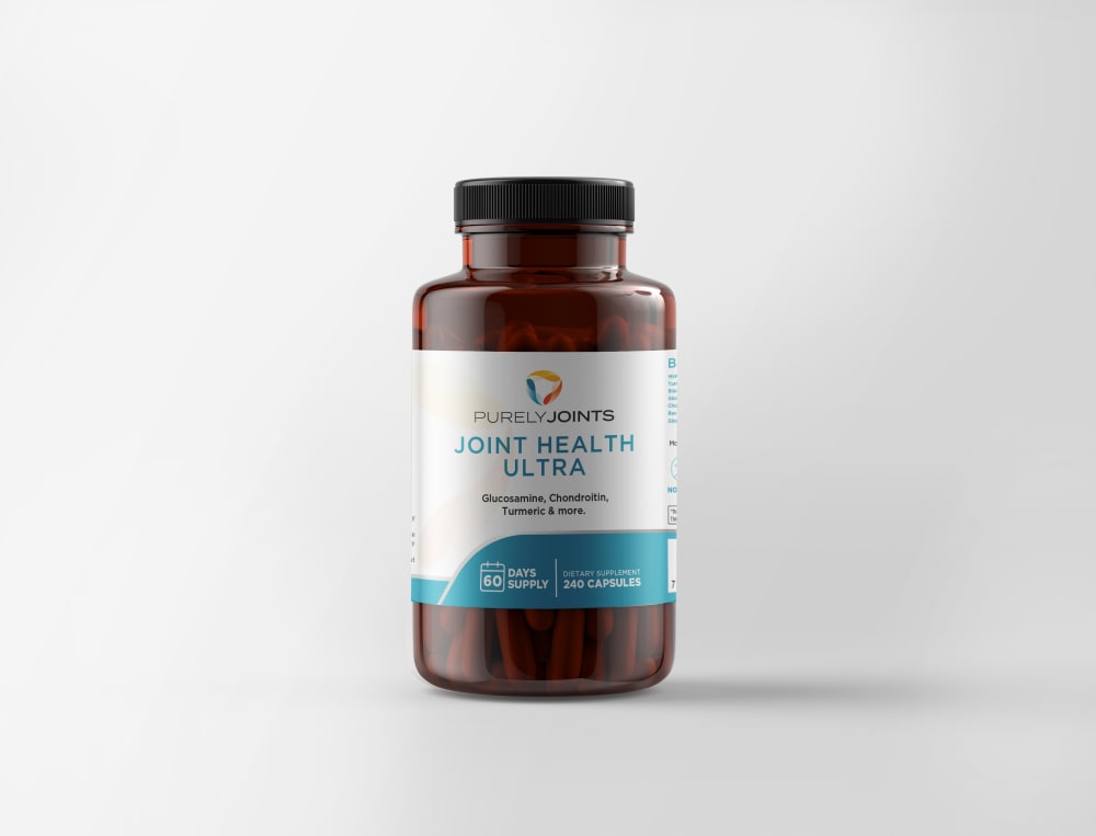
20 Responses to Option B
I think the blue text on the white background stands out more.
I liked the design of option B more
They are very similar, but the small writing on B was easier to read because of the contrasting colors
I chose B as it's easier to see the type of supplement (main ingredients) on the label at a glance.
I think I prefer Option B better because it's easier to read and clearer to see some of the main ingredients - glucosamine, chondroitin, and turmeric, and those are the true selling points of this product.
This option has a label that is brighter in color so it stands out more.
I like this version of the label because it has a very basic look to it. Isn't trying to be fancy or detailed. Has a clean and scientific feel to it.
B is easier to read and i think looks a bit nicer design wise.
I just like the mostly white label better than the mostly blue one.
Easier to read words on B with more of a white background than A
I think that the label looks more appealing with the smaller portion of blue and larger area of white. The blue letters really stand really well against the white background.
Chose B simply because the label is easier to read. Otherwise I see no difference.
Option b is my choice the label on option a is to dark and cannot be read.
I think this bottle is both more attractive and easier to read than the other one.
I would rather buy B; it's easier to read the label
I like the mostly white label as to me it is easier to see the information on the label.
I choose B because the bottle is more appealing than A. The bottle is also lighter which means I can see the content of the product Berger than option A
Both images could be improved by adjusting the lighting on the middle of the product. It's currently too dark to read easily but the text is easier to read on white background
I like B better because I think it makes it so much easier to read when the background where a lot of the text is going to be, especially the name, is white, so that the text is very easy to read and you can find what you are looking for on the shelf. I like that there is still some color to the bottle and the way the colored area flows at the bottom helps to make that part blocked off nicely.
I would choose "B" because the label has more white on it and I would notice it first.
Explore who answered your poll
Analyze your results with demographic reports.

