Poll results
Save to favorites
Add this poll to your saved list for easy reference.
If you were shopping on Amazon, which product would you rather buy and why ?
Option B won this Ranked poll with a final tally of 120 votes after 3 rounds of votes counting.
In a Ranked poll, respondents rank every option in order of preference. For example, when you test 6 options, each respondent orders their choices from first to sixth place.
PickFu requires a majority to win a Ranked poll. A majority winner differs from a plurality winner. A majority winner earns over 50% of the votes, whereas a plurality winner earns the most votes, regardless of winning percentage.
If an option does not earn a majority of votes, PickFu eliminates the option with the lowest number of votes. The votes from the eliminated option are reassigned based on each respondent’s next choice. This process continues in rounds until a majority winner emerges.
Scores reflect the percentage of total votes an option receives during the vote counting and indicate the relative preference of the respondents. If there is no majority winner, look to the scores to see how the options fared relative to one another.
| Option | Round 1 | Round 2 | Round 3 |
|---|---|---|---|
| B | 38% 76 votes | 42.5% 85 votes +9 | 60% 120 votes +35 |
| A | 23% 46 votes | 32% 64 votes +18 | 40% 80 votes +16 |
| D | 23% 46 votes | 25.5% 51 votes +5 | Eliminated 51 votes reassigned |
| C | 16% 32 votes | Eliminated 32 votes reassigned |
Age range
Education level
Gender identity
Nutritional supplement use
Options
Personal income range
Racial or ethnic identity
46 Responses to Option A
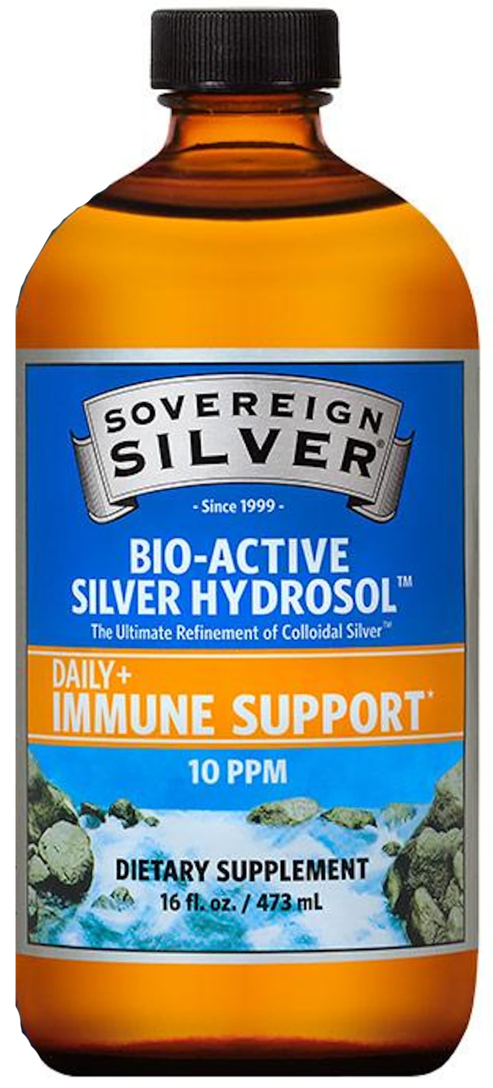
I like the label for option A, I think the nature scene and the blues and oranges look nice.
I chose A. This bottle looks the most like what would be found in a health store. C a close second. B and D are too ordinary.
A and C look more natural and safer.
I love the way the bottle looks. It is interesting and not generic and it clearly says what the supplement is intended for
The label picture looks the most natural in option A
This looks like a product that has been around for centuries. I like the river on the label.
They all would do fine I imagine but the more colorful I chose because it seemed the best of the four choices when it comes to my taste.
I chose A because I like the natural scene (water rushing over rocks in the image).
There are more natural elements presented on the bottle. It makes me think that it is healthier.
I'm a customer and I use A. I love it. C looks the most trustworthy after A.
I like the color of the bottle. I think the description on the label really stands out and sounds like it will work and help you out
Assuming they are all the same inside, I prefer A because it is colorful and attracted my attention. I also prefer option C. I felt D and B are too plain and would get lost on a store shelf.
I like the color of the bottle in A and the label looks refreshing and the color matches well.
A seems focused on immune support, which is important these days. It stands out and I would be more interested in the product for immune support reasons.
firstly not knowing the price, the top 3 i chose were double the size (8oz) of my last choice. i think the labeling on my top two were more direct and scientific sounding. the other just states "supplement"
A looks like it is an established brand with a long history.
I personally prefer orange and blue as there are some of my favorite colors. Therefore choice A is my favorite.
I like the light and brightness of the label. It is eye catching and natural looking
I would pick option A because this product design bottle looks the most attention grabbing and trustworthy, there is more information provided on label that is relevant and resonates well.
My first selection is the most appealing to me. It has a more vibrant and attractive looking bottle and it catches my eye more.
I like pictures of nature when I am buying a "holistic" product. It makes me feel that the product is healthy.
The bottle for A is pleasant colors, made me comfortable. Bottle D is not as friendly but very clear in its labeling and the word "SAFE" sticks out nicely. C was third because the colors are nice and I think blue glass bottles keep the product integrity from breaking down. I chose B last because it is so industrial looking, scary.
Option B looks really old and outdated especially the cap on the bottle. Option D's label looks old to me as well. Option A looks fresh and new.
I like option A the best. I like the amber bottle along with the blue label. it is attractive and eyecatching
colorful containers/labels are always better than plain white ones. They allow the text and colors to jump off the label. The white labels are too plain and a dime-a-dozen in stores. The product needs some personality so the more colorful container is best.
I have never heard of nor have knowledge about the purpose of Colloidal Silver, so my evaluation is on the medicinal make up (Choice 1 being Option A seems to be a new means of processing making it more efficacious), and then the other 3 that appear to be a "standard" product, I rated in order of greatest PPM in the dosing (B, D then C) presuming it would provide better value for the money the higher the PPMs were.
I chose panel A. I like the bottle itself, dark but one can see the liquid. I also was drawn to the artwork on the label. It is very noticeable.
I've used Sovereign Silver before and trust their brand, so i'd try them again.
The label on Choice A was clear as was choice B. The other choices had labels that were too busy to understand at a glance.
I could tell more that there was immune support with the label.
A has a catchy brand name and a good tagline for the product - both make it appealing! Looks like a brand that's been around a long time and knows what they're doing.
First choice for the product that I would rather buy is option A because of the color which would convince me that it has a pleasant tasteSecond is option D because it indicates pets as wellThird is option B because it support the immune system but the color is not as attractive as option AFourth is option C because it reminds me of the Philip Magnesium medicine
Option A is great looking labeling that really stands out. Definitely an eye-catching label. I'd buy option A.
I would choose Option A because the words "Immune Support" jump out to me on the label - it would make me click on this product. I like Option C second best because it has the picture of the ocean waves on the cover - the picture really attracts my eye. I do not like Options D and B nearly as much because the label is crowded with writing, which keeps any particular wording from jumping out at me.
A and C are cheerful, pretty, bright, eye catching and unique. D and B look scientific and reputable, but they are not as memorable.
I chose A first because I like the water scene in the background of the bottle. I also like the color of the bottle and how I would be able to see how much of the product is left in the bottle. C is next because it also has a very natural, water picture in the background. It makes it seem like since the image is so natural that the product in the bottle must be natural. I really like the blue of this bottle, too. I also like how the information is displayed on these first two bottles much better. It does a better job of telling you what it does for your health. The last two bottles make it seem more like it is something to be used in a science experiment. I like the D bottle over B because the information is displayed a little better on D. It's spread out more instead of just focusing mainly on the supposed product name.
I like A & C because they seem fresh and new. D & B seem rather generic to me.
I thought that the first two bottles and labels were very colorful and eye catching.
I'm not sure why but option D reminded me of cough medicine. I thought option A had the most clear description about what the product was and was easiest to comprehend quickly.
I would choose this bottle because I really love the picture on the front. That picture would make me take a second look at the product online and I would want to know more about it.
I would choose "A" it is just what I need to stay healthy.
I don't know these companies so I based my choice on the label design and colors. I chose A because I like the look of this one best. I like the blue and orange colors and the design.
This label looks the most trustworthy with the banner, font style, and the bright blue colors on the front.
I would rather buy option A, I like that it has a nice bright label and it's easy to see the important information. Option C looks pretty good too, the bottle is a nice color and it has a nice photo on the label. Options B and D look very chemical and medicinal, I don't like those that much.
Option A is my favorite because the label/ bottle design looks "vintage" and trust-able. It also looks familiar to me which makes it feels safer to consume. D and B looks like sanitizer so I am not a fan. Option C is just too boring and I dislike the word "holistics" because it seems like anti-science.
I would rather buy A; it highlights that it's immune support very well, and I like the graphics. B and D are just ok. I find the graphics on C confusing.
76 Responses to Option B
B looks potent and backed by science
I would prefer the product on option B because of its color and design which I find to be appealing and it also captures my attention.
Option B's label looks professional and seems more scientific. Option C has a pretty label, but lacks the sense of quality of Option B. Option A's label seemed a bit cluttered and gave it a haphazard feel. Option D was too plain and didn't catch my eye at all.
My choice is based on my preference over the graphic design of the product packaging that looks attractive.
B is the most concentrated formula at 30ppm, followed by D at 20ppm.
The two with the highest ppm also have the best looking labels. I chose B first because it has 30 ppm while D only has 20 ppm. C and A only have 10 ppm and A also have the least attractive logo and label.
I like b with the most professional looking label.
B it is a higher dose of product.
I much rather prefer the option B silver supplement product image because I like the gray and blue color scheme of the product label and the large and easy to read text seen here the most. I chose options D and A second and third because I like the simple silver background color with the easy to read text on the option D product label more than the more complicated product label shown in the option A product image. I chose option C last because the text is more difficult to read on this product label because of the color changes and the scenery is rather complicated and makes the text more difficult to read clearly.
Option B is the most attractive overall. It puts focus on neutral colors, and blends them together in a natural way. The lettering is an appropriate size, making it easy to read.
Too many colors makes it look cheap. I know, bad reason, buy that's how I perceive it.
Option A is a no BS, right to the point, no false promises, this is what I am, plus the color scheme suits the product.. Option D has more a periodic table feel than the others, while also hinting towards something healthy.. Option C is hinting as something involving the ocean, which is a bit confusing, and Option A looks like orange juice..
B is my first choice...it is the most potent.
I think B has a very professional and high quality look to the label. It has all of the important product information and benefits clearly visible and doesn't have any flashy claims or colors.
I like B because it includes the periodic table of elements designation for silver. It appears serious and scientific, and appeals to my intellect. A and C remind me “snake oil” product labels.
Number 4 isn't bad but I'm not a fan of the blue bottle. Number 3 I really like but i feel like the dark part of the bottle helps preserve it. Number one and number 2 both Have nice dark coloring but I prefer the design of number one it's a little more modern
I would buy Option B. The colors are attractive, and they look higher end. I feel as though this one would work really well.
Option B. it looks like a lot of helpful info is on label and it is visually appealing too. I like the professionalism it shows
The coloring, especially how the blue works with the silver, the use of the periodic symbol and the general feel of the design all works well together.
If i'm looking for something I want the name of it in big bold letters so I can see it. so my top two choices are the ones that say COLLOIDAL SILVER in the biggest letters.
The packaging and label graphics on options B and D look much more professional and trustworthy than options A and C, which look cheap in comparison.
I like the color of the bottle, and the maximum 30 ppm available in the ingredients list.
B has an attractive color scheme and professional layout.
A and C look like the most generic and cash grab bottling of a health product. Nothing about those to tell me it is to be trusted. I like B's packaging because it's reliable looking and unique enough that it would stand out.
I ordered based on most professional label design
A is my last choice because the blue and orange look hideous together and the label itself is too busy. B is my first choice because the label is highly legible, and the silver goes well with the name of the product. I think B's color scheme is more attractive than D and I don't like how the text is a bit more crowded into D's label. C's label is ugly, but the bottle is more attractive than A.
The large font snd the blue and silver labeling is the most eyecatching. The info stNda our and us quite vusible and readable.
I like B and D because they convey information and are clean and crisp designs. Why do you have pictures of water for a colloidal silver label? It's too busy.
I like the look of my first choice the best. It looks the "most professional" to me. This would be my selection.
I like the plain bottles over the ones with an image on the label. I feel like the one with the wave or river just looks cheap and not that appealing.
B looks the most modern and up-to-date. D is second in that regard. Between D and A there is a huge dropoff, as A's design and layout is tacky, for lack of a better word. C's is difficult to read and looks like a rough draft of an idea.
the bottle design of option B looks more authentic and with better color design also
I chose option B because the label on the product seems to fit with the name. I like the silver blue color with the silver.
I’m not familiar with the product. I ranked them by strength or potency of the PPM.
I like the cleaner, more scientific look.
I like the no nonsense approach to b and d. And I like the layout of b best. Highlights what’s important well
I prefer the more modern looking choice B. It has relevant information and a clean looking design.
I chose B as my first choice because I felt that the label was the easiest to read and I also was attracted to the colors/layout. I then used this criteria to rank the rest of my choices.
i liked Bs packaging the most as it is straight and to the point, letting the consumer know exactly what they are purchasing.. C and A both appear cheap and not visually appealing at all. D i am nuetral on.
B or D I would be interested in buying because the labels look professional and put out by a pharmaceutical company. I don't think the orange colored bottle looks professional. As far as C I would want to see some kind of proof of the holistic benefits.
Option B has the darker bottle and metal cap I like that. D also has the dark bottle. I like the color of C next, option A looks like a cheaper brand.
I like the darker bottles as they preserve the supplements better. Plus, the labels are simple and easy to read.
B looks the most professional by far. If I were to take something like this, I would want the most trustworthy looking brand for sure.
If I was going to purchase this product I would want a very official looking label in bottle so I'm going with things that look very official and professional here and that's why I chose options B and D the top of my list cuz I feel like those labels are very professional looking and I like the basic design of them and I understand that this is a powerful supplement based on those labels
I chose B first because I am familiar with the Triquetra brand, but otherwise I don't care because I'm not buying this product.
I would buy option B because the design looks premium and established. It gives me confidence that it’s safe.
I picked the ones that look more like medicine and less like holistic snake oil.
B has the least cluttered-looking label and appears to have the highest concentration of silver via PPM. The "nature" pictures in A and C are off-putting.
I ranked based on the strength of the product.
Option "B" seems the most professional and clinical. Option "D" is also good but possibly too clinical. Option "C" looks like a nice homeopathic option. Option "A" looks like a bottle of snake oil.
I'd buy this product. I find it to be more professional and appealing.
I prefer Option B because I want to dark bottle to protect the liquid from the light. I like the easy twist off cap.
B is by far the most professional-looking and authoritative-looking label. The design, layout, and colors make me believe in the product. C and A are not bad but not nearly the same level as B. The color choices in D as well as the text don't do anything to sell the product. B is the best.
The color of the label matches the bottle best in this order.
I wouldn't buy this product but if I was going to look for this product regardless I would choose this one because it looks more serious
I didn't like option C because the graphic was too busy. I went with option B because I could get the info I needed quickly. I want the stats of what I'm purchasing ASAP.
Most effective (higher PPM) and provides adequate info on the label.
The gunmetal gray/navy blue bottle looks the most like an extremely strong or concentrated product.
Wasn't interseted in the last one. Enjoy ones that look more official, feel the most "medical"
I like B and D because they're the clearest. A substantial amount of information is provided in an easy to read way. I like B because there's metallic silver in the design. The waterfall in C and A don't make sense for this context.
I chose option B as my favorite because I like the simple blue and silver color scheme on the label. It was the easiest one for me to read and was the one that attracted my attention the most.
B and D look the most professional compared to A and C. I don't understand the whole water references.
I like the silver and blue label of option b. I think it looks like a quality product...
B - The label is most appealing, easy to read, and descriptive.C - The package is indicative of the product and attractive. D - The packing is clear and concise but unattractive.A - This packaging is overwhelming and does not clearly depict the product as much as an image.
Option B looks the most modern and professional. It gives you a higher sense of trustworthiness over the others.
Love the design, the flower of life and the 'Ag' chemical symbol.
I like B & C best as it clearly says what the product is in bigger letters.
I prefer the ones that say collodial, as that is what I am familiar with. I also prefer the one that says Nano.
Honestly it's just as simple as the packaging appealing to me more. All of the bottles look professional which would be expected for immune support, really just coming down to personal preference of the look at this point.
I chose in order of descriptiveness on the bottle. I like to be totally informed upfront about products like this.
B is rather plain, and has a silver color, which makes it look more authoritative / legitimate.
My 1st rank is simply that it contains the highest concentration of product vs size- 30ppm in an 8oz bottle, subsequently the next highest concentration 20ppm is my second choice. As for the last two, 10ppm/same bottle size, really my choice would come down to the color of the bottle- the blue color would most likely catch my eye over the bronze/orange bottle.
i like the label and coloring of b best. it looks natural but normal tasting
I like the information given on this bottle as well as the packaging. I like blue and grey
Option B because I'm thinking higher strength equals smaller dose.
I think that brown fits the product category better, especially dark brown. I like the font and design of B, and the blue and gray label. B and D also provide the proper amount of information on the front of the bottle. It's harder to read C, and I don't like the picture of the waves.
32 Responses to Option C
I like option C the best. It grabs my attention because of that beautiful blue color on the bottle. I think when it comes to getting someones attention- the colors that are used are always the first thing to grab them and stand out. Very pretty bottle.
I wish is the blue bottle over all the other options because the brown reminds me of medicine
My first choice, option C, is bright and see-through. It conveys a sense of purity. The label is attract and seems trustworthy. I also like the label of my second choice, option B. The silver and blue make it pop. Option D seems to be an average looking label. I did not like option A. The color of the bottle seemed to clash with the colors in the label.
I like the imagery on the label, it helps draw me into the product more, the other labels are pretty boring looking, the pictures liven in it up and catch the eye
I really like options C and A because of the calming blue of the bottle and the image displayed.
C is the one I would reach for first because of the eye-catching label. I love the colors and design.
I chose option "C" as it shows this product is Holistic and that means there are hardly any synthetic ingredients added to the main product. Its seems to be more of pure product when the word "Holistic" is branded on the label of the product.
I think the blue bottle of option C is really cool, so that is the one that I would choose.
i like c because of the colors, a because it states daily immune support, b the broad spectrum immune support, and d i didnt like because it has to say safe for pets and kids
The images on my top two choices are nature scenes which are easier on the eye and make the product to seem more natural than the two medicinal looking options.
I like the pictures on C and A as they remind me of outdoors and health.
Option C looks more visually pleasing and feels safer, option A looks safer, options D and B make me think about cough syrup or prescription medicine.
I like Option C as my first choice. The graphics and color scheme are attractive and interesting. Option B is sleek and modern looking and has a very appealing look. Option A is also quite nice and has a simplicity that's pleasing. The last option looks a bit dull in comparison.
I chose option C because the water on the label makes me feel fresh and healthy.
I think the more colorful, details labels are better. I especially like the aqua color of C.
I selected option C because I like the color of blue on the bottle. This is my favorite color. I like option B because the label looks modern and interesting. I do not like option A because it reminds me of peroxide.
I like the option C as it doens't really look like a regular medicine bottle. It has a nice picture of waves in the background so makes you feel confident and fresh. Goes a little bit well with the "Immune Support" Option A looks like good one as well where it has maybe a waterfall in the picture. That also makes one feel fresh and goes with the theme of the bottle as well which is about "immune support". But the orange color of the mixture inside still makes it look like a medicine. Options B & D don't really utilize the same technique here by not putting any images in the bottle labelling. So they don't really look attractive at all.
I ranked my choices based on the attractiveness of the product labeling along with the information given on the labeling. My first choice has the most helpful information clearly listed. The following selections were made based on that same pattern.
C and A look the most unique to me and get my attention a lot easier than the others
i think for a supplement C or A looks more herbal and less chemical lab like B and D do
With nature pictures they give the feeling that they involve natural ingredients.
Brighter colors always catch my eye first. Lack of color looks so generic
quite difficult to judge these. i went with "C" first because i like the picture of the water on the label and i also like the color that the product appears to be. it looks like the color of water. i was going to go with "A" because i like the picture on the label best but the color of the product itself looks gross; it is brownish and looks like medicine. "B" definitely comes in last because it only has 8 ounces.
Chose C first because of all of the choices it least looked like a medicine bottle. I know if I want my kids to try something and it looks like medicine it will be an epic struggle to get them to swallow it. So C is the most kids friendly in my mind. Followed pretty closely with choice A both are pretty good ways to get my kids to try this. I did not only think about what kids would like but me as well and as an adult I think C and A are just better designs. I know they are all supplements but all supplement bottle look like designs B and D. In the end for both myself and my kids choices C and A are the best.
The picture presentation on the bottle has a very calming effect which greatly represents the product. It is very attractive and appealing to me
I would probably buy either product C or D. I like that the labels on them claim that it is safe for Adults, Children, and pets. That is very important to me. I also like the labeling of Product C. The picture on the label really draws my attention.
I would first choose C because it is a lower dosage which would be easier to control safely, and because it is safe for adults, children, and pets. I'd choose D next because it is also safe for adults, children, and pets. I would choose A next because it is a lower dosage which I feel is safer, but it doesn't talk about safety. I would choose B last because of its higher dosage which is less safe and easy to control and because it doesn't talk about safety for adults, children, and pets.
I looked at the four bottles and selected the bottles in the order that I would rather purchase. I liked color of the top two bottles that I selected. They had a very nice color and really stood out from the other two bottles. I then looked at the labels of the bottle and ranked the other two choices.
C. The label looks nice and the bottle makes it look more appealing. B. I like the way the label has all of the main points in bold letters or in a square separate from the rest of the name. A. This looks like a cough syrup when I first look at it. The label is nice but the bottle needs to be lighter. D. This looks like something from the early 1099's
I like the blue bottle with the immune support near the top. I love how the safe for pets kids adults is on label. D is next since it has that is is safe for kids adults pets where A doesn't inculde that on the front A is nice color choice but doesn't have important information on front. B unless you are a chemist and want to know the symbol for silver who cares .It doesn't include that it is safe for everyone .
C seems the most natural and B seems the most powerful so I think those two labels are the best.
The blue in the label in C stands out the best here for me.
46 Responses to Option D
The cap looks more modern on this bottle.
Option D was selected for it is the only one that appears to have a child proof cap on it. All the other bottles just have regular screw tops on them allowing any child to play and spill the product.
D and B have cleaner designs on their labels and look more clinical to me, which makes me think they are higher quality
The reason i chose option d is ONLY because it says children adult and pet safe. Now put those label words on bottle c with the color and picture and wow what an eye catching product you would have.
Options D and B the labels are less cluttered. Options A and C there is too much going on with the label image
Option D is my preferred choice because of all the options I find it does the best of clearly stating in a legible manner what the product is and its intended use. The rest of my choices were in descending order, using that same criteria. Option C was my least favorite because I thought the label was too cluttered and hard to read.
D and B look clinical and don't distract me with fancy imagery, so I take them more seriously and feel like they belong in my medicine cabinet. D's label is a bit more interesting and colorful without being too showy, and the style looks professional, while B is a bit less official-looking. C and A distract me with the backgrounds, so I don't take them as seriously and find it harder to read the information on the label.
Options A and C look sort of woo-y, as though I’d be buying snake oil. I’d go with either B or D as those labels look professional.
I ranked these in order of what seem most professional or medical grade and omitted labeling with imagery
I liked the D the best because I felt all the necessary info was right on front and it plainly stated everything I would want to know without having to look too hard.A was my next choice as I liked how the immune support stood out to me.I disliked D the most as I felt the label has too much clutter on it.
First pick is D because it looks good without being scientific. Second pick is A because I liked the colors and simplicity. Third pick is B because I liked the professional look but seems overly complicated. Fourth pick is C because the label doesn't look good.
I really like D, it seems professional and straight to the point. I like that it is 20ppms. The 10 seems too low and the 30 too high. I think A looks like it is trying to see itself too much, like it is lower quality. C is nice, but I would need to read the label, doesn't seem straight forward. I like B but it is too low of ounces and too high pps.
I would pick option D because the label gives the most information. On the label the small block help you understand who and what this product is for.
D looks like a professional quality product and the name is familiar, B looks like a good product but looks like it is a small size compared to D. A and C look like fly by night products not sure if I would buy those thinking the manufacturer might go out of business and not support the products
It tells you right on the front that its for everyone even your pets. Have to take care of the fur babies.
I'm not sure that I would buy this product. I would need to do more research. I selected option D and A because they have "Immune Support" most prominent on the label. That helps me to understand what this is used for and caught my eye the most.
The simple design of the top choice looks more official and capable of helping the consumer
I would buy option D as it gives safe and secure vibe when compared to other products.
i feel that choice d and b looks equally professional and looks like a serious brand. i don't like how c and a looks as it looks cheap
choices d,b,c shows more details about the product
The label on Option D gives me information on who needs it and why. I like it best. It's the only one which leads to me think about purchasing.
Option D is my preference because the bottle appears to be the simplest design and clearest to read. I also like choice B which is similar in its simplictic look. Options A and C feel like they could be quack products due to the imagery and choosing rivers and oceans that don't make sense to me.
I like the silver colors and more subtle design, no pictures, etc. I like the design and layout of options D and B equally.
The label on C is so busy and visually overwhelming, I kind of just don't have the energy to process. B is my favorite in terms of design (sleek, modern, clean) but D feels the most informative and helpful at a glance to get a handle on the product.
The botle in D tells more than the others, it has the number of servings, that it is for strong health, safe for adults and pets and it is 16 oz. I do like the coloring of A and it is 10 PPM which seems more than the 20PPM of D.
Option D because it states that it is safe for adults, children and pets. I ranked accordingly
As a first purchase option, I prefer Option D, because the label has very professional colors, it seems like a specialized product recommended by doctors. In addition to indicating the number of servings.Second, option B has colors that look professional, although it does not tell me the number of servings.Option C, I like the color of the bottle, which is different, but the label is very cluttered with information and graphics.And finally option A I don't like because it looks like an old product
Option D is the label I prefer, it is simple and easy to understand and the print is large enough for me to read it.
I prefer the darker color bottles better because I feel like it makes the label stand out better and it just looks nicer. I think the blue and lighter brown are little too light and don't really look as professional to me.
I like D and B the best. I think D is a little easier to read. A and C look too much like snake oil bottles.
D is the easiest to read as far as the concentration and the safety of use for people and pets alike. B has the best looking label and easiest to read, seems to be a very active and powerful liquid. C has my least favorite looking label but it still mentions it is safe for people and animals, though small and hard to see against the background. A is a great looking label but it is a weaker concentration and doesn't mention how safe it is to give to animals.
C and A look like some knock offs where they slapped a few pictures on a bottle. D and B look more professional and trust worthy with D just a bit ahead of B.
Because option D product can be used by everyone including pets and has 48 servings
I think that these products are more luxurious in everything so they are the options that I would choose
I'm mostly like it because of the coloring of the label in regards to the first choice I made here
Option D as it prominently states on the label it is safe for adults, children and pets. It also has a higher dosage at 20PPM. The label is quite eye catching with the triple color design. The large yellow square really sets this label off from the others. Immune support is visible and prominent as is the brand name and product name.Options C and A have the best imagery on the label. They are ranked second overall. The second place ranking is due to the fact the dosage is only 10PPM whereas Option D was 20 PPM. Options C and A look great, have an amazing and interesting image on the bottle, but the dosage knocks them both down to second place.Option B looks like a bottle right out of the chemical closet at work. It does have the highest dosage at 30 PPM, but the label has something to be desired. It looks very industrial and chemical.Option D is the choice among these four options. If Options C or A could up their dosage, these designs would be the best for the market place simply due to the imagery on the label.
The ones with the photos look like they are not professionally manufactured which makes me question the safety and quality of the product. I like that Option D states that it is safe for humans and pets.
Looks like a boring product so I like the silver packaging. Seems to fit with the name.
D because it says safe for adults, children and pets!
I specifically like that it is safe for children and pets.
I would buy the product that is clearly labeled safe for my pets because I would most likely be using this with my chickens
I chose it based on the bottle showing "Safe for adults, children and pets". That is why I chose D and then C. I chose D first because it gives number of servings which is helpful info.
D because I like it that the colloidal silver is silver-colored. B, because it has more colloida silver, 30 ppm, and I like the slver banner. C because it has the least ppm. And A becaise it also has only 10 ppm and "colloidal" is very small.
I'd probably buy these products based on their labels and design
I feel like D and B look like higher quality, more premium products than C and A. My favorite is D, I find the label very appealing and professional looking.
A looks too cartoonish, c is ok B is better and D looks the most professional to me
Explore who answered your poll
Analyze your results with demographic reports.
Demographics
Sorry, AI highlights are currently only available for polls created after February 28th.
We're working hard to bring AI to more polls, please check back soon.

