Poll results
Save to favorites
Add this poll to your saved list for easy reference.
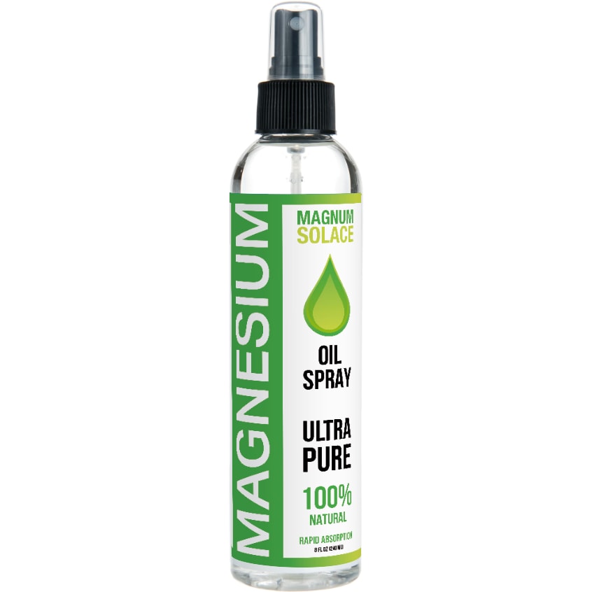
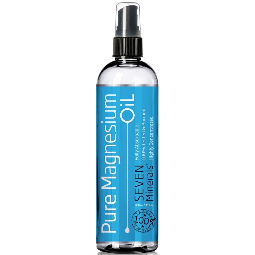
If you were shopping online for a topical magnesium supplement and saw the two labels below, which would you click on first and why?
Age range
Education level
Gender identity
Options
Personal income range
Racial or ethnic identity
17 Responses to Option A
They both look good, but A looks purer, and I like that!
Ultra pure is better than just pure. Green prettier than blue.
I like the ultra pure on the label versus 7 minerals.
Option A’s packaging is much more interesting and stands out more. I think this packaging would draw my attention more. It is also easier to see the details about this product with the change in background colors, font colors, etc.
I like the way the label is laid out in option A. More so then the other one
I like the green one, it stands out to me and I would pick it off a shelf first in comparison to the other option.
Looks more natural....
I like the lime green color, it is very eyecatching. I think the print on the bottle is more legible than the other choice
I would click on option A because it says 100% natural and ultra pure
I would click on option A first because it says it's 100% natural and I like how I can read everything on the bottle easily.
I like the green label.
I would click on Option A. I like the large capital lettering on the packaging, it's clear and easy to read.
Green is my favorite color so this one would stand out more to me.
A is more colorful, bright, bold, and easy to read.
I can read the label without having to put my glasses on for small print
I would choose this label because it says that it is ultra pure. It also caught my attention with the bright green color on the label. Also the green drop made me look right at the label.
I chose A because the label is easier to read. The blue label is pretty, though.
33 Responses to Option B
B looks more professionally designed and the layout looks very clean.
I chose the design that seems the most upscale and professional.
I would likely click on Option B. I like the blue color a lot. It feels trustworthy and honest. I like the Seven Minerals text and would want to learn more.
To me, the label in Option B looks more professional and legitimate. This one draws my eye to it more than the one in Option A.
B looks more natural. Magnum Solace name threw me off.. I first thought it said magnesium solace and wasn't sure what Solace in a oil is.
I would click on this one first because the color is pleasing, the label design isn't basic making it look cheap and I like that it more clear that it's pure.
I prefer Option B because it looks slightly more luxurious and sophisticated compared to Option A. It looks more modern.
Blue feels pure and fresh.
I like the blue label a little better. It is attractive and nice. I would click on this one and buy this one. I think magnesium is good and helpful. Thank you.
I love the blue color. It puts me in a relaxed mood.
I like that it's blue - a good shade and it catches my eye. Then, what seals it, is that it says "pure" on it. I like that.
I like monochromatic scheme -- and the blue/white combo looks nice. The green in A looks a little less slick....and Magnum Solace sounds like a fake name as opposed to Seven Minerals which sounds like a company that is focused on this kind of product.
It looks more professional/legitimate
I like choice B the best. I love the look of the packaging.
I would click on Option B because the wording "Pure Magnesium Oil" stands out. I like seeing that it is a pure oil, and the label in Option B is easier to read. For example, I don't know what the words "Magnum Solace" mean in Option A, and I don't believe that people are going to take the time to look it up.
I like the color and design of B better. You cannot minimize how important packaging is. A is kind of generic and looks like a 'green' product. B is straight-forwards and the color choice for the label is good.
The blue label is appealing to me. Both are nice, but my favorite color is blue. The blue label with white and black lettering seems more "upscale" and cleaner. The additional information on this label is also appealing.
I chose option B because the label is more attractive. It looks like more creativity went into the label than option A.
Option b is more eye catching in my opinion
I picked b because I the blue white design of the bottle.
I chose B because I am naturally more drawn to the blue color. It's soothing and visually just more attractive than the green.
I'd be more likely to purchase B first if I saw these labels. I think it has a more professional and cleaner look to it. I feel like more effort when into the design and color use and visually, I think it's more appealing.
I think that option B is a more modern design and looks more expensive to me. I also like the blue color better. I also like the idea of 7 minerals included.
The turquoise label in option B is more appealing to me. The color is bright and bold and it stands out in an obvious way. I like how classy and expensive the label looks with it's silvery text. This label has an expensive looking quality that option A does not have
B looks more high quality. The label fits much better with the product and is much more appealing and modern.
This just looks more soothing than the other. I like the blue color.
Green looks like an herb. Blue looks like a mineral. I expect to see green on an herbal product but not on a mineral product, which should have cool hues.
it looks amazing
I like B since the blue label is shiny and stylish
This is more subtle and professional, which appeals to me in this product.
I think choice B just looks overall better than A - I think the simplicity of choice B makes the product look more expensive and higher quality than choice A.
I think because it says 7 minerals it sounds like it has more ingredients than the other ones. I also like that it is tested and purified.
I think the blue makes the product look very pure.
Explore who answered your poll
Analyze your results with demographic reports.
Demographics
Sorry, AI highlights are currently only available for polls created after February 28th.
We're working hard to bring AI to more polls, please check back soon.

