Poll results
Save to favorites
Add this poll to your saved list for easy reference.
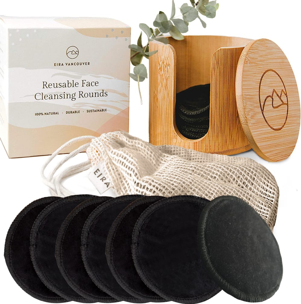
If you're wanting to buy reusable makeup remover pads on amazon, which image instantly captures what this product is and makes you want to buy it?
30 Responses to Option A
I like the choices shown here with out the smaller images of the pads in the alternative.
I like the up close visual of the makeup remover pads, it is more attention grabbing
The box is very readable and the makeup pads are close enough for me to get a good look at them.
I like choice a because it shows the cotton pads more close up.
The closer view in option A does a better job of letting me see the product.
A looks more attractive, I like the scale of the image.
The image on the left captures what the product is because the pads are larger and the box with the product name appears to be larger with larger text. It stands out more to the consumer.
I think that A is great at laying this out. I think that it displays all that comes with the product and shows all of the objects that come with it. Overall, this is product is better laid out and presented in A.
I think the closer up image of the makeup remover pads looks better than the image of the remover pads in the other option.
I can see the product better as a whole in A
I like seeing the singular row of the cleansing rounds here. I feel we get the idea from that single row. I like the last one being off centered so you can see the product better. These look great and are much more environmentally friendly. Great looking product and option A is a better choice overall.
All of the pads are in one place, in front of the bag. This makes sense visually, there is no reason to have them behind the bag also.
The texture of the product shows detail and the item appears to be of suitable quality. I would prefer this image simply due to the perceived professional nature of the company in displaying its products as desirable.
A gives you a more detailed view of what the product is, and makes it seem more attractive. There's too much extra going on in B.
This one gives you a better view of the actual product. It's closer and gives you a better angle.
B is cluttered. A is neat and close up.
I think the product looks better at the more upright angle.
The larger pads in Choice A make it more appealing and most likely for me to purchase.
The bars on the sides don't look natural and are a bit distracting, My top choice is very cool for sure!
I lime the way the product is being laid out.
I like option A a little better. The bigger photo with the pads looks better to me.
the rounds look flatter, the others look more abrasive
You can see the product better in A
Would like to buy option A is the best choice thats attracted me more to buy the product, simple and superb collection.
Option A has the rounds a little more clearly shown. Also Option B has too many displayed.
I love the up close images because I get a better idea of what I am looking at. It is very appealing to me and it is easy to process.
This shows a more closeup view of the applicator pads that show the texture and the softness more effectively.
Even though reusable makeup remover pads don't seem as realistic picture as it should be, but it enlarges the image of the product to attract attention of the customer.Comparing to choice A, picture of choice B is more realistic, but the product doesn't instantly capture customer's eye.
larger sized items and layout its clear and appealing
Option A image instantly captures what the image is because of the way the product was shown.
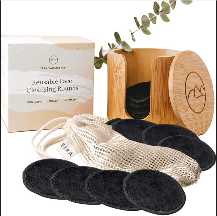
20 Responses to Option B
looks more appealing to me
The presentation of choice B shows off all the products better than the other!
B is detailed, organized, and valuable.
I like seeing it not so blown up.
I choose Option B because I like the layout of this image. Both B and A show the product well, however B is more pleasing to the eye.
i think the set up is nice and neat.
I like option B because the lay out is nice and neat and presents the product in a nice clean way.
The image is a lot nicer and pleasing to look at
I like the layout of B more, it looks nicer to me and less in your face. I would go with B
I like the layout of the product and how it is displayed in option B. The two rows of face cleansing rounds is appealing as it makes it appears as there is more product included. While that may not be the case, the appearance draws me in. Otherwise, the two product images are similar and both are positive. I do like both, I just like option B better.
I like the positioning of the cleansing rounds in Choice B better than Choice A. I like that they are placed in a more subtle way in the background, and they are laid out in a similar manner than the mesh bag is laid out. What I dislike about Choice A is that the cleansing rounds are placed so far up in the foreground of the photo that it is a bit distracting. It takes away from the overall experience/display of the advertisement. Also, the cleansing round at the far right is placed further away from the other ones, which is not aesthetically pleasing to me. It's easier for me to assess a product and decide if I want to purchase it if it's easy on my eyes, which would be Choice B here.
Picture looks cleaner because of the removers being flat.
It's a lot easier to see the complete product with the black discs separated into two smaller piles.
I like how the black is laid out differently in this one
I only chose Choice B because it gives the appearance of offering more pads with them being spread out. It gives the impression that it is a better value unless you stop and count the actual pads.
On option A, the black pads take up a lot of the focal point and are distracting to the. rest of the image. I am buying all of the items pictures, so I want to see everything as a whole first. I like how I can see the bag and the wooden storage container much better in this option. Option A might be good for a secondary image on the listing, but I think choice B is a much better option for the main image for selling this product.
For the angle, looks more real than the other
I can see the detail and material of the makeup remover pad and the overall image provides a calming sense.
I like this one better because it has a cleaner layout.
felt like i would be getting more pads, also felt like they did the better job of showcasing all the pads, as because if they are reusable i would need more then just a couple.
Explore who answered your poll
Analyze your results with demographic reports.
Demographics
Sorry, AI highlights are currently only available for polls created after February 28th.
We're working hard to bring AI to more polls, please check back soon.

