Poll results
Save to favorites
Add this poll to your saved list for easy reference.
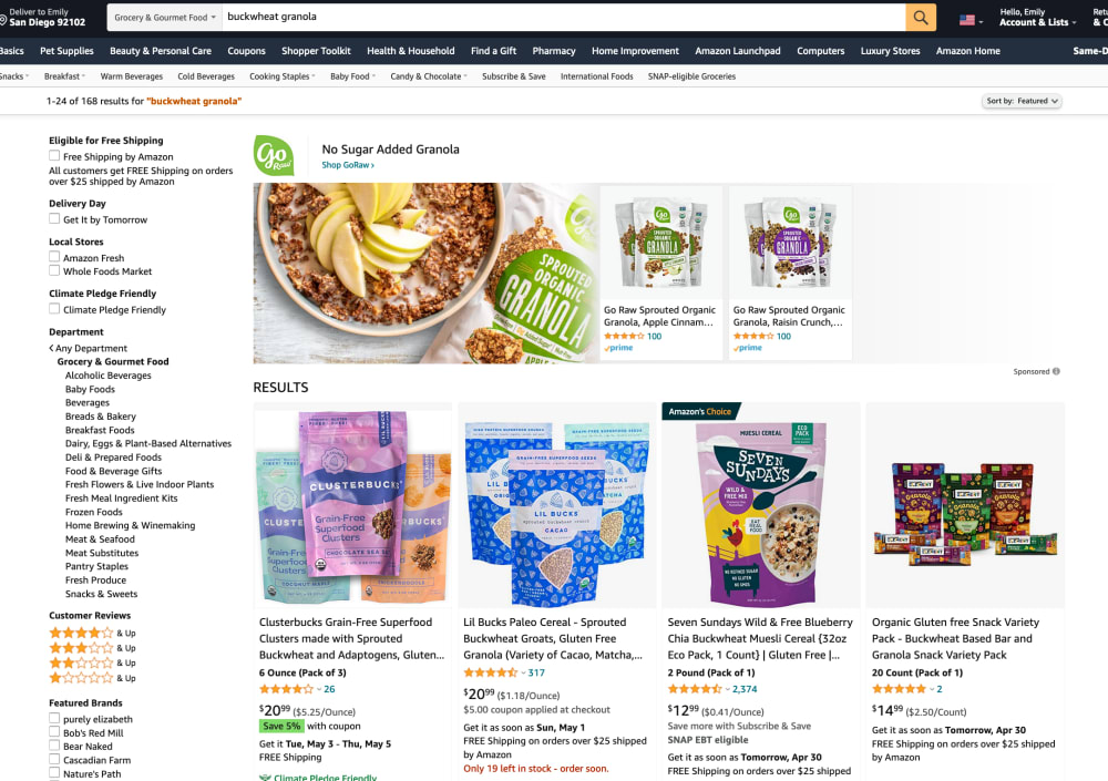
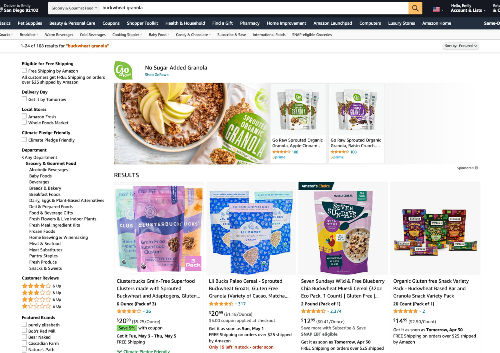
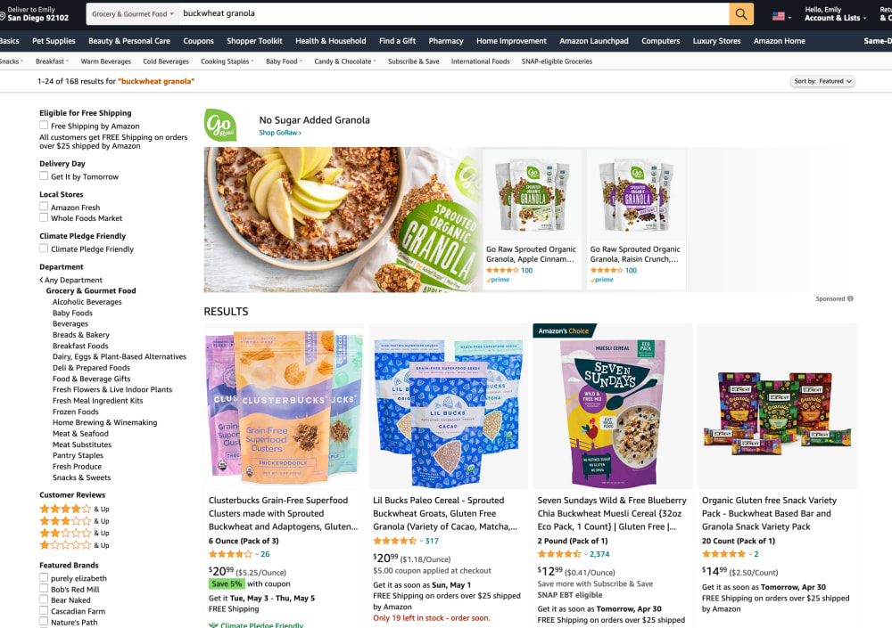
Look at the first product that comes up in search results. Which image is more appealing on this Amazon listing? What makes you click and want to learn more?


Option C won this Ranked poll with a final tally of 29 votes after 1 round of vote counting.
In a Ranked poll, respondents rank every option in order of preference. For example, when you test 6 options, each respondent orders their choices from first to sixth place.
PickFu requires a majority to win a Ranked poll. A majority winner differs from a plurality winner. A majority winner earns over 50% of the votes, whereas a plurality winner earns the most votes, regardless of winning percentage.
If an option does not earn a majority of votes, PickFu eliminates the option with the lowest number of votes. The votes from the eliminated option are reassigned based on each respondent’s next choice. This process continues in rounds until a majority winner emerges.
Scores reflect the percentage of total votes an option receives during the vote counting and indicate the relative preference of the respondents. If there is no majority winner, look to the scores to see how the options fared relative to one another.
| Option | Round 1 |
|---|---|
| C | 58% 29 votes |
| A | 26% 13 votes |
| B | 16% 8 votes |
Age range
Amazon Prime member
Education level
Gender identity
Options
Personal income range
Racial or ethnic identity
13 Responses to Option A
The images of Option A seem to be bigger, and as such make get my attention much more quickly. As such, I ranked Option A as my first choice. Option B didn't really jump out at me, so I selected this option as my last pick.
Option A you can clearly see each individual flavor better and see what sets it apart.
A - first pick because I can easily read all three flavor names in the photo (don't have to read the listing). Unfortunately, it doesn't have the "3 pack" icon, so that's not clear from the photo. B - second pick because of the "3 pack" icon. That isn't obvious in the other choices. But, can't see all three flavors. C - last pick - can't read flavor names, no "3 pack" icon.
I prefer option "A" because a shopper can see the names of all three flavors of this granola and they can see there is a discount for the products they see pictured!
The purple bag front and center is much more eyecatching than the orange bag.
A has the best photo, best laid out where you can see the different products and packaging colors better
I like the use of space in this one, it has some depth so it catches your eye a bit more, its not just a solid block like B and C, if that makes sense.
I like the layout of choice A the most of the three. I find the packaging more pleasing and appealing with its presentation over the other two.
I would want to click on option A because it shows all the flavors in the image so you know what you will be getting just by looking at the image.
I chose option A because I like the purple color package in the front, and in this option I like that the packages are at different levels to differentiate them
Option A is my first choice because the image shows a little more about the other two packages behind the first one (I can see all the flavors on each package). Option C is second because it is a nice presentation but doesn't show as much as A. Option B is last because the presentation is not as clean as the other two.
all seems same but its better / good / average
I put in order by how each listing appealed to me and how much it caught my eye - A is best then B and C
8 Responses to Option B
Seeing the variety of product shown in this sort of stacked fashion draws my attention more towards it
The purple is appealing with the look of B here, the other one is nice with the frontal one in orange for these bags
I like the way b and c were laid out but I prefer the darker colored packages
The image that is the Amazon's choice is most appealing. I am interested in Amazon Choice products and the image on the packaging looks appealing and the packaging looks resealable and well made.
I like B because I like the purple color in front and I like the packages all the same height. I like the way the packages are arranged in C but not the color arrangement as much and I think A looks odd with the front package higher.
I do not see any difference here, all results are the same, I like "seven sundays" granola the most, packaging is colorful and very appetizing looking.
They are pretty identical it does not look very different at all.
I would click on the image on option B since within the image, it indicates that the item comes in a 3 pack. Since consumers often look at the picture of the product first, having that extra piece of information of it being a 3 pack is more appelaing to a buyer like me. I would click on option B for sure.
29 Responses to Option C
I like the apples on the cereal
it looks the most professional. the bags aren't wrinkled
I voted option C number 1 because overall it’s the most appealing and doesn’t have that weird folding portion. Option B is second because it lets you know that it’s actually a pack of 3.
None of these are bad, but I do prefer option C best because it's bright and gets your attention more with that orange in the center, especially compared to the others. Then there's option B, and basically I like this better than option A because it's overall bigger - which is important, especially for a thumbnail image. Anything that helps makes something more readable is good.
In the middle photo, the first package in the second row is much clearer than the other two. Also the photos are much brighter in that choice.
C is filled with a multitude of different characteristics that are indicative of a strong brand. For example, the wording is strong and has a deep and understandable meaning to it.
The orange color in C really stands out amongst the other products, but in A you can easily see the different varieties
I chose option C. I like the peach colored bag as it has an allure about it.
The slight difference in C (with one of the images) makes the page look cleaner and more clear
I picked C because I feel I have more of a comprehensive view of the products and the subsets. Also, I like this arrangement of colors/images.
I chose C first because I prefer the clusterbucks with the orange in the front and how they are lined up as if on a table. I chose B next as I do like that the product still looks like it is sitting on a table but they appear be wrinkled. I chose A last as I do not like them not being evenly lined up and these also appear wrinkled
C stood out most to me, it has a brighter look that makes it look clearer to me and more interesting
Option C looks the most eye catching, credible, and professional which makes me the most interested to know more. I think the color placement works the best
I think they're all well arranged and almost identical to each other.
I like C and B because the 3 are aligned in a cascading but even effect, and C is the top choice because I love the cantaloupe color the most as opposed to purple. A looks weird with one in the middle floating.
I really like the placement for option C because it makes the page easier to digest overall..
I like the lighter colors used in the image of option C. This color scheme gives a lighter, not heavy feeling, sense about the product.
I like the image of the granola, which looks healthy and vibrant. The apples add a fresh accent as well. Looks like a nice product for sure!
Is this supposed to be in the "spot the differences" puzzle book? If any researcher thinks the human psyche works out differences of a magnitude this infinetesimal they should be mistrusted.
They all look just as good as the next to me. I don't see anything that would have me choose one over the other.
I prefer the straight on unfolded look to C. I think that fold or wrinkled look to both A and B just looks really off to me and I feel like the fold is trying to hide something. The straight on clean and clear look makes it professional to me.
I think option C is the best way to display the items, it has a cleaner look
In C, the bags seem bigger for some reason, although I think I like the color of the image of the food on it better in the other ones. The image of the food seems a little darker on the others. So, I like the presentation of C more, but slightly prefer the sharper colors of B.
They are all good, but option C has the arrangement of the products in the images
It’s very cluttered, but option c has one that stands out, option a is better than b with the image being placed higher than in b where they are stacked
Having the front product lower looks more natural. I don't like or understand why some of the images the packaging looks empty which is not appealing.
I would choose choice C first because of how the packs on the second line have been packed, the three packs are packed in the same height which makes it easy for one to be able to zoom into them and also the choice of color of the three packs is really nice then I would choose choice B which also has three packs well sorted and the color is also good though not as attractive as the ones in choice C then the last choice will be A which has the three packs packed in uneven order and one been higher than the rest making it a bit more hard to zoom to each pack and read the information on it clearly.
I voted primarily on the photo used - C really grabbed my attention using the bright orange packaging to draw my attention first!
A looked a bit too cramped for space. I liked that C showed the package upfront in the largest size for more transparency.
Explore who answered your poll
Analyze your results with demographic reports.
Demographics
Sorry, AI highlights are currently only available for polls created after February 28th.
We're working hard to bring AI to more polls, please check back soon.

