Poll results
Save to favorites
Add this poll to your saved list for easy reference.
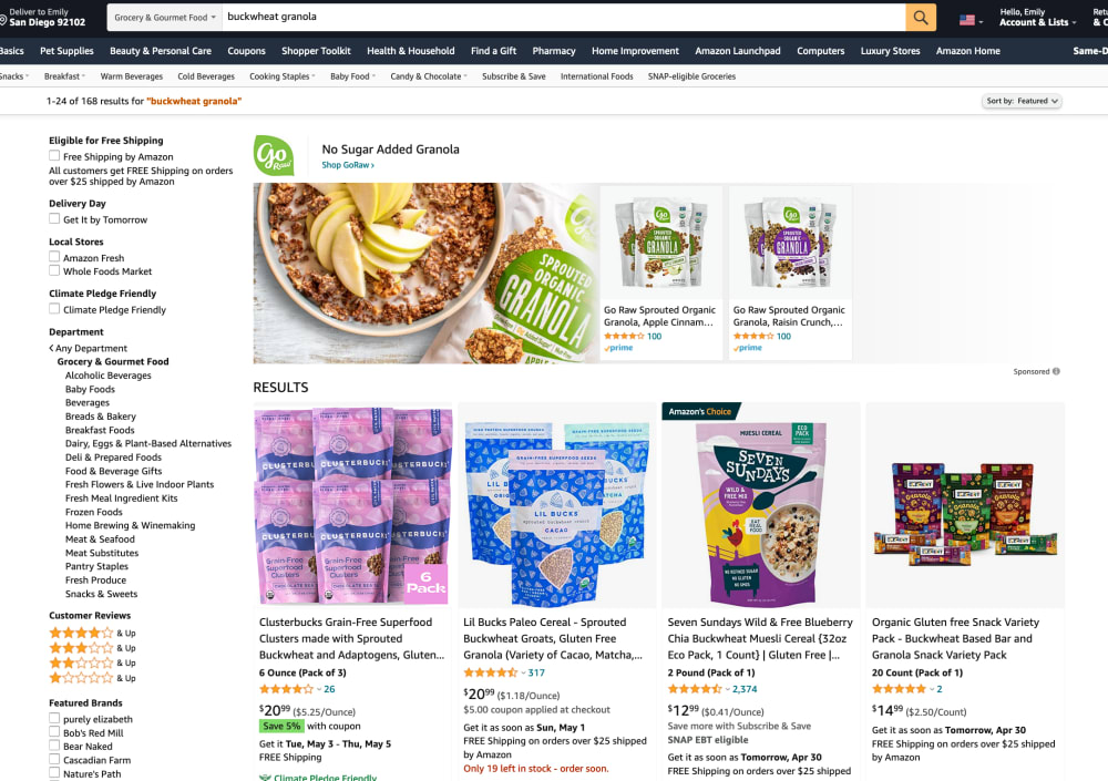
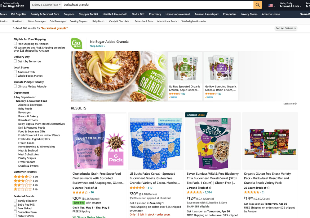
Look at the first product that comes up in search results. Which image is more appealing on this Amazon listing? What makes you click and want to learn more?
Age range
Amazon Prime member
Education level
Gender identity
Options
Personal income range
Racial or ethnic identity
24 Responses to Option A
I like the apples on the cereal
Option A gives an idea of what to expect for how big each bag might be.
I would click on A because it looks like you get 6 packs. This would make me want to learn more.
I think A is better because it makes it obvious that it is 6 bags and not just 6 of the clusters
I like how the 6 products are pictured, rather than just saying 6 pack like the other option. It makes me more likely to click on the product.
I chose A because even though they are almost identical there is a strange think on the side of the pink packages that indicate it’s a 6 pack. I prefer the one without the funny orb
I like the display for option A more. Showing the six bags is great. I think that looks wonderful and it's a good use of the graphic to show all six bags.
I like option a better. I like seeing the full six pack, gives me a better visual.
I chose option "A" because a person not able to read can see that there are six packages included in the price they are paying due to the image shown!
Assuming it's pink one I like a has the 3 pack because sometimes I miss that in the descritption
I feel A is more cohesive and easier to follow in terms of the product information and details.
That is not an answer but a choice to move to the explanation box. The images are exactly the same except for the "clusterbuster" product which is trimmed. based on the images this is a flawed question. If I was interested in one, I would likely be interested in the other.
Option B looks strange, with the sun/spiky art. Option A looks normal, and great.
I truly cannot see any difference between either of these two options. I went over them very meticulously.
I like the Option A mostly because it depicts the actual 6 pack of items. I feel on Amazon, some products that say they are a multi-pack can end up not being one for some reason. The pack image makes me feel like I'm getting value for my purchase especially when compared to the other listings in the search results (2 of 3 which also show multiple item packs).
I like seeing all the pouches while also seeing the text. It caters to a variety of audiences and makes the listing super clear
I prefer option A because I don't like the spur look shown in option B. I would be more likely to click on A and read more about the product for this reason.
Option A image is most appealing on this Amazon listing. You can clearly see how many packs comes on this listing.
Option A looks like you're getting more for your moey
I would more likely click option A as it visually shows the six bags you would receive making it easier to determine at a quick glance what you are getting.
I much prefer seeing more of them, BUT, the text says it's a pack of three. So, I'd only want to see the amount of packages I actually get.But if it's a 6-pack like in the image, I like to see 6 actual packages.
Choice A is more appealing to me since it shows the amount of products I am able to get if I purchase it. Just having that extra pieces of knowledge is appealing to me and makes me want to see if it is a viable investment since I am indicated the amount of packs I would receive.
I chose option A because of it showing one of the items that's a 6 pack!!
The images in A detail how many of each item are in the bundle for purchase.
26 Responses to Option B
On B I can see the product clearer. Not really thinking about how many I can get until I actually see it.
very clear you get 6 packs without being crowded
The products here are a big bigger and bolder and this draws my eye a bit more than the other option
Because it shows an actual picture of the item in the bag.
Option B is more appealing it looks clean and well organized, also the little star that lets you know it’s a 6 pack is very cute. Physical showing all 6 packs is a little clunky in the other option.
Showing the one bag with the 6 pack logo is nice for this instance of B here
They are so similar, I don't have a preference. Neither one stands out
I like B because it looks less cluttered. I think it looks better to say 6 pack rather than show 6.
I chose option B. I pink color is very vivid and I love the six pack.
B keeps it first response smaller and sounds more confident.
I like seeing the package more than a big bundle of the products.
This is more eye catching, it isn't as crowded which makes it easier to look at and understand
I like the single bag in B way more because the 6 pack is too cluttering and there is no space in between. The single with text noting the amount is best choice for my eyes.
I like how this one has something else going on, A looks too busy and opaque, there's nothing to catch your eye. Its just a solid block of color.
The granola looks healthy and appealing, and the apples add a fresh accent to the image as well. Very cool for sure!
I chose B because the package looks bigger and I dont like that A says 3 pack and 6 pack it makes it sound confusing.
Option B is better - you can see the package much more clearly and the 6 pack badge is easy to see and read. The clutter (6 packages) in Option A makes it look less professional, like someone less intelligent made the design or is specifically marketing to less intelligent people - not proud of thinking that, but just a first impression :)
I would rather see just one pack and have it say there are six. I don't need to see all the packages if they are identical. As long as it is easy to see how many I am getting.
sprouted organic granola is more visible and interesting thing to learn more than all other brands
I like option b, the simpler first image is uncluttered and easy to read and follow
I like the close-up of the actual product image. It's also more clear that it is a six pack (the words) without having to show 6 actual packages.
Showing the closeup of the contents is helpful
I prefer option B because I like that only one packaging is shown in the main image, this lets me examine product better and more thoroughly.
Option A says the pink/purple option comes in a pack of 3, but the photo shows what appears to be 6.
I chose option B because I like the one large package in the picture and not a bunch of smaller ones.
I would choose choice B first because the single pack below the main selling pack which as only a single pack then a writing opposite which says that the product comes as a 6 pack, this makes it to look more decongested and gives the shopper an easy time to read through the products not as choice A which has all the 6 packs stacked together making it to look crowded and hard to read individual data of the pack.
Explore who answered your poll
Analyze your results with demographic reports.
Demographics
Sorry, AI highlights are currently only available for polls created after February 28th.
We're working hard to bring AI to more polls, please check back soon.

