Poll results
Save to favorites
Add this poll to your saved list for easy reference.
Option A is our main image, Option B is our competitor,Can we use C to compete with B,What's your idea? Why?
Option B won this Ranked poll with a final tally of 26 votes after 2 rounds of votes counting.
In a Ranked poll, respondents rank every option in order of preference. For example, when you test 6 options, each respondent orders their choices from first to sixth place.
PickFu requires a majority to win a Ranked poll. A majority winner differs from a plurality winner. A majority winner earns over 50% of the votes, whereas a plurality winner earns the most votes, regardless of winning percentage.
If an option does not earn a majority of votes, PickFu eliminates the option with the lowest number of votes. The votes from the eliminated option are reassigned based on each respondent’s next choice. This process continues in rounds until a majority winner emerges.
Scores reflect the percentage of total votes an option receives during the vote counting and indicate the relative preference of the respondents. If there is no majority winner, look to the scores to see how the options fared relative to one another.
| Option | Round 1 | Round 2 |
|---|---|---|
| B | 42% 21 votes | 52% 26 votes +5 |
| C | 36% 18 votes | 48% 24 votes +6 |
| A | 22% 11 votes | Eliminated 11 votes reassigned |
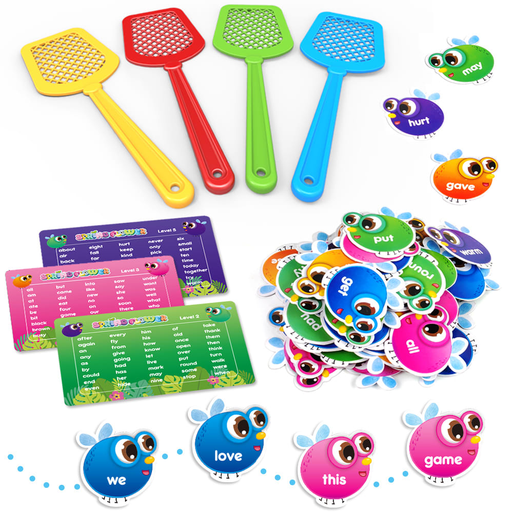
11 Responses to Option A
You can use C but it does not look as substantial as option B. Because option B has a box it looks like it is a bigger toy than option C,
Yes they both look very similar. And the concept of the game are very similar. I think this would be a good image to use.
i like the option A...but in the comparing of b and c i am con-firmly use the option C...because this designing is very attractive...and it is very innovative and look like very nice...
Choice a is the best because it only shows the product. i dont liek the box in the picture as i will throw it away anyway.
Absolutely! Except the packaging, I'm not seeing a difference and C include cards with the words. Your packaging can be hung in other areas of the store for impulse buyers. Theirs is limited to shelf space.
All 3 options are nice. I ranked them according to the size of the writing on the bugs. I like the larger writing on the bugs. When I play games with my grandsons I sometimes have trouble reading smaller print.
I think it is better to use image A to compete with B. By focusing on the cards of bees/words, which are really cute, someone will want to play that game.
Yes, mostly liked all the choices and definitely can use either B or C to compete, excellent image arrangement, great set and ideas
i like my first option it show the product closer up
yeah of course Option A is much more better than other options providing clear view of the main image. Option B cant be the competitor for option A, but it can be with option C. Both of them are similar kind of presentation. Rather than B we can compete with option C which is more clear than the option B.
Option "C" looks the most like your original product, "A". The little round pieces with the eyes are facing in the same direction. Option "B" looks clearly like a cheap knockoff. The colors of the pieces are much more dull in "B", as well. I think that "C" is a great choice to compete with "B", it looks authentic and would sell well, in my opinion.
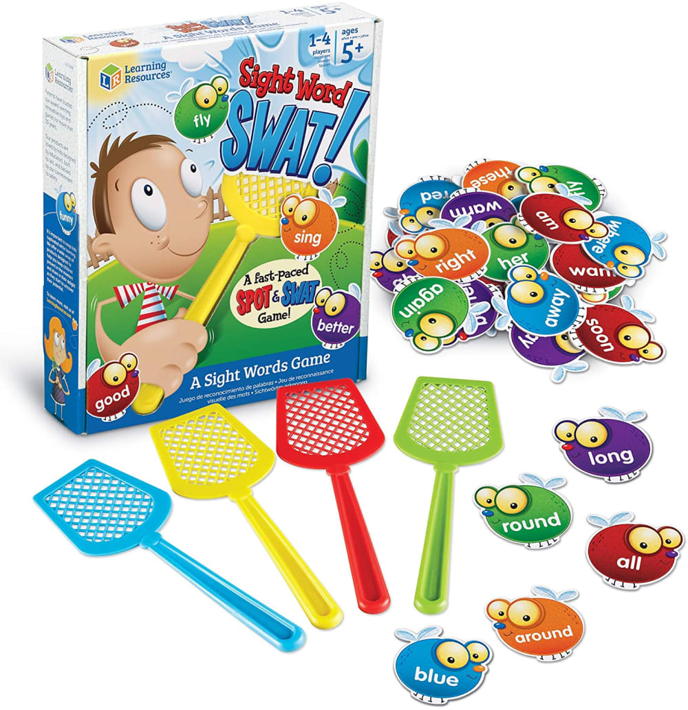
21 Responses to Option B
B shows the box which is good as well as everything it comes with.
[t os an exact match
I made these choices in this order due to the visually appealing aspects of the products.
I like the first one the best because it shows everything very well and I love the composition. Yes, C can compete with B.
No,I think B is the best design among the three. looks better with the product box standing, instead of all flat images like A and CI think A is better C because it looks simpler
I don't like option C because the photo doesn't include the box that it comes with unlike option B. I like option B the most because it has the box and I know what I am getting inside the box.
C does seem very similar to B. I would prefer to have a childrens toy that comes with a box as it can be hard to keep toys stored.
the brighter the colors the better, they appeal to the consumer and catch the eye
Option B looks like the most fun because of the picture of the boy on the box. Options A and C look very similar to one another. A is a slightly better image because C is a bit cluttered looking.
I think B is the best because it's clear how it's packaged, so for those gifting it, they know it will present nicely, and can be stored in the box. It makes it look more like a refined game. I think C does bridge the gap some, without implying that it's some sort of plot-based game for older kids. It still shows how it's packaged which is nice to know, and it looks like it comes with a storage bag. The only complaint might come with people thinking that they might get a total of 8 swatters, but personally I understand that I'd be getting 4. I'm also not sure about "we love this game". It seems the random words in B might give a slightly better representation of the variety of types of words available.
Option B is better.Because it is well detailed and boxed product.Looks like a brand.
Option B looks more professional and organized than option C in my opinion. But option C is more displaying. Option A doesn't show the package. You can use option C to compete with option B but to me, option B looks better due to their packages.
I think C can be used to compete with b in that the packaging is more appealing to children. I would think that the parents would still prefer A because it comes in a box. As a parent I would worry that the product needs a box, especially for younger kids who are prone to losing things. The product has so many pieces I think a box is necessary.
Choice B looks like a game that would be sold in a store. Option C and A look like generic brands with little instruction and the game looks like less fun. I think that option C can be used to compete with B but as a generic version of the game. It's compatible because of the similarities between the 2 games but after looking and comparing the 2 the obvious game most families would pick would be B.
The packaging of product B appears much more quality than that of A and C. I also like that it does not include the color pink in the game pieces as I feel that it does not fit within the color scheme. I do not like C because the packaging makes the game look cheap and not durable.
I think B is better than C. I do like the addition of the packaging in B where the child can be seen. It is more fun loving. I will buy and a better way to compete with that add on.
I actually purchased this game for my son last year to help him work on his sight words, so I'm familiar with the product. I much prefer B because it looks more like a board game in this box, where the clear plastic mounting of C looks more like a kit you would buy at the dollar store in the kids' toy aisle. i only wish B displayed the work family cards like C and A, as they are useful to have for quick reference for parents. A offers a nice view of the kit's contents, but doesn't show how it comes packaged. My son specifically agreed to play this 'game' because it was packaged like a board game, so I think the outer presentation of the game is vital.
I feel like C looks way too similar to the competitor's product maybe just add those lists with the words on them instead so your product still has its own look.
C is definitely better than A. Something about the fake photoshopped pile of cards looks particularly bad in A so it's better that it's smaller in C. B has nice looking packaging that makes it look higher end. However, seeing the packaging in C helps because I know what I'm getting and, assuming that option C is cheaper than option B, looks good enough that I'd consider it over B for any modest price difference
Option B explains what is it so sight word swat. Just looking at option A and option C I couldn't tell why there were bugs and fly swatters. Option A shows the words on the bugs bigger which made it more clear than C. I don't think showing the word cards is a necessity unless you show one close up. Removing the dots behind the bugs in C will help make the image a little less cluttered. Option C competes like option B in the fact that they both show the packaging/container you would get when purchasing. I also don't think you need as many bugs in the pile. Can you show different color bugs instead of just 2 blue and 2 pink?
I chose B as my first choice because of the catchy design. I like that you can see the box and everything you will be getting. Choice A was my runner up option because of the simplicity of laying all the contents out. Choice C was a little too cluttered.
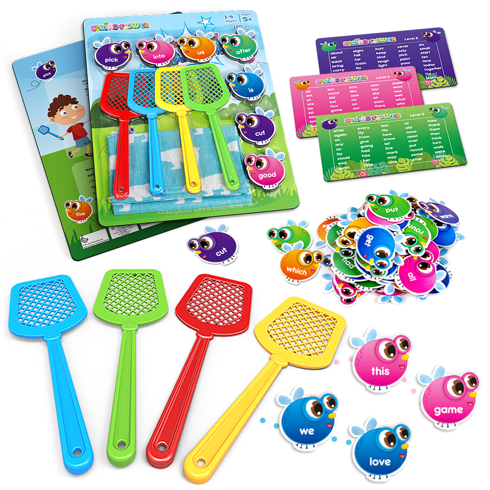
18 Responses to Option C
You can clearly see the packaging and the items included in choice C. Choice A gives you a clear look at all the products while giving you more items than choice B.
I think all of these photos are great and really get the point across what comes in this play set. I definitely think you you could use C as a competing image to B. I think that showing the packaging always makes you feel like you are buying it in person and gives it more of a personal feel but I think both option C and A are well photographed.
I like choice c because it is displayed better.
I definitely feel using C would give you an advantageous competitive edge over your competitor option B.Displaying all the pieces that will come with your game makes it look more attractive as an option and loos there’s a lot more laying pieces and more intricate then your competitor.
I really like seeing the fly swatters at the front of the layout in Option C. They point my eye to the packaging and little flies. In Option A, the swatters at the back lead my eye of the image. Option C really shows off the game well.
I prefer the pictures that have the cards which I assume give a list of the sight words included. The cards are too small for me to clearly read what is on them. These options all look really similar so I would probably base my decision on which set had the most word options.
option c seems like it has more pieces. option b has a box to hold all the pieces, which is great when you have kids. They are less likely to lose pieces. Option a seems like it does not have a lot to it. i feel like it would not come with instructions. There is nothing to hold all the pieces in.
Yes, I feel that Option A is a viable alternative as it includes more pieces and just generally seems to convey more fun for the consumer.
I think you can use C to compete because I think the image shows a lot of the aspects of the product that B doesn't. I think if you really wanted to improve the image you might consider having an image of the package also since that's really the only thing that B has that your image doesn't. I think your image is better overall though even without the package in it.
to some extent option C can compete with A because it has some additional cards in the set and it will need a more powerful message on the box to compete
You definitely use that image to compete with. It has the swatters and all the accessories.
I love the bugs on option A and C! They are super cute and colorful. I would be interested in this (compared to the competitor's product) just based on that. Definitely can use it to compete with B.
I like how we love this game is spelled out in C. I think the guy in B is creepy looking.
I think option C could be used as a good competitor for option B because it shows the game board and that there’s some sort of structure to the game. It would be a good competitor Because the pictures show all of the components and that they Both are similar games, not just the pieces to the game
Yes I believe you could use C to compete with B because it shows the fly swatters and their packaging more than option A does.
I like option C layout over option A since you have that background card to show how the game is coming. Though you do loose some of the cuteness my not having the "we love this game" in order like in option A. Maybe C can be reworked to show it that way? But Option C can definitely be used as is. The games seem so similar that I wasn't sure what was being asked until I looked closer at the eyes.
We can use C to compete with B because Option C has the best arrangement and it looks more things in a single product than other options so the customer will think it as worth buying.
It looked more interesting and appealing. It was also more unique
Explore who answered your poll
Analyze your results with demographic reports.
Demographics
Sorry, AI highlights are currently only available for polls created after February 28th.
We're working hard to bring AI to more polls, please check back soon.

