Poll results
Save to favorites
Add this poll to your saved list for easy reference.
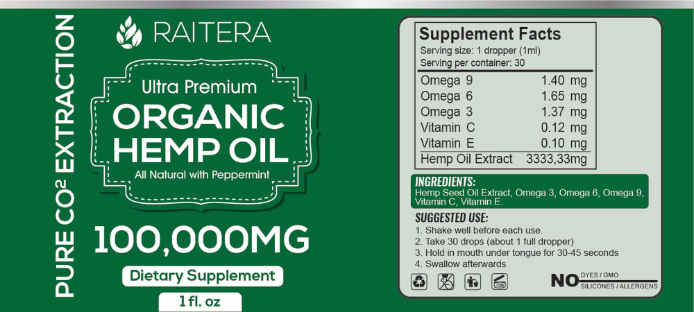
Out of these 2 choices, which product label design do you like better, and would more likely purchase on Amazon? The product is hemp oil (please ignore differences in nutrition/supplement facts when making your choice. This area needs to be updated).
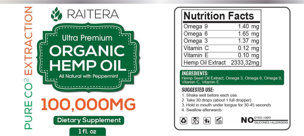
22 Responses to Option A
I picked A because of the clean and easy to read label. While it seems simple, the orange highlight of Extraction and 100,000MG makes two key features stand out. It just clean and simple and pleasing to the eye.
The bright white background makes it look more attractive, more noticeable, and newer. The green background is super dark.
I like A because I think the white background is a lot easier to read. The darker colors of B look like they're kind of too much and wouldn't be one i would choose.
The third color (orange) helps the logo. I tink the best combination might be the green background, but to use both white and orange fonts.
clearer and not so buzy so esier to take in at first glance
The color contrast makes for easier reading
The product label appears appropriate and the color scheme seems more recognizable as well.
it is easier to see and grasp on the white background.
I like this one better because the label is more colors, the brand name stands out more as well as the info going down the side.
Choice A highlights the dosage better, which is some of the most important information on the label and one of the main selling points of the product. Choice A also has a better balance of color to the eye.
The light background makes it easier to read.
It is easier to read with the white background
The white background allows more focus on the relevant product information.
the design A looks more beautiful the combination of white and green looks good
I like the white background better. It is more eye catching and looks more natural and good representation of the product.
I like the white design more as it is easier to read and the contrast is better. Overall, it makes the product brighter and it makes it easier to see the nutrition facts. Think that one is the better choice here.
I would like the design of the label of option A and would be more likely to purchase, because I like the the contrast of the imaging better than B. It stands out more.
A has a look that is more professional and detailed. It would make me think it's a higher quality product at a glance. I also think the very green label that is B is a bit on the nose and unnecessary.
In choice A, the details and information is easy to see and stands out because of the color whereas in choice B it sort of blends in with the background.
This logo is only better because it has the orange and the green combination.
I think the white background helps the label and the 100,000mg part stand out more, even though overall I'd say option b looks better
Choice A looks more crisp and professional and it is easier to read everything.
28 Responses to Option B
The solid green looks more uniform and marketable.
The green background makes it look way better.
I think the solid green label looks more professional and high-end.
The green just looks more uniform and professional to me.
I like the green more over the white. I think it makes it look prettier.
I think that B is more gentle on my eyes. I find it easier to read the information on this label. I like the orange in A, but B is just more pleasing to my eye.
The green is more appealing. Red usually has negative connotations so id think about that.
I love the green color! It is very smoothing to look at. Easier and more relaxed to read.
I chose option B because the green is a nice color and the lack of words make it clean.
I prefer the only green and white colors of B
I like the green overall because it is a shade of green that suggests health and calm and nature. Also, I think the white text on dark background is a bit easier to read. Having the green and orange text on white is a little more distracting, like your eye has to move around. I'm not a huge fan of the font used on both choices though-- it looks a little bit like it's for kids. Not Comic Sans but in the family. It doesn't fit with the shape of the graphic behind the main label, which looks kind of old-timey medicine style and should have an old-fashioned font.
I like how B only has two overall colors. I find the orange in A distracting.
The Green Background really makes the White letters stand out and makes the label very clear and crisp to read. The green almost commands that you take a look at it.
Like this labels color.
I like the green being all over as I think it is more attention drawing then the orange text on the other one. I think it just looks more like a supplement label also
I chose B because i like the green, it lets you know that its an organic product easily
The green is bold and attention getting.
I chose B because I like the solid green background. Not only does is it fitting of the "hemp" part of the product but it also is easier on the eyes. The "hemp" night mode if you will. It is bolder as well with the loud splash of green color for the background.
dark green is a much better color and is more pleasant on the eye than the white with green, which is slightly less pleasing.
Option B is beter than option A
Seems more based on the product with a predominance of green. It iis soothing and calming as the product is intended. Feels more genuine for the product.
I love the green background. It obviously matches the product and it's something out of the ordinary.
It describes informative way
I like the all green color. It goes very well with the type of product it is. Very green.
I love the color green, and everything pops on label B. Very direct and legible.
I like the vibrant green of this label. It calls attention to the “naturalness” of the product more.
I would choose Option B if I were scrolling through my choices on Amazon. The solid green is more eye catching and looks more uniform and neat compared to the white background on Option A.
Like the cohesiveness and color theme
Explore who answered your poll
Analyze your results with demographic reports.
Demographics
Sorry, AI highlights are currently only available for polls created after February 28th.
We're working hard to bring AI to more polls, please check back soon.

