Poll results
Save to favorites
Add this poll to your saved list for easy reference.
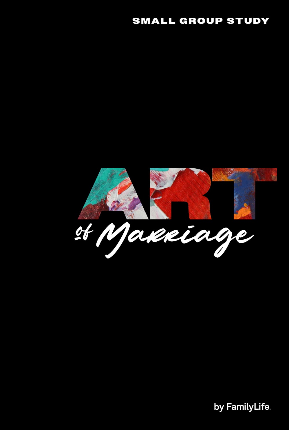
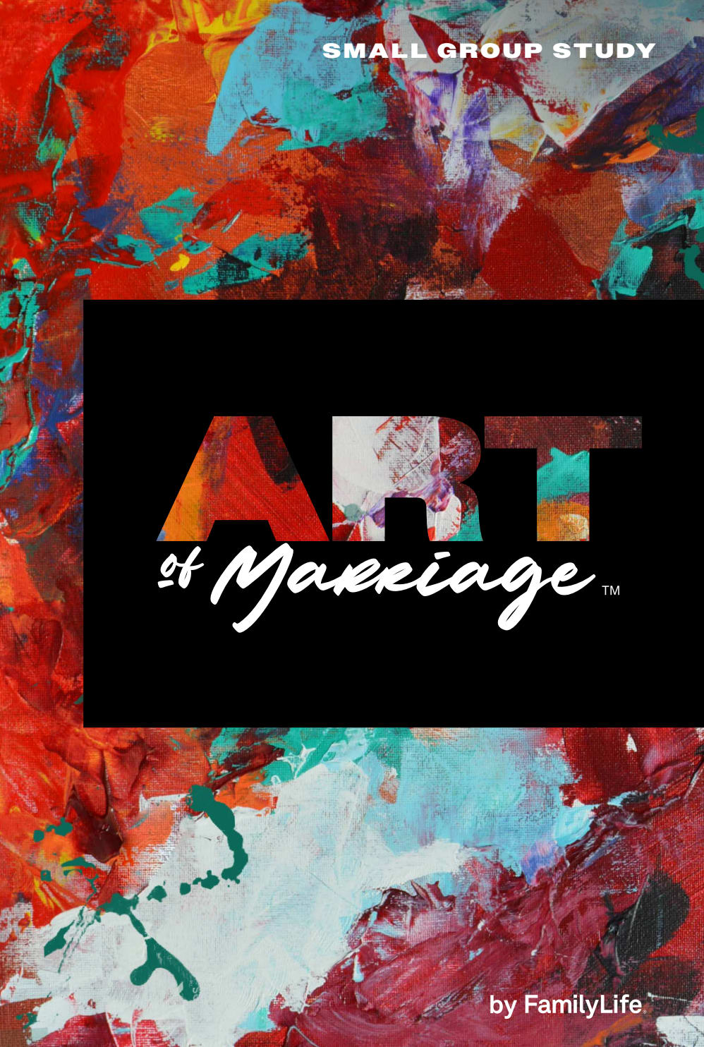
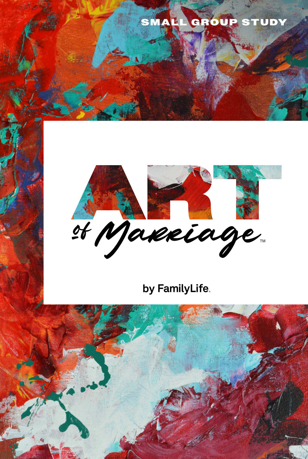
These are three different box covers for a marriage-focused small group study kit. Which packaging design do you prefer, and why?
Option C won this Ranked poll with a final tally of 28 votes after 2 rounds of votes counting.
In a Ranked poll, respondents rank every option in order of preference. For example, when you test 6 options, each respondent orders their choices from first to sixth place.
PickFu requires a majority to win a Ranked poll. A majority winner differs from a plurality winner. A majority winner earns over 50% of the votes, whereas a plurality winner earns the most votes, regardless of winning percentage.
If an option does not earn a majority of votes, PickFu eliminates the option with the lowest number of votes. The votes from the eliminated option are reassigned based on each respondent’s next choice. This process continues in rounds until a majority winner emerges.
Scores reflect the percentage of total votes an option receives during the vote counting and indicate the relative preference of the respondents. If there is no majority winner, look to the scores to see how the options fared relative to one another.
| Option | Round 1 | Round 2 |
|---|---|---|
| C | 38% 19 votes | 56% 28 votes +9 |
| A | 36% 18 votes | 44% 22 votes +4 |
| B | 26% 13 votes | Eliminated 13 votes reassigned |
Age range
Education level
Gender identity
Household income range
Options
Racial or ethnic identity
Relationship status
Religious affiliation
18 Responses to Option A
I find Option A to be the most visually appealing, and I think this is because my eyes immediately go to the word ART. It looks cool. The other 2 are a bit distracting.
I LIKE THE BLACK COVER BETTER THAN THE OTHERS. I THINK THE COLORS STAND OUT MUCH BETTER AGAINST THE BLACK
I like this one it stands out stronger and is more bolder looking
Option A is very sleek and mysterious; I really like this. There's the pop of color in the wording, but the rest is very unique in design. Options C and B are both OK, and very similar. I prefer the White background over the black, as it looks a bit cleaner.
I love the overall simplicity of A and the pop of color just in the word "art".
option A is the easiest to see and the cover doesn't take away from the title of the book
The words stand out better with the solid background. In the other options the words are hard to see it all blends together.
Choice A is easiest to read.
I like the simplicity of this black with the colorful lettering. It just pops and comes off as fun and classy.
I like the black the best. I think it jumps out at you, on this cover. It is easy to read and understand.
I prefer option A because the black background makes the art details stand out. This design is unique and fun and stand out from the other options. I can read the title clearly in this option.
The black background makes the title pop and makes it easier to read.
I like the black back drop as it was easier on my eyes to see. The others were too busy and made it hard to focus on.
I like A because I like the black and the design of this one
A stands out the best to me and would be my first choice. There's an "Art" to marriage? I guess I ran out of paint when my wife left me years ago!
I prefer simplicity and legibility. A is recognizable and simple. There's nothing going on th ebackground to detract from the title. Next is C and then last is B because there's too much going on and it took efort to read the title.
I really liked the black on the covered but stood out more it looks more professional
I like to sign because it is a little bit simpler not too crazy, often times the simple design is the better one and in this case, this is why I would choose
13 Responses to Option B
I like all of the colors and designs taking up the majority of the color. It is an art kit so it should show off artwork. I chose B because I like the black box better in the middle instead of white
I like option B the best, because it is colorful, well designed and attractive. Option C is nice too, but not as attractive as B. Option A, is rather dull in comparison to the other two.
I would choose choices B and C first because of the design of it and the display is more attractive as compared to choice A.
B caught my eye first.
Marriage is complicated, hard work and wonderfully rewarding. Option B is the one that seems most relatable to the concepts of marriage that come to mind right away.
B has the most appealing design but I like the idea of A just because it looks so different than most small group workbooks!
I prefer B because I like the black color behind the words, the design behind the words, and by Family Life in the lower right corner. I like A next because I like the black color behind the words and by Family Life in the lower right corner. I like C after that.
I prefer option B. I like the dramatic effect of the black box on the cover.
Option B feels like a full picture. The black backdrop behind Art of Marriage makes it stand out (with the colorful palette behind it).
Option B is my preferred choice because the design is more compelling and interesting.
I like the box with the bright background and the bright lettering on the black background.
I prefered the covers with larger expressions of the abstract art, so Option A was moved to last. Choosing between Options B and C was a little more difficult. While I liked Option C, with the white block seeming more "optimistic" towards marriage than the darker black. I found the black to better highlight all the many colors of the background art, and therefore I chose Option B.
I would prefer Option B. The packaging design looks brighter and attractive which intend my attention with its appearance when compared to others.
19 Responses to Option C
I like option C the best because I like the swirling colored graphics and I like the white background behind the "ART of Marriage" title.
The design of C grabs my attention and is super engaging. Sign me up!
In this order the cover art looks least depressing to most depressing.
The use of lots of color and a white background for the text is appealing and attractive.
c because the cover is colorful just like marriage should be.
i like this model of box covers for a marriage-focused small group study kit of packing is very good and its very attractive by its model of color.
It's fun and playful to have the colorful background be so prominent. The black behind the text with the color is too hard to read and the all black is too boring.
i picked option C because of its captivating design. It is very beautiful.
C I like the many colors and the word Art. I don't like that it states Small Group Study. C I don't like the black color for marriage. I think it makes it dark. A The cover makes marriage seem dark in the black cover.
I choose "C" because it is full of color like marriage is fun and interesting.
The colors in choice c are the most vibrant and stick out to me the most
I like the design of Option C and feel it is the easiest to read. Therefore, Option C is my top pick. I don't like the design of Option B as well and feel it isn't as easy to read as the other options. For this reason, Option B is my last pick.
This option truly looks like artwork to me. I really like the white text box with the same color text as the background. It makes the word 'art' stand out more and draws your attention. It looks like an art gallery tag
I think C is by far the easiest to read, which I think is really important.
The patterned print looks attractive, the white highlight makes name more visible so ranked C first and B second. A is plain so ranked last.
C and B are much more colorful, bright, engaging and creative. C is easier to read with the white, as opposed to the black of B. A is basic and uninspiring.
The bright colors and white center box are vibrant and inviting, so I ranked option C first. Option A is too dark and unappealing, so it is ranked last.
I like the colorful backgrounds in Options C & B more than the black background in Option A. However, I think that the color contrast between the letters and white background in Option C os very striking in appearance so that is my first choice.
I think Brighter is better for a subject like this, much prefer the colorful covers and the one with white the best.
Explore who answered your poll
Analyze your results with demographic reports.

