Poll results
Save to favorites
Add this poll to your saved list for easy reference.
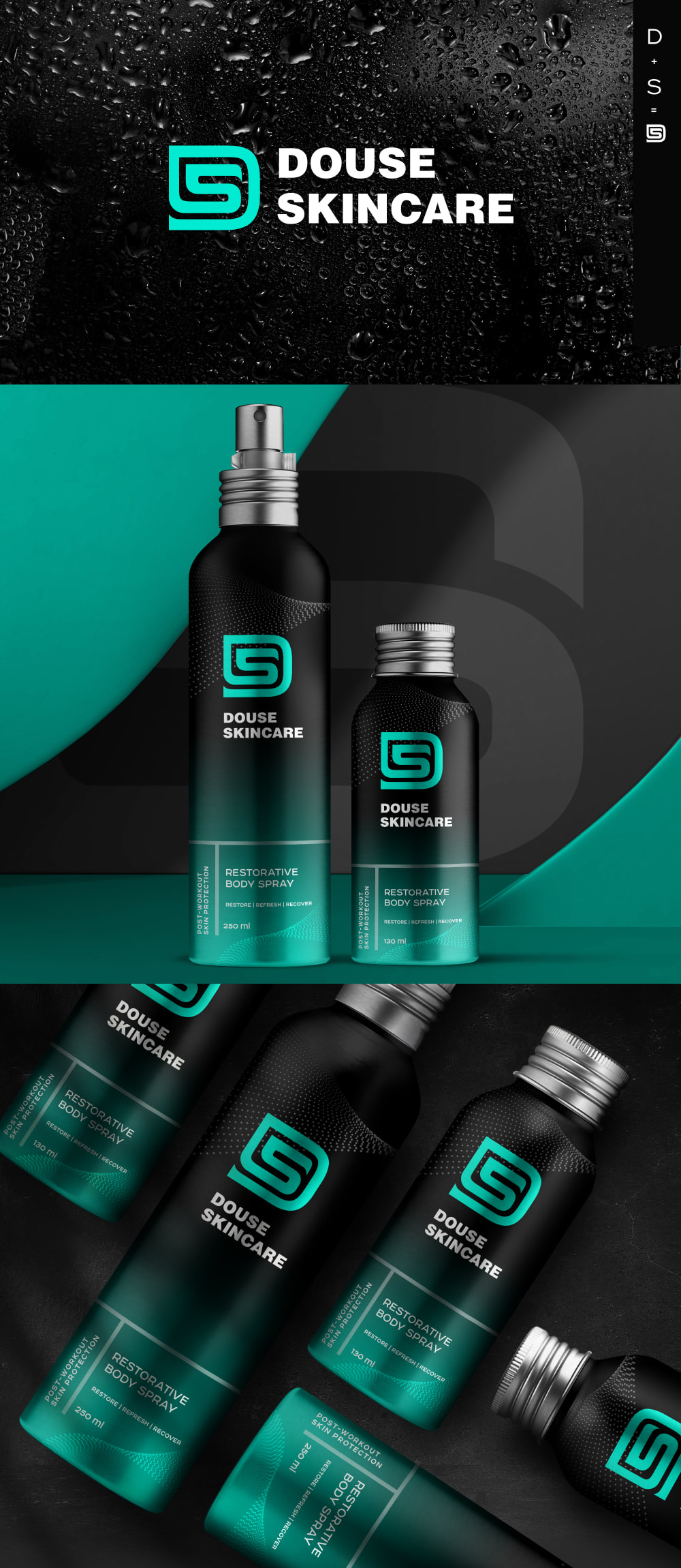
This is a sport spray deodorant both for men and women. Which design does look more attractive to you? Based on the design only which one would you prefer to buy?
Age range
Amazon Prime member
Education level
Exercise frequency
Gender identity
Options
Personal income range
Racial or ethnic identity
79 Responses to Option A
I would much rather purchase option A. I really like the look of the blue and the black and I feel it's the most appealing in terms of looks.
The color in A looks more natural to me
This option felt more rich and nourishing since it featured a sea green color.
the two tone color scheme looks sharper and grabs my attention more
I like that color scheme the most. I also like the text as it’s easier to read.
I like this design a lot better. I like the teal color and think that it matches really well with the black that is on the can. I also think the logo is better looking
I chose option A because I found the logo and color scheme of the spray bottle to be more appealing.
I think the green in option B looks like barf and option A looks sporty and premium
Personally, I like the design of option A better. However, I think that most women would prefer option B.
I like the coloring of option A and overall aesthetic much more than option B. Option B has a nice sage color but is just more bland.
This bottle design and color is the most appealing to me.
I like option A the best because I like how the letters are intertwined to where the S is located in one fluid line inside of what looks like the letter D.
I prefer the design of the skincare product of option A. I like the black and green color of the packaging.
I would prefer A because I think that the product looks better overall. I think that B is good but A had better branding and colors.
I prefer the color - and personally think it is more unisex. I like olive green but most women I know don't, and it could be perceived as a "men's" color by some.
Option A has a more soothing color that i think would work well for both genders.
I think the color and bottle design looks much better in A
These are both fine but I really like the bluish color scheme in A as it is close to my favorite color.
A has my favorite color and shade of blue and I love how it gradients to black.
I picked A as the one that I liked the most because I like the teal color better. I think that the teal pops more so it is more appealing
Option A looks more like deodorant to me. Option B looks more like shampoo or something like that.
I feel like this color is a little more dynamic and eye catching in comparison to the other option.
The dark teal logo with the black is a great contrast
The green in option B reminds me of mold or a smelly stinky green color. I think the design in option a is modern and cool.
I like the design of the logo and the color gradient and graphic on the bottle really make it stand out in my opinion.
I like the black gradient can more than the solid green.
I prefer option A. The color is just very enticing looking and the design is very cool.
I like the gradient color better. It looks mature and cool, and like something that I would feel kind of bad ass using. The solid tone is more common, so it's not as interested.
The design on A looks better to me. I think the ombre effect looks more creative, memorable, and more nice looking than B.
I like both actually. They both look good quality based on the packaging design. But since I had to pick, I went with A. It is just a gut feeling.
It just has a much more appealing design to me the gradation from a cool teal to black, the other one looks kinda like a sports drink.
This design is more aesthetically pleasing, eye catching and stimulating.
The color scheme and logo are fantastic, I love the blending of the two colors on this product.
I love the multiple color combination the best here.
It looks more fresh and cool
This design in Option A looks more catchy and attractive to me.
I think the lighter blue color goes better and is more attractive than the dark green.
The black faded style is sleek and the all green is a little tacky in my opinion
The blue with darker color is more attractive
I like the two tone gradient of A a lot more. It is more visually striking and would make me want to pick it up.
The light greeen / blue color really stands out and makes me want to buy it.
I liked the gradient look of option A the most
The green is too dark. I really like the ombre aqua color and think more people would prefer it over the solid green.
I like the combination of color of this picture. I like the black tone and the combination with the blue. I like the background and both designs actually look great.
I would prefer to buy sports spray A based off the design because the blue/green color attracts my attention more.
The green in Option B sticks out too much, and makes the product look dated. Option A looks more modern and sleek, making me want to use it more.
I like the design between the black and blue
The blue is more appealing, stands out and grabs your attention. The blue is very pleasing to the eye. In my opinion, the green feels harsh to the eye.
The black color adds mystery and strength
I love this option more because of the shade of the color blue and it is more aesthetically pleasing to me.
I prefer option A. I like the gradient pattern on the bottle. Much more eye catching and attractive then option B.
I think the black and blue are more appealing than the green. The overall green is a little too overpowering. My eye was drawn to Option A.
Black is always better, but that may be because I am a man.
I like the design of option A better. The contrast between the teal and black colors looks visually attractive.
I like the shade of blue that Option A uses and it matches the background better.
The blend of greenishblue/black made the bottle stand out to me and catch my attention first. Looks more premium overall.
I think the black just looks nicer, the green looks like a food product or something.
The gradient blue and black is more appealing and in line with other toiletry/personal use items. The green color looks too sports-drink like.
I would pick option A because the mixture of the darker and lighter colors makes the product look more sleek and eye catching.
I like the design and colors used in A more.
I like the colors better and the black makes it look sleeker, cooler and higher status.
This color scheme pops and is also extremely masculine. It would catch my eye and I'd be most likely to try it/buy it.
The color is more appealing
I prefer the color of option B because it looks more like a unisex product. But overall I like the logo design and layout of option A significantly more.
A looks really cool and elegant. Makes it look effective in my eyes.
The colorway just feels fancier.
I like the darker color scheme for this brand better.
The blue color was sharper and more interesting.
I think it's a lot easier to read the font for this option.
I love the color combination of the black with the different shades of blue.
I prefer A because I like the blue/green into black bottle. I also prefer the logo because I can see the DS.
Option A's dual-colored design looks more sleek and appealing.
I love the vibrant blue color on the bottle which makes it pop even more.
The black-to-blue gradient is more appealing, though it would probably be even better with the green color.
Based purely on the design I choose option A. Green is my favorite color and the shade of green in Option A and the contrast between that and the black background looks a LOT more visually appealing than option B.
I like the black. It reminds me of a lot of other deodorant sprays for men. I assume it will have a nice smell that's not too manly or too feminine. The logo itself is pretty pleasant as well.
Option A looks very bright and it makes me positive feelings
Option A looks more futuristic/modern. Option B reminds me of Brut which makes me think of old man body spray. Option A's colors to me seem like they would appeal to men and women equally.
Both options look fine, but I prefer the teal color in Option A. I think it's prettier and more unisex. The all green bottles in Option B is a bit too much for my taste.
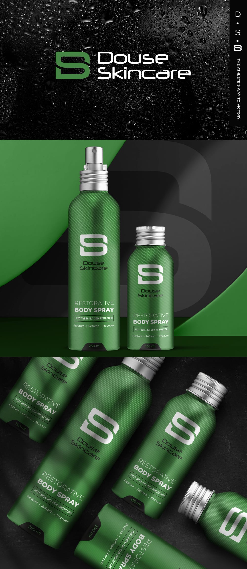
21 Responses to Option B
The use of the green really grabs my attention
The design in "B" is more appealing because it's sleeker and shows a greater attention to detail. "A" is simply unoriginal fonts smacked on the packaging. "B" is unique and interesting while avoiding the look of trying to hard.
option B: The color scheme is gender neutral. All of the information presented is easy to read. The entire package is aesthetically pleasing. option A: I feel the color scheme is more male oriented. I would not think it would be for females.
I think that best shade of grain and also a logo are both more unique and attractive
This bright green is a really interesting color. I don't see it that often but it's very bright and draws my eyes in.
I think that choice B is the better looking choice.
I like the all green bottle of B, it's modern and eye catching. I think the colors of option A are too manly to be considered a unisex product.
The green of B looks natural and appealing to the eye
I like this design because the green makes me associate the spray with smelling fresh like the outdoors.
I prefer this option because the simplified design make it seem cleaner which is a positive for this type of product.
Option B of a more green colored bottle creates the sense the product is from sustainable sources and does not contain harmful artificial ingredients.
The green label makes the product seem natural.
This color is more neutral than the black and therefore more fitting of a product design for men and women and the actual design B is better because it looks more clean cut and clear than the wrap around logo in A.
The logo on A is just too busy and and the bold font on the top logo is too strong. B looks cleaner and more elegant, but also powerful enough to work for men.
I chose option B because the font of the text in that product was sleeker and more eye-catching. The green color of the product container also stood out in a good way to make the product look more interesting.
i usually would like the blueish, but for some reason the army green is making me feel like it's a no frills, just quality type of product.
I like B because green is a unisex color and the design is not too girly and not too masculine either. Also because B uses clean and solid lines it appeals to all ages.
I can't really read the other one that well. And the logo is too convuluted
I love the green bottle. It’s bold and pops out. I would use
I think the design and color of the product in option b looks more attractive and innovative to me
The green bottles and logo look more gender neutral
Explore who answered your poll
Analyze your results with demographic reports.
Demographics
Sorry, AI highlights are currently only available for polls created after February 28th.
We're working hard to bring AI to more polls, please check back soon.

