Poll results
Save to favorites
Add this poll to your saved list for easy reference.
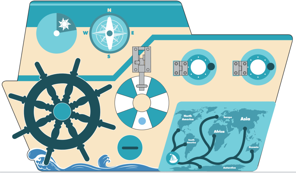
This is a wooden busy board for toddlers. Which color scheme do you prefer?
10 Responses to Option A
I like the shade of blue seen in A
For toddlers, I think it is important to make sure their eye heath is protected when they play with such products. For that purpose, using green or light green in the design would be preferred. The color scheme in A uses light and dark green for several areas so I do not worry about kids' eye health.
I would prefer A
I like how the blue really accents the theme
I really like the teal scheme. Might not be best for toddlers but I like it best.
I think the colors of A seemed calmer and more friendly looking.
this color set reminds me more of the sea and the water
this one reminds me more of the ocean and water and boating cuz of the color set
This one looks more appealing and interesting to me.
The colors on A are more aquatic than B
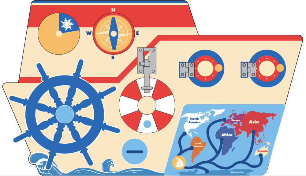
40 Responses to Option B
I like the use of all the different colors. Having the colors to associate with the different continents will help children learn them better.
I preferred B because it was a lot more colorful and interesting.
I like choice B color scheme looks vibrant. I choose this because it stands out well.
This one is bright and playful. The other design is too light and the colors look faded and boring.
I personally prefer the blue colors of A but my Toddler would prefer bright and bold colors and so that would be the one I would buy.
I love the pop of colors in Option B. It looks much more attractive to me than the other one.
I voted for B because while I would prefer A as the parent, I know that my kids would like the brighter colors in B.
The colors in B are more attractive as they have nice red and blue combination going on. The other one looks pale! Doesn't have the type of diversity required in colors for the kids to have interest in it. Kids still might play with Option A but with B they will have more fun as they will enjoy the colors. It will attract them from a distance even if the toy isn't near them they will come to it to play with it.
i like this because there is more of a color variety which is more appealing to the eye and i think toddlers would stay engaged longer
I like the additional colors. It is brighter and probably easier for a toddler to play with or stay attended to.
This choice was more colorful. I like the different colors
I think toddlers would be more attracted to the bright colors in Option B. It looks like one that they'd be more engaged with.
B is more colorful and visually appealing.
I think the contrast of the colors makes B look much more interesting.
While I would always go towards the blue coloring, choice B is bold and more noticeable. Especially the map, the continents in different colors stand out a lot more. The red is bright and more cheerful. Usually I would go towards the blue colors of choice A, but it's flat and boring and the map being the same color does pop. Definitely would go with choice B.
I think b looks more realistic and is a better variety of colors used
A is a little too one-note. I like the varitey of colors on B.
I think B is the cooler and better option, the change in color scheme is key and I could see my child loving it.
My top choice has brighter, bolder colors that is more appealing to the eyes
This option featured brighter and more vibrant colors.
I choose B because its color pattern is more vivid and visually attractive than A
Choice B is much more colorful and eye catching. The use of red, blues, orange, and white are easier on the eyes.
The color looks more vibrant and enticing!
It looks more eye catching , which is what you want for children. it would entertain them longer. I have a 2 year old and this is the one I would chose, just because it has more colors!
I like the wider variety of colors and the fact that the map has different colors in choice B
This one looks the most like an actual boat, the pop of red breaks it up and makes it more eye catching
I like the options that have colors that are reflective of the real colors on a boat.
The color scheme in Option B will be very attractive to babies, compared to Option A.
I like this one as it is more colorful and looks more fun.
I chose b because I like the board with the bright colors.
I would choose choice B first because it has a nice design and the color combinations of it are more attractive to me as compared to choice A.
I chose B because it is more colorful which would be more appealing for a toddler. And I like that the different continents are different colors so there is a differentiation between them and the oceans.
I think the wooden busy board of option B looks better than option A.
I think that this option matches the nautical theme of the product better. I also like that this option is more gender neutral.
It's more colorful and I think toddlers would gravitate to the reds.
Option B is bright and fun, the independent pieces stick out a bit more, I think the continents show better, and it looks more interactive.
I like option B the best because I like that there are a good mix of colors compared to option A.
Red is more of primary color and dominant, and I believe it highlights this design better. It's more "fun."
I like B because it gives the more nautical feel, with the bright colors.
This color combination is perfect and looks good to have it for my toddler.
Explore who answered your poll
Analyze your results with demographic reports.
Demographics
Sorry, AI highlights are currently only available for polls created after February 28th.
We're working hard to bring AI to more polls, please check back soon.

