Poll results
Save to favorites
Add this poll to your saved list for easy reference.
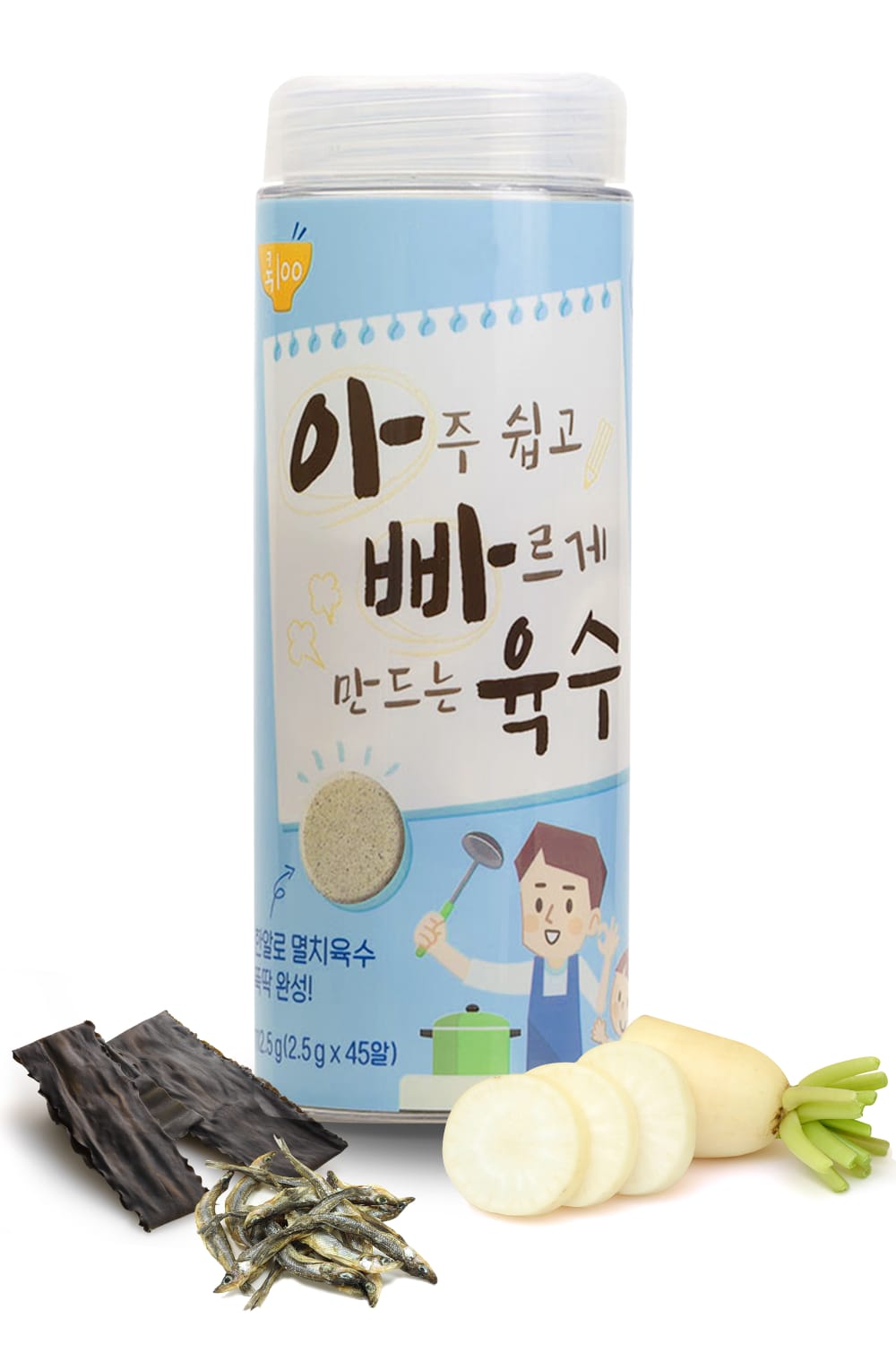
This product is a broth capsule made with natural ingredients. Which images would you like to click more on Amazon ?
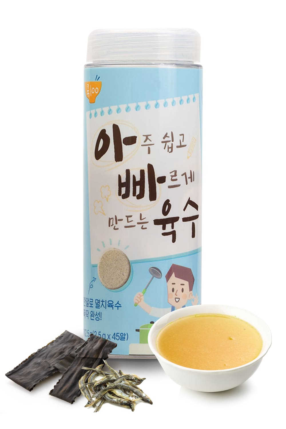

Option A won this Ranked poll with a final tally of 33 votes after 1 round of vote counting.
In a Ranked poll, respondents rank every option in order of preference. For example, when you test 6 options, each respondent orders their choices from first to sixth place.
PickFu requires a majority to win a Ranked poll. A majority winner differs from a plurality winner. A majority winner earns over 50% of the votes, whereas a plurality winner earns the most votes, regardless of winning percentage.
If an option does not earn a majority of votes, PickFu eliminates the option with the lowest number of votes. The votes from the eliminated option are reassigned based on each respondent’s next choice. This process continues in rounds until a majority winner emerges.
Scores reflect the percentage of total votes an option receives during the vote counting and indicate the relative preference of the respondents. If there is no majority winner, look to the scores to see how the options fared relative to one another.
| Option | Round 1 |
|---|---|
| A | 66% 33 votes |
| B | 22% 11 votes |
| C | 12% 6 votes |
33 Responses to Option A
I think option A is the best option because it shows broth in a bowl. I think if I didn't know what I was looking at, option A would give me an idea.
I love option A the most because it shows what the broth looks like after adding water to it.
Because the capsule itself is already visible on the packaging, I greatly prefer the pictures A and B that showcase the broth itself or the ingredients.
Option A is my first choice, because it gives a clear image of what the product in the container looks like (i.e. broth). It looks like an appetizing broth. B is my next choice, because I like that the vegetables look delicious and flavorful. Option C is my last choice, because I am not sure what the brown discs are, or how it relates to the product.
I like A best because seeing a small bowl of broth in the image is good to show what it will turn into, it makes me imagine having the finished product with me and how it will taste and smell. I like C next because the capsules look like they would turn into broth because of their color. I like B last because it doesn't look anything like broth, they look like small disks of radish or something and they don't make me think about broth at all
A is my first choice because it shows me actual broth (plus the ingredients).B is my next choice because it looks like I see a few more of the ingredients than in C.C is my third choice mainly from process of elimination.The labels are cute on all of them!
The tablets look kind of gross … the finished product of broth in the bowl looked good … the one with the vegetable was cute and a solid effort but not my fav
I wouldn't even know it was broth except that A shows the broth, so A is the best one.
C looked way too plain and dull. I thought A looked the most inviting with the big bowl of broth.
I would be more likely to click on Option A, assuming that the yellow liquid inside the bowl is what is made from the broth capsule.
I ranked A the highest because I liked the image of the broth product after it went into the soup water. It gives me an idea of what it would look like.
As it is about broth, the image of the broth is vital, along with as many ingredients included as possible.
I like Option A because I can see the broth in the bowl. I like Option B because I can see the raw product that the broth has been made from.
I definitely like to see a small both of brother to represent the capsule. I think it's instantly recognized and relatable and the overall image is so attractive.
I like seeing the broth and I like seeing natural ingredients.
The capsules in C are redundant. The broth makes sense in A.
Being able to see the broth as a finished product in the bowl is great because I know what it will look like when it is ready to eat.
I like option A the best out of the options because it shows more about what the product is. It has a nice-looking bowl of broth in front of the product. I think seeing the bowl of broth with another piece of ingredient gives a better idea of what the product does and looks like. It also doesn't lose its original form and shows you the capsule on the tube in the background. I like option B second best because I like how it shows more natural ingredients in its image. The product looks to be made with healthy and quality ingredients. I like option C the least because its image is plain compared to the others and doesn't have more information to entice to learn more about the product.
Option A that's my attention quicker so I would click on it and then option C and b
I prefer option A, I think the colors and organization of the ingredients spread out are more attractive and would catch people's attention more. The bowl of soup with it's contrasting color makes it really apparent and attracted me more.
A looks delicious and attractive
A I can tell it's for brotherB looks like natural ingredientsC has some tablets/wafers, doesn't look as appealing even if on the package
A has a vowl of broth, making it clearer just what the product is. B has veggies, but it's not clear the product is broth. And in C, I don't even know what those brown round things are.
I would click on option a first. I like option a the best because it shows a broth. i would almost think the others are crackers to be honest.
The choice I made was based on the ingredients that are shown around the bottle of product.
I would choose A because it clearly shows the end result of a broth. I think the broth should definitely show in the image. It would be good to have the broth and the capsule in the same image for clarity.
Option A gives a better visual description as I cannot read the product label, C the same but I wouldn’t understand the tablet form, and B gives the impression of a healthy drink.
Choice A and showing the bowl of broth makes the product appealing and helps understand how the product works and what it is.
I chose C; having some actual broth in a bowl is helpful if you cannot read Korean. C and D are nice too though; interesting product!
I like seeing the ingredients like in Option A & B. The capsule itself is a little odd looking in Option C and doesn't really add anything to the image. They look too much like vitamins.
I like A with the bowl of broth in the front. Looks good and comforting.
I liked Option A because it showed what the broth looks like once it is prepared. Option C was good, since it showed what the capsules look like. Option B was the least effective, because it doesn't show the finished product or the capsules; instead, it shows some sort of vegetable.
Option A shows what the liquid looks like when outside the container, shows it density/viscosity better.
11 Responses to Option B
B and A are the best because I can actually see what is used in it
Option B looks the most natural. Option C has the soup as well, but C looks aritifical.
I would click on option B, it shows the broth capsules so that's helpful. Option A looks good with the bowl of broth but option C shows capsules that look really big and hard to swallow.
I prefer this option from the group. I liked the ingredients laid out. The packaging is not helpful.
This one gives me the impression that it is natural. The plant next to the bottom of the can gives this easy. It is healthier overall.
I think option B is the most natural seeming and most eye catching which makes me the most likely to buy
Choice B is the one I find that is the best layout that I like.
I like the fruit looking item in B best A just looks like soup and C looks like a big vitamin tablet.
Definitely Option B because it shows the whole product and doesn't cover any of it up. Thank you.
B I feel makes it easier to see what is included in the capsule.
Although the capsules are what they are l, I don’t think the picture including them helps. The natural ingredients are more appealing. Even more than the plain broth itself. But the broth is more appealing than the capsules. So I ranked the natural first and capsules last - knowing that I would actually be using capsules if I bought it.
6 Responses to Option C
I really love the inclusion of the capsule itself on the image - it lets you know what you’re getting from the product. Then, I ranked the other two based on what I liked most. Seeing ingredients is also visually appealing.
I would be much more likely to click on Choice C. My primary reason for that choice is that this is the only one that shows these capsules clearly here in the main image. That's something I'd really like to see immediately when coming across the product. The actual item speaks more for itself than the packaging.
My favorite is option C. I like it because it’s the only one that shows what the broth capsules look like.
Option C illustrates what I should expect the product to look like outside of the container, the other options are ranked based on visual appeal or the nature of the image in relation to the actual product.
I am torn between options C and A as I am choosing between an image of the actual broth capsules, and the bowl of broth, and I wish there was an option that included both. However since that is not an available selection I will go with C as it shows the actual capsule whereas the bowl of broth is the "completed product". I really wish that the dead fish were not shown in any of the options.
I want to know what I'm getting in the container
Explore who answered your poll
Analyze your results with demographic reports.
Demographics
Sorry, AI highlights are currently only available for polls created after February 28th.
We're working hard to bring AI to more polls, please check back soon.

