Poll results
Save to favorites
Add this poll to your saved list for easy reference.
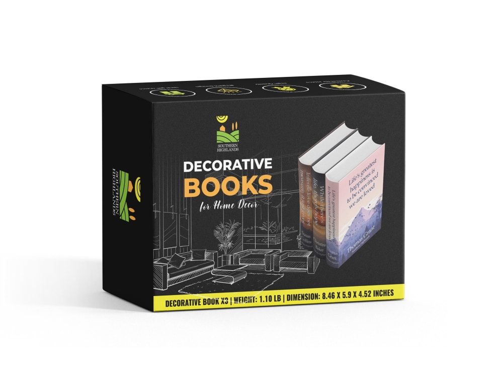
Wanna know the 'suitable and attractive' First main image for the AMAZON US the product is 'decorative books' you can search what it is. What looks better and attractive book angles? Will give you 3 options. Thanks!
Option B won this Ranked poll with a final tally of 56 votes after 2 rounds of votes counting.
In a Ranked poll, respondents rank every option in order of preference. For example, when you test 6 options, each respondent orders their choices from first to sixth place.
PickFu requires a majority to win a Ranked poll. A majority winner differs from a plurality winner. A majority winner earns over 50% of the votes, whereas a plurality winner earns the most votes, regardless of winning percentage.
If an option does not earn a majority of votes, PickFu eliminates the option with the lowest number of votes. The votes from the eliminated option are reassigned based on each respondent’s next choice. This process continues in rounds until a majority winner emerges.
Scores reflect the percentage of total votes an option receives during the vote counting and indicate the relative preference of the respondents. If there is no majority winner, look to the scores to see how the options fared relative to one another.
| Option | Round 1 | Round 2 |
|---|---|---|
| B | 46% 46 votes | 56% 56 votes +10 |
| C | 42% 42 votes | 44% 44 votes +2 |
| A | 12% 12 votes | Eliminated 12 votes reassigned |
12 Responses to Option A
I like seeing them in box that they're decorative books. I'd think of them as regular books otherwise.
I always like when the box is shown. I can get more info off the box. Plus I do find this one more attractive in a professional way.
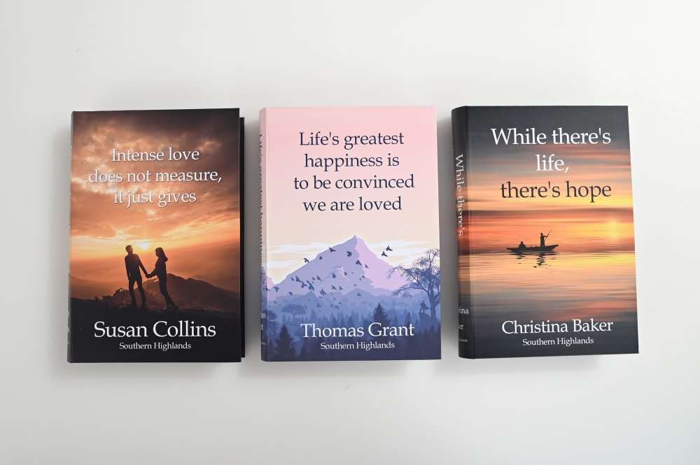
I prefer the option A decorative book product image because this is the only product image that shows the product box with the decorative books on it. I chose option B second because this is the only product image that shows the entire front cover of each of the three decorative books. I chose option C last because this product image does not show the product box nor the full front cover of each of the decorative books.
Not loving any of these as the "main" image. But I do think seeing the packaging in A makes it seem more legit and trustworthy for quality.
i think the one in option A is more attractive because it shows you what the product is for
I like that choice A looks like a boxed set, next I would choose B because I can see all three covers clearly, and C is okay
If they are just to be decorative then A is the best picture, if actual books for reading then B so the front covers can be seen, C isn't bad but not as informative as B
I ranked the images for the decorative books that I liked the most. I liked seeing the box that it comes with in option A the most. I then liked seeing each individual one in option B and then finally option C's image.
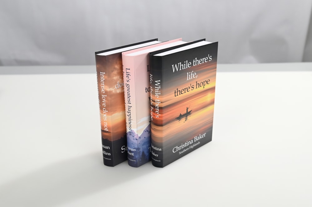
I like the way the books are presented in E the most looks like a nice gift side. C is my next favorite with the three books are together gives an artistic look
option A looks the most modern with striking design and darker features bile option C just obstructs the titles of the book
I like the yellow band on the box in this option, which is bright and energetic. Very cool for sure!
I went with A, B and C. I really liked A. I love that A show how they look.
46 Responses to Option B
Seeing the cover of the books I feel is very helpful and shows them off the best.
I prefer the image that gives the best view of the covers of the books.
B because it is much more presentable and formatted in a way I find progressively helpful in determing the product line.
I like when they're laid out so I can see each book individually and gauge if those are the ones I want to set out.
Option B showed the covers of the books the best and made them look the most appealing. Option C gave an impression of one of the books, but should show more. Option A didn't show the covers at all, so it was the least effective.
I would prefer choice B first because it shows the cover page of every book and it is easy to read the title of each book separately and it is better when choosing a book to read then choice C will be next because it does not show the front page but the side also which allows one to know the titles of the books from the side and the last option will be A which really does not show much of the books and not that appealing to the readers and buyers.
B is first because of the angles and they look the most attractive when seeing 3 books on a table in a line. I like the books laying down and that the middle one is different from the left and right one. C is next because it has an angle to the right but I can't really see what the books are. A is last because I don't see the actual books but they are in a box. I like seeing the physical books in their entirety and how they would look next to each other.
Really like the layout on c. You can still see the spines as well as the full covers.
I prefer option B because I think that it is the most eye-catching and visually appealing product image out of the three options. I also think that it gives the best overall view of the decorative books.
Colors are eyecatching and these have the most colors best in this order.
I definitely like seeing the books instead of the box. I like B better because I can see the front of each cover. I like the bright colors and I see more details than them being stacked sideways.
Option B clearly shows the covers and titles and is a better shot. I do like C also because it shows how they look from the side on the shelf, but not a good shot of each cover and you might like to put them on a coffee table where you can see covers. Option A is the worst because it doesn' tshow the books at all. Best option would be a combination photo of C and B
I chose option B as my favorite because I like that the 3 books are laid out so that I can see the entire front covers of the books
The position of the books in Option B gives you the impression that the books offer a lot of variety
The design cover were chosen by how well they look enticing, attractive and eye catching.
In terms of the angles of the books, these are the most attractive
I like seeing the covers of the books laid out side by side and choice B and C achieve this
I like the first option mainly because of the imagery used on the front of the cover. This looks fantastic displayed in a book store display readily available for purchase.
B cathces the eye first because it shows all 3 books and the name can be seen clearly.
This product is decorative books intense love with life greatest happiness to be convinced are loved the life there hope cofidence in this life than future in knowledge and the powerful to energy to activities in the good product
I like the look of B the best because I like that everything can be seen clearly. I think the next best option is C with the step look. You can still see enough of it but not as great as B but much better than A. I don't like the box look of A because it makes me think you are hiding the actual look of it I want to actually see the product, not the box of it.
This product is decorative books intense love with life greatest happiness to be convinced are loved the life there hope cofidence in this life than future in knowledge and the powerful to energy to activities in the good product most beautiful color and this like product
Option B was very good in depiction, it gives the full view of the product. In that picture the book image was clearly displayed in that angle. Full coverage was shown in that picture.
I like seeing all the covers side by side
I think B is the most attractive angle because it showcases the different covers and their designs very well.
i want the angle that looks directly towards the book covers; not the sides of the books.
I like seeing them out but I don't want my view of them obstructed like it is in two of the three images.
This option shows the beautiful and encapsulating nature of each of the covers and provides a unique artistic appeal
In order, the first option I picked because it shows the best look of the books, allowing you to see the cover and titles, option 2 is almost as good, but the angle makes it less appealing, and the final option is just generic, you can barely see the books.
Seeing the covers in the picture looks the best and you can see what they are in it.
I like that the three books are laid out side by side. It gives the consumer the chance to look at the books they are purchasing and get a feel for the cover, the author, the title, and everything else. Choice A was a close second because I like the packaging and the logo of "Decorative Books."
Prefer seeing the front covers, which is why I chose B and C. The box doesn't really give me a sense of what they will look like.
A’s colors were too dark and depressing. B was the most transparent showing all of the covers.
Option B is most attractive because you get to see all the covers and none are blocked by the type of angle used.
I prefer choice B because you can clearly see what each book looks like and what each book is.
I choose B, Because in this image it clearly shows how it's display very well to attract people which is very effective and I like it very much.
I prefer option B because it looks the most clear and transparent. Option C and A do not really fascinate me as much overall!
Option B has a better angle that looks more appealing.
I like that b gave you a clear view of all of them
I prefer choice B because it shows a better angle of the books.
I don't like how my last choice doesn't really show you the books. I want to see the books and covers of the book that I will be carrying around.
I like option B the best because I can see each book cover clearly. it gives me a lot of information about the products!
Option B you can see all the images that can be associated with inspiration.
I like the books listed side by side but the black box looks a little plain
Having the books laid out like this is attention grabbing based on the covers and I think that makes B the best choice.
I'm honestly not super keen on any of the displays, however B shows all of the books out and you can see the patterns. Then from there, C shows a fair amount and the color pattern, although you don't get much of an idea of what they look like. A is my least favorite because it's in the box set and doesn't give any details whatsoever. Perhaps of there were some displays in the photos to show how one would use decorative books versus just owning books that they'd read.
42 Responses to Option C
I picked C and B as my top choices as they tell me what's in the order.
Option C as that is how it will look on a shelf(shows the spine) and also shows off the books a little. Option B shows off the books as well but they're splayed out and Option A has them in a box which doesn't help with gauging how theyd look on a shelf.
I definitely think option C looks the best. Since that is how the books will end up being displayed it gives the best impression.
C is the better angle because it gives me a clearer look at the spine which is an important factor I would consider when buying these.
Although you can't quite see all the covers it shows what they will look like when they are in use.
I like C the best because you can see the spine of the books. I think A is okay because you can see that they're decorative books but I don't really care for B because you can't see how thick the books are. It's not a very good visual.
I like angles, but I also like to see the entirety of the cover. I think best would have the angles with the entire covers underneath.
C looks attractive and decorative. A makes it clear what the product is (i.e., decorative rather than real books). B does not look professional.
I like being able to see the books at an angle, so it's dimensional. My second choice is the box that the books come in, again it has a dimensional quality.
anged lets me know I get to be creative with how th books are set
For being decorative, the books at an angle in C are most attractive and you can still read the title and author on the spines. B is next because you can see the covers of the actual books. A is my last choice because the box is not very attractive, even if the books pictured are.
Option C is easily the best angle and most aesthetically pleasing/eye-catching of the options here
I don't think it's attractive for anyone just looking at a box, I think showing the product is best.
I like C because I think it does the best job at showing how the books would look on a shelf.
I like option C the best because I can still see all three books and read their titles and the layout is the nicest.
I like option C's angle best. The spine is probably how they would be displayed. The covers are also nice to see.
Option C shows better these books in all 3 dimensions, I like this - rank 1.Option B shows these books only in 2 dimensions, this is not enough - rank 2.Option A shows not books but their box, not good at all - rank 3.
Option A doesn't tell me what the books look like. Option B you can see one side of the books, but you can see the spine of the books, which will be most visible in option C.
For decorative books, I feel like the spines are the most important part. I don’t really care about covers. I like choice C
I like option C. It looks nice. The other 2 are just ok.
C is the best option because they show what people are wanting to display - books that look good on a shelf. They don't look that great laid out flat as in B.
there is only one good answer, you want to see the books in place not in the box they came in, thats ridiculous
I prefer option C. This is a good way to show off the books. It gives me an idea of how attractive they are in a decorative setting such as on a coffee table or a bookshelf.
I like how it shows the front and the spine of the books
I like to see the books on an angle as it looks decorative and most helps me to imagine using the books. I like to see the box they come in as that makes me think of this as a possible gift item.
C and b look good, they show much detail. A is ugly.
I like option C because it showcases how it is used and shows how I might use them
Seeing the product, rather than its packaging, is always preferable if I can't have both - though I would rather have both. So C and B rank higher than A. Out of those two, for something like this, I think seeing the spine is more important than the actual cover. So the best looking and attention-grabbing of the three, I'd chalk up to C.
I like the books stacked side by side. The look like they belong together and we still get a good look at the covers.
They might look better if you displayed them on a shelf or coffee table.
I like choice C because it gives the most unique in terms of presentation angles and has good color usage across the three books. Choice B is more straight forward while choice A looks too bland for me.
Option C looks more appealing. The angle and lighting and placement is attractive and professional. Option B looks like an eBay listing, and Option A doesn't look like books.
I chose C as my first ranking because the angle shows me the thickness of the decorative books, which gives me a better idea of the true size.
I think that C has the nicest angle and that the books look good like that. B is okay but I don't really like them stacked down like that. It looks strange. I don't like the way A is showing the product inside a box.
C it shows off the books as theyd appear on the shelf.
You want the spines. Often this type book is stored spine out, so you'll want to see them. C gives you this option. A you are only getting the carry box case and a sort of spine from a distance. B does give the front, which i better than A I think.
I choose option C as the first choice for the main image because it is stacked in a uniformed way to represent a beautiful Coffee Table for decorating the home.Second is option B because the open display showing interest which is good without having to handle each individual book.Third is option A because the box would have to be handled and a person may want to open the box and handle it creating out of order for the home.
I like the angle of C and I can see some of the different covers. A is my second choice as I like the way they are arranged, and the straight on view of B is my last choice.
C showed the books best as being decorative. B is almost too informational, showing blatantly what the books are, which isn't really the point of the books, I think. A is kind of middle ground between those two, showing the product without being overly informational.
I think showing the individual books is better than showing their package
I like seeing the books themselves, not just packaging, and the angled view shows them off the best
The angle of the image for decorative books is best in option C
Explore who answered your poll
Analyze your results with demographic reports.
Demographics
Sorry, AI highlights are currently only available for polls created after February 28th.
We're working hard to bring AI to more polls, please check back soon.

