Poll results
Save to favorites
Add this poll to your saved list for easy reference.
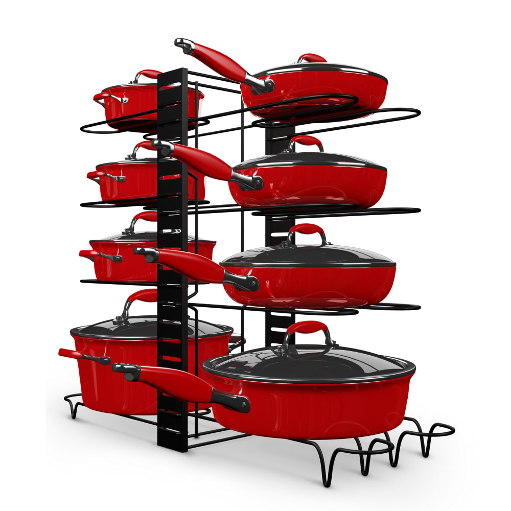
What image would be more likely to click on and why you chose it?
34 Responses to Option A
I really like the red pot set. It catches my attention. It is bright and would light up a room. Give it color.
I would be more likely to pick this image because it is bold and it would catch my eye on a listing due to the color scheme.
I liked the colors, they were striking.
A just really stands out to me and looks nice. I would want to learn more
This one matches my kitchen
I chose A, because the red catches my eye, and I would prefer more stylish cookware.
I can see how much I can hold because I can see the rack from the angle.
I would be more likely to press on the link for option A because the color red stands out more than the color silver in option B and the pots and pans in option A are organized better than those in option B.
The red is cool and vibrant.
Definitely A because I like the red color and also the angle of the rack shows more of the design of the product.
red is my favorite color. it just stands out and looks beautiful. the whole set looks so creative and original and not like something most people would have. if i saw this set in stores i would get it.
it looks more expensive.
It is colorful and adds personality to a kitchen.
I prefer the color of A. Also, the items look easier to handle. B concerns me about heat transfer.
i choose option A, because it is very colorful and attractive. i like it very much.
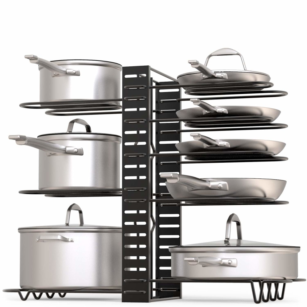
I'd prefer the silver color, but A has a better selection of pots and pans. Some of the skillets in the silver set look too shallow. I have a small household, so the smaller pots in B would be more likely to be useful than the huge ones in A.
more colorful and long time durability.
I chose Choice A because the red color made it pop compared to the silver color of Choice B. The posts in choice A are also a different shape than the pots in Choice B.
You can see how they split up a little better
Well if it counts the color, I think the red stands out more, other than that, I like the way they are stacked on the holder, looks to take up less room also, looks better because you don't see all the middle slots.
The bright red color is more attention-grabbing.
I feel like the angle that image A shows the stand at gives a little more interest and helps me understand what it looks like. I also think that the red color of the cookware really pops. Even though it's not my favorite color for pans, it certainly is eye-catching on the page.
I like the red look to this for sure
I like the alerting red and the more quantity of pans. This looks rich, bold, and attractive.
This was a really difficult decision, but Option A kept pulling my eye away from Option B. I am drawn to the angle of Option A--I like the way you can get a relatively solid idea on each dish's depth and size, which is so crucial when choosing cookware. Option B, while attractive, doesn't portray the depth of the dishes quite as well. Option A also shows the lids quite clearly, which is something my mom always taught me to look for. I like the clean, clear, organized look of Option A--it's striking.
I like the visual of the red pots. it is very eye catching
I prefer the coloring as it would suit best.
I think that red pans stand out a lot more. I can't say that I would want to purchase that color more than the silver but your question was about which picture stood out more. The red definitely is more eye catching and shows the details better.
i love the red! the red is so nice to look at and is very pleasant. the silver is nice, of course, and goes with everything, but the red is just much nicer to look at.
It is more attractive to the eye in red colors.
I would click on option A because the red really makes the stand, stand out. I also like the angle of the picture, it gives a clear view of the stand from two sides instead of just one.
like the color it stand out a lot more than choice B
It is bright and appealing. I like the shape of the pots and pans and the angle the picture is in.
Because of the angle of the photo, A looks like a more spacious rack than B (even though upon closer examination it is the same rack). Also the color contrast is more eye-catching.
16 Responses to Option B
looks sleeker than the red version
can see colors best
i find the silver pan a bit more eyec catching in B
I know the image is for the rack, not the pans, but the red pans put me off because they're so flamboyant and ugly. The rack itself I would totally buy though.
I LIKE STAINLESS STEAL LOOK MORE
The red ones wouldn't go with my kitchen so I would click on the more neutral silver ones.
The cookware in Option B looks more professional and of higher quality than that in Option A.
I prefer natural looking colors to the bold red
I chose B because I like the classic, timeless look of stainless steel. When I buy kitchen items that are going to last a long time, I don't want them to be too fancy or stand out too much, I want them to be able to match anything else I put in my kitchen even as my style and/or decor changes.
much nicer than the other one
The red colored pots and pans would not match my kitchen's color scheme.
Although the red set initially caught my eye due to the bright color I think it looks a little cheap compared to the all stainless set. The stainless set looks like a high end brand and it has a very nice variety of pots & pans. The red set seems to have a repetitive amount of the same type of pot just in increasing size while the stainless set has a variety of both shapes and sizes. I also appreciate how the pot rack itself is turned towards me in the photo of the stainless set, I'm not sure why the pot rack is turned away from me in the red set, it blocks the view of the back row which is just silly when trying to market a product.
The image looks more professional/clean with the silver, and the pots and pans look larger, making me believe this tool will fit my own pots and pans better.
My eyes definitely went to B first and looked around the picture. I actually love this idea and need one of these - our cupboards are a mess because of our pans! I like B better than A because in A, the red is too busy and distracting, plus I like that B shows the pans and the holder more "straight-on" so I have a better sense of dimension and exactly what I can do with it - it looks like I can set the configuration exactly how I want (which is fabulous), but I don't really have that impression with A; it's not so clear that I can move the shelves around.
I chose choice B because I am not a huge fan of having colorful pots and pans, I would like to stick with the simple ones that would make it easier to clean.
I choose B because I prefer cookware that is basic and functional. I do not like to use cookware that has paint or Teflon on it. Option B fits my personal preference on cookware better than option A.
Explore who answered your poll
Analyze your results with demographic reports.
Demographics
Sorry, AI highlights are currently only available for polls created after February 28th.
We're working hard to bring AI to more polls, please check back soon.

