Poll results
Save to favorites
Add this poll to your saved list for easy reference.
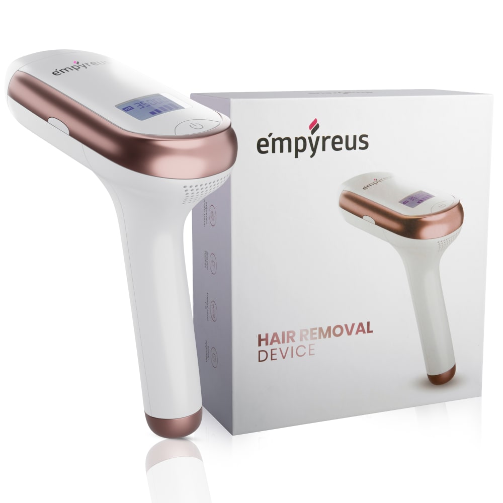
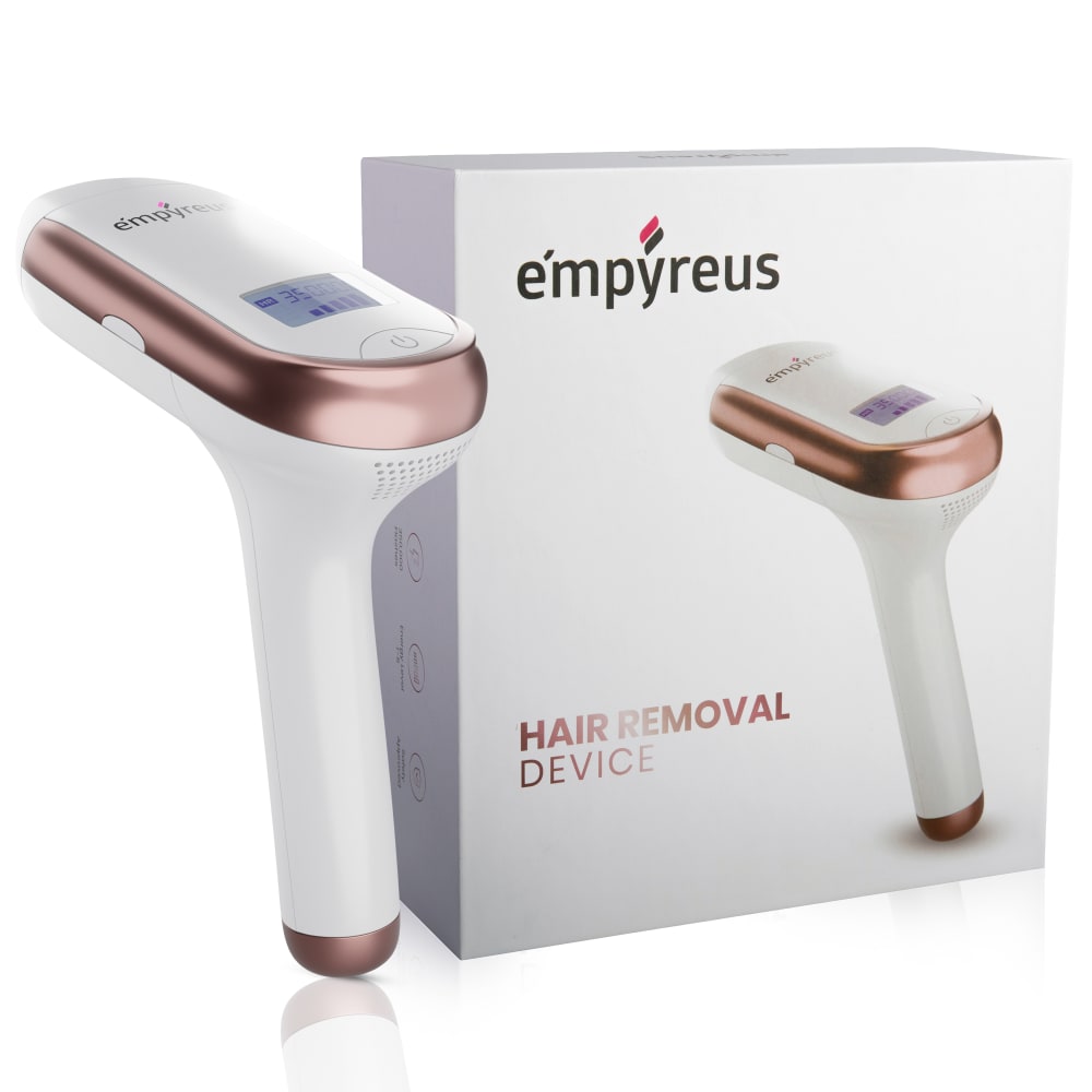
What images catches your eye the most if you were shopping on Amazon?
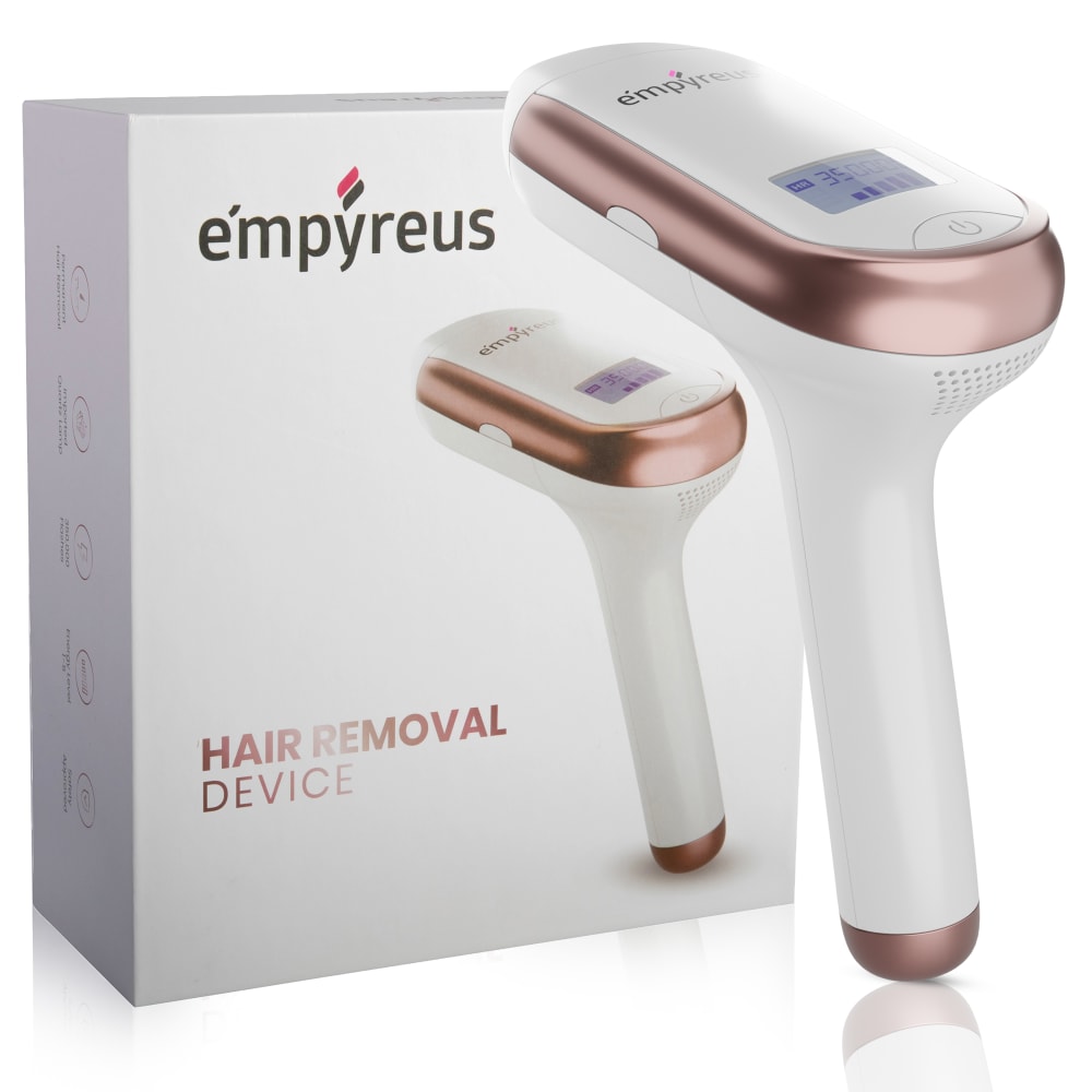
Option C won this Ranked poll with a final tally of 36 votes after 1 round of vote counting.
In a Ranked poll, respondents rank every option in order of preference. For example, when you test 6 options, each respondent orders their choices from first to sixth place.
PickFu requires a majority to win a Ranked poll. A majority winner differs from a plurality winner. A majority winner earns over 50% of the votes, whereas a plurality winner earns the most votes, regardless of winning percentage.
If an option does not earn a majority of votes, PickFu eliminates the option with the lowest number of votes. The votes from the eliminated option are reassigned based on each respondent’s next choice. This process continues in rounds until a majority winner emerges.
Scores reflect the percentage of total votes an option receives during the vote counting and indicate the relative preference of the respondents. If there is no majority winner, look to the scores to see how the options fared relative to one another.
| Option | Round 1 |
|---|---|
| C | 72% 36 votes |
| B | 16% 8 votes |
| A | 12% 6 votes |
6 Responses to Option A
I view from left to right and want to see the product more than the box. The bigger the photo of the actual product, the better
I think that this one would catch my eye the most because it looks the most realistic. For option C, the device looks bigger than the box which just doesn't make any sense because how can an object come in a box that's too small for it? I think that Option A has the best device to box ratio, which is why it would catch my eye the most. It looks like the most realistic product.
I like the hair removal product is on the left. I like the it shows part of the reflection of the handle
A is better for me. I don't want it too close or too big nor too small. C is too big and A and B both run a close first for me, but I'm going with A. As goldilocks said, "It's just right."
I think option A has the best presentation overall, the product is positioned next to the box very well and doesn't obstruct the view of the packaging, and the closeness of the product and package in the picture is perfect, along with the angle of the items in the picture.
I like Option A the best because the device is bigger than B, but it is not blocking part of the packaging like in C. I think the device in C is way too big and looks awkward next to the device picture on the box. A is fine, but having the device slightly bigger, like in B, makes it stand out better.
8 Responses to Option B
The product does not tend to contrast against the white background or the mainly white packaging. So the orientation of the actual product is going to be key to catching someone's eye.
I chose (B) because it's the picture that shows the product most. (A) is a close second, but (C) seems completely wrong, as it covers too much of the box and seems as if it's on the wrong side for a product placement.
Option B is the most clear looking out of all of them. A is a bit too small, and C conflicts with image composition.
I’m not sure why, but having the name of the product on the box was the most eye-catching design to me. Also, having the name more on the right also seemed to stand out to me more. Option B had both the name on the right, as well as the bigger box, so this was the photo I chose first. I think it is because I have never used a product quite like this before, so the words are really what grabbed my attention vs. the larger image of the product itself.
The hair removal object next to box B looks much more presentable because it is easier to view and review compared to other versions where the box and the object are obscured.
I like B the best because the device isn't right in your face. In A and C the device is looking way larger than it should and doesn't look like something I want to use.
I chose B because i like the display and how the packaging looks
B looks easiest to use
36 Responses to Option C
C seems the most consistent in regards to sizing of the box and the product itself (to me anyway).
Option C is the winner here. I like option C because I can get an idea of how big the product is compared to the packaging.
The first two photos seem much more bigger and detailed where I could read it perfectly through the screen.
Option C would be most likely to catch my eye. It shows the product in more detail than the other options since it is zoomed in a bit more.
I chose C first because it's placement above the picture on the box is a nice visual method called "stacking", that works really well in marketing. Options B I chose next because it looks like it be more scaled to actual size of the product, whereas Option C looks to be much bigger than it might be. One could say that for C, but in C the object is in front of the packaging, in B and A the object is directly beside the packaging so scale is more applicable due to the placement. Overall C is the most visually appealing.
I like C because it shows the product in the largest scale. I like to be able to see the details. A also has a slightly larger product, but it's not front and center like in C. Show the product, not the box. B has the product in the smallest scale, which makes it hard to see the details.
C definitely catches my eyes because it is larger and I feel like more detailed. B and A are smaller in pic size.
looks of better quality
This one is larger and stands out the most
It is larger and would cover more area at one time. When using it on legs or arms it would take a lot less time than the other options.
My first choice is the most complimentary to the product. I prefer the way that the product is lined up. When it is shown on the outside of the box and then lined up with the product photo on the box itself, it makes it look quite professional and well photographed. My first choice shows that the product is exactly the same as the item pictured so that the person buying it knows they will get exactly what they see on the box
Option C is definitely the most eye-catching image because the product is shown larger and the text "Hair Removal Device" is more prominent and easier to read.As for option B, the product is way too small compared to the other 2 options. I feel that my eyes will be more drawn to other product thumbnails from other brands if I was looking at a search result page on Amazon. However, I feel that this option is still better than option A because option A's small box size makes the brand name and the "hair removal device" text too obscured.
Option c is less cluttered than the others.
C is more visually appealing because the box and product are closer in size. A will make you stop and look and B is ordinary
the product itself is moved up closer in the images with choices C & A.
The size of the product in option C really stands out and catches my eye. It was the first thing I saw. Option A is a little smaller but still able to catch my eye more then option B does. Option B looks nice like the others but does not stand out as much because the image of the product is smaller.
Option C shows the product at a good angle
I chose C first only because it shows the product larger than the others. Then A because it got a bit smaller and B lastly because it was the smallest image of the product.
I chose C because I can see better how large the device actually is, with A and B, I see absolutely no difference.
The device was in the front and doing so made it look bigger catching my eye immediately. Subconsciously it seemed stronger and I would buy that it.
The closer view was the best photo of your product with the box. it is just easier to see more detail.
The one that catches my eye the most is the one that makes me try to see what it says on the display. I had to look and look though to see what this thing actually was. I wouldn't call any of these appealing or interesting.
It looks a bit bigger and zoomed in maybe.
The larger choices just pops out more and grabs your attention better than the smaller ones.
They aren't really different enough for me to have a strong preference. They all show the same items at about the same scale.
When I'm searching for a product on amazon 9/10 its on my mobile phone. As I'm scrolling through I sometimes look at the products name but most of the time the image is what gets me to click on a product. The reason I picked C,A,B was simply because of the product size. In A the actual product was to small to give me any details were as C the product was almost the entire image
Choice C is just pleasing to the eye with the product being parallel to the image of the product on the box. The other two options look alike to me, so I don't really prefer one over the other.
C shows the item in the biggest way which makes it easier to understand what it looks like
I like having the item on the right because that is where my eye focus first when looking at an image.
I like the way C is set up. I think having the actual product in front of the box helps maximize its quality and makes it look very realistic and nice. Curious to learn more about this actually, I am going to go to do some research as I could very much use something like this!
The product is easier to see in C. It looks bigger.
Being unfamiliar with this object, I feel the close up pictures will probably be the best for me so I can see and figure out how exactly this product works and get an idea of how I can use it.
C because it is highly eye catching and gives off a lot of energy.
I chose them by the life look size. The size in which looks more realistic.
The actual product needs to be much larger than the photo of the same product on the box, otherwise there's no reason to show the actual product. You can just show the box. C has the largest product and for some reason it captures my attention being on the right side of the box. I think that this is because we read left to right so our attention scans to the right and ends up on the right and that's where you want your product to be. A is 2nd because the product is larger than it is in B. The product in B is just way too small.
Option C is the top choice for me because of the way it is sitting. The actual product being on the right side of the image draws in your eyes. It also helps with the comparison of real size to the image on the box. Option A is my last choice because it does not look realistic. The way the box is positioned makes it look darker and unappealing.
Explore who answered your poll
Analyze your results with demographic reports.
Demographics
Sorry, AI highlights are currently only available for polls created after February 28th.
We're working hard to bring AI to more polls, please check back soon.

