Poll results
Save to favorites
Add this poll to your saved list for easy reference.
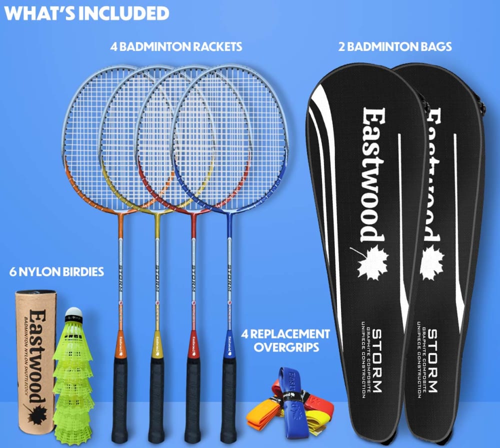
What is better? The labels at the top right corner, or next to each product?
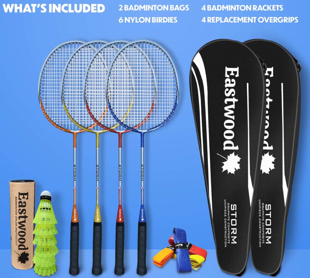
11 Responses to Option A
Option A makes it a little bit easier to understand what is included in the package.
The top-right definitely looks better to me because it has good spacing/placement, whereas bring them close feels more cluttered/too pressed together or in near vicinity to distract or "meld" together.
I think in this case, I like it in the top right because my eyes don't feel like they're taking a long time to search for what is in the set.
Option A allows the viewer to obtain the information about the product quicker with everything being placed together.
I think having everything at the top makes for easier reading/scanning, as in A.
the labels are well arranged and listed.
I like how the label is all at the top right, easier to read.
I think all next to each other just presents a much tidier image. It's easy enough for someone who is purchasing these products to identify what each thing is, so they don't need to be labelled specifically next to the item.
I like option A because it feels more informative and intriguing to me. Option B looks less interesting to me overall.
A more clearly lays out what is included in words
i like how all the items are included in writing together at the top of A
39 Responses to Option B
I think putting the name of the item near it makes more sense and lets people see what they're getting.
I prefer the labels next to each product because it is easier to understand what’s included when it is next to the product.
I liked that this option aligned the labels up with the items included in the set.
i prefer the labels next to the products
I like having the labels next to the items so I can see what they are quickly without taking the time to decipher it.
I think B is a little easier to process since all the text isn't group really close together like in A.
I like that it describes each individual product. It shows the product, and describes exactly what it is, right above each item. It makes it easier to understand each piece, and it also just looks more pleasing overall.
I really prefer the copy being directly above the item it is referring to. It was really easy to miss when they were all up top.
I like B cuz it labels everything that comes with the item which may be better as it seems this may be more targeted towards beginners who may not know what each thing is
It clearly identifies what each item is
I think, "next to each product." works better. I think it just makes for a more useful display.
Option B reads cleaner to me. It doesn't feel like the ad is throwing a bunch of info at me.
I feel this image does a better job of labeling the items included and is more clear and easy to understand.
It is better that it's next to each of the item. So you know exactly what you're getting
I like seeing directly on top of each product what it is; it helps me to figure out what I am getting.
The titles of the equipment work a lot better next to the actual products! Looks good.
I think the labels next to the product make it easier to see and understand what all is included
I like them next to the product. It becomes more descriptive and informative. It also brings more variety to the picture
Option B is a better choice as it gives consumers a better visual representation of what item is and titled. The consumer can easily grasp what is what as not every player of this sport is aware of the name for each item.
I choose "B" because I like the labels next to the product.
Next to each product. It’s more functional and professional.
Next to each product is easier on the eyes.
I chose B because the way the labels are in the product make it easy to understand what each product is and how it will work.;
Choice B is better because having the labels next to each product in the image makes it so that I clearly know what is what.
I like the labels next to each other because they are more balanced with the design, both in terms of aligning up with the individual products and adding balance by breaking up the lines. I think everything on one line looks too crammed, forced, and awkward.
I like Option B because I am more sure about what I'm getting with my money.
I like the font being next to each object so I know what's what
The labels on top of each item makes it easier to identify which item it is.
I like the labels next to each product. Option B. It is more descriptive labeling that way to inform the buyer.
I prefer this because I think the text is better over the individual items
I prefer option B because I think that having the labels next to the products leaves no questions as to what the products are. I think most people wouldn't even need labels but for those that do need the labels I think that having next to the products in essential as well.
The labels look better in option B because they look very crowded in option A.
I liked that option B labeled each item.
Next to each product so everyone knows what everything is.
I like the one with next to each product. I know what each product is.
I like the labels next to the product, its a lot clearer
Top right labels are much better. I think they are more natural to read there. Better look here and think people will appreciate and understand the image better.
I like the labels next to the product because it makes it easier to identify each thing.
The labels next to the product because as a new user to stuff like this I might not know exactly what each thing's real name is
Explore who answered your poll
Analyze your results with demographic reports.
Demographics
Sorry, AI highlights are currently only available for polls created after February 28th.
We're working hard to bring AI to more polls, please check back soon.

