Poll results
Save to favorites
Add this poll to your saved list for easy reference.
What style font do you like? And what would you buy? **Pictures aren’t final**
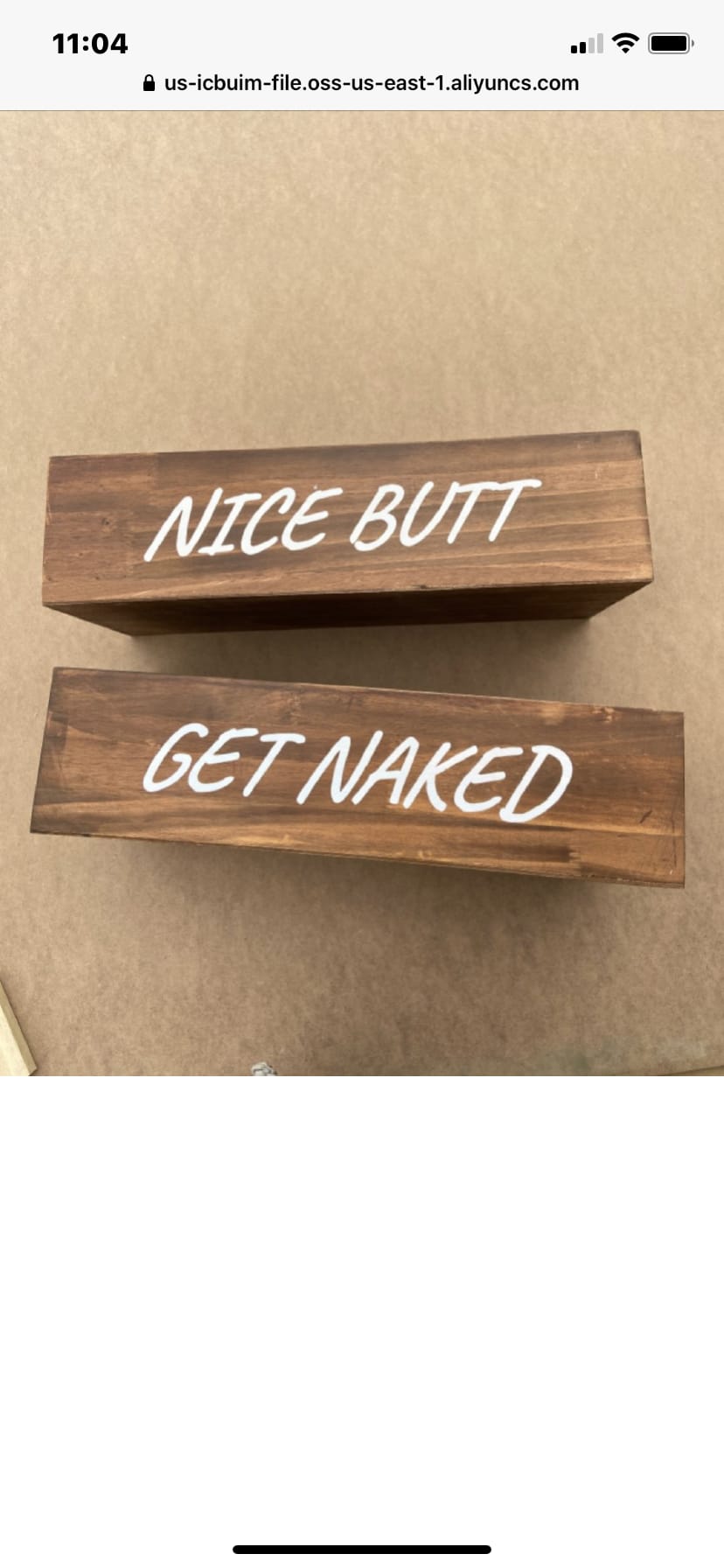
16 Responses to Option A
this font is the best and its funny too
I like the more straight forward font instead of the script, makes it seem funnier.
Option A Have they thought that is much more novelty and funny to me. I don't know why, but the style of the text for this one is funnier.
i think the option is to fake for the message. i like the frankness and boldness of option As font its very clean
I prefer this style font because it is easier to ready and understand.
I feel the other font is old and tired, due to all of the soccer moms using it for monograms. My choice is fresher and better looking.
Choice A is a basic font that standouts and is more clear and easier to process than B.
I prefer non script fonts. Depends on the person and the decor they are going for. The script looks fancy, but these are supposed to be funny and im not sure the script font says funny. Script best for females, non script best for males.
I don't really like flowy fonts. Also, I feel like the simple font in A makes more sense for the message.
This font is better, but I would -never- buy anything like this. This is so corny, cringey, and cheesy. This is shockingly unfunny,and what a very out-of-touch Grandma from a very backwater place like Kentucky would enjoy.
I like A because the messages seem to be more fun and the font is more fun.
the wood makes it looko more authentic and stand out
I think this font seems less snobby and more "normal". Cursive seems like its trying too hard to be different.
This font is clean while a bit out there
This font is easier to read and see. Also the font is more straight forward and simple.
The font in item A receives my top vote because that font reminds me a bit more of writing on a bathroom stall wall, writing in the sand on the beach -- or more importantly, the writing "font" used in comic books. This sort of "comic relief" (LOL) would be a fun thing to see and laugh about while you are using the restroom.
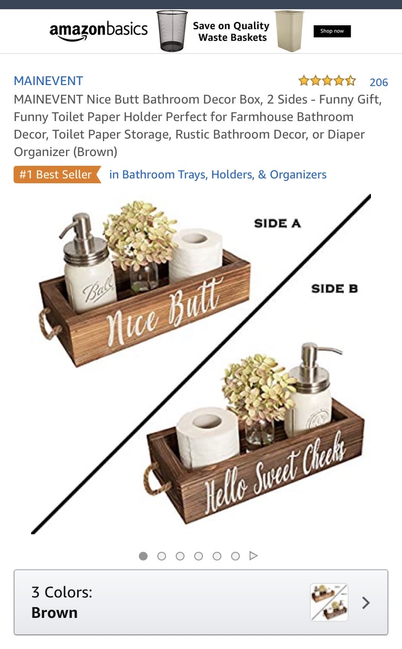
34 Responses to Option B
I think it is helpful seeing the additional decor that can be added. That inspires me to buy them and see how they would fit in my room.
The font loos fancier and nicer in my opinion. It makes the product look more professional in my opinion
easy to see product details more clearly and how it will be used in reality
Love this! Would be perfect for the bathroom and the pictures are great
I think the font is more aesthetically pleasing.
In reality, I would never buy either B or A. Option B was more attractively presented than Option A. The font used for the lettering in Option B was also more appealing than the font on Option A.
The font in option B looks better being more cursive and feeling fancier. I would go with that as the best option. I like the way it looks over the more modern font in option A. So I'd stick with option B as the better choice for fonts here. It makes the slogans funnier.
BETTER LOOKING SETUP AND MORE VARIETY
Choice B shows what the item can actually be used for. Without that context Choice A just looks like something you hang on a wall like a picture.
I think the look of this one is more classy.
I prefer the lighter brown colors, as we need some cheery colors in these trying times.
The font style is better with B, because it is a crass (but funny) message in a font usually reserved for a degree of fanciness The font in A is a bit too direct.
Looks a little with the sayings on two sides and the picture having white background.
I prefer the font for option B. Not the product though.
I chose “B”, I think they would give the bathroom a bit of fun and like the fact the it shows decor ideas. Option “a” is bland and does not really tell a story of what the product is. I would buy!
I like option B the best because the font is writtne in an italic script that for some reason gives me an even more rustic looking vibe to the product. The capital letters for option A look too clean for me on something that is a rustic looking product.
B looks better on the side of the product over A, at least to me. A looks "local shop".
text style looks more elegant and high class despite what the text says
I liked the font of B and the wording. Its appropriate for any age.
I like this one because it shows more specifically what it can be used for in the bathroom.
I like cursive writing. So I choose option B.
I like option B because I like that it gives the total product package as it gives me a better idea as to what it is supposed to be.
I like B because the script style gives it a little bit of a decorator look rather than a country store feel
This font is classy, which contrasts well with the content of the message. The other font is a bit too casual!
I liked the cursive style and makes for a good visual compared to A. It fits well on the wood finish and style in my opinion
more professional looking listing and images, laid out better and in use rather than just a focus on the words on the front, you can see the product at more angles and how much items it holds
I think B is funnier because the fancy font clashes with the crass message
The script font has a classier look to it that looks more aesthetically pleasing.
Cute item I chose B because I like to see the product in use.
I think the font in B is cheekier (no pun intended) for a product like this. I also like the "Hello Sweet Cheeks" message; I think it's funny and clever. I also feel like the cursive font in B fits better with other home decor items as I see fonts like this on signs and plaques a lot.I
I am an old timer who writes in cursive. Badly, but I know what good cursive looks like. Option B reminds me of how my writing should look but doesn't. The other one is ok, but B looks more human and classical then the other one. I will help us remember.
I prefer B. B looks cute and sassy. B has a nice picture as well. I don't really like the saying of Get Naked on A. I also prefer the font on B.
I like the flowy fonts cursive type things for decorations. It looks more pleasing to the eye in my opinion. The other is a nice font too but in my opinion for something that's a decoration it's better to be a cursive font.
I get the full idea of what this product does and how it will look in my home.
Explore who answered your poll
Analyze your results with demographic reports.
Demographics
Sorry, AI highlights are currently only available for polls created after February 28th.
We're working hard to bring AI to more polls, please check back soon.

