Poll results
Save to favorites
Add this poll to your saved list for easy reference.
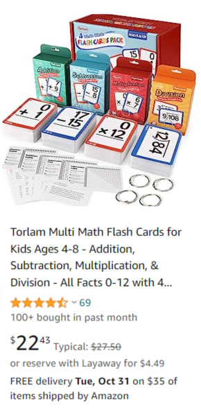
When shopping on Amazon, which one of these images would you be more likely to click on, and why?
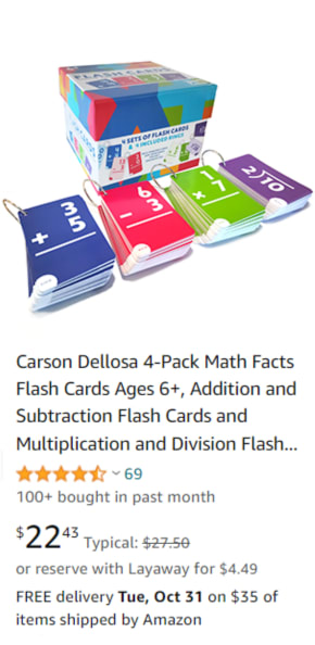
14 Responses to Option A
I like looking at the assembled cards that have rings on it. Then I can imagine using it. Just seeing boxes of cards and the cards isn't as good.
These colors are more vivid and stimulating.
I would click on option A because I like that the cards have solid colored backgrounds making the white numbers written on them easy to see and read.
This option features cards that use brighter and more vibrant colors.
The colorful backgrounds on these cards stands out and grabs my attention right away. I also think the bright colors help highlight the numbers on the cards better.
THE BOLD COLORS AND THE LARGE PRINT MAKES THESE CARDS CATCH YOUR EYE FIRST
It's tricky because they are both so colorful and fun, but I ultimately went with Option A. Upon viewing both images closer, I realized that I very much prefer the colors used in Option A. I think they are unique, rather than using traditional primary colors like Option B does. They are more pleasing to the eye and more vibrant.
I prefer option A because its color and design are more elegant than those of option B.
I like the colors better. They grabbed my attention.
I think the brighter colors of the cards are much more eye catching
I chose A because when it comes to children, they respond more to colors that "pop" and it grabs their attention more and make them want to learn more.
I like the color scheme of these a bit more. It is much more vibrant and much better looking overall
I would click on these math flash cards. They have a very vibrant appearance. It is also colorful and gives me a level of excitement. It provides a positive energy in learning.
I prefer option A. I like the bold colors of the cards. It seems to make them stand out more and more easy to read.
36 Responses to Option B
i like that it shows everything you are getting
B is more pleasing to me and better displayed as compared to choice A.
I like the image that shows all of what I would be getting in the package. It helped me understand exactly what I was buying.
I think B is the better choice because it looks better from this angle, and it seems like a more complete set.
It is useful for a wider age range which makes it more desirable and beneficial. It is appealing and attractive too. I like the colors and the design too.
This image in Option B is really set in a professional and eye-catching manner.
I think they both look great, but B looks more fully featured
The black and white cxards are easier to read.
I prefer the more traditional look of B. I think the dark coloring of A might be distracting.
B has more options to play, so I would buy B.
B is more aesthetic, the product is placed in an organized manner that makes it more visible, in general the product is displayed in a better angle.
Like the way the photo is done in this one compared to the other.
Option b would get my attention better and have me more likely to click on it. I like the way option b looks in the image it has a more inviting look. It looks like it has a better look at the entire product line it looks like it has extras I like that you can see extras in what looks like everything that you would get if you bought this set. I prefer to see everything that comes in the set lined up in a clean manner like option b has.
This option shows more of the cards and what you get in the box which I prefer.
For some reason it Option B seems like it has more to offer. Even though all of them are showing the same math functions, it seemed to me that there was more in option B than A as in more to offer, more cards
Although A is more colorful and eye catching, B is easier to read against the white background.
I prefer Option B as my first choice. The set and cards look sharp and attractive. The details are sleek and modern with the equations having a white background making the black numbers stand out. Option A is also nice but not as striking or eye catching.
I think it's helpful to see the product as well as the packaging.
For me this seems like a more in depth image when it comes to showing the product.
I like this one, it looks like you're getting more or seeing more of it. The way the flashcards are stacked, you can see more of them, see the actual part your kid will be using and it looks like you get so much more for the same price. I like that the other ones are brightly colored, but that might also distract my kids, so I would just stick with the color on the outline instead of a different color on the full card.
As and educator, I think the black numbers on the white background are easier to see quickly and therefore get into the memory the easiest (even if they don't look as fun)
I chose option B because the white background on the cards is easier for the kids to read.
I like B because I like how they come in there seperate boxes and you can put the rings on them your self. It seems more organizzed this way. I like the display of the product.
I like the look and design of the cards in choice B that I would pick these flashcards.
It looks like it has more variety with all the operations of math.
I think that this set of cards has a more robust and complete packaging. I like that you are being showing the external boxes as well here.
I picked b because the age range is to 8 meaning there not a lot of older kid stuff in there.
I like the white backgrounds and colored borders on Option B, which looks more professional, useful for kids.
I chose B because the image shows more variety of activities using the cards, and thus more exciting.
It seems both the products comes with same price and specifications so i am choosing option B as my first choice depending upon the design of the product .
This image shows more of the product than the other one, and gets my interest better than the other image.
I can see more things in this picture and would make me click it to see what everything is.
I feel like everything looks more colorful and fun in choice B.
B because the numbers stand out more to me.
B seems more engaging and better laid out. Cards are bright and colorful.
I like the look of this packaging a lot more. I like the card design more also.
Explore who answered your poll
Analyze your results with demographic reports.

