Poll results
Save to favorites
Add this poll to your saved list for easy reference.
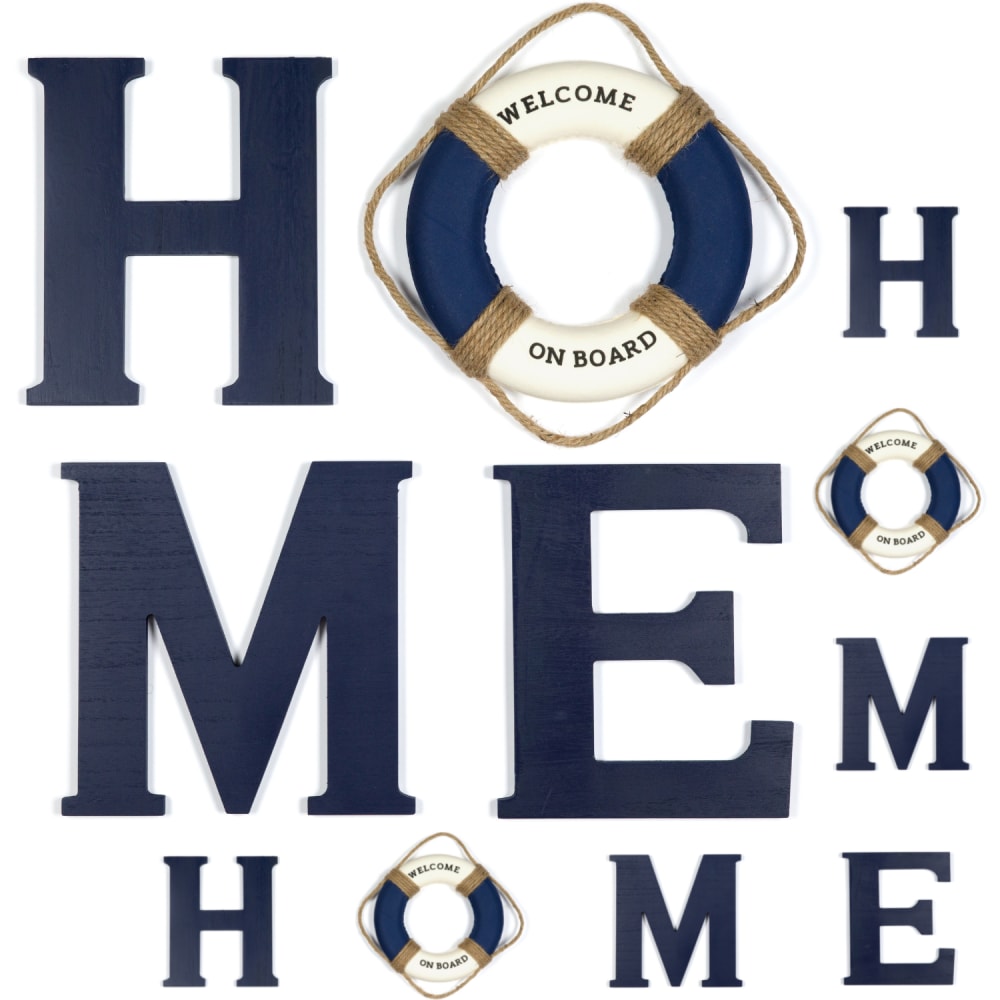
When shopping on Amazon, which one of these images would you be more likely to click on, and why?
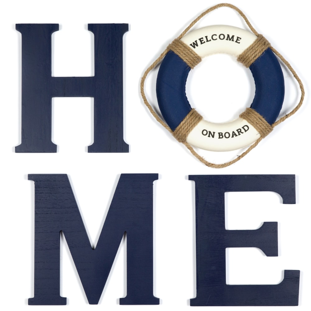
41 Responses to Option A
B is a bit redundant
I would choose option A because it is bigger and minimal.
the other one is way too much i dont know why it's done so many time but im not into it
The display with just the text is enough for showing off the home banner
Option A is the best option because it has the logo in large text front and center. The other option looks messy.
This one looks nicer makes more sense.
I chose option A. Option B I see is saying HOME but there are just way too many letters that people can get confused as to what this image is saying
I prefer this option because it only uses the word once - the overall design is much cleaner and less cluttered than the other option.
i prefer not seeing the word "home" twice
I find this a little more pleasant to look at because it's not as crowded.
I like the simplicity of Option A. The other option has way too much going on and it isn't immediately clear what Option B is trying to say without having seen Option A first.
I chose A because B is too repetitive and busy looking. It is tacky.
Choice B is very redundant. Only one instance of the word HOME is necessary.
I voted for Choice A, because I felt like choice B has way too much of the same word which seems like it's over driving the point home. It's clever to have the E in home connect to each other, but three Home and two lifesavers is a bit redundant. This is one of those less is more moments and Choice A does exactly what it needs to do as is and that is to draw attention with the uniqueness of the simple four letter word with a single lifesaver as the O.
I chose A because B is messy, overwhelming. I like that B shows different configurations, but I think it's too much for the main photo.
This image is simple and clean, it doesn't have a lot going on and that is good. Option B has a lot going and it is kind of confusing to look at.
Option B feels way to cluttered
A is nice and simple with it's message. B could easily be misread as HohoMemhome and that's just weird.
Choice B looks much too cluttered. Choice A is clean and easier to understand.
I'd choose option A because option B looks a lot more cluttered in its design.
The other one looks a little too chaotic and harder to read
I prefer option A because the design is more simple and not as redundant as the other option.
Option B is is way too busy to even consider. Option A is calmer and more peaceful and in keeping with the beach motif.
Option B is too busy and too confusing! But Option A is to the point and rather fun.
I think everything is a little jumbled in B. A has a neater presentation.
I rather prefer the option A home wall decor product image because I like the larger size of the letters and the welcome on board object much more than the more repetitive and smaller images of the home wall decor shown in the option B product image.
I picked A since B is way to over-crowded with all the words which makes it harder to read. I can easily read what the letters in A are spelling and it looks a lot neater and clean. The spacing is done nicely, eye attention grabbing and would make me want to see other pictures to see how it would be used.
A is more straightforward and less confusing. B, I'm not sure which way I'm supposed to be reading first or if I'm supposed to think of it as multiple words or multiple versions of a logo.
I would click on option A, it's simple and straight to the point. Option B is repetitive.
The other design is too complicated and I just think it's too much to handle
I like this one because I feel like this is easier for my eyes visually. While B looks cool, it's too busy and confusing for me
I think B is more subtle. Only one lifesaver and home sign is needed.
Option B is overwhelming at first glance.
This option showed the text in a bolder font.
I like A because I just think it is silly how there are three homes, like what is the point of that?
I would click on option A because I like that I can see the letters and the life ring that make up the word home. I like that I can just focus on the one image compared to the way the letters and life rings are arranged in option B, which have HOME spelled out in three different ways.
I like a. Nice and simple. B is just overdone.
Option B is too busy. Option A is much more attractive and appealing to the eye. I prefer the more simplistic.
I like A because it has a cleaner less cluttered look to it compared to B.
Very visually nice to see on the first glance. The large font letters work out well. I chose A because it looks good quality.
Option A. definitely because option B is way too much of one word. Not sure exactly how to word this properly and I'm not trying to be rude but this only way I know how to explain it but it's extremely overwhelming, confusing and it makes absolutely zero sense. I'm so confused by it and I'll try explaining it this way looking at the image it looks like the word home is 12 separate letters like when I order it I would be receiving the word home three times to hang like that who would want to do that? The way it's displayed It's confusing. So confusing that I've spent five minutes trying to make sense of it myself. There's a way I can see it is maybe it's just displayed in the listing that way but I don't think so because they're sharing the letter E and now that I have completely over thought this for a solid seven minutes lol that's all I should say
9 Responses to Option B
I like being see three different ways that the word is spelled out.
B (more letters overall) but that is primarily simply because the font on the letters looks less blurry.
I liked seeing both the larger and smaller versions of the sign.
I would buy Option B. I like the repeated word. It brings home the message, while providing the viewer with more to do while taking in the piece.
The visual of different layouts for this decoration gives the view suggestive ideas for how it could be used other than the standard layout.
There is a lot more variety, and variety matters a lot to me.
i chose option a as the one i would click on first because it is the simplest style which i prefer
I like the look of the one that has the additional HOME across the bottom. Easy to read.
I think B is the overall better option for a listing thumbnail. I like how in B, it shows the different configurations this home decor can be displayed at, which is useful for the consumer.
Explore who answered your poll
Analyze your results with demographic reports.
Demographics
Sorry, AI highlights are currently only available for polls created after February 28th.
We're working hard to bring AI to more polls, please check back soon.

