Poll results
Save to favorites
Add this poll to your saved list for easy reference.
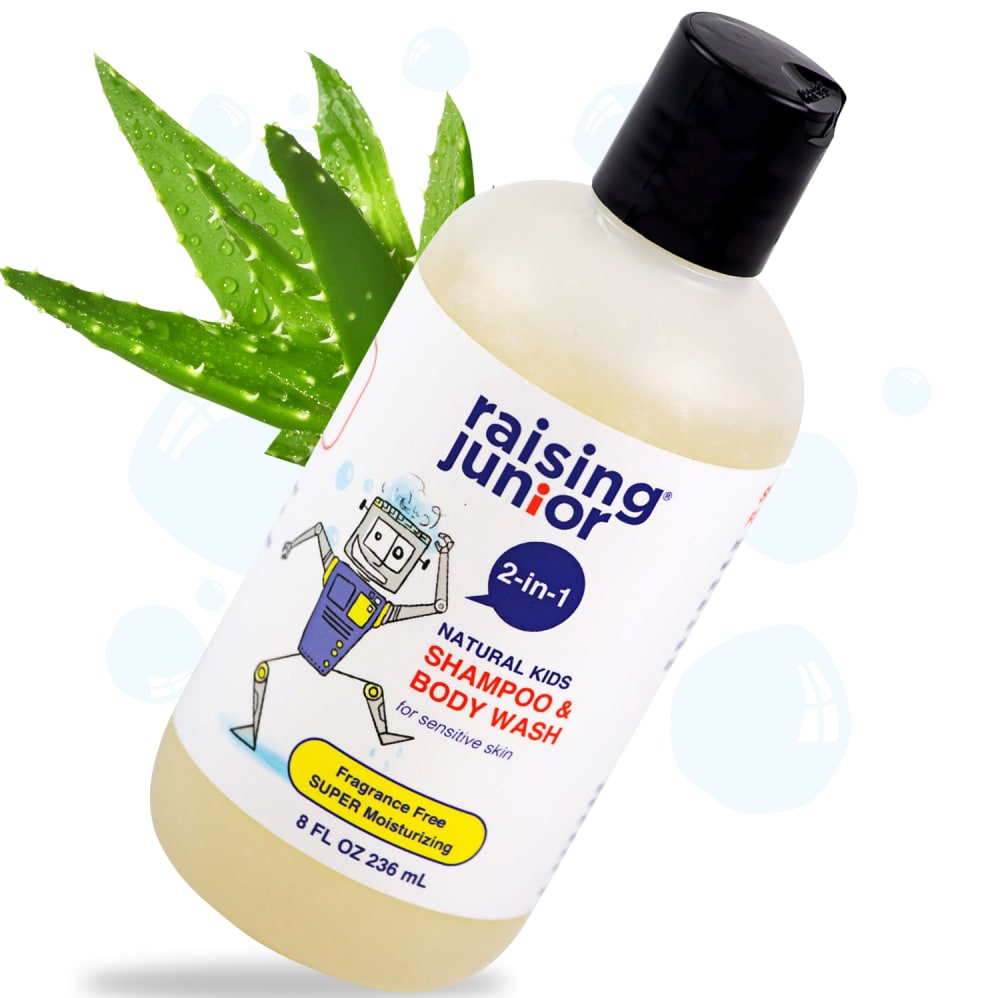
Which 2-in-1 kids soap looks better?
Age range
Education level
Gender identity
Household income range
Number of kids
Options
Racial or ethnic identity
29 Responses to Option A
A plant in the background makes it look more organic.
People trust aloe, so of course moms want to see it on a product for their children. Plus the added green is visually appealing.
this one points out more that there is natural aloe in it.
This one looks better because the aloe makes it look like a more natural product and soft on the kid's skin.
The aloe pic is more appealing to me.
It lets me think there is aloe in the shampoo.
I chose option A because of the picture of the aloe. It makes me feel like the product contains aloe
The extra green splash of color looks good and is needed in this picture as the bottle does not have much color.
This 2-in-1 kids soap looks better. The contrast helps make is catchier
It looks nicer with the plant behind it. It seems more 'welcoming'.
I think the added aloe vera picture grabs your attention better and is just more appealing.
T chose image "A" - I guess" - because of the "little" extra green leaves behind the bottle of shampoo. It just seemed to attract my attention first. The other image seemed kind of dreary and drab never to this one.
The aloe vera plant makes option A look better and more eye catching.
I like the addition of the aloe because it makes it seem more natural.
more clear and demonstrative
I like A the best because of the aloe plant. I like aloe products and use aloe products frequently to heal. I would buy this one because of this.
I chose A because i like that it shows the aloe in the backgroung, makes me want to click on it more
I like how this choice shows the aloe in the photo so you can see what the product is made up of.
The exposure is better on the photo that I have chosen.
Seeing the green plant on the top right makes it look higher in quality.
I like the plant in the ad it looks pretty nice.
The aloe leaf adds a pop of color and gives the impression of health
I like A because aloe is soothing and I would assume the body wash has aloe in it. The plant makes it look more natural.
It has an eye catching splash of color.
I like the green leaves
Since they are identical except for the faint prints in blue on Option B and the Cactus in Option A it's pretty much a toss up. But in the end the Cactus at least adds a bit of color and tricks you into thinking it's a natural product.
I like that it has aloe leaves, suggesting that it contains aloe.
Well, a prickly pokey thorny plant seems an odd thing to associate with bath time for little kids, but I get it is supposed to mean aloe and soothing. It kind of goes with the theme of that odd clunky robot on the label, and even the off balance of the photo composition. Kind of artistic in the way the theme goes (with tilt/angularity/not smoothness), so I chose it. I like how it was done.
This image shows that it contains aloe which is good for the skin
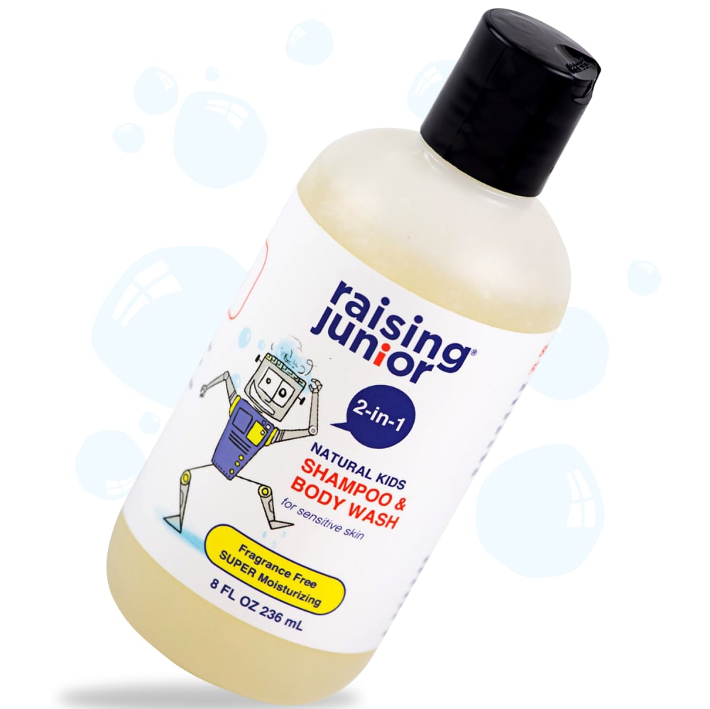
21 Responses to Option B
i like the pop of color in the background
Option A looks like a CBD product and I dont want that for my kid so the soap bubbles are more than fine.
I like B. The aloe plant sticking out from the other just looks very odd and out of place.
I actually din't see aloe as such a big feature on this product that it made it to the front of the label so I prefer the blue bubbles but they should be a little darker. Right now they look like a watermark.
The leaves are a little distracting
My choice looks more kid friendly than the other.
I think the aloe leaf in the back adds just a bit too much. The bottle itself is fine
I cannot tell what type of plant is behind the bottle. If you want a plant there, go for something that looks nicer, maybe with a flower, not something that looks like weed.
The bottle with no Aloe looks much better. Label has no info about Aloe, so nobody would expect to see Aloe in the image. If there is Aloe in the ingredients, the front label should definitely mention that (for sensitive skin with Aloe extract, for example)
i like one without aloe pic
i like it very much
I think the leaf is not necessary in the picture. It actually distracts from the item a little bit.
I choose B because I don't see anywhere on the bottle that it contains aloe so I didn't want to vote for A.
B looks better. Do not need the aloe leaves in the ad.
This is easier to read and see than the other one.
Not sure what the purpose of the plant is, doesn't have anything on the bottle stating it uses it.
I picked B. I did not like the aloe plant. I know aloe is soothing for the skin but the sharp points on the allow leaves were unappealing and just the green plant reminded me of poison ivy even though I know it is not poison ivy.
aloe plant was distracting
The fact that Option A has an aloe plant behind it does not make me want to buy this product anymore. In the natural baby/children's section everything is about price and how safe is it - putting an aloe plant in the background won't change that equation.
I feel that the photo with the aloe leaf is insulting. The packaging doesn't mention aloe but it's just thrown there in the background. As a parent of a child, I'm looking at the product itself, not what's thrown into the background, it's not just insulting but maybe even distracting from the product. If you want to keep the aloe leaf, maybe incorporate it differently.
I prefer option B because Option a has the leaves in the background which adds nothing meaningful and is rather distracting
Explore who answered your poll
Analyze your results with demographic reports.
Demographics
Sorry, AI highlights are currently only available for polls created after February 28th.
We're working hard to bring AI to more polls, please check back soon.

