Poll results
Save to favorites
Add this poll to your saved list for easy reference.
Which Amazon listing main image would you most likely click on? Please explain why.
Age range
Amazon Prime member
Education level
Gender identity
Household income range
Online shopping marketplaces
Options
Personal income range
Racial or ethnic identity
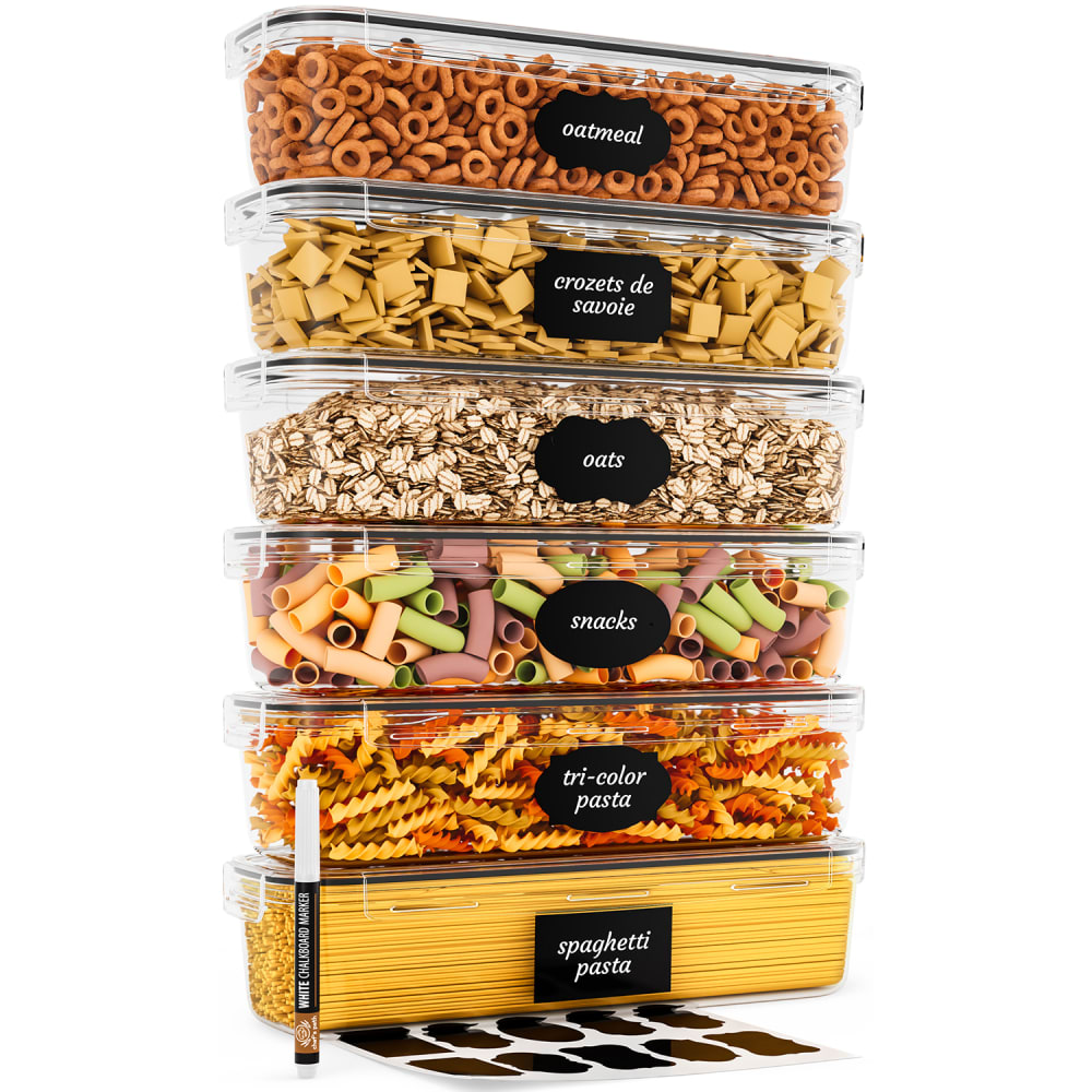
21 Responses to Option A
I like choice A because it looks more organized.
A shows how tall they all are stacked together with the marker used as a reference.
A makes it clear that all the containers are the same size and that they aren't being strategically hidden in the product picture.
I like how A is stacked, it helps show the items much better.
Because I like to see that you can stack it pretty high.
I thought option A showed off the product a bit better.
I selected option A because it is easier to see all of the labels on the containers. There is also a better overall view of the containers, so I get a better idea of what they look like.
I chose option A because I like that I can read all of the labels.
I prefer option A for this listing image photo because it looks more attention grabbing and effective, more grand and higher in quality, coherent.
I chose option A as most likely to be clicked on because it appears to look much more organized then option B. I like how all the containers are simply stacked and you can see exactly how each one looks with writing.
With choice A I like seeing all containers stacked up on top of each other to give you a better visual. Choice B seems to have to much space above that it's a little distracting.
I like the presentation of how the items are stacked.
I would probably click on both but A would catch my attention faster because of how tall the product stacks. This would be appealing in terms of how space saving the product could be.
This option provides a clearer view of the product, it’s features, and accessories. I can see that they are all the same size, I get a marker, and there are various types of labels. Option B this was not as clear, you really can’t tell the full size of the bowls.
A focuses my attention better because it's only one column as opposed to two.
This option looked more impressive with its stacked tower of containers.
I like Option A the best and would most likely click on this image if I was shopping on Amazon because I like how all the storage containers are very visible. They seem to be more symmetrical and visually appealing to me. I like being able to see the text on the storage containers clearly.
I would click on Option A. The tall stack is eye catching and impressive.
Having all of the containers in one stack makes it easy to see what you get and how much each one holds.
I like A over B because it is easier to read what is in the containers for A.
I can see the products that I'm buying in full view with option A.
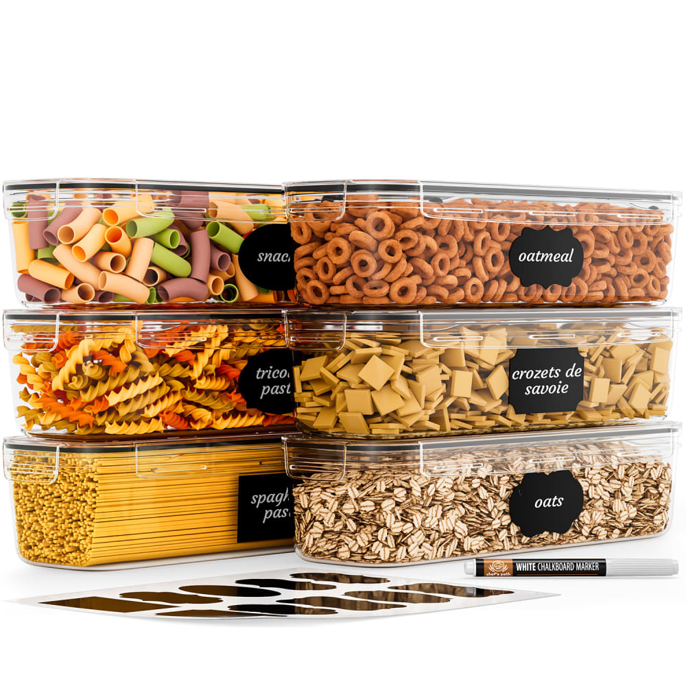
29 Responses to Option B
The way the containers are stacked in B looks neater and more realistic to how they'd be in my pantry.
Gives the image more depth and looks more organized
I like B because I can see that they can be stacked but also I notice the label marker better there. Also, I would more realistically stack the boxes this way in my own pantry.
It feels like I don't have to scroll down a page to see all of the products in one picture. It makes it look like a cleaner image.
I would go with option B. I like how it is stacked by 3s and side by side, it gives the product a greater visual appeal.
I find this option the most attractive and attention grabbing because of the display and layout of the product.
I like the two shorter stacks of containers, because to me it feels like more of what I would actually have in my kitchen rather than one tall stack, and the picture of option B also just is a bit more visually appealing.
A is way to tall.
B looks more like how I'd arrange them in my kitchen, so I guess that is more appealing to me.
I think B looks better as I see myself using them more like this than one extremely tall stack.
I like that this image isn't as tall. I can view the whole image without having to scroll or keep looking up and down in the image. It's a better way to show the product.
I find how they are stacked in B to be much more pleasing. I can also read the lettering on the marker easier.
I like being able to see the different stacking combinations that are possible, and believe Option B sheds more light into the flexible range of configurations. I also think that B lets you better see the depth of the containers because they are somewhat slanted. This gives more insight into how much could fit.
I like this one because it looks a lot more realistic to me and I like how the items contrast each other nicely.
I picked option B because I think the display is more practical than in A, which looks like it could topple over.
Option A the stacking looks very awkward, subconsciously I feel like its going to tip over. Also I don't like that the pen is standing. That is why I chose option B its more appealing.
I chose B because I think they are stacked in a more appealing way
Definitely B, the image is more pleasant to look at, colorful and its easier to see the details of the product
The two stacks of three containers looks manageable and gives me ideas of where they would fit in my cupboards, unlike one tall stack, I wouldn't think of separating it and would worry it would be too tall to fit on any of my shelves
I voted for B because I think that the image is more pleasing to the eye and the layout makes it easier to assess the product.
I chose B because it just looks better and gives the photo depth whereas A just isn't as visually pleasing.
I prefer the two stacks of option B. It gives me more of a colorful, fun feel displayed in this way.
The arrangements looks nice to see
I chose option B because the containers look bigger stacked this way.It looks like it would hold more product.
I would most likely click on choice B. Choice B looks well put together and well organized. Choice A looks like it could very easily tip over and the containers could break.
I feel like my eyes go up and down too much when looking at the product photo of A so I would prefer B because I can just look at it and easily see what the set looks like.
Deciding on both images was very hard. I really liked both A and B. So I picked B. I really love the containers. I believe they're both the same in each image. But I picked B because I liked the way they were stacked.
I would definitely click on option B because I like the stacked sizes of the containers better. I could see myself using these containers in this way
It looks neater stacked side by side.
Explore who answered your poll
Analyze your results with demographic reports.
Demographics
Sorry, AI highlights are currently only available for polls created after February 28th.
We're working hard to bring AI to more polls, please check back soon.

