Poll results
Save to favorites
Add this poll to your saved list for easy reference.
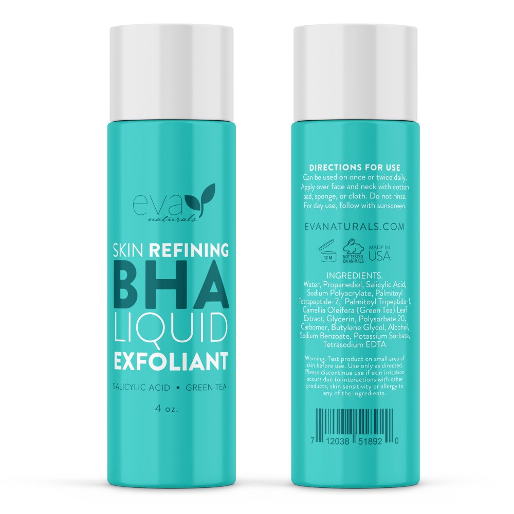
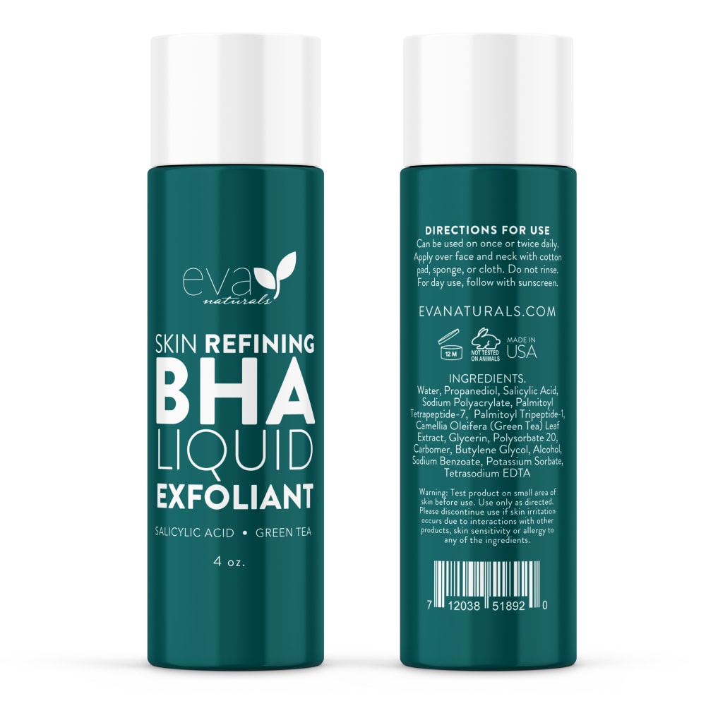
Which BHA Liquid Exfoliant image would you most likely click on to purchase from an online skin care company?
Age range
Education level
Gender identity
Household income range
Options
Personal income range
Racial or ethnic identity
32 Responses to Option A
I liked the color for option A more.
i like the color of the bottle in option A, it catches my attention and makes me want to buy it more than option B
i loved the lighter background color. it is more eye catching
The light blue color pops and looks best.
I would most likely purchase option A because I love the teal color and think it's so pretty.
I think this packaging is much more engaging and really grabs your attention.
I choose option A because it has more delicate colors, and they also attract attention. Delicate colors go well with a product that I require to be gentle on my skin.
I choose A because the lighter color makes the words easier to read unlike the dark color. It fits the product better too.
The main reason I would click on this image to buy it would be because the color of the bottle is more appealing then the other bottle. I like the lighter color of this bottle. It makes me feel uplifted and bright. The other bottle's dark color is depressing and feels heavy. I associate the light color of this bottle with fresher and clear skin.
I like the brighter colors in Option A and would pick that if I were buying between the two.
I like the color of A better - the color of B looks more like spray paint or other industrial spray.
I find Option A for the BHA Liquid Exfoliant image to be more suitable for purchase from an online skin care company due to its gentle color scheme which has a more feminine appeal, while the bolder hue of Option B appears more masculine.
I like the more brightly colored one because that's what I would want to picture from a cleaning product is something clean and bright at the end. I also like how it has two shades of green on it whereas the other one just has the dark green and it makes it more boring.
the lighter color background makes it look more fun and exciting and less dull of a product
I think the Tiffany blue packaging looks richer and stands out more. Hit looks more upscale.
I prefer the aqua color because it reminds me of clean and fresh
I prefer option A. I like the color and look of the container.
I think the lighter teal color is a better design than the darker teal.
I love the bright teal on the bottle and it looks very modern and trendy
It is more eye catching. The lighter label makes me feel like my skin will be brighter and healthier.
I always go for the brighter packaging. It is more likely to catch the eyes of the consumer.
A because I think the lighter color is more inviting and makes the text easier to read. The color makes me think of an ocean, feels calming.
The lighter color feels like something more gentle and clean as well refreshing.
I really like A because of the light bluish green color of the bottle, I think this color is really modern and really stands out. I don't like A because the green color is too dark, maybe if the color was lighter I would like this shade of green.
I liked the lighter coloring it seemed more light and happy.
I picked option A because I like its lighter blue color.
I chose A because teal is one of my favorite colors. Although b is easier to read
The color looks more feminine and higher quality
I prefer the lighter color bottle. It stands out more and for skin care products, I associate lighter packaging with "brightening" and "clear". Also, I like that there are actually 3 colors used on the bottle color scheme, whereas B only has the dark color and then the white lettering. A is much better color designed.
this color looks and feels clean and is an instant eye-catcher - I am very drawn to this option
Slightly prefer the brighter color of A's packaging because it looks more modern than B.
I prefer the lighter color. It seems like a younger, fresher product. I associate the dark color product with old ladies.
18 Responses to Option B
I think with the color contrast, the label is easier to read
B because the darker color makes the product seem more premium and high-end
The color is more appealing to me personally. It would interest me.
The darker sea green just looks so much better in my opinion and more professional.
I think that this one is clear to read and I like the color of the background more then the other option.
Easier to read the wording on B. white letters on dark color. important to follow directions with skin care products
I chose B because the wording on the darker packaging is much easier to read than the lighter color packaging.
I prefer the color scheme and clarity of the package shown in Option B. I feel like I can read the text more easily, aside from my preference of this color palette.
I would probably gravitate towards B just based on color. I find this darker color to be a little more mature. I can imagine myself mixing up A with another popular brand.
I really like the bottle color of choice B and the white lettering. It really pops and is more noticeable then it is in choice A. Choice A isn't horrible, I just like choice B's bottle colorings a lot more.
I prefer Option B because the color is bolder and more sophisticated and saturated. It looks like a product for adults.
I feel like I can see the lettering more. The other one looks faded.
I feel like the text is too hard to read in Option B because the contrast between the teal and the white text is too low. Option B is easier to read because the background color is darker which allows the white text to jump out.
the dark green with white writing stands out more and grabbed my attention right away, love that kind of green
The darker color makes the text easier to read, and it's a very unique color so I do like it a lot more than the other option.
I would more likely click on B; it's easier to read the white lettering on the dark background of B than the light background of A
I feel like the image in Option B is more visually striking because of the dark background and the white lettering. Additionally, it's easier to read.
the blue in B is softer and more elegant
Explore who answered your poll
Analyze your results with demographic reports.
Demographics
Sorry, AI highlights are currently only available for polls created after February 28th.
We're working hard to bring AI to more polls, please check back soon.

