Poll results
Save to favorites
Add this poll to your saved list for easy reference.
Which box design do you prefer for a kid's science experiment kit, and why?
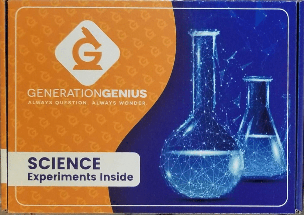
15 Responses to Option A
I prefer option A more personally simply because the color is more vibrant and the text is easier to read.
I liked choice A since the cover fits the theme and use of the package. Choice B looks more plain and generic using a science symbol.
I do not think you need the other symbol that is in B. I thikn the dobul beaker is great and very good contrast.
I prefer the imagery in this design better than the other option. This would be my choice.
This option looks more vibrant and "alive" to me. I really think this looks more appealing and exciting.
When design a kids friendly product, Should consider about the product will attract the kids easily. By that, the option A design was designed very well. It was too good to see and will definitely attract kids mind.
I just like the way the beakers look on this box better it looks more science-like if that makes sense.
i like that this choice has 2 beakers on the box. it looks more real and authenthic
The lettering stands out more, looks bolder and more defined. The flask and beaker on A are also cooler to look at making it look as if an actual chemical experiment is taking place on it.
I like that this design has brighter colors.
This design is much more appealing as the vials have better graphics. It looks authentic and something that’d make kids really feel like a scientist
It’s more sparkly and eye catching. It looks more inviting and exciting.
I chose A because it shows two beakers on the box instead of just one which indicates more variety.
I like the darker tones of option A and the extra flask in option A looks better than option B.
I prefer A. I really like the design of A. I love how it looks glittery.
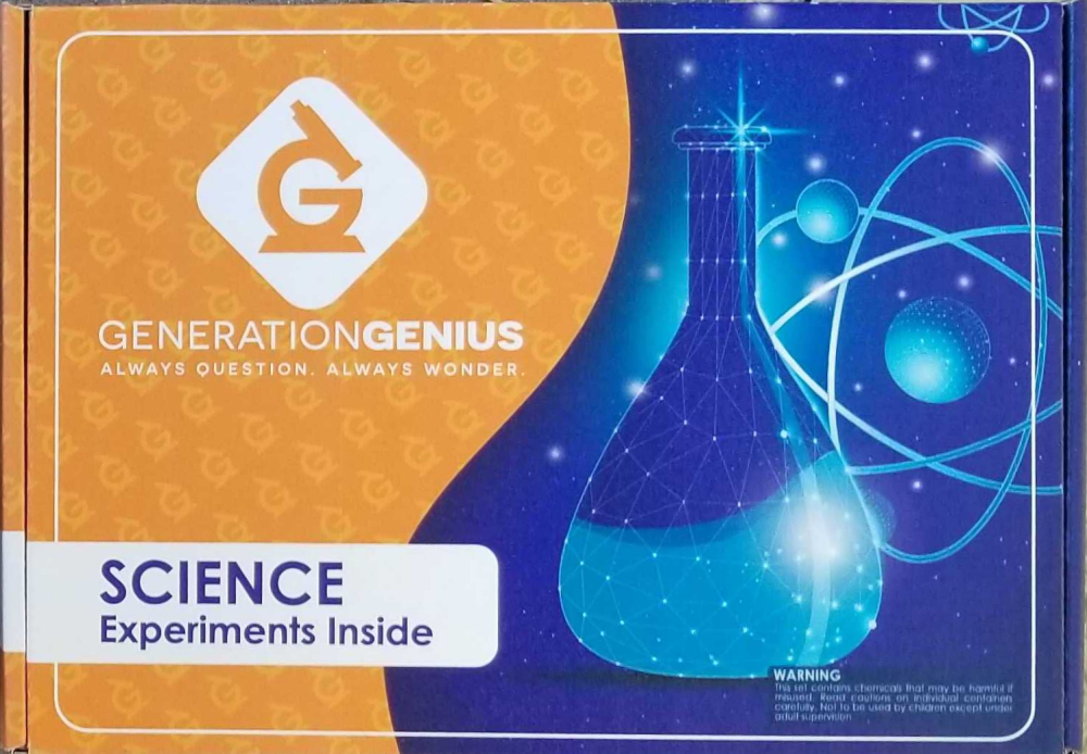
35 Responses to Option B
These are obviously very similar, but B looks like a new product while A looks used.
I chose option B over option A because it is brighter, cleaner looking, and I enjoy the images depicted better. I like that the color is lighter than the overall design it makes it nicer to look at and easier to read the box. I like that the images are of two items and not like option A which only has two different science flasks pictured. I also like that on the science flask of option B you can really see the constellation design easier because it is less cluttered than the flasks on option A.
i like the box design in option B the most because it looks more appealing to kids
I feel like when I think of science I see these symbols that are on the box. The other one just has the beakers.
I like the looks of option b better. I prefer the shape of the flask in this one, and I like the atom.
I chose option B because I like the graphics in the background better. I like the atom looking thing in the back behind the flask along with the other background designs.
I like the variety of having a beaker and a molecule, rather than two beakers.
The science kit in A looks more like a science kit from the 80s. The image is similar to a scan image in moderate quality.
This design is more engaging and feels more science like.
Definitely B. It looks cooler with the beaker and the atom. That diversity of images makes it look more appealing to me.
This looks like it would be more fun for kids and not just a chemistry project.
I prefer the image for choice B. I like the representation of the atom behind the beeker.
I prefer the lighter shade of orange and the atom graphics in the background to the more simplistic design.
Which box design do you prefer for a kid's science experiment kit, and why?- Image B has brighter colors and the atomic particle in the background is glowing and creates a cool visual effect that I think kids would like.
I like the overall brightness of this product. I like the shape of the beaker and the image behind the beaker.
B's colors are a little brighter so they catch my eye more, and the warning in the corner makes me think it might actually have some element of risk, which I think can be good for kids. The blue section also has more stuff than just flasks, so it makes me think about more science stuff than just chemistry.
I like the 1 beaker better in B.
I would choose choice B first because of the writings of it are really looking great and the galaxy picture gives the box a whole new look which will be attractive to my kids aa compared to choice A which has no really that fascinating image.
A is harder to see the flasks, but I like the darker blue. B has more variety in the science oriented graphics which I like
its design and background scientific logo is more attractive
the graphic looks better
The jar design and background design looks very good
The background in B looks more science like with the atom
I think B is best for a class setting it feels more kid friendly to me.
This one is better because it has a more scientific look whereas the other looks fuzzy almost like there's hair all over the box.
I like the light and dark blue in terms of how they contrast.
I like B, the font of the words is more appealing for a kid and looks more intriguing
I like the design shown in option B the best because I think the bottle and atom would spark the minds of people who might be interested in purchasing it. That spark would put them in a buy mood thinking about what kind of expermiments they could do with the kit.
I like option B the best. I really like the atom in the picture behind the beaker
Option B shows a symbol for chemical reaction, which is interesting and relatable. Option A appears like it is a set of vases.
I think b is more kid friendly because of the planets in the background
I choose B because I like the design better. The atom in the back behind the beaker is more appealing to the eye in my opinion.
Option A is too dark. B pulls the eye when they are next to eachother.
I like B better because I think that the shape of the beaker is better. I like the colors more
B I feel is the better design as it image looks better and not as sparkly looking like A.
Explore who answered your poll
Analyze your results with demographic reports.
Demographics
Sorry, AI highlights are currently only available for polls created after February 28th.
We're working hard to bring AI to more polls, please check back soon.

