Poll results
Save to favorites
Add this poll to your saved list for easy reference.
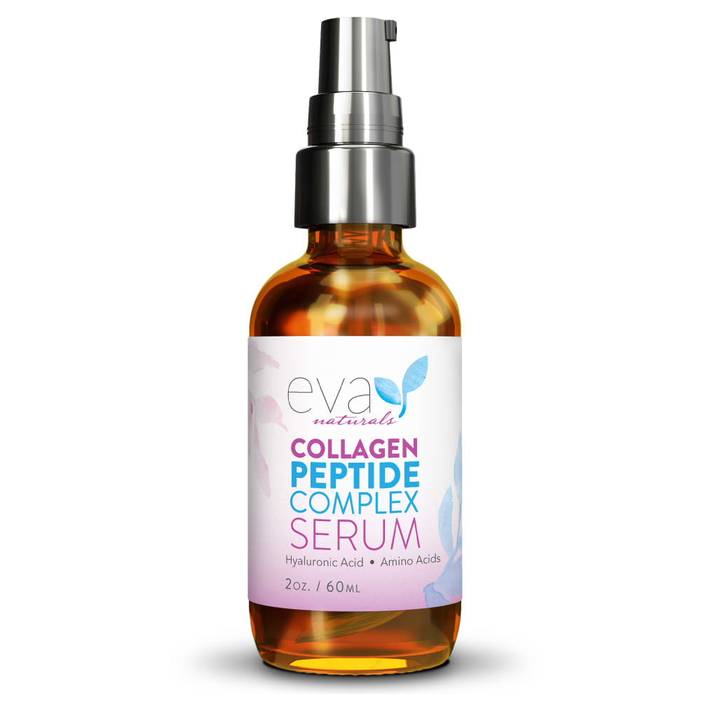
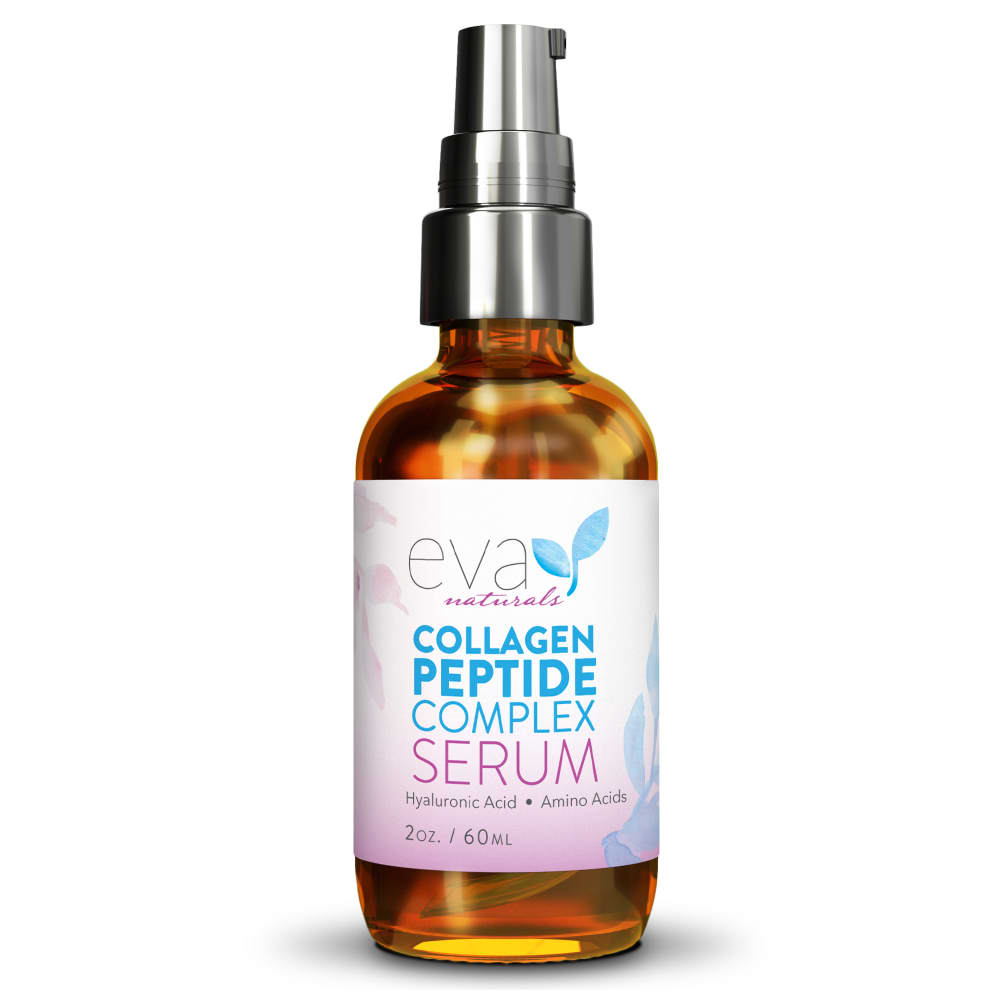
Which Collagen Peptide Serum image would you most likely click on to purchase from an online skin care company?
Age range
Education level
Gender identity
Household income range
Options
Personal income range
Racial or ethnic identity
35 Responses to Option A
A seems more professional.
The color scheme is more attractive. I like the use of two colors to title the product.
A is a bit more eye-catching and it's easier to tell at an immediate glance that it has collagen due to the different colored font.
I like the use of the purple font. It looks more fun and inviting.
I think that collagen in a different font makes it stand out
The purple coloring in collagen just stands out so much more and is so eye catching
Although there's not much difference between the two bottles, I prefer A simply because making the word "collagen" purple makes the list more symmetrical (purple top, two blue middle lines, purple bottom) which is more aesthetically pleasing to me.
My choice is option A because the product is zoom and clearly visible so i choose this.
I honestly wouldn't click on either since I don't like a lot of pink on products. That said, the A label is more balanced because of how the text is highlighted.
I picked A because the packaging is slightly more attractive.
This option made the word "collagen" stand out more since it was in a different color.
I like the color of the text in this image of the product, I think it pops out more, and really grabs my attention.
I like the color differentiation with more purple copy in A.
The word "collagen" is in a different colour which makes it easier to read
This is the one that I would be likely to click on and buy. This one stands out and grabs my attention a lot more than the other one
I would be equally likely to click on either because I cannot see a difference between the 2 images.
The lettering colors on option A are more balanced and attractive. The word collagen is emphasized more as well.
I like choice A because I feel that the bottle is more eye catching than choice B.
I like the diffferent colors of text in A, it stands out more.
I like the word collagen being in a different color.
This has that little bit more color and slightly more vibrancy. It does cause focus on prominent ingredient.
Having the different colored text on the bottle makes it stand out better and also makes it easier to read.
I like how collage is in pink in A to stand out.
the "collagen" in dark purple is easier to read than the all blue one
I prefer option A because it caught my attention the most
I would be very likely to purchase from the company because the packaging is very eye catching and looks high quality.
The images look the exact same so i just picked at random.
I don't have an issue with either one, but I find the look of A to be more appealing. I think the use of color in the text is more cohesive.
I think the extra bit of purple is eye catching.
The are almost the same, but A for the pink color
I like this one. It is pretty and attractive. I would chose this one. It is eye catching. Thank you.
I like the sharper contrast of the words and the background. It draws my eyes and it's much easier to read.
I like the use of color in the word Collagen. I like that it's bold and purple instead of blue like the next line. Option B looks more boring.
I like Option A. The variety of font colors makes it easier to read. It also looks more well balanced.
The differences are pretty mild between the two but A seems to be the better one
15 Responses to Option B
it feels more cohesive
BOTH ARE VERY SIMILAR. I WOULD CHOOSE OPTION B ONLY BECAUSE IT'S A LITTLE EASIER TO READ
This option looks bigger and it covers more of the listing. I feel that option A looks too small and it gets lost to the white background. It just doesn't stand out as much.
The look the same to me so I chose the image that first got my eye.
I prefer Option B because the bottle looks slightly darker and I prefer that less light be able to get in.
I would be more likely to click on B. The blue writing in collagen somehow inspires more trust in the product, and it definitely improves the focus of the words on the bottle.
I like the coloring and emphasis on serum.
This one appears closer up. I can read the text better.
option b I really like the color tones and it matches and goes perfectly with the silver lid I also like the way says the collagen in the different color
I like the boldness of the label - it jumps out to me.
I like B because I think having the word collagen in blue looks more cohesive and attractive.
I would pick option B because it is a bit more attention grabbing due to brightness, but, honestly, they both looks very nice and desirable, attractive by design.
to me the difference is imperceptible so I just chose one
The label on B seems clearer than the one on A. I like the color division on B as well.
This image is more eye catching and visible stimulating
Explore who answered your poll
Analyze your results with demographic reports.
Demographics
Sorry, AI highlights are currently only available for polls created after February 28th.
We're working hard to bring AI to more polls, please check back soon.

