Poll results
Save to favorites
Add this poll to your saved list for easy reference.
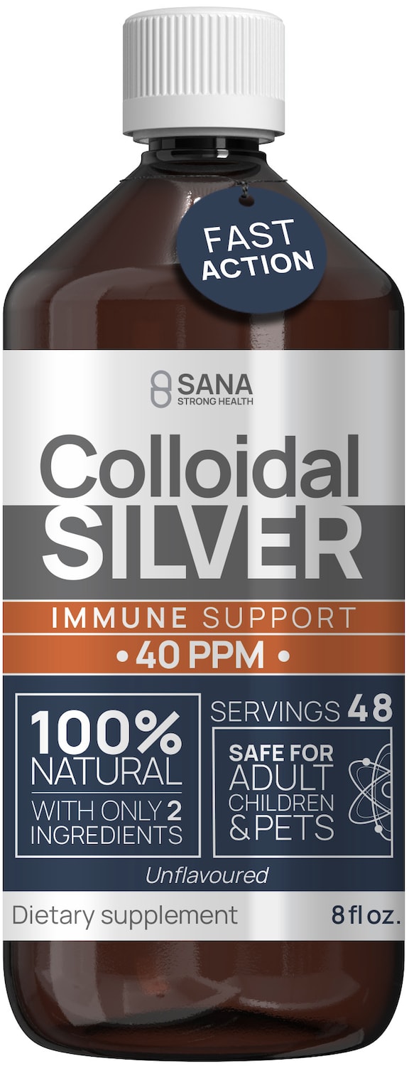
Which colloidal silver would you rather buy and why ?
Age range
Education level
Gender identity
Nutritional supplement use
Options
Personal income range
Racial or ethnic identity
69 Responses to Option A
I like option A because the orange on the label stands out and grabs my attention.
I like the fast action hang tag. The bottle also looks larger.
The pop of orange makes it stand out more.
Because it states that it is "Fast Action" and safe for Adult, children and pets
I like the higher dosage of 40 ppm. The "fast action" tab draws me in as well.
It has more information on the label than B does.
This one at least tells me what the product is supposed to do.
The best choose A and clear image
I chose A because it says it is fast action and also it is safe also for children.
I like that it seems it is more effective and it is more natural.
I like that it tells you how many servings right on the front of the bottle. Plus, it appears to be a stronger formula.
Sure, if I was in the market for colloidal silver, then, based on the label design, I'd buy option A. It looks professional and premium.
The urgent point, safety, is answered ONLY in A. It clearly says it's fine for kids and pets and adults. This answers the biggest reason someone might avoid the product.
Looks more scientific and effective.
I don't know these companies so I chose A because I like this label the best. I like the look of its colors and design.
I chose option A because I like that I can see this label against the dark bottle easily.
Based on the label content and design, I would buy Option A's colloidal silver because this is an unflavored, 100% natural product. Also, it benefits adults, children, and even pets.
I prefer Option A because the label more prominently displays that the product is used for immune support.
Fast action seems very important
A has a higher PPM and promises fast action.
The label is a nice color of silver to match the word silver in the name.
I would buy Option A. I like it because there seems to be more information on the label.
A has 40 ppm and B has 30 ppm so I think A is stronger and since they are both 8 ounces, A would be better value for the money
I would choose A because the label contains much more information that is useful to me making a decision as to which to buy. For example this label tells me it's for immune support. This is helpful because I know what it is for. The other label adds the words broad spectrum. I am not sure what that means and it makes me confused. This label says it only contains two ingredients which is very important to me. Also this label clearly says it is unflavored which is important for me to know. Including the information of how many servings are in the bottle is also important so that I know how much of this product I will need. And finally knowing this is for pets, adults and children is also very helpful and important. The other label does not contain any of this information and all of this information is important when deciding which one to buy.
I voted for A because I like the call outs on the front of the bottle better. It makes it seem a lot safer to take since it specifically says that it is safe for adults, kids and pets. So if a child or pet accidentally got ahold of this bottle from a cabinet it doesn't seem like it would hurt them. I also like that the part of being the immune support is larger. I'm not sure why people would take this but if it is for immune support this makes it very easy to see that this bottle does that when looking at a shelf of products. I also like that is specifically mentioned that it is not flavored. The added flavoring in medicine can make me avoid a product if I don't like the flavor used. I noticed that this cap looks like the child proof ones as opposed to B. If this is safe for children it seems a little strange needing this special cap, so maybe if it is safe for kids this cap can be changed, or change the wording to "daily dosage is safe for adults, kids and pets."
I would choose option A due to the higher PPM. I also like that it is labeled as having only two ingredients.
Option A seems to jump out at the customer more due to the mix of colors (especially orange). The darker shades of option B blend in with the dark brown of the bottle. Option A has a nice contain colors between the label and bottle.
Both are pretty mundane looking to be honest, but the "fast acting" tag gives A the edge.
I chose A because it has more information than B does. Also, the writing on A is much easier to read with the lighter background.
I like how A has the reason for taking in large letters (immune support) right there. I also think the thought of taking silver sounds crazy and I like how it says it's safe on the bottle for kids and pets which means to me it must be mild. I'd feel better about taking this product if I was able to see the bottle for A. I also like how it has the number of servings on it. I don't even understand a couple things on B.
the design with the silver color design correspond with the silver name
A has more info. Seems more trustworthy.
It has 40 ppm instead of 30.
I would choose option A because I like the label better. I like the font and the colors that are used and the layout better, It catches my attention more
I would select option A as my choice because of the higher PPM immune support.
I chose Option A as I can see by just looking at the label what is in the product. I can also see that it is safe for children and adults but for my pet as well. The words " nano concentrate" and "bioactive form" do not help the consumer decide to buy a product to buy; they are not every day usage terms. I think customers prefer labels to be in easy to understand terms.
I would pick this because it looks like it has a childproof lid.
I chose A because I like the colors and graphics and the tag which draws attention.
The description of ingredients are I think more appropriate on label on A
I like that A is more concentrated and makes it clear it is safe for a variety of possible recipients.
I like that it says it's 100% natural with only 2 ingredients and that it's unflavored.
I like option A more because I felt the design and color of the bottle better caught my attention.
Label states 100% natural and safe for adult children and pets. This makes me feel safer about what I put in my body as a consumer
I like the info on a better. More detail.
I prefer the fast action bottle because I want an immediate feeling from taking this supplement
This one is more concentrated, so a smaller amount is necessary. I like the message that it is safe.
The orange part of the bottle draws my attention the most. I feel like I need to know this information.
I chose A, because I like that the packaging incorporates some silver while using other colors that make it easier to read the label, and I think it offers better info on the front.
The label on A tells me much more info. It’s tells me that’s there’s only 2 ingredients and it’s 100% natural, it tells me there’s 48 servings in the bottle, and on top of that it tells me it’s safe for children and pets to use. These things are important and interested me more in A than in B.
A seems to be stronger and more effective.
I like A because it like that fact that it says fast action and it looks to be a little stronger.
Option a is easier to understand and more importsntly it states kid safe and pet safe thats very important to most people accidents happen.
Option A seems to have more information on the label and it is 40 ppm versus 30 ppm on Option B.
Option A is stronger strength and gives you more information about the product on the label.
A: I think the label includes more relevant, valuable info about the product itself. Safe for pets, the number of servings, the number of ingredients, the PPM, unflavored, that's all useful info and im glad its there. The colors and fonts used are pretty good, they give it a trustworthy impression.B: i actually like the colors on this label more, but the lack of relevant info about the product makes the other one better.
This one appears to be stronger, I also like that there is more information about the product on the label. This label also catches my eye quicker and is easier to read!
A has more concise information on the label.
Bottle A is just easier to read based on the color scheme. My vision was drawn tot this bottle first so that would probably be the one i chose to buy.
A because it clearly states it's a dietary supplement and fast acting the other doesn't.
There’s more information on the label and it’s all easier to understand than option B.
I prefer A because it clearly says it's 100% natural, and is safe for children and pets.
Option A has a label design that highlights that it is a dietary supplement. This label design is the highest potency at 40 PPM and states that it is safe for adults, children and pets. It also prominently displays that it is fast acting. The label design includes a bright orange highlight color that is quite eye catching.Option B looks like a chemical container more fitting for a chemistry storage closet. It does not come across as a supplement but rather a bottle of hazardous chemicals. The label design is not welcoming nor inviting.Option A is a supplement label designed for consumers.
I prefer this option the best. I like that there are multiple selling points that are clear and easy to read. Dietary supplement, fast acting, immune support, 100% natural etc.
I chose this option because the label is much more descriptive. It's easy to read and understand. I really liked that it included that it's safe for pets.
I like the label for the colloidal silver supplement in A. For one, the silver label fits the product. Secondly, the information is not only easy to read, but it is presented in a way where you can visually digest the info at a glance.
I liked that option A specifically said it was for immune support.
A is easier to read and informs you better of what the purpose is for the pills.
I chose A because there is a lot of information on the front of the bottle.
It has more per dosage -40ppm- than the other option. Also the shape of the bottle and the design of the cap is a little more aesthetic and modern-looking than the other one.
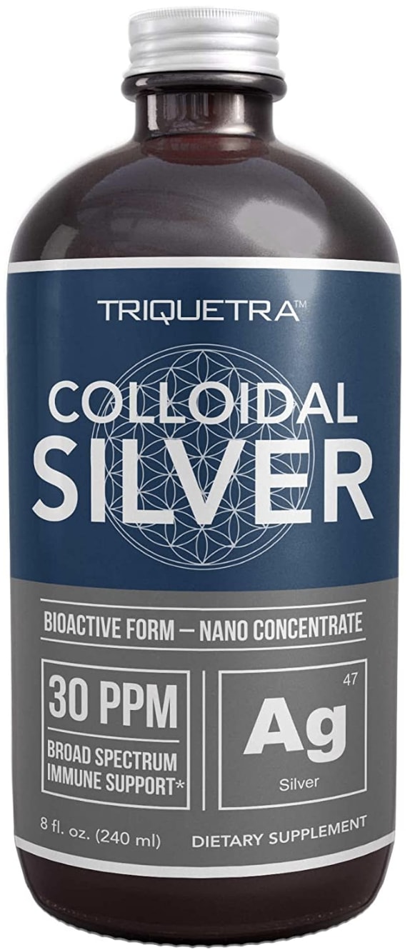
31 Responses to Option B
The blue in B seems bolder and more...electric? It seems faster, sleeker, and more stylish.
I like the blue color and the flower of life symbol.
I love the dark blue with the silver design in the background. It's subtle but very elegant which I love
I like the label here a lot more, the design and layout looks a bit more professional and it catches my eye more off the bat.
I like the design of this bottle. It is very eye catching.
I'd probably buy this product based on how it appears and what it offers
the silver on the label really goes a long way to complete the sellable presentation
The label on choice B looks very professional and trustworthy. I really liked the simple yet efficient design.
I prefer Option B because the design is more modern, clean, crisper and I love the geometric style and color choices.
A has just one too many colors. Eliminating the orange would make it look a lot better. B has a good color combination.
I chose B because the bottle cap looks easier to open.
The bottle that has the silver-gray and blue label, to me, looks like it is a more powerful product.
I rather prefer the option B silver dietary supplement product image because I like the gray and blue and white color scheme the most and do not really like the orange color used on the option A product label.
the lid and bottle make it look more premium. also the label is more attractive.
B looks like it would work better, and a bottle looks more sophisticated
I chose B because it is in bioactive nano concentrate form.
I like the graphic design and in inclusion of the periodic table of elements notation for silver.
B because it looks like a stronger product with that label.
The design of the bottle in Option B is more appealing. Option A is too plain and angular.
option B this one grabs my attention quicker and I like the design on it behind where the name is and even though they both have generally the same information it looks like option b is more informative to me for some reason.
Bioactive implies that it will be most effective; I don't trust "natural" as on A, as it can mean anything!
i like the coloring an design of this label best. it is big and easiest to view and read.
A has too many different design elements on the label.
B has a cleaner, less complicated design, and therefore looks more trustworthy.
This label seems more professional. I like the color scheme better.
Option B is more visually attractive in terms of its label design. From there, I read the information provided and determine that this is the product I want to give a try.
I like the blue and silver color only Because it fits the product. But I don't actually like the label. It looks cheap and generic. It's better than the other one though.
I prefer option B because this bottle design looks higher in quality and better made, more trustworthy.
I chose B because it is Bioactive and a Nano Concentrate which are smaller particles, therefore, more absorbed and faster absorbed. Broad Spectrum, which I like as it will include all components of the silver. I do not know what other ingredient was put into Choice A.
I prefer option B because it looks more modern and I like the blue on the bottle. I think the silver contrast with looks nice.
B has a nice clean design with an attractive color scheme.
Explore who answered your poll
Analyze your results with demographic reports.
Demographics
Sorry, AI highlights are currently only available for polls created after February 28th.
We're working hard to bring AI to more polls, please check back soon.

