Poll results
Save to favorites
Add this poll to your saved list for easy reference.
Which color would you like to buy?
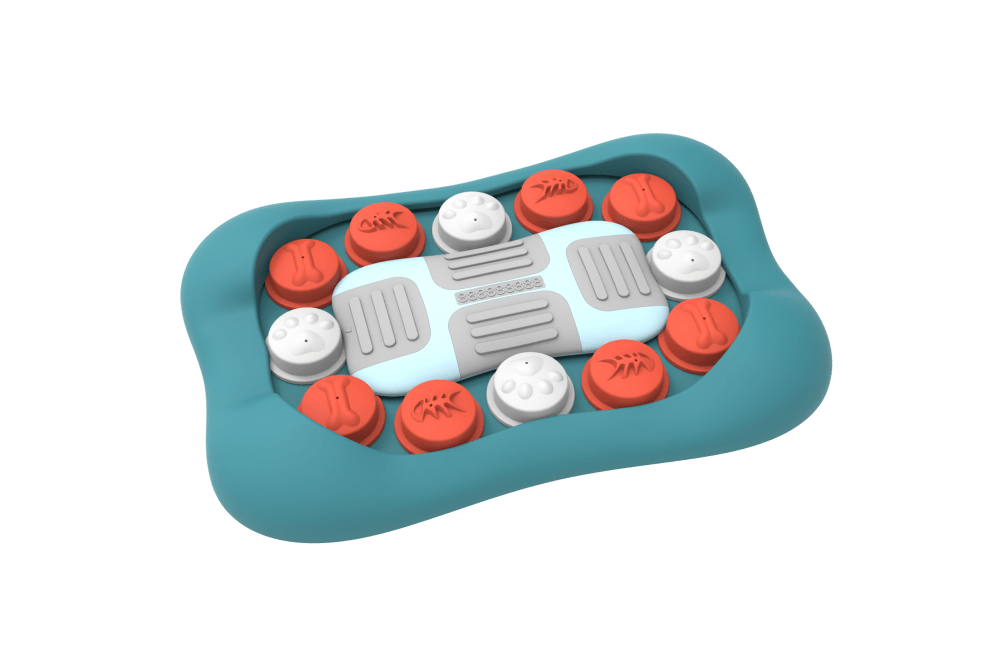
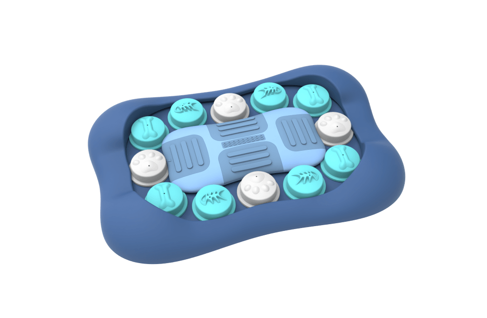
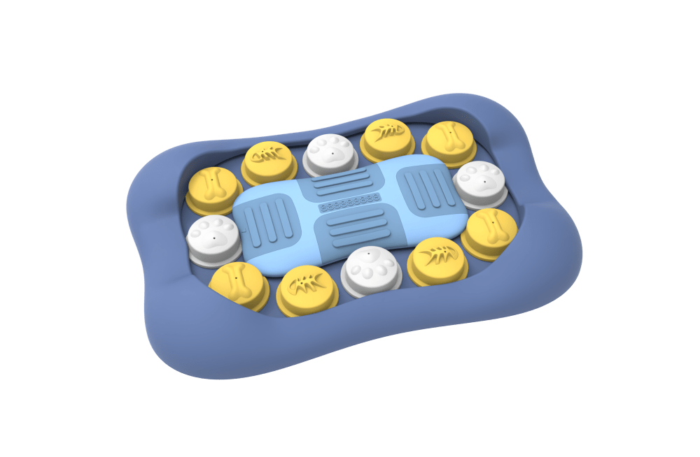
Option B won this Ranked poll with a final tally of 53 votes after 1 round of vote counting.
In a Ranked poll, respondents rank every option in order of preference. For example, when you test 6 options, each respondent orders their choices from first to sixth place.
PickFu requires a majority to win a Ranked poll. A majority winner differs from a plurality winner. A majority winner earns over 50% of the votes, whereas a plurality winner earns the most votes, regardless of winning percentage.
If an option does not earn a majority of votes, PickFu eliminates the option with the lowest number of votes. The votes from the eliminated option are reassigned based on each respondent’s next choice. This process continues in rounds until a majority winner emerges.
Scores reflect the percentage of total votes an option receives during the vote counting and indicate the relative preference of the respondents. If there is no majority winner, look to the scores to see how the options fared relative to one another.
| Option | Round 1 |
|---|---|
| B | 53% 53 votes |
| A | 25% 25 votes |
| C | 22% 22 votes |
Age range
Amazon Prime member
Dog owner
Education level
Gender identity
Options
Personal income range
Racial or ethnic identity
25 Responses to Option A
I most prefer option A personally due to the color scheme used. Just my personal preference.
The color is more attractive.
This is a fun and bright combination.
I chose option A because it was bright and colorful, so my eyes would be drawn to that one first. Option C is also colorful, but I am not as attracted to the yellow as I was to the red. Option B is rather dull, so I would look right over that one.
Option "A": This color scheme works best for me for this product type; it allows a clear view of the "bones" relief on each individual section within.
I went with the blue and red as I think that it easily stands out the most out of all the things that are up there to choose from.
I prefer the darker colors.
colors stand out to me as being the most vivid and eye catching that i would be interested in
I like the color orange thus my top choice. I like my top two. They seem more cheerful to me.
A because the turquoise color is more poignant and refreshing
I ranked them based on my favorite colors and how well the color scheme looks.
I like the turquoise looking color the best (A). I prefer the darker blue to the lighter blue.
Option A and C both have a more dynamic color range which is nice. I prefer A due to the red/orange color over the yellow in C. Option B tends to stay in the same range of color (blue and white).
I like option A the best. I really like the orange and white colors. they are very attractive
i think the red and blue look best together and feel nicely calming.
A is my first choice because I like the lighter blue and the contrast with orange. B is nice, but I am not as fond of the darker blue, however I love the bright blue used. C is my last choice because the yellow looks unremarkable and the blue used is ugly.
I ranked the colors of the dog feeding trays that I liked the most. I found the color of option A to be the most appealing followed by option C and then finally option B.
I prefer choice A is visually appealing. I choose this because it stands out well.
I like the contrast of the reddish orange and blue on option A. It is a nice color combination.
This color is simple and nice.
I like the contrast of not-blue to blue the best. The red has more contrast than the yellow, too.
Teal felt a little more unique to me than pure blue. I thought C looked lighter and more bubbly with the yellow colors than B did.
I like the contrasting colors best. A has the most contrast and then c. B is different shades of the same color which I don’t like
I simply looked over the color schemes and selected in order of color schemes that seemed the most natural and appealing to me.
Prefer the real baby blue color over dark blue for kids.
53 Responses to Option B
I liked choice B since the shades of blue look the most appealing and eye catching. Choice A looks too different and the color scheme doesn't look as appealing.
The light blue colors in Option B looks so cool and appealing to me and thats my favorite.
I prefer the option B product image because I like the blue and teal color scheme the most. I chose option C second because I like the dark blue and white and yellow colors. I chose option A last because I do not like the red color on this product very much with the blue or teal color.
I think the color combo of the blue, soft green, and white go well together. They all are in the same color family.
I'm not sure what this is but I'm always partial to blue
I like dark colors that show a bond of connection blue is more calming and red is more of a unique color that gets little notice of standing out. Yellow is my last selection for this product because it stands out too much.
The colors seem to go together better than the other ones do. I would choose that one over the other options.
I like B best because Blue is my favorite color. I like C the the least because yellow shows dirt and is sometimes hard to clean. A is ok.I would buy any color if the price was right.
I would buy option B the blues. I think they are all good colors, and look great. I prefer the B becausae I love the blues.
B looks calming C looks basic a is too bright and pops too much
Options B and C fit my style and taste, the color combination is a nice look. Option A isn't bad at all, it just that options B and A are my favorite colors.
I like the two differnt blues the best, so B would be my first choice as blue is my favorite color. I also like A as the red color stands out. C is not bad either.
I love blue and the other colors are way too offensive to me and hurt my eyes
I choose B first...I think these colors look better together.
I picked strictly based on my own color preferences. I'm not overly thrilled with any choice though...I would love to see black and white.
I like the blue one the best, the yellow is kind of cheery, I'm not too into the red one.
I like the blue and teal together.
I'm not at all sure what this product is, but I like how the darker base makes the colored dots stand out more.
I chose B because it is not so bright.it looks neat because of color combination
I'm honestly not sure what this is, so I'm not sure what's appropriate. B seems more soothing.
Option B is the most pleasing color theme to look at out of the three options. The colors don't clash and seems to work well together. Option A is okay, but the colors aren't anywhere near as pleasing as Option B. Option C is my least favorite because I don't like the clash of the yellow against the blue and it's just overall not pleasing to look at.
I prefer the darker blue color with the teal accents. The option is more monochromatic and more appealing than C and A.
I like the colors of option B, they are bright and happy colors.
I chose based on which colors caught my eye more.
I like option B because I rally like that color of blue. I think it looks really nice and matches up with the white nicely.
Loving the turquoise colored blue against the darker blue.
I like B the most with the dark/light blue contrast.
Red is my favorite color but the blue and white look so nice and clean, and modern.
I would like option B because i like the color combination of soft and bright color combination
I like the blue, I then think the inner parts just match a lot better. The turquoise of A looks OK but I think the orange and white internal does not. C just looks strange to me.
The all blues option (B) is so cool looking compared to the others. I think it has the neater look. I also really like C too, the yellow pops.
These colors are the best looking.
I like the blue and white best and also like the red/white/blue. Here in Columbus, Ohio we do not buy ANYTHING in blue and yellow (Michigan colors)!
I prefer Option B as my first choice. The colors are attractive and complimentary. Option C is also quite nice and has a appealing design and color palette. Option A is my least favorite, mostly because I'm not overly fond of orange.
I like the darker blue with the lighter aquamarine colors, I think they match the best.
While i'm not quite sure what this is I do like the shade of blue on this option.
I would choose option B because blue is my favorite color and I think it looks the best of the options available. Option C looks tacky.
I really prefer the dark blue over the lighter ones so I ranked B first
I like the shade of blue around the outside of B and C the best. I think it is a great color. I would choose B as my first choice because I like light blue better than yellow. Light blue goes really well with the other shade of blue
I think the blues together look the best
I like the blue colors, and blue is my favorite anyway. The yellow are very pretty too. I don't really like the red very much. The blue just matches with the overall theme better.
I ranked in those orders because i think B would be a great one and i think it will grab a lot of buyers attention more than the other ones and i think many will think the same way.
I selected the colors that I found to be the most visually attractive and eye catching.
My choice is option B as rank 1 because my favorite color is blue so i choose this as my choice.
I chose the blue covers as my first choice because they are closer to the look of pill covers. The yellow was pleasant enough but the red lids soert of indicated stop. Mixed messaging for a lid to be opened.
The light blue looks nice and appealing. The yellow is just not a pretty color and does not match the rest of the product well. The red is okay, but doesn't really match the outside of the product well.
All look great. But I like the color combo on B the best.
Option B is a neat design without sticking out too much. The blue on blue with white dots is a soothing cool tone and looks appropriate for dogs.
I like B best as the colors are complimentary, but with enough difference to stand out. C I liked for a similar reason to B, but I’m not a big fan of yellow. I don’t like the bland outer color on A nor do I think red works well with that color.
I don't know what this product is, so I brief description would have been nice so I can adequately assess what color would have been best. Without knowing that, I always prefer neutral blue tons that are light in color in pretty much any product. I would always tend to go with blue, especially not knowing what this is for. It has some animals symbols on it, so I am guessing something for a pet. I don't like option A because it looks like the advil color. I wouldn't want to associate anything for my pet or kids with advils.
I would want to buy option B the most because it matches the best.
My favorite is B with all the shades of blue because they're all on the same grade of color and nothing clashes - the reds and yellows in the other images seem to clash very much with the blue base
I probably would go with option B, but A is pretty nice too. Both are interesting designs.
22 Responses to Option C
I like the shades of blue and yellow together. It flows well and looks calming.
All of these colors are nice. A is a great color combination. B is a very close runner up but the blue and gold of C is my utter favorite.
top choice has the preferred color scheme and product design
i like the yellow looking one . my eyes are dawn to this product the most
I like the color contrast in c. Makes the pieces stand out better.
I selected Choice C as this is my favorite color.
I like the blue and yellow combination; it has a nice variation in color that pops, but the yellow is still quite complimentary to the blue. Blue and teal is my second favorite; it reminds me of beach colors. I don't care for teal and orange.
I prefer C as the yellow color really stands out. I like the mix of the yellow, white, and blue in this option.
Option C is very modern and Chic, I like the color scheme a lot.
I chose in the order I thought the colors fit together. I went with what drew my eye in best
I would buy Option C because I enjoy the happy yellow accent color.
I like the bright yellow colors in option C, so that is the one I would choose.
I like the contrast of the colors in C the best. C was my first impulse and after analyzing them I still felt drawn to C.
I chose B because I like yellow against the blue background. It looks good.
I like the colors in this and how they stand out different from each other
I like the warm yellow color involved as it makes this really stand out
I like option C more than the other 2 options because of the eye catching color contrast. Option B is to monotone for my taste.
I like the yellow and blue color combo the most
I like this option most because the colors really pop more than the others.
I prefer choice C because the yellow makes it stand out more.
I like the darker blue and yellow contrast for the set in C and The light blue and white of B
Option C is the most colorful and stands out the most to me with the yellow colors. I would buy that one first. Option A is the second most colorful so I ranked it second.
Explore who answered your poll
Analyze your results with demographic reports.
Demographics
Sorry, AI highlights are currently only available for polls created after February 28th.
We're working hard to bring AI to more polls, please check back soon.

