Poll results
Save to favorites
Add this poll to your saved list for easy reference.
which design do you like
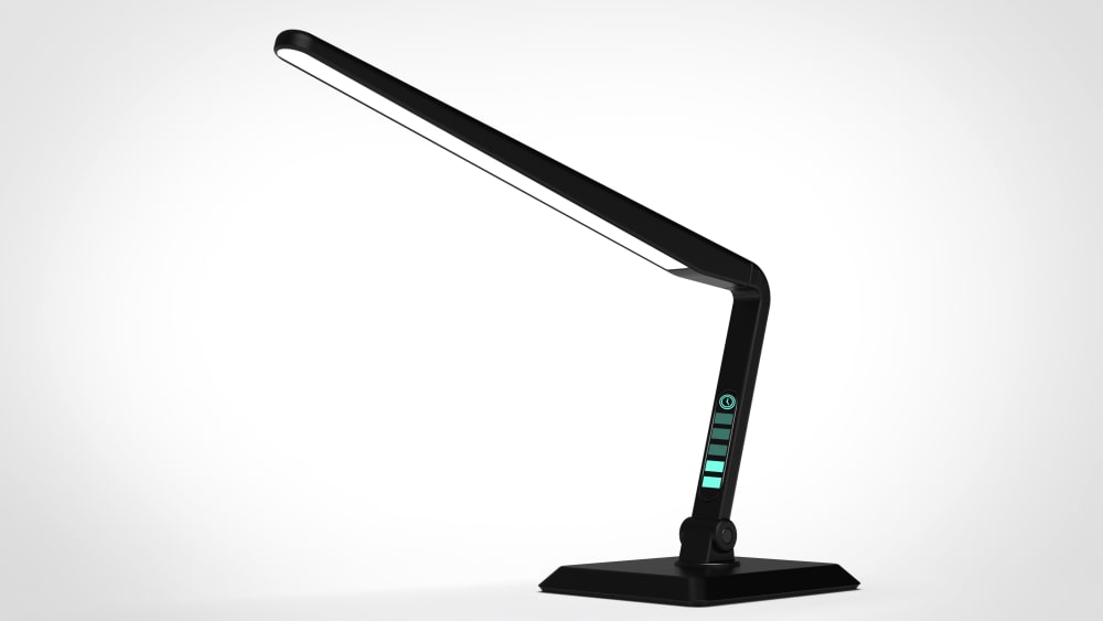
Option A won this Ranked poll with a final tally of 33 votes after 2 rounds of votes counting.
In a Ranked poll, respondents rank every option in order of preference. For example, when you test 6 options, each respondent orders their choices from first to sixth place.
PickFu requires a majority to win a Ranked poll. A majority winner differs from a plurality winner. A majority winner earns over 50% of the votes, whereas a plurality winner earns the most votes, regardless of winning percentage.
If an option does not earn a majority of votes, PickFu eliminates the option with the lowest number of votes. The votes from the eliminated option are reassigned based on each respondent’s next choice. This process continues in rounds until a majority winner emerges.
Scores reflect the percentage of total votes an option receives during the vote counting and indicate the relative preference of the respondents. If there is no majority winner, look to the scores to see how the options fared relative to one another.
| Option | Round 1 | Round 2 |
|---|---|---|
| A | 44% 22 votes | 66% 33 votes +11 |
| B | 32% 16 votes | 34% 17 votes +1 |
| C | 24% 12 votes | Eliminated 12 votes reassigned |
22 Responses to Option A
Chosen in order of which looks sleekest, to least.
I like that the light stretches all the way across in A and B. Then I like the triangle shape vs. the circle for A.
I like the base shape and lights to the side
Options A and C look identical. I like the lights on the side and the actual light appears to be larger and would cover a bigger area of my desk.
I like the lights on the side, they have an interesting futuristic look that looks like it offers more quality and more settings.
A and C look exactly the same to me. The pose for them is more dynamic and interesting than B.
I like the ones that are slanted bc they look easier to use and more versatile, although I can't tell much difference between my first and second choice.
A I like whole thing it's perfect. I like the square bottom. C I like it just like A, but this has a round bottom. B is way too big. Don't like it.
can see the level better
A and C are my favorites (although I can't really tell these two apart)- I really like the menu type thing that is on the stem of the light.B- I like this one as well (particularly the sleek look of it, the color, etc). However, compared to the other two, this would be my last option mainly due to the missing "menu" that the others have.
I chose A because I like the angle the light is shown at. I also like the square base. It seems more stable than the round.
Best angles in the best order
I like the angle and color on A and the angle on b will cover more space! C is to plan
I like the blue buttons and the square base in A the best. C has the blue buttons and it looks better that B, even with a square base.
The all look the same to me, except at different angles.
i liked the bars on the side of it and the first choice seemed more slick because the base looks like a triangle
I like option A the best because the light is at an angle, and looks adjustable. It has a larger light than C which is why it came first. I chose B last because it doesnt look like it bends much and would be hard to adjust
The difference between A and C is negligible in my opinion, and I like them both more than the rigid and less aerodynamic-looking style of B.
I like option A the best because I like the angle that the light is at and I like the square bottom much better than I like the circular bottom. Option C is only better than B because I like the angle better. That angle seems like it would be a better one for doing homework under or reading a book. Option B has a good bottom but I don't like the light being perfectly horizontal because I don't feel like it would give me the amount of light that I want. I don't want to necessarily read my book having it sitting on my desk.
A and C seem very similar if not exactly the same. Personally I prefer the slanted look because it seems like it would be less in the way than the straight bar. I also like the way the little colored bars are places on the base of the A model. It adds a little accent of style that suits me.
I feel the tilted can cover more area with the light. I like the square base over circle base. B just doesnt come off as it would cover much area.
Options A and C seem like they are more compact and wouldn't be in the way, though option B could be useful if you needed to light a wider area from above.
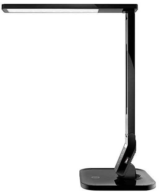
16 Responses to Option B
I like the first one but am having a hard time seeing how this works on a desk. I think that needs to be in the picture as well.
I like B the most because I can tell that the position of the arm is adjustable and can be straight up or angled. I chose A next because I like the square base more than the rounded base.
I prefer B because I like that the top is flat, rather than at an angle. I would choose that for my piano if I were shopping for one. A and C look to be the same to me, and they are nice looking, but I don't like the angle of the lamp. I imagine the light would shine into my eyes, and I don't like that.
I feel like the taller one, option B, will be more useful for tasks.
B is my top pick because of the detail in the enlarged photo.
This picture shows you the item up close
I like #1 best. When I get a lamp I like to have some height so I can get light to cover a larger area. 2 and 3 look low and if I wanted to get more light I would have to tilt them up and the light would blind me. I hope 1 would telescope so I could adjust the light height.
I like B. The lamp is close up so I can get a better look at it and it has more of a square base which I love.
B shows off the product the best
the one i voted for is higher and more level so it will not shine so much in your eyes and more on a desk and the other two look the exact same
A and C looked exactly the same, but B was higher which I like, it could be used for more tasks
B has cleaner anglesA has square base which I likeC with round base is less desirable
I like b because the light is horizontal. It also looks larger than other two.
Square bases are good. The square base with the straight lamp is symmetrical and pleasing to me.
option B is my favorite I like the base out of these choices the most. Choice C would be my second choice and choice A would be my last .
Option one looks like it provides the best lighting and reach which is important with a lamp. I like the rounded corners of #2 more than #3 square corners. They seem more friendly.
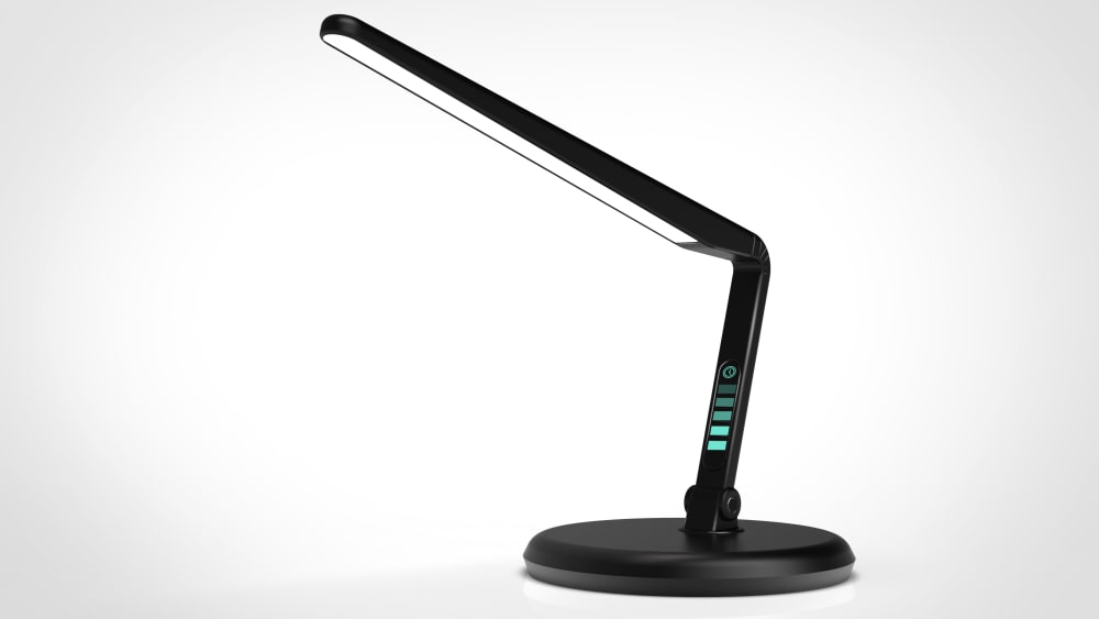
12 Responses to Option C
I think the blue glow at the bottom looks really great and makes it more modern and sophistacted, I also like how we can see the angle. I would geniunely purchase this.
I like the angled light. I don't like the right angle because it looks like a crane. I like the rounded base of C vs the square base of A. A looks flimsy.
Being able to bend it is nicer. I also like the taller one better.
I like the angled designs best along with the green lights. I think the one that's appears s little taller is best.
Option C is the higher choice mostly because I prefer a circle base as oppose to a square base in option A. Option B is last because it is very difficult to tell it is a lamp.
I find the round base to be most eye appealing. I like the blue lights on the front in the two smaller pics Im assuming that is for the dimmness and I like having control on how bright the light would be. I can't see that in pic b which is why it's my last choice.
Options C and A are good because they have a good view of the product and makes me think that I really need while Option B is not showing a good view and makes me distrust the product.
I think C has the nicest-looking design.
I like the light at a slight angel as it makes it easier to use
The gradient colors on C and A look super cool. Modern and fun
I prefer the look of the round base. After that, I think the look of the shorter arm is more appealing. The base on B looks kind of cheap and makes the whole lamp look cheap.
The angular design is more appealing to me than right angles, but the product still seems firm and rigid overall.
Explore who answered your poll
Analyze your results with demographic reports.
Demographics
Sorry, AI highlights are currently only available for polls created after February 28th.
We're working hard to bring AI to more polls, please check back soon.

