Poll results
Save to favorites
Add this poll to your saved list for easy reference.
Which design do you like best?
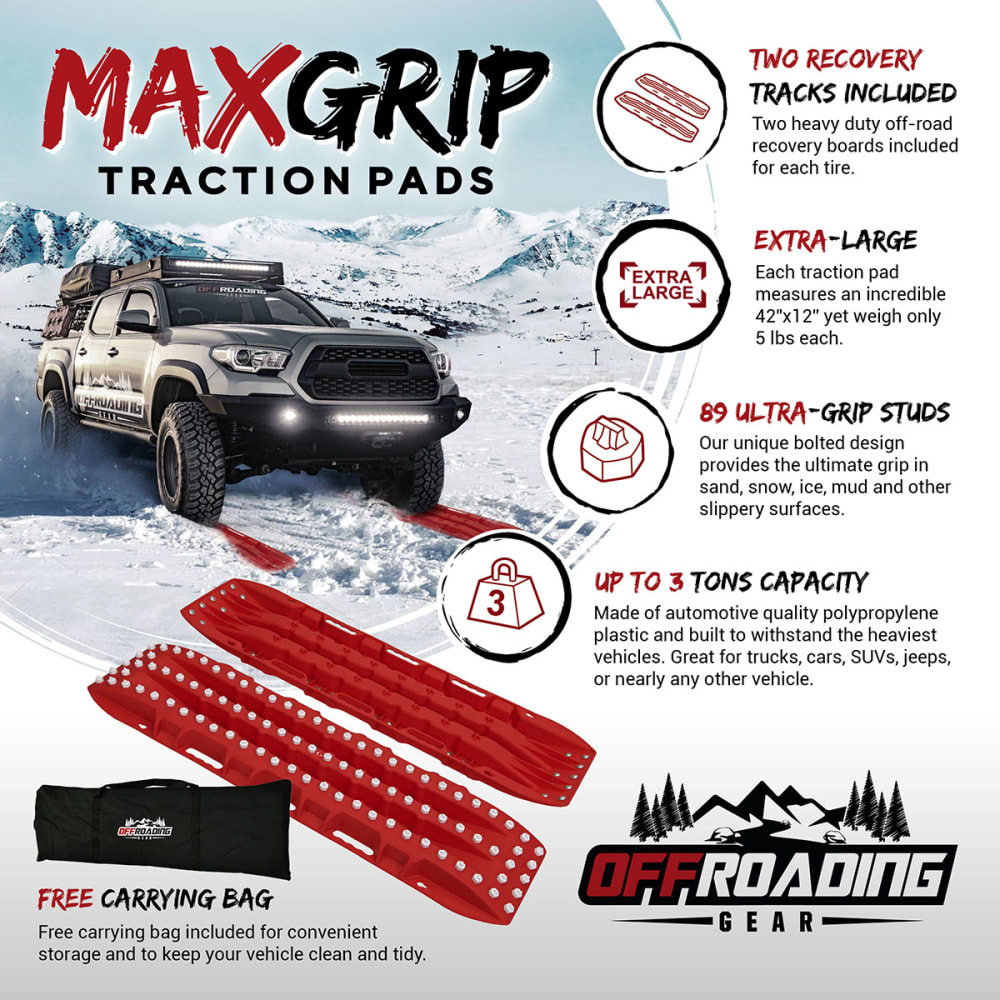
Option D won this Ranked poll with a final tally of 36 votes after 1 round of vote counting.
In a Ranked poll, respondents rank every option in order of preference. For example, when you test 6 options, each respondent orders their choices from first to sixth place.
PickFu requires a majority to win a Ranked poll. A majority winner differs from a plurality winner. A majority winner earns over 50% of the votes, whereas a plurality winner earns the most votes, regardless of winning percentage.
If an option does not earn a majority of votes, PickFu eliminates the option with the lowest number of votes. The votes from the eliminated option are reassigned based on each respondent’s next choice. This process continues in rounds until a majority winner emerges.
Scores reflect the percentage of total votes an option receives during the vote counting and indicate the relative preference of the respondents. If there is no majority winner, look to the scores to see how the options fared relative to one another.
| Option | Round 1 |
|---|---|
| D | 72% 36 votes |
| B | 18% 9 votes |
| C | 10% 5 votes |
| A |
9 Responses to Option B
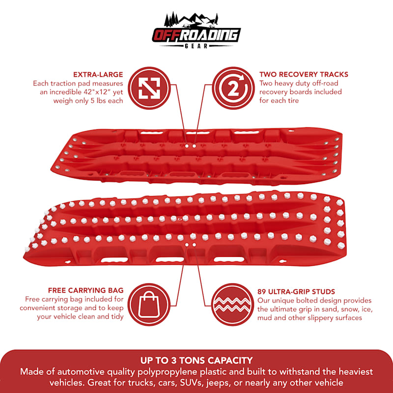
Choice A and B show all the little up close details of the item and choice D shows a picture of it's actual use.
Showing details of the product helped to determine if I felt the construction was suitable for purchase. After reading it, I felt it would be a great product. I then saw an advertisement for it (Option D) and it reminded that I saw a fantastic product. I started to search for the product and came across advertisement C and the product was reenforced to want this product. I would definitely buy it after seeing these ads.
I chose B because i like all of the little bubbles saying each and every feature of it
They give a pretty good idea of what youre getting in the product
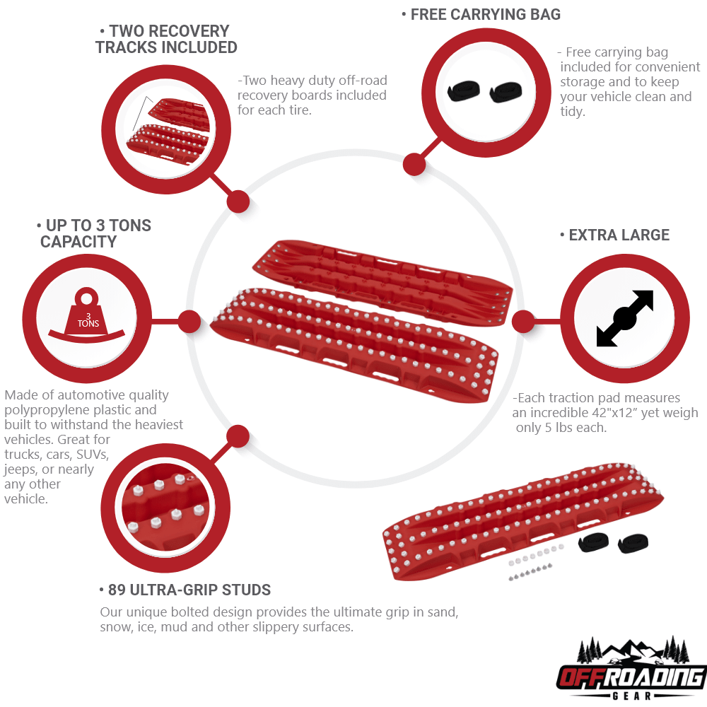
B clearly displays all features as easily understandable as possible, A most clearly displays product
It looks cleaner. More direct and simple.
The focus on the product is evident in the top two product images that I selected. My least favorite seems to be less focused on the article and more on background usages.
I really like the presentation of the material in this order
it all comes down to how easy is it for me to read all the features of the product. i find "B" the easiest and "C" by far the most difficult but i'm sure others might look at it differently.
5 Responses to Option C
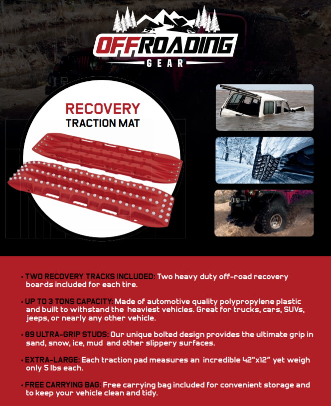
I really like seeing the vehicles on the pictures. It makes it more obvious to me what I'm looking at and draws my eyes in.
I like the images that shows what the product is used for and what it is used on. I think that information is very valuable.
I prefer the images with big titles. For the one I did not pick, I did not like the circular design because your eyes have to move all over the place to read everything.
C takes first for me because the dark background and the pictures. My eye was drawn to it first. D takes second again because of the picture. Finally A took third because the logo is center top instead of bottom right. Picking A third was a bit difficult because I really like the ones with pictures of the vehicles in them.
Seeing the product in use def helps explain what it does
36 Responses to Option D
I think option b and C had too much going on in the picture. Option D was my favorite since it had a picture of a truck in it
Seeing them in action is the best idea, then showing all it's uses, then having details looking in a good order is third.
Honestly I just like the truck in D's picture
I'm a big fan of the snow background in the first one I picked
The top answers I chose are most appealing, because the graphic design draws the reader in the most. I became interested based on the pictures I saw.
The first one has a nice real life picture to go along with the product, same with the second one but not as nice, the third is the more user friendly flier but no nice picture
Option D provide less descriptive picture, other are too technical
I think the picture in choice D really makes the product stand out more. It really caught my attention while the other designs are pretty boring.
This design is good and it's not annoying me at all like option C. Option C has a horrible combination of colors. I liked this design: Option D because I found the information well organized, looked good, credible and I liked what I saw there.
I choose D because of the pictures portraying they various uses of the product
D is the best because I can imagine the type of vehicle I can use it with. It's more exciting to look at and more eye-catching.C is 2nd best because it shows the features directly with real life graphics.B is my last choice because it's like an info graph that quickly tells you information you need to or want to know.
I liked Option D design the best because it showed the product in use, the specs/features of the product and a close up of the product as well. The red & black font contrasted perfectly against the backdrop so it was noticeable and easier to read (if enlarged).
Its good to see what the product looks like in use.
Option D is the top choice because it shows all the important information along with a car actually using the product. From a glance at some of the others you didn't know what it was without reading more details, with Option D it is pretty clear from the first glance. Option C shows cars but not actually using it and Option A is good because the actual product is pretty big and viable in the picture but is missing a car to help show what it is.
I liked option D the most because it was the most effective at conveying the traits of the product and in showing how it is supposed to be used with a picture. Option C also used pictures to convey how the product was to be used but the pictures weren't as effective as in option D. My third pick was option A because it showed clearly what the product looked like and listed the traits in a way that was easy to read.
The combination of live action and technical images in D make it the winner.
less wordy image is better and showing the car as demonstration is nice
Option D gives a complete picture, with a vehicle, of what the product is about and the highlights are easy to read and catchy. Option C also displays a picture of vehicle, but the product highlights list is not very catchy. Option B is very plain.
I Like choice D first because it shows the capability of the product. It explains the details of the product and how it works. Choice B was similar in fashion with the detailed product specifications. Option C was my third choice because it shows the product working in real situations but I don't see how the product would work under water.
i like the ones with the actual photos of the items in action - it makes me see how to use them in the right way
Option D is the best one because it shows the product in action while explaining the details in bullet point format. Option C is a close second because it does the same except for showing the product in action. Option B just does a good job of explaining the benefits of the product.
I like choice D since it is the most descriptive about the product. I also like how this ad shows me a car as reference as to what this product is for.
Option D is by far the best of the 4 options, it has a photo that pretty much sums-up the entire ad and it makes you want to read more about it, there's no ambivalence about what the product does. The other options I think are better secondary ads that contain more detailed spec's about the traction pads, but, they don't have a photo of the traction pads in action like option D shows very clearly.
I like seeing the product in use and it catches my eye better. While the description of the product is good and useful it is something that I would more seek out after I'm aware of the product
i think the inclusion of the pickup truck or jeep, helps to make the pictures more visually appealing
I like the visual qualities.
I chose these choices in this specific order based on the apparent amount of information that is being conveyed in a clear and concise message.
If prefer photos that show actual pictures of the product in use. Also, ones that emphasize product name.
They are in order of better conveying the information you need.
I chose #1 because it felt most relevant to the consumer of this item. I liked the design, the picture of off-roading and the location of the feature bubbles. I chose #2 because the features feel like a list, and the order is good. I chose 3 because I liked it better than option a. In a the features were connected to points on the item, but we're not about the point they were connected to.
Option D clearly shows the free carrying bag. Option B provides a nice diagram.
The image with the truck makes the presentation look more eye catching and gives it a professional and better polished look.
D does a good job integrating pictures to get your attention, B and A are both better than C which looks too cluttered
D seems to be the most helpful in explain what this thing is. It shows a picture of tires rolled over them. C shows what the device is for, but not how its applied and between B and A, B seems to have been more descriptive of the item.
I chose be option D as my first choice since it shows the product and describes it's different features in a nice and clean depiction.
I thought D gave me the best description as to what they are used for. And the other two I just liked better than C
Explore who answered your poll
Analyze your results with demographic reports.
Demographics
Sorry, AI highlights are currently only available for polls created after February 28th.
We're working hard to bring AI to more polls, please check back soon.

