Poll results
Save to favorites
Add this poll to your saved list for easy reference.
Which design do you like better?
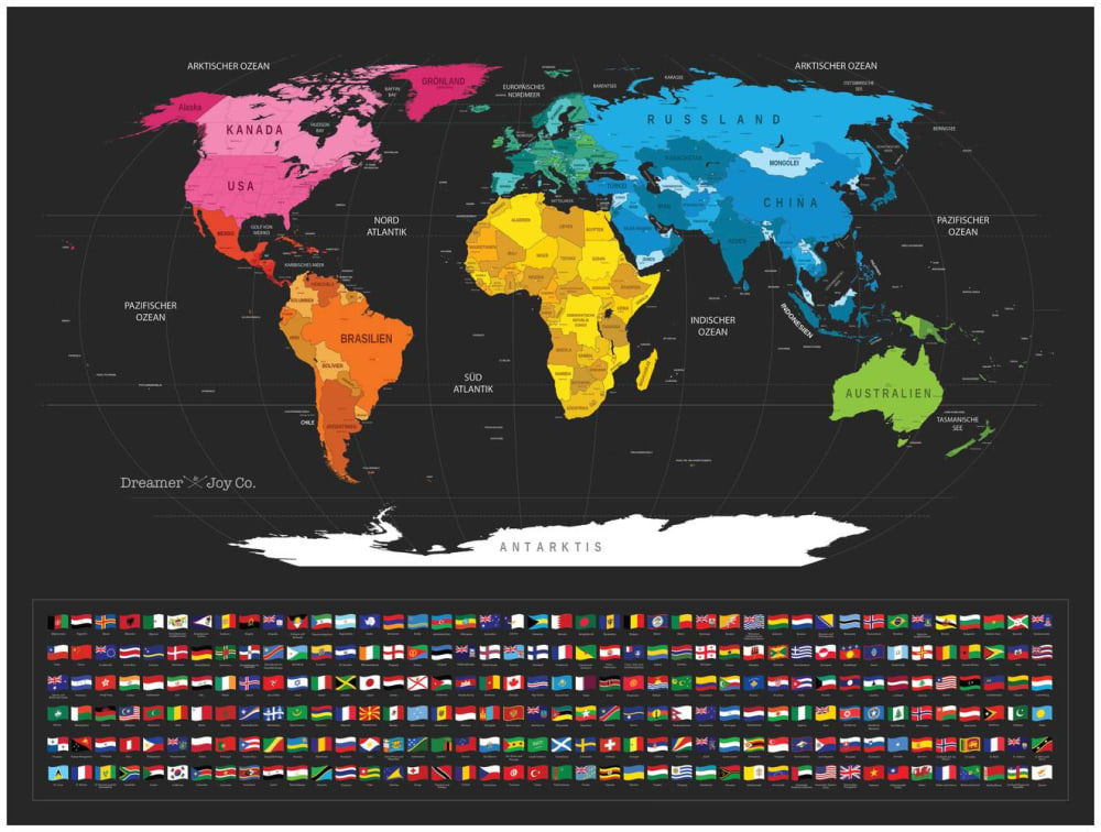
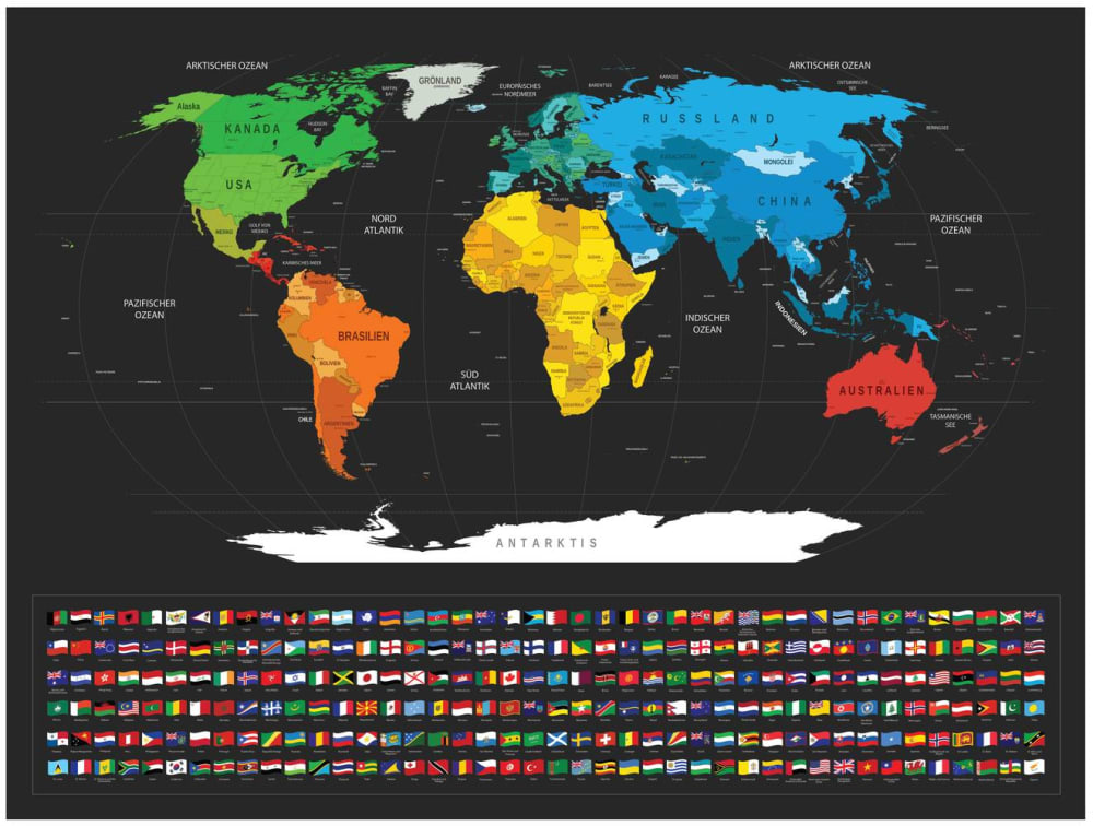
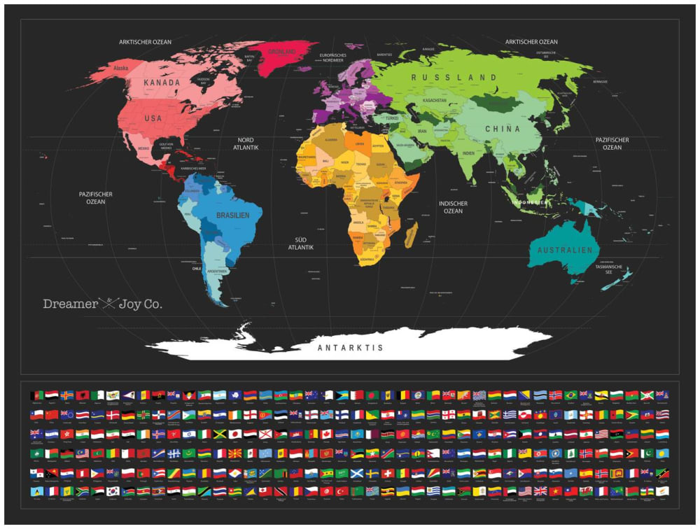
Option B won this Ranked poll with a final tally of 28 votes after 1 round of vote counting.
In a Ranked poll, respondents rank every option in order of preference. For example, when you test 6 options, each respondent orders their choices from first to sixth place.
PickFu requires a majority to win a Ranked poll. A majority winner differs from a plurality winner. A majority winner earns over 50% of the votes, whereas a plurality winner earns the most votes, regardless of winning percentage.
If an option does not earn a majority of votes, PickFu eliminates the option with the lowest number of votes. The votes from the eliminated option are reassigned based on each respondent’s next choice. This process continues in rounds until a majority winner emerges.
Scores reflect the percentage of total votes an option receives during the vote counting and indicate the relative preference of the respondents. If there is no majority winner, look to the scores to see how the options fared relative to one another.
| Option | Round 1 |
|---|---|
| B | 56% 28 votes |
| A | 24% 12 votes |
| C | 20% 10 votes |
12 Responses to Option A
I really like magenta, and the fact the North America is in magenta, I really liked Option A the most.
No real big difference, just prefer the color schemes better in that order. All look decent go me
I chose option A beacuse I like the combo of pink and orange for north and south america and I like the yellow and blue combo of Europe and Africa together.
i like the colors in a bst
The more color differences the better it will be to see and remember
I think A looks the best because of how the colors progress from left to right across the map. I like C as my next choice because it has purple
I chose my answers in order based on how well you can see each color for its country. The different reds for North America and the different oranges for south is what I really liked about A the most. I put B last because I didn’t like the green for North America.
Pink is my favorite color. I chose the one that had lots of pink.
They are all good but my top.choice has the best color combination
the colors were more pleasing to the eye on the first one.
A reads red-orange-yellow... and then green & blue... from left to right. That was appealing to me, the general progression of the rainbow. Second best is B because the colors are more uniform (North America appears more unified). Choice C seemed to highlight divisions more in the Americas and Africa.
Option A is the most colorful without looking like a full scale fiesta.
28 Responses to Option B
I like seeing North America represented as a green country. That's where I am living, and it's a comfortable color to feel like I am part of.
They are all fine but the scheme for B seems the most appealing and visually appealing to me.
I like the color arangement
B is the brightest and stands the most out. A is ok but i dont like the pinkish of NA. C is a little drab
Option B has a more primary color scheme which is easier to look at as a whole. Option A is a little brighter but demands your attention. Option C has random weird colors.
Having russian be blue and the us be green makes the most sense to me.
this one is the one i like the most
USA should be green!
The color layout. That is all
The darker green colors look like they're more difficult to read the text underneath. Therefore, it should be used for either North America (where, with only three countries to color, lighter shades can be used), or Australia. Also, I feel like green Asia clashes with purple Europe. The blue teal provide enough distinction between the two already without clashing.
I really like the different colors that differentiate each continent by color. I specifically liked North America being green with the orange being in South America. gives me the impression that South America is below the equator and North America, is the cooler continent. I like that Africa is yellow, reminds me of sand, dessert, and pyramids. Australia is hot and has a lot of snakes so red makes sense to me. and Aisa, a continent surrounded by water, rice pads. overall the colors of option B make the most sense to me.
B has the USA in green and green is a positive color. It has the former Soviet Union in cold blue, which is also appropriate. A has the USA in a shad of red which makes it pop and be noticeable more than any other country. C has the USA in a shade of red that pops, not as brilliant as A but acceptable to emphasize the USA first.
I like all of them equally. I think I like C a little more because there are no two colors super similar right next to one another.
All of these are pretty much the same except for the colors used. It is all preferential. Based on that, option B, for me, is the one I prefer as the colors feel less harsh to look at (i.e. the amount of red in both options C and A). Option C is next because the red is not that bold to look at and the contrast is much better. Option is last by default.
B is the best because North America is green and I like Australia being red really stands out!
the colors are bolder and stand out more. my eye is drawn to choice B
The colors make the most sense in this order. The designs are all bad. They really have no difference. This should pay more than a nickle.
The coloring of B and C, at least as it applies to North America, is more even and doesn't clash as much as it transitions into Central America. A was the least appealing because of the bright pink color didn't match the overall palette utilized on the rest of the map.
I chose B because I like it's colors the best for some reason - for some reason I wasn't a big fan of the pinks.
That puke green color of Australia and Russia are disgusting. 1 minimizes that color.
I think having North America in green is more pleasant to look at, it is the most agreeable.
B and A are close, C is not as good in my opinion
I like the blue asian continent the most so I chose those first and I think the green north america is superior so with the green north america and blue asia B is the best one.
I have a full length keyboard and mouse cover like this. I like the colors of B the best.
The colors are coordinated the best.
I like choice B the most because blue makes sense to me for covering that large section of the map. I think it is easiest to read in terms of color identification.Choice C is ok, I like the shading used on Africa.Choice A is my least favorite because of the very pink part for America.
I selected designs where I thought that the color divisions made the most sense.
I like the color palette of option B the most. It has the best, boldest colors and it makes for the easiest viewing. Options C and A are not bad either but the color scheme in option B is definitely the best in my eyes.
10 Responses to Option C
Those are the best designs in the best order I could put them in
I think the colors and tone of Option C have the best look, are the most attractive, contemporary, stand out and are the most soothing. Option A could do without the pink and option B needs some red. I think it's all about the color choices.
I like green Asia and blue Australia better. Those two colors seem to complement each other better than the other combinations.
I like the color pink
The colors dont really matter at the end, as long as the continents can be distinguished among one another.
Better contrast of countries.
The primary colors flow better from left to right in Option C.
I like C's coloring because it's more vibrant than B's but not as girly as A's
C's colors look a lot less harsh to see plus the color picked really section off the contients
C is the best for me because of the colors here are the best. The map stands out the most here and caught my eyes first.
Explore who answered your poll
Analyze your results with demographic reports.
Demographics
Sorry, AI highlights are currently only available for polls created after February 28th.
We're working hard to bring AI to more polls, please check back soon.

