Poll results
Save to favorites
Add this poll to your saved list for easy reference.
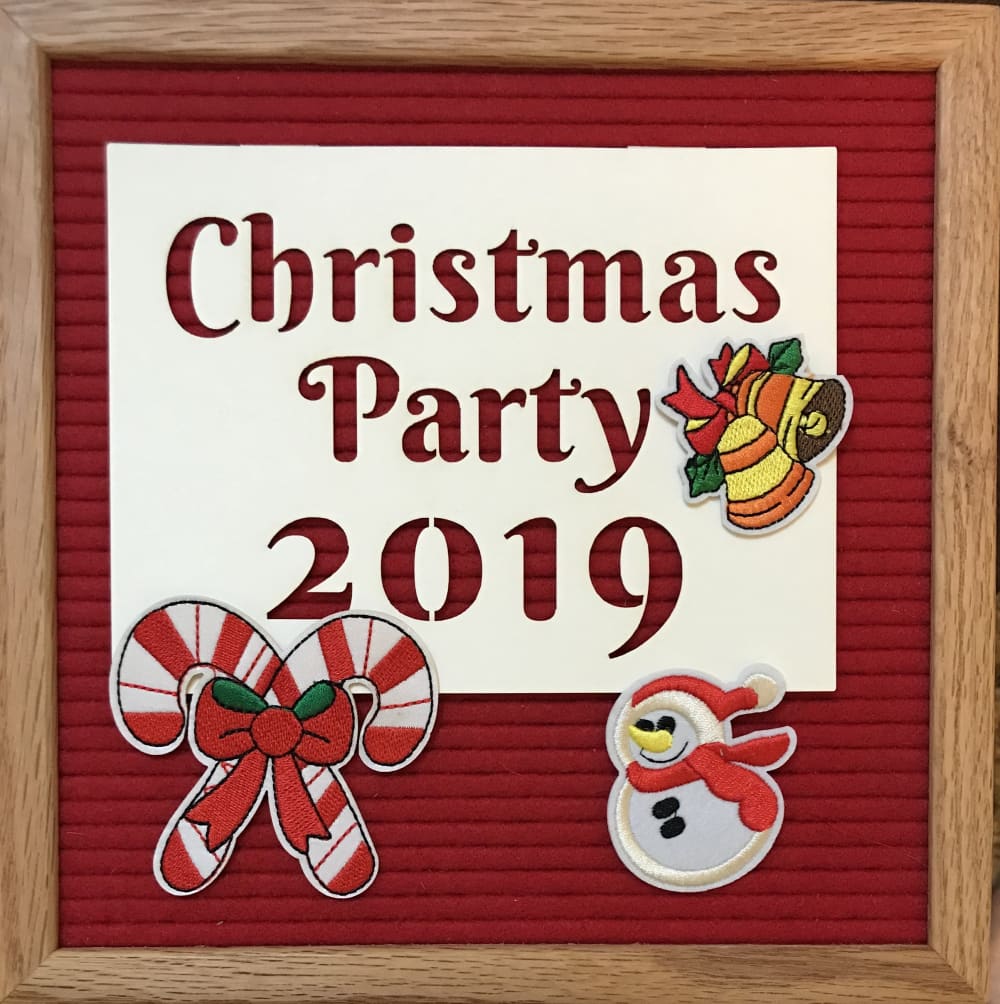
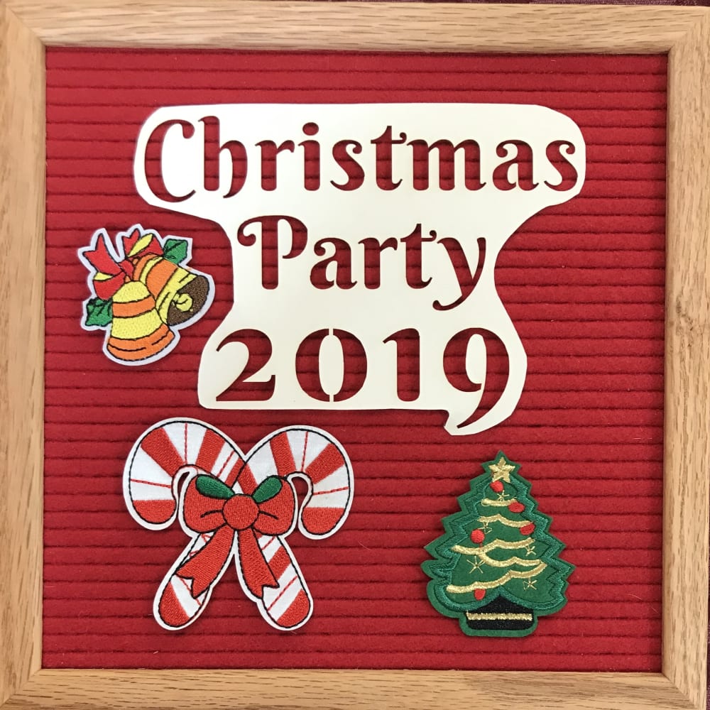
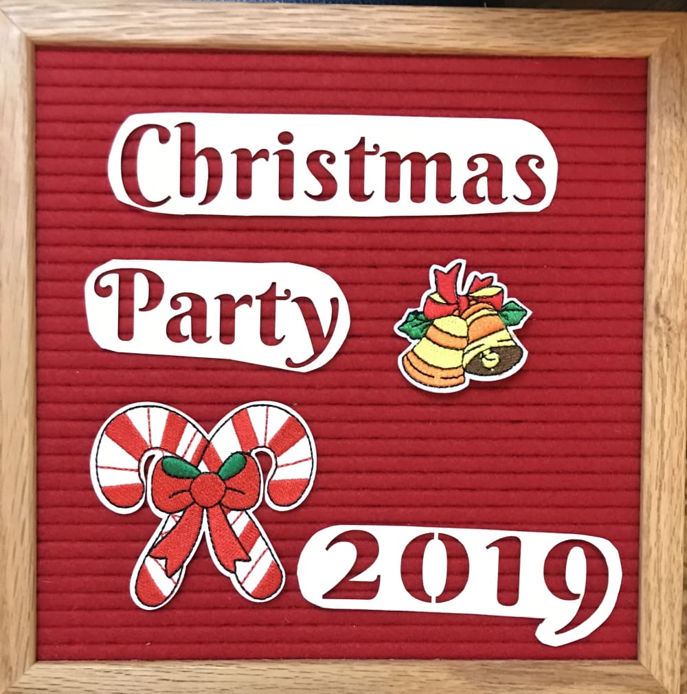
Which design do you like the best? Focus on the lettering more than the colored figures.


Option B won this Ranked poll with a final tally of 26 votes after 1 round of vote counting.
In a Ranked poll, respondents rank every option in order of preference. For example, when you test 6 options, each respondent orders their choices from first to sixth place.
PickFu requires a majority to win a Ranked poll. A majority winner differs from a plurality winner. A majority winner earns over 50% of the votes, whereas a plurality winner earns the most votes, regardless of winning percentage.
If an option does not earn a majority of votes, PickFu eliminates the option with the lowest number of votes. The votes from the eliminated option are reassigned based on each respondent’s next choice. This process continues in rounds until a majority winner emerges.
Scores reflect the percentage of total votes an option receives during the vote counting and indicate the relative preference of the respondents. If there is no majority winner, look to the scores to see how the options fared relative to one another.
| Option | Round 1 |
|---|---|
| B | 52% 26 votes |
| A | 38% 19 votes |
| C | 10% 5 votes |
19 Responses to Option A
I think the "cut out" looks weird compared to the first option (A) - I feel that it looks more like a kids cutout and not very professional (especially C)
I think the lettering and the word arrangement (having all the words together in one block), looks better in A and B options. Having the words splayed out on the board don't look as nice, plus they don't look as if they're placed level an looks thrown together.
I like option A the best because the letters have a complete background to them. Option B and C look alright but I don't like the cut out look as much. It almost looks like it was made with construction paper in those.
I really liked Option A, the large text centered. It really makes the message stand out very well.
I chose option A because I like the words on the large white paper. I don't like how the paper is cut out in the other two options.
My first choice the lettering and the square white behind it make is look more professional and symmetrical. The others ones looks like a kit made it.
Option A is the most professional and has a good mix of red and white in the background. B is a close second for the same reasons, although the spacing looks sub-optimal for a reason I can't quite put together. Option C looks hastily thrown together.
I like A the most because it seems more balanced and makes the lettering more noticeable and eye catching. This is the best layout.
A looks the best to me the way the lettering is contained. The others are fine but a little too odd also.
I like these in this order. It distracts me when I see letters that look off or unbalanced..It may be my OCD but it annoys me
I chose A because all the words are right there and easy to read, with nothing in the way. I chose B because the words are grouped together, even though they are cut out differently it is still easy to read. I chose C last because the way the words are cut into strips, it makes it harder to read until you stare at it for a little bit.
I chose based on how I like the designs.
Choice A caught my attention quicker than the other choices. In addition, the lettering on Choice A looks more festive and professional than the other choices presented. Choice B is a close second. The lettering in choice B still looked festive, but less professionally done than Choice A. I did not care for choice C, it had a bit of an elementary school feel to it.
I like A because I think having the wording in the square looks more professional. I think B is okay with the cutout around the words but not my favorite. I don't really like C at all, I think it looks a bit amateurish.
My first choice just caught my eye better I like how its all one piece of paper rather all cut up
I like A because it looks more put together. The words aren't separated and it looks nicer.I chose B second because I like that the words are together but the shape of the word box looks a little childish.C looks like a child did it. With not reason on the positioning and it looks like it was just randomly thrown together.
I think the text needs to look unified so having it in one coloured block makes more sense that the weird splotches
I like this design the best because it's more appealing and more aesthetically pleasing.
I prefer all the words together so they are more easily read, that is why I chose C last. I picked A over B because the font seemed larger, this may just be the white box having more contrast over the white bubble.
26 Responses to Option B
i like had Christmas tree
Option B is the most preferable, not only are the trees, and the candy canes in the most desirable spot. The background is a lighter shade of red, which really helps the rest of the colors pop out more.
Option B looks clean, there's too much white left in option A's lettering and Option C looks messy with the words being spread out.
I like the font choice and arrangement in B best. C looks very homemade, certainly not as appealing visually. It lacks symmetry. The excess border on A made B a better choice.
The lettering in my first selection was the easiest to read compared to the others.
Choice B that has a cut out of the text looks neater than the others.
The one I picked looks more even and professional than the others. The font on the others looks unevenly spaced and placed
I didn't really like any of them to be honest.
i like the images on this one
First things seem brighter
It looks to be in a better format.
I put option A last because the color was too dark and didn't pop, the picture looked cluttered with the overlapping cutouts onto the "Christmas Party 2019 rectangle, and it just looked thrown together. I chose option B first because it looked the most professional, the brighter color of red was more attention getting, and with the "Christmas Party 2019" all on one piece of paper it was easier to focus on the entire subject with the additional drawings still standing out but being supportive to the main topic. Option C is better than Option A but it doesn't feel balanced.
I prefer the lettering in option B because the spacing looks even and the background has a nice design to it that has an organized appearance.
I like the greater variety of colors in option B as well as the way the layout of items better than the other options.
design is more coherent in options 1 & 2. the design in option c looks uncohesive, as the party elements break up the space between the text lines.
The all inclusive image in choice B appears to be the best image. I would go with that as the primary product as the cutout looks the best. The layout and design is the best there. Think it would be the top image to click on for everyone. Option A has too much whitespace and option C is harder for the eye to follow.
A looks like it didn't take much effort, so A loses. B has three pictures, which makes it slightly better than C
First choice looks the most classy, the last with the words split up looks terrible.`
I chse based on which ones I liked
I like the options that look more hand made.
I think the lettering works better blocked together, but curved shape works better than the square
Can't really explain beyond just saying it looks better to me.
B was the cutest
The font is easiest to read, and the images do not interfere with the readability of the text.
I chose B because it looks like there has been more effort put into shaping the sign. Having the title cut out looks best to me. However, I did select C as my last Choice because it seemed to me that those words individually cut out were crooked. That seemed careless. It did not look professional.
I prefer these text fonts and how they position the 2019
5 Responses to Option C
I like the layout best, then B second most. I don't like the square box around the text in A
I like it all cut out and spaced the best. It gives it that homey feel. I chose A over B as i think the semi cut out look doesnt work as well. So either solid or all cut out.
Choice C is well balanced and is most reminiscent of Christmas to me.
I think the text looks the best split up a bit and larger. It just looks more "Christmasy" to me. I also like the brightness.
The font on option C looks like the most clear from a distance, though all options look nice.
Explore who answered your poll
Analyze your results with demographic reports.
Demographics
Sorry, AI highlights are currently only available for polls created after February 28th.
We're working hard to bring AI to more polls, please check back soon.

