Poll results
Save to favorites
Add this poll to your saved list for easy reference.
which design do you like the most and why?
Option C won this Ranked poll with a final tally of 26 votes after 2 rounds of votes counting.
In a Ranked poll, respondents rank every option in order of preference. For example, when you test 6 options, each respondent orders their choices from first to sixth place.
PickFu requires a majority to win a Ranked poll. A majority winner differs from a plurality winner. A majority winner earns over 50% of the votes, whereas a plurality winner earns the most votes, regardless of winning percentage.
If an option does not earn a majority of votes, PickFu eliminates the option with the lowest number of votes. The votes from the eliminated option are reassigned based on each respondent’s next choice. This process continues in rounds until a majority winner emerges.
Scores reflect the percentage of total votes an option receives during the vote counting and indicate the relative preference of the respondents. If there is no majority winner, look to the scores to see how the options fared relative to one another.
| Option | Round 1 | Round 2 |
|---|---|---|
| C | 40% 20 votes | 52% 26 votes +6 |
| B | 38% 19 votes | 48% 24 votes +5 |
| A | 22% 11 votes | Eliminated 11 votes reassigned |
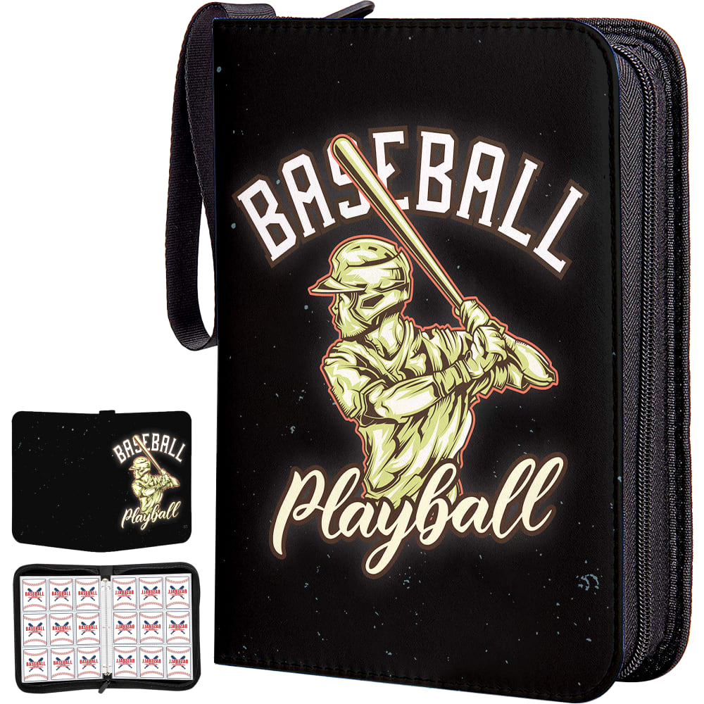
11 Responses to Option A
I like how different this looks that what I would normally expect. It is really unique and interesting
i like the design in option A because it looks high quality and unique
The gold and black design, definitely! It's so much prettier than both of the others! The gold is practically glowing, and the black smooth and sleek.
Out of three available options, I chose option A. Because the design and color are so elegant.
I like the colors of the design. It looks kind of fancy. Looks better quality than the other two.
Black with gold logo looks pretty so I chose A first. The baseball theme in C is attractive than the color and silhouette image in B.
Choices A and C first because they have a good display and the design is more attractive to me as compared to choice B.
I think this one looks more expensive than the others. It is a lot more detailed and interesting. I like the style of it. C is a bit boring but I really just don't like B.
I would be most likely to purchase option A because I think that it has the most interesting and visually appealing cover design out of the three options above. The other two just seem a little too plain and common. There is just not really anything unique about them.
the image is descriptive on its own ,
Not very original but interesting color
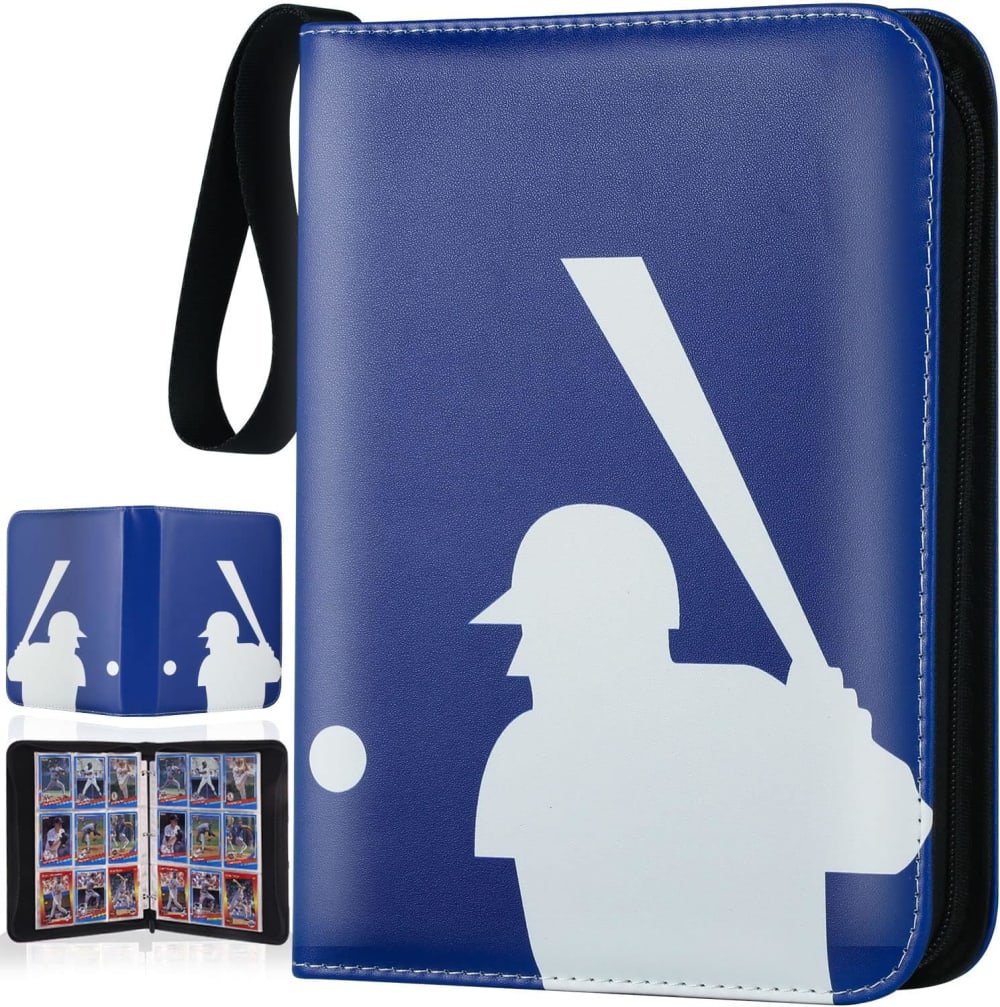
19 Responses to Option B
I like the blue MLB style cover in option B.
A looks like it's geared toward kids. B has my favorite color pattern
B feels iconic and more timeless. A is a little too busy and childish to me.
B has a more authentic looking style that I find more appealing and attractive
B. Color stands out more. Is unique and sort of looks like the MLB logo. Nice looking and easy to show off.
I prefer option B because it looks the most classic and novel. Option C and A feel rather average to me.
I like option B the best. It doesn't state anything on the front, but the picture says it all.
B is the most classy as it is evocative of classic MLB colors and the often used batter graphic. The ball in C is a bit cheesy but at least the cover is clean. I find A very juvenile and I think both the glow and colors look terrible.
I love the simplicity of B and C. B has great colors and I like that it is darker overall so it would be my first choice. I don't really like the image in A.
This image makes me feel nostalgic because it reminds me of the MLB logo I would see on TV as a kid.
I prefer Option B because it is a classic logo with a retro look that I really appreciate.
I like the design and color of my top choice. It fits my needs and style.
To me the look of the classic MLB logo with the batter up such as B would be a high light to me.
I think B is the classic logo and it reminds me of the MLB logo.
I ranked these based on the cover designs that I found the most attractive.
I like the silhouette of the player. It has a really old school feel to it. I like the blue background. It makes me feel nostalgic
I have to go with option B for this one. I like it a lot better than the other two. I love blue, it's my favorite color so naturally I would pick this one. I did like the artwork on option A. I thought it looked really good too. I didn't care too much about the baseball themed white binder at all though. I like how the logo is on the front and back of option B as well.
its simple and looks a lot like the MLB logo. the second one is a very fun design while the third one looks a little girly with the PLAY BALL font
I like the look and design of the case in option B the most, so that is the one I would choose.
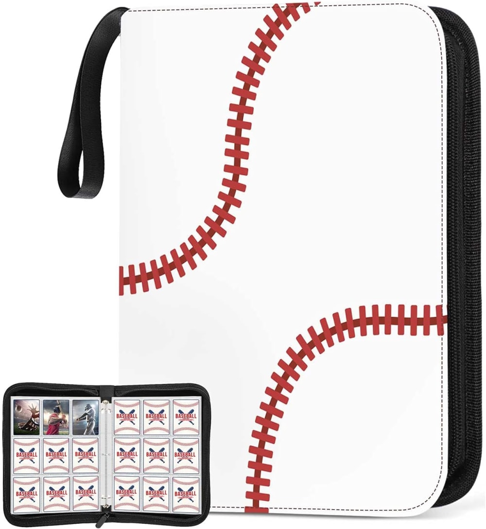
20 Responses to Option C
I LIKE THE SIMPLE LOOK OF OPTION C. I THINK OPTION A AND B HAVE TOO MUCH ON THEM
I like the binder cover of choice C as I love the standard baseball is what I like.
The classic red baseball stitching caught my eye right away.
I like this classic look.
I like this one the best due to the color and overall design.
C first because I like how the design actually looks like a baseball which make this the most appealingB second because I like how straightforward the design isA last because the design is a bit too dark for my liking which makes this the least appealing
I picked the ones most visually appealing to me, personally
I like the minimalist design of just the baseball. Think it looks the coolest.
I like the abstraction art of the thread on the ball. It's obvious but not obvious.
I like the fact that it looks like a baseball, it is simple and I like red and white.
C is the best look because of how simple it is compared to the other designs. I like B a lot as well, but would rather the cover be the baseball than an image of a player.
I prefer C as I like the likeness of the baseball for the cover.
I like the classic baseball look and the red baseball stitching on this binder.
Option C is my favorite because of the baseball style motif.
I like the subtlety of the one that looks like a baseball. It could also be more easily used for girls/women's items. Option A seems a really weird coloring that's a bit freaky.
A is no, it is very ugly and off putting. I like the simplicity of C and B but I like the minimalistic of C more. It is timeless and classy
The cover being made to look like a baseball is really unique and inspired.
I like Option C the best because it is relatively plain and tasteful, but still instantly recognizable as a baseball-card album. B is in second place because it is relatively restrained in its design, and it somewhat resembles the Major League Baseball logo, and A is in last place because I think the design is just too loud
C has a very appealing white color, that makes it modern and stylish. The design also has baseball thread lines that snake across the white cover to form creative and unique red lines which add life to the cover. The theme perfectly aligns with baseball and is easy to identify.
I liked the simple baseball design of option C the most. Option A, I liked the art-style more than option B.
Explore who answered your poll
Analyze your results with demographic reports.

