Poll results
Save to favorites
Add this poll to your saved list for easy reference.
Which design do you prefer?
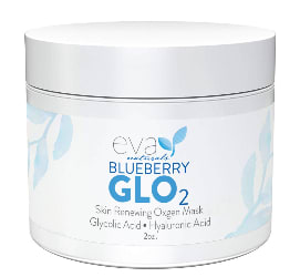
28 Responses to Option A
I like the larger bold text with the glo that is used in A
I like the stacked logo in A. It is easier to read and to digest.
I think it looks better having the two words on top of each other. I also like the word glo being very bold because it makes it stick out and I also really like the color that it is in
I like this design. It is cool and attractive. I think this one is more attention getting. I would chose this one to buy. Thank you.
The more centered fonts make the packaging easier to read at a glance
I like A the best I like how it is more centered an has a pop to it that B does not.
A is more bold, strong, eye catching and professional.
I prefer this option because the writing on the bottle is simpler and sounds more professional it seems high quality and useful
I think the product label looks better with the name of the product with the brand of the product. Too much white space with those separated.
I like option A because it seems like all the information is more centralized. This makes it easier and quicker to read and look at.
I prefer Option A as my first choice. It looks soft and feminine with a delicate style that's very attractive. Blue and white always looks so clean and fresh.
I like the text written on top of each other instead of a long single line.
I like option A the best because it stands out the most with the bolder text.
They're both really similar, but I think I prefer Choice A. The more centrally-aligned text is just more pleasing to the eye than the wider spanning writing present in its counterpart.
I like option A the most because I like the design a little better and I like the vertical writing for the brand and slogan.
I like this one because it's on two different lines and gives it more dimension and easier to read
Just seems to me like the text is a little more compact and easier to read
I like how this text has a little more information and it looks bolder to me which stands out better
I prefer the design of the label of option A more than option B's label design.
The container with the larger letters would be my choice. It makes it easier to see what the product is for at first glance.
I like that it's more detailed and has more to it. Looks great!
I like the emphasis on GLO. It's a stronger brand name.
it is easier to read and stands out very well
I like the design of A a lot more because I think that the color scheme and wording is more attractive. I think that B is fine but I would trust the product in A more because of its design.
Both of these designs are nice but I chose the one that most gets my attention. The larger font on the word GLO is effective.
A seems more symmetrical - B seems words and too long and too much text
I think most of my feelings on these designs are pretty subjective and subtle. I slightly prefer A but thats just my opinion.
I think it makes it stand out more.
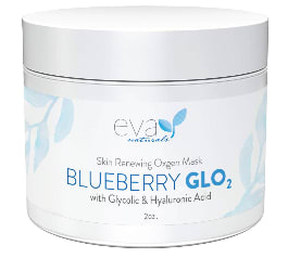
22 Responses to Option B
The spacing in A seems to dense. Spacing it out like B makes a cleaner appearance.
This is a little easier to read and know what it is.
i like this logo/wording design best. it has a better, cleaner look to it
I like the BLUEBERRY and GLO side by side, and the different fonts seem to be more eye catching when the label is designed this way.
I prefer the option B product image because the container is not as wide and looks more square than the option A product image.
I can read the ingredients better on the front and it's in a bigger font so it looks more authentic.
I think the design is better with the words in a greater width, not looking like a themometer
I feel like the label on B is so much more appealing overall. I think the larger spacing between parts looks so much cleaner and makes the label look so much more professional. I really how it's easier to read everything in option B. Option A just feels like all of the information is piled on top of each other and there's no negative space for my eye to rest- it's much more overwhelming.
Option B better emphasizes the blueberry.
B has a cool look to it. I found the design a bit more interesting.
The labeling overall looks more neat and symmetrical. I like the name too!
I like the word "blueberry" being as big as "glo", it just looks better
I like the design with everything on the same line.
I think I prefer the bigger writing on the bottle, it is easier to read and blueberry is more prominent.
I picked B as my top choice as I like the wording for that bottle.
Right away "Blueberry glo" stuck out to me on B. I want it to be on the same line. It looks disconnected on A.
I like the more wide label its easier to read and see and looks more professional
Option B's text is better aligned, so I prefer it over A.
I voted based on how appealing the images were to me compared to the others and which ones I would click on in the real world.
I prefer design B as it looks unique and attract everybody
I prefer option "B". The design looks appealing and eye catching.
I chose option B because the text felt more readable and it had a more aesthetically pleasing design. It did not feel crushed in and the layout felt natural.
Explore who answered your poll
Analyze your results with demographic reports.
Demographics
Sorry, AI highlights are currently only available for polls created after February 28th.
We're working hard to bring AI to more polls, please check back soon.

