Poll results
Save to favorites
Add this poll to your saved list for easy reference.
Which design do you prefer?
Age range
Education level
Gender identity
Household income range
Options
Personal income range
Racial or ethnic identity
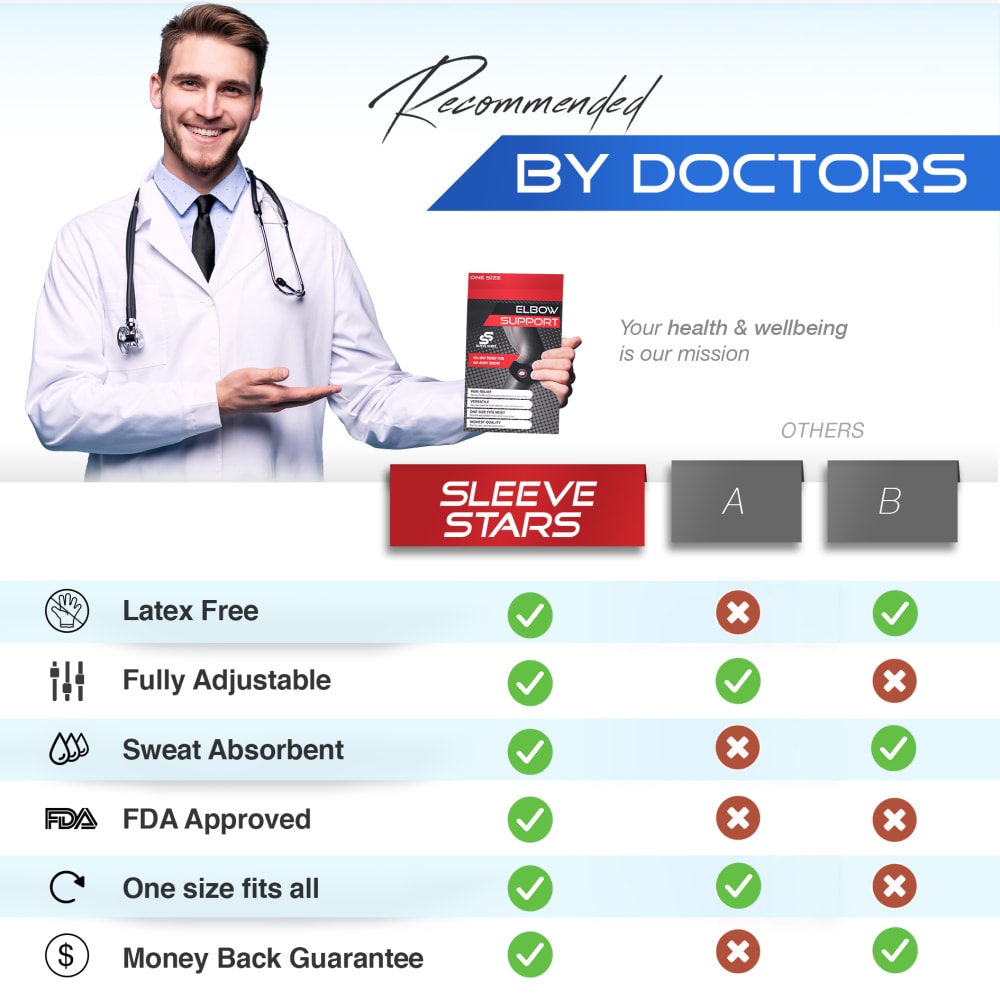
46 Responses to Option A
I like that there are more comparisons which gives me additional information
I like the blue bar at the top of this option, which is attractive. Looks like a useful product for sure!
Choice A is my pick because I like how it has the slogan about their mission. I also liked how it compared their product to two different competitors in the field. That shows how they really have an advantage over the competition in terms of what the product offers.
I prefer option "A". The color scheme matches the overall design nicely.
provides a more detailed product feature comparison
Has a format that I am used to seeing and blue is more professional than red.
this seems a little more detailed and also the color (blue) makes it seem more warm and personal (black and red feels like a gym supplement ad to me)
I like the color scheme on Option A. It looks more trustworthy.
I like option A more because option B looks like a sports breakdown with all the red and black.
I think it is easier to read the information at the bottom and I also like the blue color at the top better than the red
I like the design of option A better. I like how the text "by doctors" is highlighted with a blue background as it helps catch people' attention. I also like how there are 3 columns in the comparison.
I like that A includes blue and red. Blue is a color I associate with health/the medical field, so it feels more appropriate here.
I like the comparisons to other brands in A.
I like the colors in this one. The others color palette reminds me of performance muscle products.
I like A because I like the graph but better than B. I like that it shows two competitors and gives complete detail rather than just a summary. I think option B is a bit deceiving because it does not fully disclose that more than one competitor is being used and it always uses the company that allows them to use the red X.
I like A better because the columns are more comprehensive.
I think having two others is good. The competitors in B are all red X's which makes me think it might be a scam product. I also think the layout for A is cleaner.
I like comparing it to a few options not just lumping all the competitors together as one
They both look sketchy, but lighter colors are more friendly.
I like option A better because it shows two different competitors and shows what they do right and what they do wrong. Option A seems less cocky than option B with only show one competitor that apparently fails in all departments.
The "Doctor Recommended" banner in red and black makes it way too "busy" in a single section of the image (toward the top)..go for the other as your listing.
I liked choice A and the simplicity of the background made it look more professional and trustworthy. Choice B is too distracting with too much going on to keep my interest.
The chart is easier to read and understand in A.
The white and blue is a cleaner color scheme. B is way too dark.
A looks cleaner and the information is just generally easy to read and access with a glance. B is just not as good. The colors and fonts are a turn off against A.
I picked A as my top choice as the blue color makes it feel more calm and easy to understand.
A is the better design. The sky blue gradient is more fitting for an ad featuring a model dressed as a doctor, and the overall presentation is very clean without excess clutter.
The competitor comparison in A seems more realistic.
i feel like the colors on B are too strong and agressive. B looks more doctor like and professional
A by far way more attractive and eye catching and it is easy to read and understand.
A has a little bit more color with the blue tones, I think it makes the add seem happier and more engaging to the reader.
I prefer the brighter color scheme in option A. It captured my interest far more than the more muted color scheme in option B.
It looks more legitimate to me than Option B. Option B looks like one of a million different kind of ads for all kinds of different things
I like the colors better, the other option has a big black bar on the very top and it just seems too dark
I like that this graphic shows that some competitors have some of the features but not all of them like the sleeve stars has.
More comparison is better
I think that other one is a little bit too bold and in your face. This one looks friendlier, if that makes any sense.
A is cleaner, neater, and less busy. B has too much going on it and the long red and black bars are distracting. A is direct and straight to the message.
The color scheme in Option A makes it look less like an advertisement and more of a PSA. The color scheme being different than the product itself makes it look like it wasn't put out by the company, making it somewhat more trustworthy. Having more competitors listed with different features also makes the comparisons look more legitimate.
this layout is easier to consume and i can grasp the information better from this side by side comparison
I like option A more. It feels more official. It doesn't seem as showy and it sells the facts better I feel. I'd use option A as the image here. Better feel to it and more trustworthy.
Option A. This design seems more honest as it compares itself to its competitors. The icons next to the list of benefits draws the eyes to the list, which is optimal.
i choose A because the image look beautiful and fits for the advert purpose.
The clearer space puts more focus on the product.
The color scheme and palette for option a was really good. The artist has a lot of talent to set it up this way. I am drawn to that one for sure.
I chose A, because I wouldn't believe that none of the competitors didn't have have certain features such as sweat absorbent or latex free. I would probably go look at the competitors have I saw B, just to see if it was true.
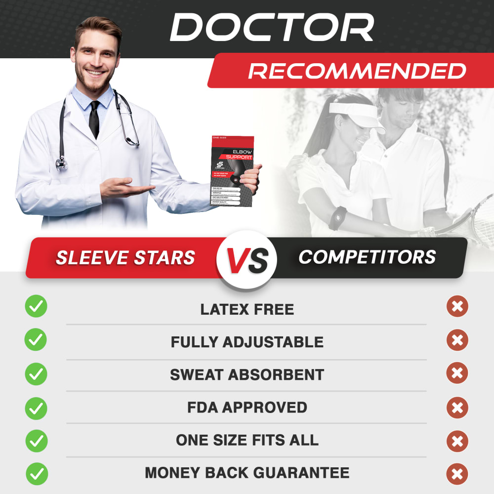
54 Responses to Option B
Option B is helpful because it shows one of the sports that the product could be useful for.
It’s easier to follow and is laid out more neatly and attractive.
When reading option A, my brain completely skips over the word 'Reccomended' because of the font, so I just read it as 'by doctors' rather than as it should be. I did not notice 8t said recommended until I saw it on the other option and scrolled back up to check if it was on the first one too.
The colors of this option seem to be more professional and eye-catching.
I like the red and black packaging. It stands out and draws the buyers eyes to the package product.
I chose 'B' because the text is much easier to read. The details are upfront and I can get all of the basic information easily. This design is also less crowded.
I chose Option B because the comparison is easier to see and doctor recommended stands out more. I think Option B is much more attention grabbing.
I like seeing all check boxes versus only some check boxes
Prefer option B better due to the following reasons:1) Simple comparison with one column for competitors.2) Larger test, easy to read.3) Focus goes to all greens and red in the comparison and how good this product is.A few things I like in "A":1) The graphic appears to be more honest. Option B is picking the competitors in their advantage.2) Like the logos next to the comparison text.Recommendation: Consider changing competitors to just one (pick one). That will be more honest and look cleaner and will be the best in my opinion.
This style fits the brand a little better and has a more serious and modern look that I find pleasant.
I chose B because this image is clear, easy to read and understand.
Option B is easier to understand.
I chose the image that most gets my attention.
I think this looks more persuasive
I don't think you need two anonymous competitors. Its not helpful to have the second one if I don't know who they are. I think B is simpler and better as a result. Also, I do not believe that that dude at the top is a doctor. Nevertheless, I would choose B
I chose B because I like the part of the image where they compare their product to someone else. I like how it is spaced with the text in the middle. It's easier to understand. I hate how I would have to scroll left and right in A to see what they have compared to their competitors.
I chose B because it is a cleaner ad
B is easier to tell what the features/benefits were. A would have been better if it was just A vs B rather than showing it against 2 competitor products.
I like option A because I think it’s really clean and enticing but I prefer B because it’s much easier to understand. Because there are two others being compared in A it seems as if the two others are what is being compared and it’s easy to miss the actual product comparison. I think B does a better job of getting the point across that the product has everything while the competitors don’t.
Option B is my choice because the word Doctor stands out more and provides a strong endorsement.
I chose B because of how bold the colors are. They bring out the detail.
I prefer the more straightforward comparison chart with fewer columns to peruse that can be absorbed or understood at a glance.
I think this one's a little bit better although unless your comparing to a specific competitor I am not sure out either of these really apply
I chose B because the look is not as busy. A has the extra column (B) and is a bit cluttered.
Option B is more visually pleasing, and it's more definitive in its comparison of the product to other brands. The red really pops out in option B and makes for easy reading. I prefer option B to option A by a large margin.
I like the color scheme better and the bolder print too.
The chart in A is too complicated to easily understand. What do A and B represent in this chart? Option B is simpler and better.
I like the black and red colors for this advertisement. I makes the product pop more.
This design is easier and faster to read. It looks more impressive.
I think having the competitor options listed as A and B without names is gimmicky. Makes it seem like it is just a made-up comparison.
B design is more informative and less noisy with icons and symbols.
I prefer the chart that compares the projects for option A, but option B is much better in terms of overall aeasthetic.
the graphis layout is so much better the font and colors make it easy to read and understand
I like that Option B feels more contained and like it has a more uniform style. Plus red and black just go together really well and create a backdrop for the text and the handsome doctor to really stand out.
Option B appears easier to read and is more eye catching
the colors and layout are better plus it's easier to read and understand
A bit more clear and concise. If you are comparing your product to other products ut us easier to go down a list of what you have that other don't always have. The way A was done it would have been better to have named the products rather than seeing checks or crosses for two phantom products. It really says nothing and is a bit more confusing to look at. Writing in B is clear and bold.
I prefer Option B, as the chart is much more organized and easy to read compared to Option A, which is confusing and all jumbled together.
B has a simplified chart which makes it easier to read.
If you're not going to name the competitors, don't put 'A' and 'B' up there. This other image makes more sense to me.
This options gives a little something extra with the photo of the 2 people.
The black band up top gives better contrast so it makes the doctor heading much more noticeable and effective relative to the other option.
B is just far more appealing. I like the added photo inset, the color scheme. The chart is easier to understand.
I would rather just see a side-by-side comparison with one other product...the comparison with two other products is a little confusing. Plus, I prefer the phrase Doctor Recommended.
I think the "doctor recommended" stands out more. I also like the way the features are listed, much easier to read especially at first glance, easier to understand.
It's easier to read the list in B without needing to scan for checkmarks on the right. It also doesn't name competitors (or use a generic stand-in), so I'm not able to be distracted by their offerings and features.
I like choice B because the comparison chart is easier to comprehend.
more colorful and appealing imaging for the product
choice b looks like its clearly better than choice a because it shows all the things it offers over the competitor
I prefer image B since the color scheme fits better with the product itself. Just looks nicer to me.
the inclusion of the tenis players is a great addtiont and the graphics seem more dramatic and eye catching
A seems kind of basic. B seems like it has a better layout and is also easier to understand.
The other option was way too busy for my taste.
I chose option B because it's look is clean, simple and easy to read it without having to look at a bunch of unnecessary information. Also, the B&W photo of the tennis player with coach is easily relatable seeing the product in use.
Explore who answered your poll
Analyze your results with demographic reports.
Demographics
Sorry, AI highlights are currently only available for polls created after February 28th.
We're working hard to bring AI to more polls, please check back soon.

